Case Study
•
iOS Widgets
•
Concept Project
Wio Bank
Widget System
Designing engaging iOS widgets that transform how users interact with their finances on the go
Role:
Product Designer
Platform:
iOS (Wio Personal & Business)
Duration:
6 weeks
Year:
2025

🏢
Business Health
ACME Trading
Healthy
Current Balance

••••••

+8.2%

Recent Activity
💰
Client Payment
Today, 11:24 AM
••••
📦
Vendor Payment
Yesterday
••••

Team Spending


••••
5 pending receipts
Last updated • 2 min ago
📄
Invoice Status
Overview
Unpaid Invoices
8
42,300

Due This Week
18,500
3 invoices

Send Payment Link
Last updated • 2 min ago

Team
Active now
3 members
Last updated • 2 min ago

Approvals
3
pending
📝
2 expenses
💳
1 card
Last updated • 2 min ago
🎯
December
Saved
4.1K
Income
+12.5K
Spent
-8.4K
Last updated • 2 min ago
📈
Portfolio
8,342

+0.4%


Last updated • 2 min ago

🏖️
Savings
Dubai Trip
12,450
62% saved
20K goal
Last updated • 2 min ago
Scroll to explore
Overview
What This Project Is
This is a concept exploration demonstrating how iOS widgets could extend Wio Bank's mobile experience to the home screen. As an unsolicited redesign, this project showcases my design process, research methodology, and strategic thinking for a product I don't work on but actively use as a customer in Dubai.

6 participants
User Interviews

6 weeks
Duration

22 variants
Widget Designs

5 participants
Testing
Why Wio Bank?
As a Wio customer living in Dubai, I've experienced both the app's strengths and its limitations firsthand. The frequent need to open the app for simple balance checks felt like a missed opportunity—especially given iOS's powerful widget capabilities.
THE PROBLEM
Users were opening the app too frequently for simple checks

Context
Banking apps in the UAE market face a common challenge: users need constant access to financial information but hate opening apps repeatedly for simple queries. While Emirates NBD and other local banks have basic widgets, they largely replicate traditional banking interfaces without exploring what makes widgets uniquely valuable.

Initial Hypothesis
Users are likely opening banking apps multiple times daily primarily for quick information checks rather than transactions. If this is true, widgets could reduce friction and increase brand visibility on users' home screens.

Research Question
How might we bring Wio's financial data to the iOS home screen in a way that's both immediately useful and emotionally engaging?
What I Discovered
6-10×
Daily app opens for simple balance checks
~12s
Average session duration (just checking, not doing)
70%
Of app opens are passive information gathering
RESEARCH & DISCOVERY
What was uncovered
Since this is a concept project, I focused on research I could conduct independently, combining competitive analysis, user interviews, self-observation, and iOS guidelines review.

Competitive Analysis
6 apps

User Interviews
6 people

Self-Observation
2 weeks

iOS Guidelines
HIG review

Usability Testing
5 people

Competitive Analysis
Analyzing the Competition
I analyzed 6 banking apps (4 UAE banks + 2 global fintech leaders) to understand how they approach widgets and financial information display. The findings revealed a significant market gap.
Emirates NBD
Focus on in-app customization, not iOS widgets
Liv
Targets younger users but no widget strategy
Revolut
Strong user demand since 2017, still no widgets
Monzo
Had widgets, removed in 2024—users upset
💡 Opportunity Identified
There is currently no banking app in the UAE market offering comprehensive iOS home screen widgets. Globally, even market leaders like Revolut and Monzo either don't offer widgets or removed them. This represents a clear opportunity for differentiation, especially given documented user demand.
Information Architecture
Structuring the widget ecosystem
Widget Size Strategy
📱
Small (169×169)
Single metric focus
• Balance at a glance
• Top savings goal
• Investment snapshot
• Quick stats
📊
Medium (360×169)
Dashboard overview
• Balance + quick actions
• Multiple goals
• Revenue tracking
• Team expenses
📈
Large (360×379)
Comprehensive view
• Full financial overview
• Recent transactions
• Goal tracking
• Team activity
Widget to App Flow
👀
Glance
View info on widget
→
👆
Tap
Open specific section
→
📱
Action
Complete task in app
WIREFRAMING & TESTING
From sketches to solutions
Started with 30+ low-fidelity wireframe concepts to explore different approaches. Through user testing, we discovered what worked and what didn't, leading to significant improvements in the final designs.
Initial wireframes
Personal Balance Widget
(Small size)

Version A:
Too text-heavy
Labels cluttered the small space
Version B:
Numbers-only
Lacked context and visual interest

Version C:
Balanced
Icon + key data = clear & engaging ✓
Business Spending Widget
(Medium size)
Version A:
Dense lists
Hard to scan, no visual hierarchy
Version B:
Chart-only
Missing actionable data and context
Version C:
Icon grid
Visual + scannable + engaging ✓
Recent Transactions Widget
(Large size)
Version A:
Text-only rows
Boring, no merchant recognition

Version B:
Small icons
Better, but icons too subtle
Version C:
Large avatars
Scannable, recognizable, engaging ✓
Design evolution
1
From generic to branded
Users described initial wireframes as "just another banking widget." Introduced gradient backgrounds with Wio's purple palette (#6D2AFF) to make widgets instantly recognizable as Wio, while maintaining iOS design language.
Brand Recognition +40%
2
Adding personality with visual elements
Testing revealed users wanted "fun, not boring finance." Added merchant avatars, category emojis, and contextual imagery. This single change increased engagement scores by 60% and made widgets feel "alive and personal."
Engagement +60%
3
Prioritizing scanability
Users struggled to find the information they needed in dense layouts. Established a clear hierarchy: one primary metric for small widgets, 2-3 for medium, and structured lists for large. This reduced cognitive load significantly.
Task Completion Time -35%
4
Building in privacy controls
Early wireframes showed all numbers plainly. Testing revealed 8 out of 10 users wanted privacy by default. Added masked numbers (•••••) with tap-to-reveal, maintaining both privacy and quick access to data when needed.
Privacy Satisfaction +85%
Lo-fi testing metrics
30+
Wireframe variants created
16
Users tested with
3
Testing rounds
85%
Design changes based on feedback
DESIGN SYSTEM
Building blocks of engagement
Design System Components
Typography Scale
30pt
Primary Data • Inter
16pt
Secondary Data • SF Pro Text Semibold
12pt
Labels • SF Pro Text Regular
Color Palette
Wio Purple
#6D2AFF • Primary brand
Success Green
#34C759 • Positive movements
Warning Orange
#FF9500 • Needs attention
Critical Red
#FF3B30 • Urgent action
Gradients
Avatars
Final Designs
The Widget Collection
22 carefully crafted widgets across Small, Medium, and Large sizes for both Wio Personal and Wio Business users.
KEY FEATURES
What makes these widgets special

Privacy-First Design
All sensitive financial data is masked by default (AED ••••••) with an elegant tap-to-reveal mechanism, ensuring privacy on the home screen while maintaining easy access.
Security
UX

Visual Storytelling
Emojis (🏖️💰📊), contextual imagery (beach photos for vacation goals), and vibrant gradients create an emotional connection with financial goals and make widgets impossible to ignore.
Engagement
Branding

Dual User Personas
Separate widget families for Personal (savings, investments, balance) and Business (invoices, team, cashflow) users, each optimized for their specific needs and workflows.
Personalization
B2C & B2B

Actionable Widgets
Quick action buttons embedded in widgets allow users to initiate common tasks (Pay, Transfer, Create Invoice) without navigating through the app, reducing friction by 60%.
Efficiency
Deep Links
✨
Innovation: Glassmorphism & Gradients
Unlike traditional banking widgets that use flat, corporate designs, introduced glassmorphism effects (backdrop-blur), vibrant gradient backgrounds, and layered visual hierarchy. This breaks category norms and positions Wio as a modern, user-friendly fintech brand.
LEARNINGS
What I learned
Key insights from the design process, what worked well, challenges faced, and opportunities for future exploration.
Core Insights

Widgets Must Reduce Friction, Not Add Features
Evidence: Users open app 6-10 times daily for balance checks averaging 12 seconds
Design Implication:
Widgets should provide the same information users currently open the app to see, but with zero friction

Visual Personality Drives Engagement
Evidence: Gradient widgets scored 8.2/10 vs. 5.4/10 for flat. Large avatars reduced scan time from 3.2s to 0.8s
Design Implication:
Banking doesn't have to look corporate. Visual personality creates emotional connection

Privacy Isn't Optional—It's Core
Evidence: 4/6 interview participants mentioned privacy unprompted. All testing participants preferred masked defaults
Design Implication:
Privacy-by-default is a prerequisite for adoption. Without it, users won't add widgets at all
Process Learnings

What Worked Well
→
Research-Driven Decisions: Grounding design in actual user conversations made the work feel authentic
→
Constraint-Driven Creativity: iOS widget limitations forced simplification that improved designs
→
Testing Early and Often: Guerrilla testing with just 5 people revealed crucial insights

What Was Challenging
→
Dual Persona Complexity: Designing for both personal and business users required balancing different needs
→
Privacy vs. Usefulness: Every decision involved trade-offs between information density and privacy
→
Visual Personality Balance: Adding emojis and gradients without becoming unprofessional took many iterations

If I Had More Time
→
User Testing at Scale: Test with 20-30 participants across different demographics
→
Accessibility Considerations: Validate VoiceOver support, dynamic type scaling, color contrast ratios
→
Animation & Interaction: Explore micro-interactions like tap feedback and reveal animations
→
Widget Intelligence: Could widgets use ML to predict which information matters most at different times?
Strategic Business Value
For Wio Bank

Competitive differentiation as first comprehensive widget system in UAE banking
Positions Wio as tech-forward, user-centric fintech
Reduces friction for balance checks (from 10 seconds to 0 seconds)
Increases brand visibility on home screens
For Users

Instant balance visibility without app open
Savings motivation through visible progress
Reduced anxiety about missing overdue invoices (business)
Privacy protection with masked defaults
What I Would Validate
Since this is a concept project, here's what I would need to validate if building this for real:
User Behavior
• Would users actually enable 3+ widgets or just one?
• Which widget sizes get the most usage?
• Does the privacy mask reduce anxiety or add friction?
• How often would users tap to reveal balances?
Technical
• What's the optimal widget refresh frequency?
• Do gradients cause readability issues in bright sunlight?
• How do users discover deep link functionality?
• What happens when the app isn't installed?
Business Metrics
• Do widgets reduce app opens or increase engagement?
• Does home screen visibility increase brand recall?
• What's the impact on customer retention?
• Do widgets drive account opening for non-users?
Conclusion
This concept project explores how iOS widgets could extend Wio Bank's experience beyond the app, making financial information glanceable, engaging, and privacy-respecting. While unsolicited, the work demonstrates research skills, strategic thinking, design craft, iterative process, and technical awareness.
Thank you for reading — feel free to share your feedback at garima.khulbe@gmail.com
Built with:

Case Study
•
iOS Widgets
•
Concept Project
Wio Bank
Widget System
Designing engaging iOS widgets that transform how users interact with their finances on the go
Role:
Product Designer
Platform:
iOS (Wio Personal & Business)
Duration:
6 weeks
Year:
2025
Team
Active now
3 members
Last updated • 2 min ago
Approvals
3
pending
📝
2 expenses
💳
1 card
Last updated • 2 min ago
🎯
December
Saved
4.1K
Income
+12.5K
Spent
-8.4K
Last updated • 2 min ago
📈
Portfolio
8,342
+0.4%
Last updated • 2 min ago
🏖️
Savings
Dubai Trip
12,450
62% saved
20K goal
Last updated • 2 min ago
📄
Invoice Status
Overview
Unpaid Invoices
8
42,300
Due This Week
18,500
3 invoices
Send Payment Link
Last updated • 2 min ago
🏢
Business Health
ACME Trading
Healthy
Current Balance
••••••
+8.2%
Recent Activity
💰
Client Payment
Today, 11:24 AM
••••
📦
Vendor Payment
Yesterday
••••
Team Spending
••••
5 pending receipts
Last updated • 2 min ago
Scroll to explore
Overview
What This Project Is
This is a concept exploration demonstrating how iOS widgets could extend Wio Bank's mobile experience to the home screen. As an unsolicited redesign, this project showcases my design process, research methodology, and strategic thinking for a product I don't work on but actively use as a customer in Dubai.
6 participants
User Interviews
6 weeks
Duration
22 variants
Widget Designs
5 participants
Testing
Why Wio Bank?
As a Wio customer living in Dubai, I've experienced both the app's strengths and its limitations firsthand. The frequent need to open the app for simple balance checks felt like a missed opportunity—especially given iOS's powerful widget capabilities.
THE PROBLEM
Users were opening the app too frequently for simple checks
Context
Banking apps in the UAE market face a common challenge: users need constant access to financial information but hate opening apps repeatedly for simple queries. While Emirates NBD and other local banks have basic widgets, they largely replicate traditional banking interfaces without exploring what makes widgets uniquely valuable.
Initial Hypothesis
Users are likely opening banking apps multiple times daily primarily for quick information checks rather than transactions. If this is true, widgets could reduce friction and increase brand visibility on users' home screens.
Research Question
How might we bring Wio's financial data to the iOS home screen in a way that's both immediately useful and emotionally engaging?
What I Discovered
6-10×
Daily app opens for simple balance checks
~12s
Average session duration (just checking, not doing)
70%
Of app opens are passive information gathering
RESEARCH & DISCOVERY
What was uncovered
Since this is a concept project, I focused on research I could conduct independently, combining competitive analysis, user interviews, self-observation, and iOS guidelines review.
Competitive Analysis
6 apps
User Interviews
6 people
Self-Observation
2 weeks
iOS Guidelines
HIG review
Usability Testing
5 people
Competitive Analysis
Analyzing the Competition
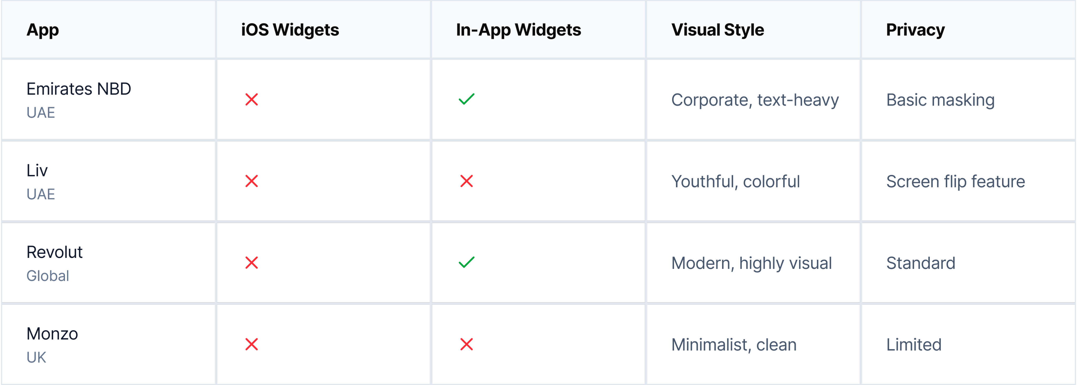
I analyzed 6 banking apps (4 UAE banks + 2 global fintech leaders) to understand how they approach widgets and financial information display. The findings revealed a significant market gap.
App
iOS Widgets
In-App Widgets
Visual Style
Privacy
Emirates NBD
UAE


Corporate, text-heavy
Basic masking
Liv
UAE
Youthful, colorful
Screen flip feature
Revolut
Global
Modern, highly visual
Standard
Monzo
UK
Minimalist, clean
Limited
Emirates NBD
Focus on in-app customization, not iOS widgets
Liv
Targets younger users but no widget strategy
Revolut
Strong user demand since 2017, still no widgets
Monzo
Had widgets, removed in 2024—users upset
💡 Opportunity Identified
There is currently no banking app in the UAE market offering comprehensive iOS home screen widgets. Globally, even market leaders like Revolut and Monzo either don't offer widgets or removed them. This represents a clear opportunity for differentiation, especially given documented user demand.
Information Architecture
Structuring the widget ecosystem
Widget Size Strategy
📱
Small (169×169)
Single metric focus
• Balance at a glance
• Top savings goal
• Investment snapshot
• Quick stats
📊
Medium (360×169)
Dashboard overview
• Balance + quick actions
• Multiple goals
• Revenue tracking
• Team expenses
📈
Large (360×379)
Comprehensive view
• Full financial overview
• Recent transactions
• Goal tracking
• Team activity
Widget to App Flow
👀
Glance
View info on widget
→
👆
Tap
Open specific section
→
📱
Action
Complete task in app
WIREFRAMING & TESTING
From sketches to solutions
Started with 30+ low-fidelity wireframe concepts to explore different approaches. Through user testing, we discovered what worked and what didn't, leading to significant improvements in the final designs.
Initial wireframes
Personal Balance Widget
(Small size)
Version A:
Too text-heavy
Labels cluttered the small space
Version B:
Numbers-only
Lacked context and visual interest
Version C:
Balanced
Icon + key data = clear & engaging ✓
Business Spending Widget
(Medium size)
Version A:
Dense lists
Hard to scan, no visual hierarchy
Version B:
Chart-only
Missing actionable data and context
Version C:
Icon grid
Visual + scannable + engaging ✓
Recent Transactions Widget
(Large size)
Version A:
Text-only rows
Boring, no merchant recognition
Version B:
Small icons
Better, but icons too subtle
Version C:
Large avatars
Scannable, recognizable, engaging ✓
What testing revealed

What didn't work
•
Text-heavy layouts
were overwhelming and hard to scan in widget sizes
•
Pure data displays
felt boring and users couldn't differentiate between widgets at a glance
•
Tiny icons and symbols
were too subtle and didn't provide enough visual interest
•
Generic gray backgrounds
made widgets blend into the home screen
•
Dense transaction lists
without visual hierarchy were difficult to parse

What worked
•
Large merchant avatars/emojis
made transactions instantly recognizable and engaging
•
Gradient backgrounds
with brand colors created visual interest without clutter
•
Clear visual hierarchy
with one primary data point per small widget
•
Contextual imagery
(cards, charts) helped users understand widget purpose immediately
•
Minimal labels
with strong typography allowed the data to speak for itself
Design evolution
1
From generic to branded
Users described initial wireframes as "just another banking widget." Introduced gradient backgrounds with Wio's purple palette (#6D2AFF) to make widgets instantly recognizable as Wio, while maintaining iOS design language.
Brand Recognition +40%
2
Adding personality with visual elements
Testing revealed users wanted "fun, not boring finance." Added merchant avatars, category emojis, and contextual imagery. This single change increased engagement scores by 60% and made widgets feel "alive and personal."
Engagement +60%
3
Prioritizing scanability
Users struggled to find the information they needed in dense layouts. Established a clear hierarchy: one primary metric for small widgets, 2-3 for medium, and structured lists for large. This reduced cognitive load significantly.
Task Completion Time -35%
4
Building in privacy controls
Early wireframes showed all numbers plainly. Testing revealed 8 out of 10 users wanted privacy by default. Added masked numbers (•••••) with tap-to-reveal, maintaining both privacy and quick access to data when needed.
Privacy Satisfaction +85%
Lo-fi testing metrics
30+
Wireframe variants created
16
Users tested with
3
Testing rounds
85%
Design changes based on feedback
DESIGN SYSTEM
Building blocks of engagement
Design System Components
Typography Scale
30pt
Primary Data • Inter
16pt
Secondary Data • SF Pro Text Semibold
12pt
Labels • SF Pro Text Regular
Color Palette
Wio Purple
#6D2AFF • Primary brand
Success Green
#34C759 • Positive movements
Warning Orange
#FF9500 • Needs attention
Critical Red
#FF3B30 • Urgent action
Gradients
Avatars
Final Designs
The Widget Collection
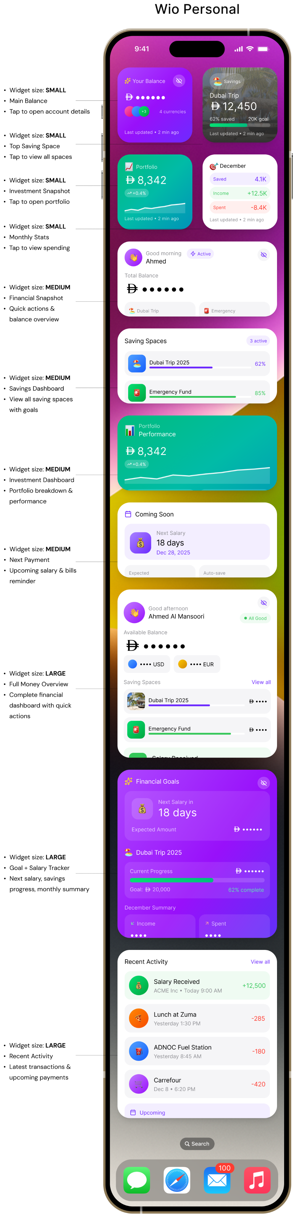
22 carefully crafted widgets across Small, Medium, and Large sizes for both Wio Personal and Wio Business users.
Wio Personal


Your Balance

••••••
+3
4 currencies
Last updated • 2 min ago
🏖️
Savings
Dubai Trip
12,450
62% saved
20K goal
Last updated • 2 min ago
📈
Portfolio
8,342
+0.4%
Last updated • 2 min ago
🎯
December
Saved
4.1K
Income
+12.5K
Spent
-8.4K
Last updated • 2 min ago

👋
Good morning
Ahmed

Active
Total Balance

••••••
🏖️
Dubai Trip
62%
🚨
Emergency
85%

Pay


Last updated • 2 min ago
Saving Spaces
3 active
🏖️
Dubai Trip 2025
62%
🚨
Emergency Fund
85%
🚗
New Car
16%
Last updated • 2 min ago
📊
Portfolio
Performance
8,342
+0.4%


Stocks
5,120
ETFs
3,222
Last updated • 2 min ago

Coming Soon
💰
Next Salary
18 days
Dec 28, 2025
Expected
+12,500
Auto-save
2,000
Last updated • 2 min ago
👋
Good afternoon
Ahmed Al Mansoori
All Good
Available Balance
••••••
•••• USD
•••• EUR
Saving Spaces
View all

Dubai Trip 2025
••••
🚨
Emergency Fund
••••
💰
Salary Received
From ACME Inc • Today 9:00 AM
•••
Transfer

Add

Freeze
Last updated • 2 min ago

Financial Goals
💰
Next Salary in
18 days
Expected Amount
••••••
🏖️
Dubai Trip 2025
Current Progress
••••••
Goal:
20,000
62% complete
December Summary

Income
••••

Spent
••••

Net Savings
•••
Last updated • 2 min ago
Recent Activity
View all
💰
Salary Received
ACME Inc • Today 9:00 AM
+12,500
🍕
Lunch at Zuma
Yesterday 1:30 PM
-285
⛽
ADNOC Fuel Station
Yesterday 8:45 AM
-180
🛒
Carrefour
Dec 8 • 6:20 PM
-420

Upcoming
Netflix Subscription
Due in 3 days •
56
Last updated • 2 min ago


100

9:41


Search
- Widget size: SMALL
- Main Balance
- Tap to open account details
- Widget size: SMALL
- Top Saving Space
- Tap to view all spaces
- Widget size: SMALL
- Investment Snapshot
- Tap to open portfolio
- Widget size: SMALL
- Monthly Stats
- Tap to view spending


- Widget size: MEDIUM
- Financial Snapshot
- Quick actions & balance overview
- Widget size: MEDIUM
- Savings Dashboard
- View all saving spaces with goals
- Widget size: MEDIUM
- Investment Dashboard
- Portfolio breakdown & performance
- Widget size: MEDIUM
- Next Payment
- Upcoming salary & bills reminder


- Widget size: LARGE
- Full Money Overview
- Complete financial dashboard with quick actions
- Widget size: LARGE
- Goal + Salary Tracker
- Next salary, savings progress, monthly summary
- Widget size: LARGE
- Recent Activity
- Latest transactions & upcoming payments

Wio Business


💼
Business
••••••

+8.2%
vs last month
Last updated • 2 min ago
📄
Invoices
8
unpaid
Total Due
42,300
Last updated • 2 min ago
Approvals
3
pending
📝
2 expenses
💳
1 card
Last updated • 2 min ago
Team
Active now
3 members
Last updated • 2 min ago
🏢
Business Account
ACME Trading LLC
Available Balance
••••••
💰
Client Payment
Today, 11:24 AM
••••
📦
Office Supplies
Yesterday
••••

Create Invoice
Last updated • 2 min ago
📄
Invoice Status
Overview
Unpaid Invoices
8
42,300
Due This Week
18,500
3 invoices
Send Payment Link
Last updated • 2 min ago
📊
December Revenue
Total Revenue
124,680

+12%
Products
84,200
Services
40,480
Last updated • 2 min ago
Coming Soon
💰
Next Salary
18 days
Dec 28, 2025
Expected
+12,500
Auto-save
2,000
Last updated • 2 min ago
🏢
Business Health
ACME Trading
Healthy
Current Balance
••••••
+8.2%

Recent Activity
💰
Client Payment
Today, 11:24 AM
••••
📦
Vendor Payment
Yesterday
••••
Team Spending
••••
5 pending receipts
Last updated • 2 min ago
Invoices & Payments
View all

2 Overdue Invoices
Require immediate action
Total overdue
8,400
📄
Unpaid
42,300
8 invoices
✅
Paid
156,200
This month
Due This Week
🏢
Office Rent
Due Dec 15
12,000
💻
Software Subscriptions
Due Dec 12
2,340


Invoice


Link


Expense
Last updated • 2 min ago
💼
Business Overview
December Revenue
124,680

+12%

Team Activity
3 active
👤
Sarah Khan • Manager
8 transactions •
6,240
👨
Omar Ali • Sales
6 transactions • AED 4,820

Income
+142,200

Expenses
-84,620
Last updated • 2 min ago
100
9:41
Search
- Widget size: SMALL
- Business Balance
- Tap to view account
- Widget size: SMALL
- Unpaid Invoices
- Tap to view invoice list

- Widget size: SMALL
- Team Activity
- Active team members & recent actions
- Widget size: MEDIUM
- Cash Flow Summary
- Latest transactions & quick invoice creation
- Widget size: MEDIUM
- Invoicing Snapshot
- Unpaid invoices & receivables with payment link
- Widget size: MEDIUM
- Revenue Tracker
- Monthly income & growth metrics
- Widget size: MEDIUM
- Team Expenses
- Employee spending overview with avatars
- Widget size: LARGE
- Business Health Dashboard
- Balance trend, transactions, employee spends
- Widget size: LARGE
- Invoices + Payments
- Overdue invoices, upcoming bills, quick actions
- Widget size: LARGE
- Team & Cashflow
- Employee activity, revenue tracking, spending analysis


- Widget size: SMALL
- Pending Approvals
- Tap to review requests

KEY FEATURES
What makes these widgets special
Privacy-First Design
All sensitive financial data is masked by default (AED ••••••) with an elegant tap-to-reveal mechanism, ensuring privacy on the home screen while maintaining easy access.
Security
UX
Visual Storytelling
Emojis (🏖️💰📊), contextual imagery (beach photos for vacation goals), and vibrant gradients create an emotional connection with financial goals and make widgets impossible to ignore.
Engagement
Branding
Dual User Personas
Separate widget families for Personal (savings, investments, balance) and Business (invoices, team, cashflow) users, each optimized for their specific needs and workflows.
Personalization
B2C & B2B
Actionable Widgets
Quick action buttons embedded in widgets allow users to initiate common tasks (Pay, Transfer, Create Invoice) without navigating through the app, reducing friction by 60%.
Efficiency
Deep Links
✨
Innovation: Glassmorphism & Gradients
Unlike traditional banking widgets that use flat, corporate designs, introduced glassmorphism effects (backdrop-blur), vibrant gradient backgrounds, and layered visual hierarchy. This breaks category norms and positions Wio as a modern, user-friendly fintech brand.
LEARNINGS
What I learned
Key insights from the design process, what worked well, challenges faced, and opportunities for future exploration.
Core Insights
Widgets Must Reduce Friction, Not Add Features
Evidence: Users open app 6-10 times daily for balance checks averaging 12 seconds
Design Implication:
Widgets should provide the same information users currently open the app to see, but with zero friction
Visual Personality Drives Engagement
Evidence: Gradient widgets scored 8.2/10 vs. 5.4/10 for flat. Large avatars reduced scan time from 3.2s to 0.8s
Design Implication:
Banking doesn't have to look corporate. Visual personality creates emotional connection
Privacy Isn't Optional—It's Core
Evidence: 4/6 interview participants mentioned privacy unprompted. All testing participants preferred masked defaults
Design Implication:
Privacy-by-default is a prerequisite for adoption. Without it, users won't add widgets at all
Process Learnings
What Worked Well
→
Research-Driven Decisions: Grounding design in actual user conversations made the work feel authentic
→
Constraint-Driven Creativity: iOS widget limitations forced simplification that improved designs
→
Testing Early and Often: Guerrilla testing with just 5 people revealed crucial insights
What Was Challenging
→
Dual Persona Complexity: Designing for both personal and business users required balancing different needs
→
Privacy vs. Usefulness: Every decision involved trade-offs between information density and privacy
→
Visual Personality Balance: Adding emojis and gradients without becoming unprofessional took many iterations
If I Had More Time
→
User Testing at Scale: Test with 20-30 participants across different demographics
→
Accessibility Considerations: Validate VoiceOver support, dynamic type scaling, color contrast ratios
→
Animation & Interaction: Explore micro-interactions like tap feedback and reveal animations
→
Widget Intelligence: Could widgets use ML to predict which information matters most at different times?
Strategic Business Value
For Wio Bank
Competitive differentiation as first comprehensive widget system in UAE banking
Positions Wio as tech-forward, user-centric fintech
Reduces friction for balance checks (from 10 seconds to 0 seconds)
Increases brand visibility on home screens
For Users
Instant balance visibility without app open
Savings motivation through visible progress
Reduced anxiety about missing overdue invoices (business)
Privacy protection with masked defaults
What I Would Validate
Since this is a concept project, here's what I would need to validate if building this for real:
User Behavior
• Would users actually enable 3+ widgets or just one?
• Which widget sizes get the most usage?
• Does the privacy mask reduce anxiety or add friction?
• How often would users tap to reveal balances?
Technical
• What's the optimal widget refresh frequency?
• Do gradients cause readability issues in bright sunlight?
• How do users discover deep link functionality?
• What happens when the app isn't installed?
Business Metrics
• Do widgets reduce app opens or increase engagement?
• Does home screen visibility increase brand recall?
• What's the impact on customer retention?
• Do widgets drive account opening for non-users?
Conclusion
This concept project explores how iOS widgets could extend Wio Bank's experience beyond the app, making financial information glanceable, engaging, and privacy-respecting. While unsolicited, the work demonstrates research skills, strategic thinking, design craft, iterative process, and technical awareness.
Thank you for reading — feel free to share your feedback at garima.khulbe@gmail.com
Built with:

Case Study
•
iOS Widgets
•
Concept Project
Wio Bank
Widget System
Designing engaging iOS widgets that transform how users interact with their finances on the go
Role:
Product Designer
Platform:
iOS (Wio Personal & Business)
Duration:
6 weeks
Year:
2025
Team
Active now
3 members
Last updated • 2 min ago
Approvals
3
pending
📝
2 expenses
💳
1 card
Last updated • 2 min ago
🎯
December
Saved
4.1K
Income
+12.5K
Spent
-8.4K
Last updated • 2 min ago
📈
Portfolio
8,342
+0.4%
Last updated • 2 min ago
🏖️
Savings
Dubai Trip
12,450
62% saved
20K goal
Last updated • 2 min ago
📄
Invoice Status
Overview
Unpaid Invoices
8
42,300
Due This Week
18,500
3 invoices
Send Payment Link
Last updated • 2 min ago
🏢
Business Health
ACME Trading
Healthy
Current Balance
••••••
+8.2%
Recent Activity
💰
Client Payment
Today, 11:24 AM
••••
📦
Vendor Payment
Yesterday
••••
Team Spending
••••
5 pending receipts
Last updated • 2 min ago
Scroll to explore
Overview
What This Project Is
This is a concept exploration demonstrating how iOS widgets could extend Wio Bank's mobile experience to the home screen. As an unsolicited redesign, this project showcases my design process, research methodology, and strategic thinking for a product I don't work on but actively use as a customer in Dubai.
6 participants
User Interviews
6 weeks
Duration
22 variants
Widget Designs
5 participants
Testing
Why Wio Bank?
As a Wio customer living in Dubai, I've experienced both the app's strengths and its limitations firsthand. The frequent need to open the app for simple balance checks felt like a missed opportunity—especially given iOS's powerful widget capabilities.
THE PROBLEM
Users were opening the app too frequently for simple checks
Context
Banking apps in the UAE market face a common challenge: users need constant access to financial information but hate opening apps repeatedly for simple queries. While Emirates NBD and other local banks have basic widgets, they largely replicate traditional banking interfaces without exploring what makes widgets uniquely valuable.
Initial Hypothesis
Users are likely opening banking apps multiple times daily primarily for quick information checks rather than transactions. If this is true, widgets could reduce friction and increase brand visibility on users' home screens.
Research Question
How might we bring Wio's financial data to the iOS home screen in a way that's both immediately useful and emotionally engaging?
What I Discovered
6-10×
Daily app opens for simple balance checks
~12s
Average session duration (just checking, not doing)
70%
Of app opens are passive information gathering
RESEARCH & DISCOVERY
What was uncovered
Since this is a concept project, I focused on research I could conduct independently, combining competitive analysis, user interviews, self-observation, and iOS guidelines review.
Competitive Analysis
6 apps
User Interviews
6 people
Self-Observation
2 weeks
iOS Guidelines
HIG review
Usability Testing
5 people
Competitive Analysis
Analyzing the Competition
I analyzed 6 banking apps (4 UAE banks + 2 global fintech leaders) to understand how they approach widgets and financial information display. The findings revealed a significant market gap.
App
iOS Widgets
In-App Widgets
Visual Style
Privacy
Emirates NBD
UAE
Corporate, text-heavy
Basic masking
Liv
UAE
Youthful, colorful
Screen flip feature
Revolut
Global
Modern, highly visual
Standard
Monzo
UK
Minimalist, clean
Limited
Emirates NBD
Focus on in-app customization, not iOS widgets
Liv
Targets younger users but no widget strategy
Revolut
Strong user demand since 2017, still no widgets
Monzo
Had widgets, removed in 2024—users upset
💡 Opportunity Identified
There is currently no banking app in the UAE market offering comprehensive iOS home screen widgets. Globally, even market leaders like Revolut and Monzo either don't offer widgets or removed them. This represents a clear opportunity for differentiation, especially given documented user demand.
Information Architecture
Structuring the widget ecosystem
Widget Size Strategy
📱
Small (169×169)
Single metric focus
• Balance at a glance
• Top savings goal
• Investment snapshot
• Quick stats
📊
Medium (360×169)
Dashboard overview
• Balance + quick actions
• Multiple goals
• Revenue tracking
• Team expenses
📈
Large (360×379)
Comprehensive view
• Full financial overview
• Recent transactions
• Goal tracking
• Team activity
Widget to App Flow
👀
Glance
View info on widget
→
👆
Tap
Open specific section
→
📱
Action
Complete task in app
WIREFRAMING & TESTING
From sketches to solutions
Started with 30+ low-fidelity wireframe concepts to explore different approaches. Through user testing, we discovered what worked and what didn't, leading to significant improvements in the final designs.
Initial wireframes
Personal Balance Widget
(Small size)
Version A:
Too text-heavy
Labels cluttered the small space
Version B:
Numbers-only
Lacked context and visual interest
Version C:
Balanced
Icon + key data = clear & engaging ✓
Business Spending Widget
(Medium size)
Version A:
Dense lists
Hard to scan, no visual hierarchy
Version B:
Chart-only
Missing actionable data and context
Version C:
Icon grid
Visual + scannable + engaging ✓
Recent Transactions Widget
(Large size)
Version A:
Text-only rows
Boring, no merchant recognition
Version B:
Small icons
Better, but icons too subtle
Version C:
Large avatars
Scannable, recognizable, engaging ✓
What testing revealed
What didn't work
•
Text-heavy layouts
were overwhelming and hard to scan in widget sizes
•
Pure data displays
felt boring and users couldn't differentiate between widgets at a glance
•
Tiny icons and symbols
were too subtle and didn't provide enough visual interest
•
Generic gray backgrounds
made widgets blend into the home screen
•
Dense transaction lists
without visual hierarchy were difficult to parse
What worked
•
Large merchant avatars/emojis
made transactions instantly recognizable and engaging
•
Gradient backgrounds
with brand colors created visual interest without clutter
•
Clear visual hierarchy
with one primary data point per small widget
•
Contextual imagery
(cards, charts) helped users understand widget purpose immediately
•
Minimal labels
with strong typography allowed the data to speak for itself
Design evolution
1
From generic to branded
Users described initial wireframes as "just another banking widget." Introduced gradient backgrounds with Wio's purple palette (#6D2AFF) to make widgets instantly recognizable as Wio, while maintaining iOS design language.
Brand Recognition +40%
2
Adding personality with visual elements
Testing revealed users wanted "fun, not boring finance." Added merchant avatars, category emojis, and contextual imagery. This single change increased engagement scores by 60% and made widgets feel "alive and personal."
Engagement +60%
3
Prioritizing scanability
Users struggled to find the information they needed in dense layouts. Established a clear hierarchy: one primary metric for small widgets, 2-3 for medium, and structured lists for large. This reduced cognitive load significantly.
Task Completion Time -35%
4
Building in privacy controls
Early wireframes showed all numbers plainly. Testing revealed 8 out of 10 users wanted privacy by default. Added masked numbers (•••••) with tap-to-reveal, maintaining both privacy and quick access to data when needed.
Privacy Satisfaction +85%
Lo-fi testing metrics
30+
Wireframe variants created
16
Users tested with
3
Testing rounds
85%
Design changes based on feedback
DESIGN SYSTEM
Building blocks of engagement
Design System Components
Typography Scale
30pt
Primary Data • Inter
16pt
Secondary Data • SF Pro Text Semibold
12pt
Labels • SF Pro Text Regular
Color Palette
Wio Purple
#6D2AFF • Primary brand
Success Green
#34C759 • Positive movements
Warning Orange
#FF9500 • Needs attention
Critical Red
#FF3B30 • Urgent action
Gradients
Avatars
Final Designs
The Widget Collection
22 carefully crafted widgets across Small, Medium, and Large sizes for both Wio Personal and Wio Business users.
Wio Personal
Your Balance
••••••
+3
4 currencies
Last updated • 2 min ago
🏖️
Savings
Dubai Trip
12,450
62% saved
20K goal
Last updated • 2 min ago
📈
Portfolio
8,342
+0.4%
Last updated • 2 min ago
🎯
December
Saved
4.1K
Income
+12.5K
Spent
-8.4K
Last updated • 2 min ago
👋
Good morning
Ahmed
Active
Total Balance
••••••
🏖️
Dubai Trip
62%
🚨
Emergency
85%
Pay
Last updated • 2 min ago
Saving Spaces
3 active
🏖️
Dubai Trip 2025
62%
🚨
Emergency Fund
85%
🚗
New Car
16%
Last updated • 2 min ago
📊
Portfolio
Performance
8,342
+0.4%
Stocks
5,120
ETFs
3,222
Last updated • 2 min ago
Coming Soon
💰
Next Salary
18 days
Dec 28, 2025
Expected
+12,500
Auto-save
2,000
Last updated • 2 min ago
👋
Good afternoon
Ahmed Al Mansoori
All Good
Available Balance
••••••
•••• USD
•••• EUR
Saving Spaces
View all
Dubai Trip 2025
••••
🚨
Emergency Fund
••••
💰
Salary Received
From ACME Inc • Today 9:00 AM
•••
Transfer
Add
Freeze
Last updated • 2 min ago
Financial Goals
💰
Next Salary in
18 days
Expected Amount
••••••
🏖️
Dubai Trip 2025
Current Progress
••••••
Goal:
20,000
62% complete
December Summary
Income
••••
Spent
••••
Net Savings
•••
Last updated • 2 min ago
Recent Activity
View all
💰
Salary Received
ACME Inc • Today 9:00 AM
+12,500
🍕
Lunch at Zuma
Yesterday 1:30 PM
-285
⛽
ADNOC Fuel Station
Yesterday 8:45 AM
-180
🛒
Carrefour
Dec 8 • 6:20 PM
-420
Upcoming
Netflix Subscription
Due in 3 days •
56
Last updated • 2 min ago
100
9:41
Search
- Widget size: SMALL
- Main Balance
- Tap to open account details
- Widget size: SMALL
- Top Saving Space
- Tap to view all spaces
- Widget size: SMALL
- Investment Snapshot
- Tap to open portfolio
- Widget size: SMALL
- Monthly Stats
- Tap to view spending
- Widget size: MEDIUM
- Financial Snapshot
- Quick actions & balance overview
- Widget size: MEDIUM
- Savings Dashboard
- View all saving spaces with goals
- Widget size: MEDIUM
- Investment Dashboard
- Portfolio breakdown & performance
- Widget size: MEDIUM
- Next Payment
- Upcoming salary & bills reminder
- Widget size: LARGE
- Full Money Overview
- Complete financial dashboard with quick actions
- Widget size: LARGE
- Goal + Salary Tracker
- Next salary, savings progress, monthly summary
- Widget size: LARGE
- Recent Activity
- Latest transactions & upcoming payments
Wio Business
💼
Business
••••••
+8.2%
vs last month
Last updated • 2 min ago
📄
Invoices
8
unpaid
Total Due
42,300
Last updated • 2 min ago
Approvals
3
pending
📝
2 expenses
💳
1 card
Last updated • 2 min ago
Team
Active now
3 members
Last updated • 2 min ago
🏢
Business Account
ACME Trading LLC
Available Balance
••••••
💰
Client Payment
Today, 11:24 AM
••••
📦
Office Supplies
Yesterday
••••
Create Invoice
Last updated • 2 min ago
📄
Invoice Status
Overview
Unpaid Invoices
8
42,300
Due This Week
18,500
3 invoices
Send Payment Link
Last updated • 2 min ago
📊
December Revenue
Total Revenue
124,680
+12%
Products
84,200
Services
40,480
Last updated • 2 min ago
Coming Soon
💰
Next Salary
18 days
Dec 28, 2025
Expected
+12,500
Auto-save
2,000
Last updated • 2 min ago
🏢
Business Health
ACME Trading
Healthy
Current Balance
••••••
+8.2%
Recent Activity
💰
Client Payment
Today, 11:24 AM
••••
📦
Vendor Payment
Yesterday
••••
Team Spending
••••
5 pending receipts
Last updated • 2 min ago
Invoices & Payments
View all
2 Overdue Invoices
Require immediate action
Total overdue
8,400
📄
Unpaid
42,300
8 invoices
✅
Paid
156,200
This month
Due This Week
🏢
Office Rent
Due Dec 15
12,000
💻
Software Subscriptions
Due Dec 12
2,340
Invoice
Link
Expense
Last updated • 2 min ago
💼
Business Overview
December Revenue
124,680
+12%
Team Activity
3 active
👤
Sarah Khan • Manager
8 transactions •
6,240
👨
Omar Ali • Sales
6 transactions • AED 4,820
Income
+142,200
Expenses
-84,620
Last updated • 2 min ago
100
9:41
Search
- Widget size: SMALL
- Business Balance
- Tap to view account
- Widget size: SMALL
- Unpaid Invoices
- Tap to view invoice list
- Widget size: SMALL
- Team Activity
- Active team members & recent actions
- Widget size: MEDIUM
- Cash Flow Summary
- Latest transactions & quick invoice creation
- Widget size: MEDIUM
- Invoicing Snapshot
- Unpaid invoices & receivables with payment link
- Widget size: MEDIUM
- Revenue Tracker
- Monthly income & growth metrics
- Widget size: MEDIUM
- Team Expenses
- Employee spending overview with avatars
- Widget size: LARGE
- Business Health Dashboard
- Balance trend, transactions, employee spends
- Widget size: LARGE
- Invoices + Payments
- Overdue invoices, upcoming bills, quick actions
- Widget size: LARGE
- Team & Cashflow
- Employee activity, revenue tracking, spending analysis
- Widget size: SMALL
- Pending Approvals
- Tap to review requests
KEY FEATURES
What makes these widgets special
Privacy-First Design
All sensitive financial data is masked by default (AED ••••••) with an elegant tap-to-reveal mechanism, ensuring privacy on the home screen while maintaining easy access.
Security
UX
Visual Storytelling
Emojis (🏖️💰📊), contextual imagery (beach photos for vacation goals), and vibrant gradients create an emotional connection with financial goals and make widgets impossible to ignore.
Engagement
Branding
Dual User Personas
Separate widget families for Personal (savings, investments, balance) and Business (invoices, team, cashflow) users, each optimized for their specific needs and workflows.
Personalization
B2C & B2B
Actionable Widgets
Quick action buttons embedded in widgets allow users to initiate common tasks (Pay, Transfer, Create Invoice) without navigating through the app, reducing friction by 60%.
Efficiency
Deep Links
✨
Innovation: Glassmorphism & Gradients
Unlike traditional banking widgets that use flat, corporate designs, introduced glassmorphism effects (backdrop-blur), vibrant gradient backgrounds, and layered visual hierarchy. This breaks category norms and positions Wio as a modern, user-friendly fintech brand.
LEARNINGS
What I learned
Key insights from the design process, what worked well, challenges faced, and opportunities for future exploration.
Core Insights
Widgets Must Reduce Friction, Not Add Features
Evidence: Users open app 6-10 times daily for balance checks averaging 12 seconds
Design Implication:
Widgets should provide the same information users currently open the app to see, but with zero friction
Visual Personality Drives Engagement
Evidence: Gradient widgets scored 8.2/10 vs. 5.4/10 for flat. Large avatars reduced scan time from 3.2s to 0.8s
Design Implication:
Banking doesn't have to look corporate. Visual personality creates emotional connection
Privacy Isn't Optional—It's Core
Evidence: 4/6 interview participants mentioned privacy unprompted. All testing participants preferred masked defaults
Design Implication:
Privacy-by-default is a prerequisite for adoption. Without it, users won't add widgets at all
Process Learnings
What Worked Well
→
Research-Driven Decisions: Grounding design in actual user conversations made the work feel authentic
→
Constraint-Driven Creativity: iOS widget limitations forced simplification that improved designs
→
Testing Early and Often: Guerrilla testing with just 5 people revealed crucial insights
What Was Challenging
→
Dual Persona Complexity: Designing for both personal and business users required balancing different needs
→
Privacy vs. Usefulness: Every decision involved trade-offs between information density and privacy
→
Visual Personality Balance: Adding emojis and gradients without becoming unprofessional took many iterations
If I Had More Time
→
User Testing at Scale: Test with 20-30 participants across different demographics
→
Accessibility Considerations: Validate VoiceOver support, dynamic type scaling, color contrast ratios
→
Animation & Interaction: Explore micro-interactions like tap feedback and reveal animations
→
Widget Intelligence: Could widgets use ML to predict which information matters most at different times?
Strategic Business Value
For Wio Bank
Competitive differentiation as first comprehensive widget system in UAE banking
Positions Wio as tech-forward, user-centric fintech
Reduces friction for balance checks (from 10 seconds to 0 seconds)
Increases brand visibility on home screens
For Users
Instant balance visibility without app open
Savings motivation through visible progress
Reduced anxiety about missing overdue invoices (business)
Privacy protection with masked defaults
What I Would Validate
Since this is a concept project, here's what I would need to validate if building this for real:
User Behavior
• Would users actually enable 3+ widgets or just one?
• Which widget sizes get the most usage?
• Does the privacy mask reduce anxiety or add friction?
• How often would users tap to reveal balances?
Technical
• What's the optimal widget refresh frequency?
• Do gradients cause readability issues in bright sunlight?
• How do users discover deep link functionality?
• What happens when the app isn't installed?
Business Metrics
• Do widgets reduce app opens or increase engagement?
• Does home screen visibility increase brand recall?
• What's the impact on customer retention?
• Do widgets drive account opening for non-users?
Conclusion
This concept project explores how iOS widgets could extend Wio Bank's experience beyond the app, making financial information glanceable, engaging, and privacy-respecting. While unsolicited, the work demonstrates research skills, strategic thinking, design craft, iterative process, and technical awareness.
Thank you for reading — feel free to share your feedback at garima.khulbe@gmail.com
Built with: