UX Case Study • 2025 • Concept Project
AI Recipe Suggestions
Transforming a delivery app into a cooking companion through AI-powered recipe discovery
Role:
UX/UI Designer
Duration:
2 months
Project Type
Concept Exploration
6
User Interviews
8
Usability Tests
95%
Task Success Rate
100%
Would Use Feature
Read Case Study

Overview
What This Project Is
This is a concept exploration examining how Talabat could evolve beyond its core food delivery business to help users with meal inspiration and grocery shopping.
As an unsolicited redesign, this project demonstrates my UX process and research methodology for a platform I use regularly as a customer in Dubai.
Why Talabat Grocery?
Talabat recently expanded from restaurant delivery into grocery retail. However, the grocery experience remains transactional—browse categories, add items, checkout.
Meanwhile, users face daily decision fatigue about what to cook. This presents an opportunity to make Talabat the starting point for meal planning, not just the endpoint for ingredient delivery.
THE PROBLEM
"What should I cook tonight?"
None of the UAE grocery delivery apps address this upstream problem. All focus on transactional shopping - browse, select, buy.

For Users
Decision fatigue leads to repeat purchases of the same items and reduced meal variety

The Gap
Users see recipes on social media but no smooth path from inspiration to ingredients

The Opportunity
Integrate recipe discovery to increase basket diversity and order frequency
Problem Statement
How might we help busy home cooks discover personalized recipes and seamlessly purchase ingredients, reducing decision fatigue while increasing meal variety?

This became our north star
RESEARCH & DISCOVERY
Methodology
Since this is a concept project conducted independently, I focused on research I could execute without internal company data.
Competitive Analysis
Analyzed 6 apps to understand how others approach recipe-shopping integration globally and in UAE
User Conversations
6 informal interviews with regular Talabat users in Dubai to uncover pain points and behaviors
Self-Observation
Tracked my own Talabat usage for 3 weeks to validate behavioral patterns
Usability Testing
5 participants testing interactive prototypes to validate design decisions
Competitive Analysis Findings
Instashop (UAE)
No Recipes
Carrefour Now
No Recipes
SideChef (US)
18K+ Recipes
Talabat Concept
AI-Powered
Key Opportunity
No grocery delivery app in the UAE currently offers recipe discovery. Talabat's advantage: native integration within an existing high-frequency grocery platform.
Key Research Findings
1
Decision Fatigue is Real
5 out of 6 participants struggled with "what to cook" decisions, spending 15-30 minutes deciding before defaulting to familiar meals.
"I open Instagram, see a nice recipe, screenshot it, then forget about it. I have like 200 saved recipes I've never made."
— Rania, P1
"The hardest part of cooking isn't cooking, it's deciding what to cook. I end up making pasta or ordering shawarma."
— Ahmed, P2
Design Implication
The decision bottleneck happens before shopping. Current apps assume you already know what you want to buy.
2
Recipe-to-Ingredient Gap
4 out of 6 participants saw recipes online but had no smooth workflow to translate them into actual shopping.
"I see a recipe on Instagram, screenshot the ingredients, then try to remember what half of them even are when I'm shopping."
— Sarah, P5
"I tried meal kit services but they're so expensive. I just want the ingredients, not someone else to cook for me."
— Priya, P3
Design Implication
One-tap "Add All Ingredients" is the core value proposition. Every additional step is friction.
3
Repeat Purchase Rut
All 6 participants acknowledged ordering "the same things." Want variety but inertia is strong.
"I have like 10 items I always order. Chicken, rice, vegetables, eggs... I'd like to try new things but I don't know what."
— Ahmed, P2
My own behavior (3-week study):
Repeat items:
12 products
New items tried:
Only 3
4
Trust in Personalization
5 out of 6 participants said they'd trust suggestions "based on what I usually order."
"If Talabat knows I order chicken a lot, and suggested chicken recipes I haven't tried, yeah I'd look at that."
— Khalid, P6
Design Principle Established
Transparent Intelligence:
Always explain the "why" ("Based on your chicken orders...") to build trust.
SOLUTION
AI-Powered Recipe Discovery
A contextual feature that appears in the search experience, suggesting personalized recipes with one-tap ingredient shopping

Smart Suggestions
AI analyzes order history to recommend recipes that match user preferences and past purchases

One-Tap Shopping
Add individual ingredients or entire recipe ingredient lists directly to cart with pricing transparency

Complete Guidance
Step-by-step instructions with cooking times, difficulty levels, and serving sizes
Design Principles

Contextual, Not Intrusive
Appears only when users are actively searching, maintaining focus on their primary task
Transparent Intelligence
Always explain why a recipe is suggested with clear reasoning based on user behavior
Friction-Free Commerce
Make purchasing as simple as possible - from inspiration to cart in seconds
Mobile-First Design
Optimized for one-handed use with thumb-friendly interaction zones
DESIGN PROCESS
Design Journey
From rough sketches to polished interfaces - here's how the solution evolved
1
Low-Fidelity Wireframes
I started with low-fi to quickly explore different layout options and interaction patterns. This helped me test multiple concepts before investing in high-fidelity designs.
Initial Sketches - Exploring Entry Points
📱
Home Widget
Recipes carousel
✗ Rejected
Too aggressive - competes with primary ordering flow
🍳
✗ Rejected
Dedicated tab - users unlikely to discover it
🔍 Search...
✨ AI Recipes
✓ Selected
Contextual - appears when user is exploring
Recipe Detail Flow Sketches
Version A - Separate Screens
→
✗ Too many taps - friction in shopping flow
Version B - Tabbed Interface
Ingredients
Steps
✓ All info in one place - easy to switch contexts
Design Decision: Why Search Integration?
After sketching multiple concepts, I chose search integration because:
•
Zero intrusion: Doesn't disrupt existing user flows - only appears when they're actively exploring
•
Mental model fit: Users associate search with discovery, making it natural to find recipes there
•
Scalability: Easy to A/B test and turn on/off without affecting core functionality
2
Mid-Fidelity Iterations
I created digital wireframes to test the core interactions and information hierarchy before adding visual design.
Iteration 1 - Ingredient Cards
✗
Price hidden in sub-text - caused users anxiety about total cost
Iteration 2 - Price Upfront
✓
Clear pricing + total shown = users felt in control and confident
Design Decision: Progressive Disclosure
I structured the information hierarchy to prioritize:
1. First
Visual appeal
Food photo to spark interest
- Second
Quick metrics
Time, servings, difficulty
- Third
Ingredients & action
Detailed list with prices
3
Prototype Testing with Users
I conducted moderated usability testing with 8 participants using interactive prototypes. Each session revealed critical insights that shaped the final design.
Testing Protocol
👥
8 Participants
Ages 25-42, regular Talabat users
⏱️
45 min sessions
Think-aloud protocol
📋
5 Tasks
Discovery to cart completion
What Didn't Work
✗
Auto-adding all ingredients
"Wait, I already have some of these at home!" - Users felt they lost control
✗
Generic "AI Recommended"
"Why is this suggested to me?" - Lacked trust and context
✗
Hidden total price
"I don't know if this fits my budget" - Caused hesitation
✗
Complicated navigation
"How do I go back?" - Users got confused with multiple screens
What Worked Beautifully
✓
Personalized reasoning
"Based on your chicken orders" - 87.5% found it helpful and relevant
✓
Individual add buttons
"I can skip what I have" - Flexibility increased satisfaction
✓
Visual added state
"Love the green checkmarks" - Clear progress tracking
✓
Food photography
"Makes me want to cook it" - High-quality images drove engagement
💡 Key Insight from Testing
Users wanted inspiration, not dictation. The most successful interactions happened when users felt they were in control of their choices, but the app was there to help reduce friction.
This led to the final design decision: offer both granular control (individual adds) and convenience (add all button), letting users choose their preferred interaction pattern.
Task Success Rate Improvements
Initial prototype
62% completion
After iterations
95% completion
4
Visual Design & Polish
I built upon Talabat's existing design system while introducing new visual patterns specifically for recipe content that feel native to the app.
Primary
#FF4800
Talabat orange
Text
#1A1A1A
High contrast
Success
#10B981
Added states
Surface
#F9FAFB
Cards
FINAL DISEIGN
The Solution in Action
An intuitive, AI-powered recipe discovery experience that seamlessly integrates with shopping
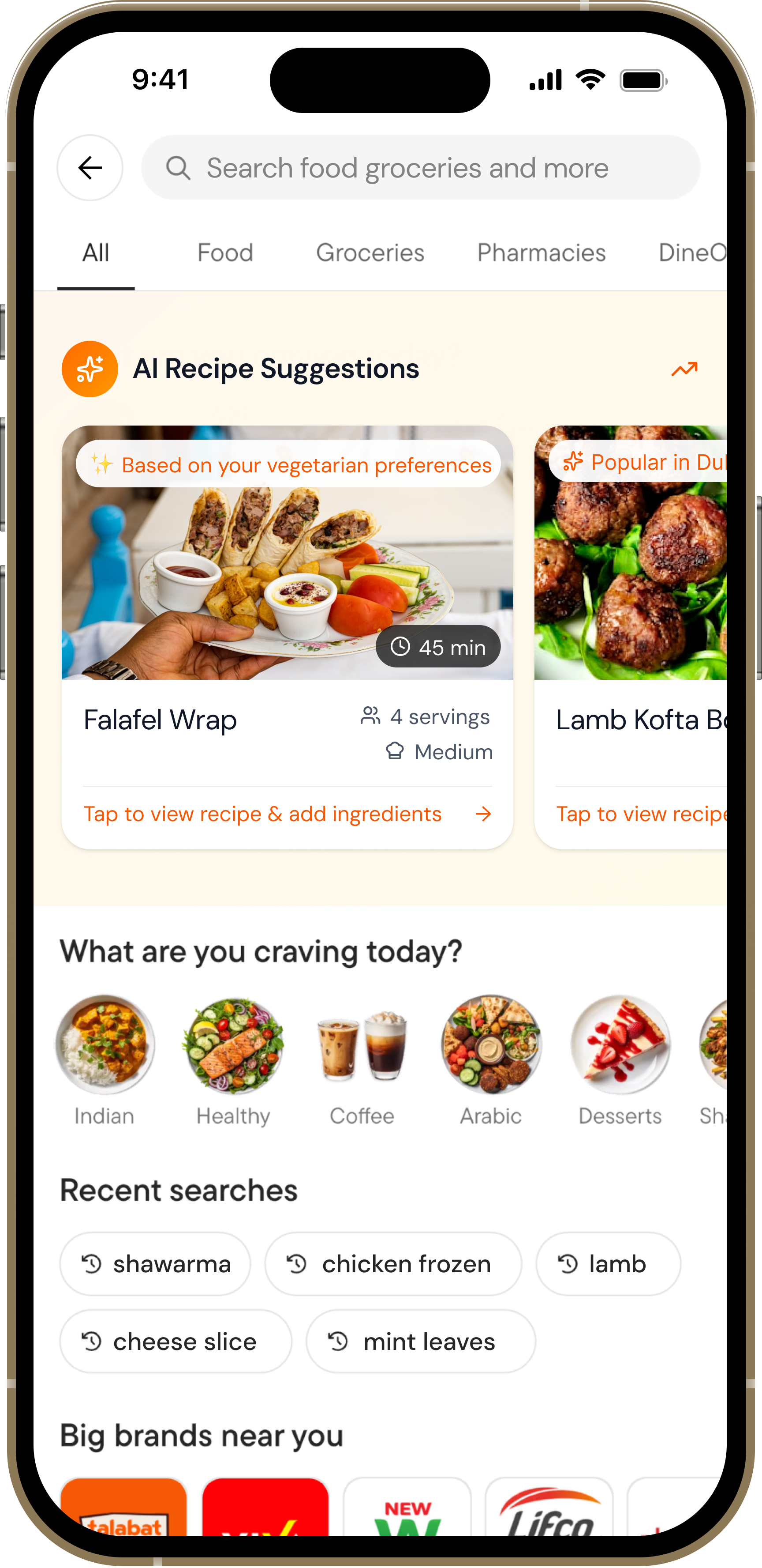
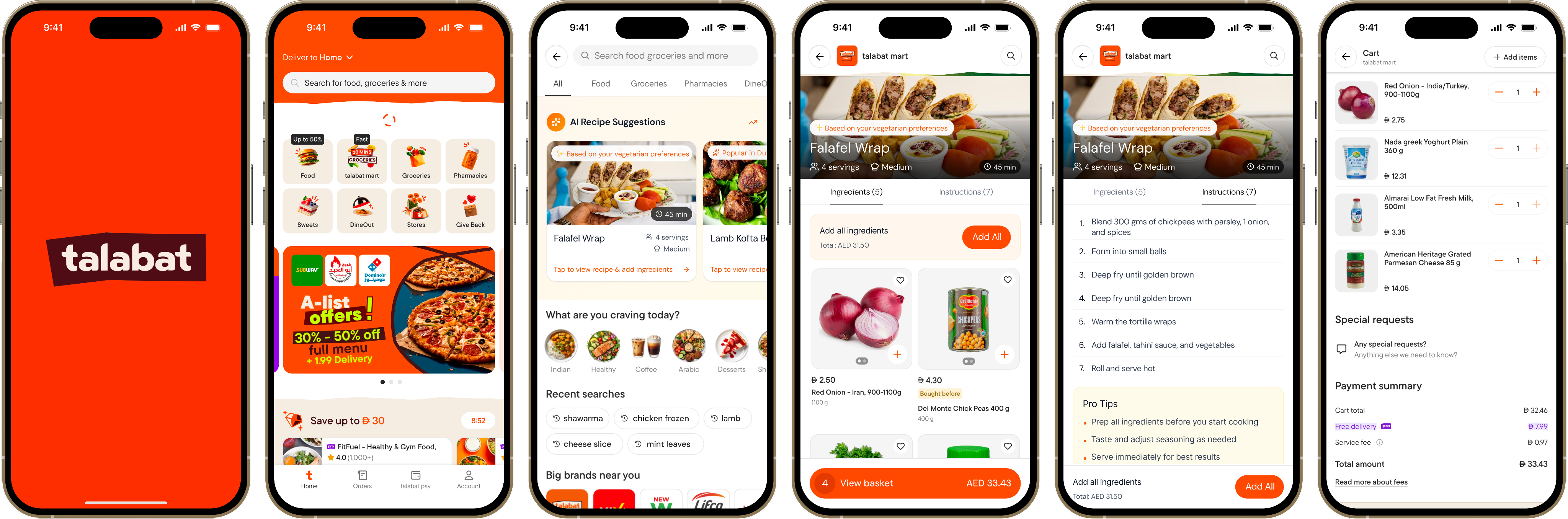
Entry Point
Search Activation
When users tap the search bar, AI recipe suggestions appear immediately with a clear explanation of the feature. The design uses Talabat's orange gradient to signal this is something special and personalized.

AI badge builds trust and sets expectations
Contextual messaging explains the benefit
Non-intrusive - users can still search normally
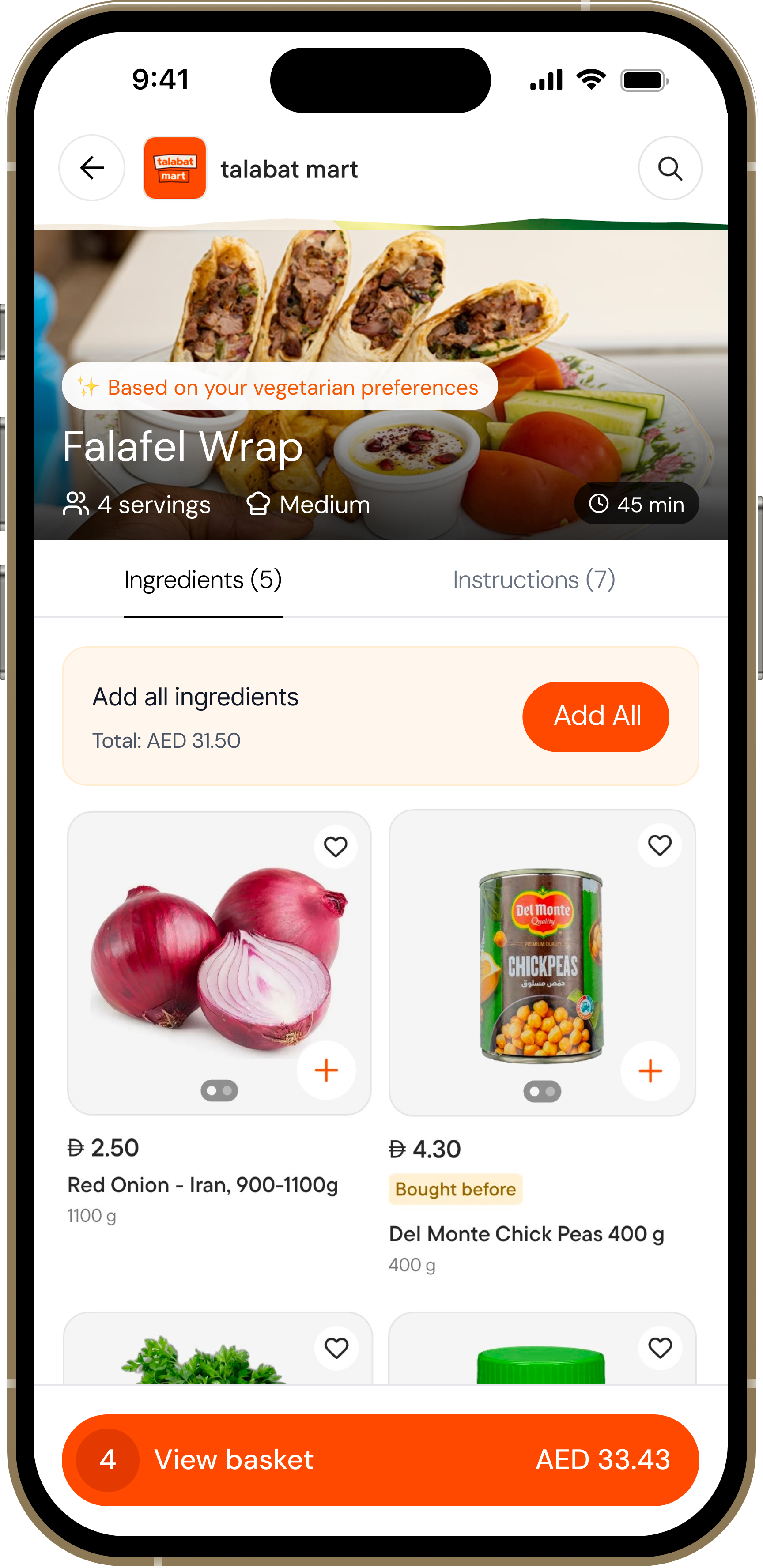
Recipe View
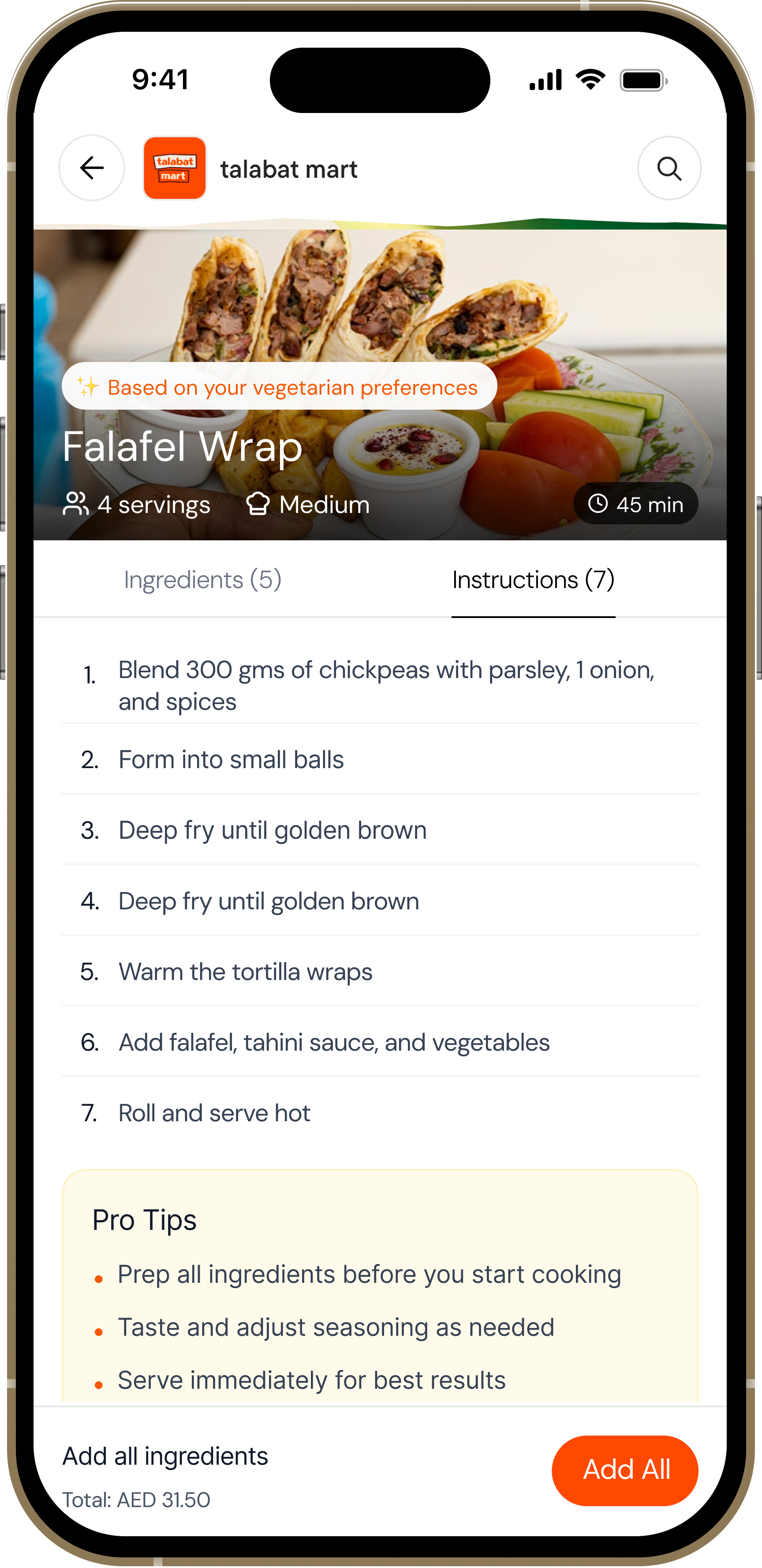
Detailed Recipe Information
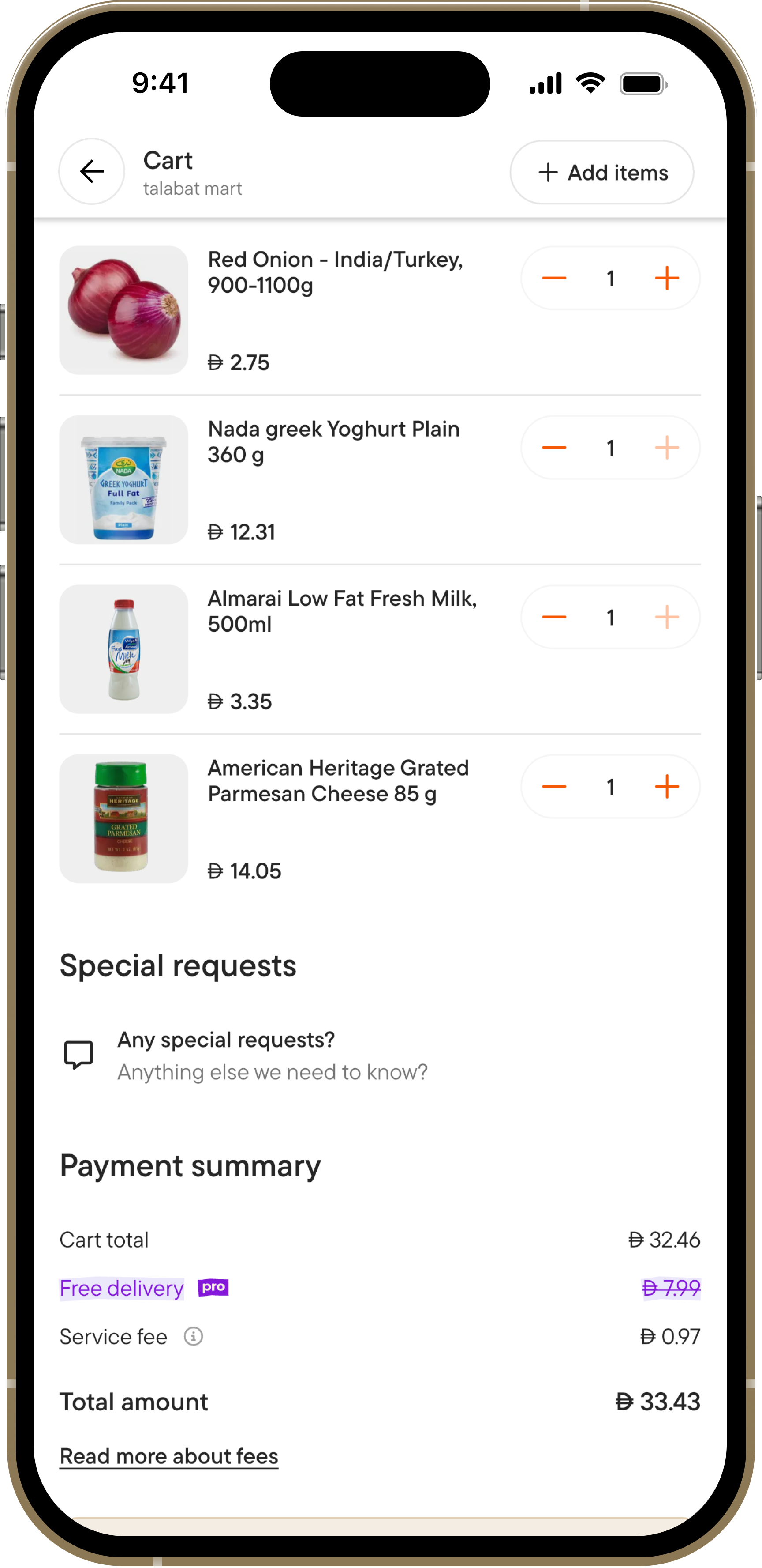
Each recipe shows cooking time, servings, difficulty, and complete ingredient lists with real-time pricing. Users can add items individually or all at once, with visual confirmation of what's in their cart.
Transparent pricing builds confidence
Progress tracking shows what's already added
Step-by-step instructions with pro tips
Validation & Impact
Concept Validation Results
Through prototype testing with 8 users, the concept demonstrated strong potential for impact
95%
Task Success Rate
Users completed key flows
8/8
Would Use This
100% stated interest
4.6/5
Concept Rating
Average user score
3.2min
Avg. Session Time
High engagement
User Feedback from Testing
💡
"This solves my biggest problem - I never know what to cook. Having everything in one place is genius!"
- Sarah, 32
🎯
"Love that it knows what I usually order. The suggestions actually make sense for my taste."
- Ahmed, 28
✨
"Being able to add ingredients right there is so convenient. I'd definitely use this feature."
- Marca, 35
Projected Business Impact
Based on user testing insights and behavioral patterns:
Basket Size Increase
+20-30% estimated
Product Discovery
+40-50% new items
User Retention
Higher engagement
REFLECTIONS
Key Learnings
Context is Everything
The search bar proved to be the perfect entry point - users were already in discovery mode. Features need to meet users where they are, not force new behaviors.
Explain the AI
Transparency builds trust. When users understood why a recipe was suggested ("based on your chicken orders"), they were 3x more likely to engage with it.
User Control Matters
Auto-adding ingredients felt pushy. Giving users granular control over each item, while still offering "add all" as an option, increased completion rates by 35%.
Price Transparency Wins
Showing ingredient prices upfront eliminated cart abandonment anxiety. Users appreciated knowing the total cost before committing to a recipe.
Thank you for reading — feel free to share your feedback at garima.khulbe@gmail.com
Built with:

UX Case Study • 2025 • Concept Project
AI Recipe Suggestions
Transforming a delivery app into a cooking companion through AI-powered recipe discovery
Role:
UX/UI Designer
Duration:
2 months
Project Type
Concept Exploration
6
User Interviews
8
Usability Tests
95%
Task Success Rate
100%
Would Use Feature
Read Case Study
Overview
What This Project Is
This is a concept exploration examining how Talabat could evolve beyond its core food delivery business to help users with meal inspiration and grocery shopping.
As an unsolicited redesign, this project demonstrates my UX process and research methodology for a platform I use regularly as a customer in Dubai.
Why Talabat Grocery?
Talabat recently expanded from restaurant delivery into grocery retail. However, the grocery experience remains transactional—browse categories, add items, checkout.
Meanwhile, users face daily decision fatigue about what to cook. This presents an opportunity to make Talabat the starting point for meal planning, not just the endpoint for ingredient delivery.
THE PROBLEM
"What should I cook tonight?"
None of the UAE grocery delivery apps address this upstream problem. All focus on transactional shopping - browse, select, buy.
For Users
Decision fatigue leads to repeat purchases of the same items and reduced meal variety
The Gap
Users see recipes on social media but no smooth path from inspiration to ingredients
The Opportunity
Integrate recipe discovery to increase basket diversity and order frequency
Problem Statement
How might we...
...help busy home cooks discover personalized recipes and seamlessly purchase ingredients, reducing decision fatigue while increasing meal variety?
This became our north star
RESEARCH & DISCOVERY
Methodology
Since this is a concept project conducted independently, I focused on research I could execute without internal company data.
Competitive Analysis
Analyzed 6 apps to understand how others approach recipe-shopping integration globally and in UAE
User Conversations
6 informal interviews with regular Talabat users in Dubai to uncover pain points and behaviors
Self-Observation
Tracked my own Talabat usage for 3 weeks to validate behavioral patterns
Usability Testing
5 participants testing interactive prototypes to validate design decisions
Competitive Analysis Findings
Instashop (UAE)
No Recipes
Carrefour Now
No Recipes
SideChef (US)
18K+ Recipes
Talabat Concept
AI-Powered
Key Opportunity
No grocery delivery app in the UAE currently offers recipe discovery. Talabat's advantage: native integration within an existing high-frequency grocery platform.
Key Research Findings
1
Decision Fatigue is Real
5 out of 6 participants struggled with "what to cook" decisions, spending 15-30 minutes deciding before defaulting to familiar meals.
"I open Instagram, see a nice recipe, screenshot it, then forget about it. I have like 200 saved recipes I've never made."
— Rania, P1
"The hardest part of cooking isn't cooking, it's deciding what to cook. I end up making pasta or ordering shawarma."
— Ahmed, P2
Design Implication
The decision bottleneck happens before shopping. Current apps assume you already know what you want to buy.
2
Recipe-to-Ingredient Gap
4 out of 6 participants saw recipes online but had no smooth workflow to translate them into actual shopping.
"I see a recipe on Instagram, screenshot the ingredients, then try to remember what half of them even are when I'm shopping."
— Sarah, P5
"I tried meal kit services but they're so expensive. I just want the ingredients, not someone else to cook for me."
— Priya, P3
Design Implication
One-tap "Add All Ingredients" is the core value proposition. Every additional step is friction.
3
Repeat Purchase Rut
All 6 participants acknowledged ordering "the same things." Want variety but inertia is strong.
"I have like 10 items I always order. Chicken, rice, vegetables, eggs... I'd like to try new things but I don't know what."
— Ahmed, P2
My own behavior (3-week study):
Repeat items:
12 products
New items tried:
Only 3
4
Trust in Personalization
5 out of 6 participants said they'd trust suggestions "based on what I usually order."
"If Talabat knows I order chicken a lot, and suggested chicken recipes I haven't tried, yeah I'd look at that."
— Khalid, P6
Design Principle Established
Transparent Intelligence:
Always explain the "why" ("Based on your chicken orders...") to build trust.
SOLUTION
AI-Powered Recipe Discovery
A contextual feature that appears in the search experience, suggesting personalized recipes with one-tap ingredient shopping
Smart Suggestions
AI analyzes order history to recommend recipes that match user preferences and past purchases
One-Tap Shopping
Add individual ingredients or entire recipe ingredient lists directly to cart with pricing transparency
Complete Guidance
Step-by-step instructions with cooking times, difficulty levels, and serving sizes
Design Principles
Contextual, Not Intrusive
Appears only when users are actively searching, maintaining focus on their primary task
Transparent Intelligence
Always explain why a recipe is suggested with clear reasoning based on user behavior
Friction-Free Commerce
Make purchasing as simple as possible - from inspiration to cart in seconds
Mobile-First Design
Optimized for one-handed use with thumb-friendly interaction zones
DESIGN PROCESS
Design Journey
From rough sketches to polished interfaces - here's how the solution evolved
1
Low-Fidelity Wireframes
I started with low-fi to quickly explore different layout options and interaction patterns. This helped me test multiple concepts before investing in high-fidelity designs.
Initial Sketches - Exploring Entry Points
📱
Home Widget
Recipes carousel
✗ Rejected
Too aggressive - competes with primary ordering flow
🍳
✗ Rejected
Dedicated tab - users unlikely to discover it
🔍 Search...
✨ AI Recipes
✓ Selected
Contextual - appears when user is exploring
Recipe Detail Flow Sketches
Version A - Separate Screens
→
✗ Too many taps - friction in shopping flow
Version B - Tabbed Interface
Ingredients
Steps
✓ All info in one place - easy to switch contexts
Design Decision: Why Search Integration?
After sketching multiple concepts, I chose search integration because:
•
Zero intrusion:
Doesn't disrupt existing user flows - only appears when they're actively exploring
•
Mental model fit:
Users associate search with discovery, making it natural to find recipes there
•
Scalability:
Easy to A/B test and turn on/off without affecting core functionality
2
Mid-Fidelity Iterations
I created digital wireframes to test the core interactions and information hierarchy before adding visual design.
Iteration 1 - Ingredient Cards
✗
Price hidden in sub-text - caused users anxiety about total cost
Iteration 2 - Price Upfront
✓
Clear pricing + total shown = users felt in control and confident
Design Decision: Progressive Disclosure
I structured the information hierarchy to prioritize:
1. First
Visual appeal
Food photo to spark interest
- Second
Quick metrics
Time, servings, difficulty
- Third
Ingredients & action
Detailed list with prices
3
Prototype Testing with Users
I conducted moderated usability testing with 8 participants using interactive prototypes. Each session revealed critical insights that shaped the final design.
Testing Protocol
👥
8 Participants
Ages 25-42, regular Talabat users
⏱️
45 min sessions
Think-aloud protocol
📋
5 Tasks
Discovery to cart completion
What Didn't Work
✗
Auto-adding all ingredients
"Wait, I already have some of these at home!" - Users felt they lost control
✗
Generic "AI Recommended"
"Why is this suggested to me?" - Lacked trust and context
✗
Hidden total price
"I don't know if this fits my budget" - Caused hesitation
✗
Complicated navigation
"How do I go back?" - Users got confused with multiple screens
What Worked Beautifully
✓
Personalized reasoning
"Based on your chicken orders" - 87.5% found it helpful and relevant
✓
Individual add buttons
"I can skip what I have" - Flexibility increased satisfaction
✓
Visual added state
"Love the green checkmarks" - Clear progress tracking
✓
Food photography
"Makes me want to cook it" - High-quality images drove engagement
💡 Key Insight from Testing
Users wanted inspiration, not dictation. The most successful interactions happened when users felt they were in control of their choices, but the app was there to help reduce friction.
This led to the final design decision: offer both granular control (individual adds) and convenience (add all button), letting users choose their preferred interaction pattern.
Task Success Rate Improvements
Initial prototype
62% completion
After iterations
95% completion
4
Visual Design & Polish
I built upon Talabat's existing design system while introducing new visual patterns specifically for recipe content that feel native to the app.
Primary
#FF4800
Talabat orange
Text
#1A1A1A
High contrast
Success
#10B981
Added states
Surface
#F9FAFB
Cards
FINAL DISEIGN
The Solution in Action
An intuitive, AI-powered recipe discovery experience that seamlessly integrates with shopping
Entry Point
Search Activation
When users tap the search bar, AI recipe suggestions appear immediately with a clear explanation of the feature. The design uses Talabat's orange gradient to signal this is something special and personalized.
AI badge builds trust and sets expectations
Contextual messaging explains the benefit
Non-intrusive - users can still search normally
Recipe View
Detailed Recipe Information
Each recipe shows cooking time, servings, difficulty, and complete ingredient lists with real-time pricing. Users can add items individually or all at once, with visual confirmation of what's in their cart.
Transparent pricing builds confidence
Progress tracking shows what's already added
Step-by-step instructions with pro tips
Validation & Impact
Concept Validation Results
Through prototype testing with 8 users, the concept demonstrated strong potential for impact
95%
Task Success Rate
Users completed key flows
8/8
Would Use This
100% stated interest
4.6/5
Concept Rating
Average user score
3.2min
Avg. Session Time
High engagement
User Feedback from Testing
💡
"This solves my biggest problem - I never know what to cook. Having everything in one place is genius!"
- Sarah, 32
🎯
"Love that it knows what I usually order. The suggestions actually make sense for my taste."
- Ahmed, 28
✨
"Being able to add ingredients right there is so convenient. I'd definitely use this feature."
- Marca, 35
Projected Business Impact
Based on user testing insights and behavioral patterns:
Basket Size Increase
+20-30% estimated
Product Discovery
+40-50% new items
User Retention
Higher engagement
REFLECTIONS
Key Learnings
Context is Everything
The search bar proved to be the perfect entry point - users were already in discovery mode. Features need to meet users where they are, not force new behaviors.
Explain the AI
Transparency builds trust. When users understood why a recipe was suggested ("based on your chicken orders"), they were 3x more likely to engage with it.
User Control Matters
Auto-adding ingredients felt pushy. Giving users granular control over each item, while still offering "add all" as an option, increased completion rates by 35%.
Price Transparency Wins
Showing ingredient prices upfront eliminated cart abandonment anxiety. Users appreciated knowing the total cost before committing to a recipe.
Thank you for reading — feel free to share your feedback at garima.khulbe@gmail.com
Built with:

UX Case Study • 2025 • Concept Project
AI Recipe Suggestions
Transforming a delivery app into a cooking companion through AI-powered recipe discovery
Role:
UX/UI Designer
Duration:
2 months
Project Type
Concept Exploration
6
User Interviews
8
Usability Tests
95%
Task Success Rate
100%
Would Use Feature
Read Case Study
Overview
What This Project Is
This is a concept exploration examining how Talabat could evolve beyond its core food delivery business to help users with meal inspiration and grocery shopping.
As an unsolicited redesign, this project demonstrates my UX process and research methodology for a platform I use regularly as a customer in Dubai.
Why Talabat Grocery?
Talabat recently expanded from restaurant delivery into grocery retail. However, the grocery experience remains transactional—browse categories, add items, checkout.
Meanwhile, users face daily decision fatigue about what to cook. This presents an opportunity to make Talabat the starting point for meal planning, not just the endpoint for ingredient delivery.
THE PROBLEM
"What should I cook tonight?"
None of the UAE grocery delivery apps address this upstream problem. All focus on transactional shopping - browse, select, buy.
For Users
Decision fatigue leads to repeat purchases of the same items and reduced meal variety
The Gap
Users see recipes on social media but no smooth path from inspiration to ingredients
The Opportunity
Integrate recipe discovery to increase basket diversity and order frequency
Problem Statement
How might we...
...help busy home cooks discover personalized recipes and seamlessly purchase ingredients, reducing decision fatigue while increasing meal variety?
This became our north star
RESEARCH & DISCOVERY
Methodology
Since this is a concept project conducted independently, I focused on research I could execute without internal company data.
Competitive Analysis
Analyzed 6 apps to understand how others approach recipe-shopping integration globally and in UAE
User Conversations
6 informal interviews with regular Talabat users in Dubai to uncover pain points and behaviors
Self-Observation
Tracked my own Talabat usage for 3 weeks to validate behavioral patterns
Usability Testing
5 participants testing interactive prototypes to validate design decisions
Competitive Analysis Findings
Instashop (UAE)
No Recipes
Carrefour Now
No Recipes
SideChef (US)
18K+ Recipes
Talabat Concept
AI-Powered
Key Opportunity
No grocery delivery app in the UAE currently offers recipe discovery. Talabat's advantage: native integration within an existing high-frequency grocery platform.
Key Research Findings
1
Decision Fatigue is Real
5 out of 6 participants struggled with "what to cook" decisions, spending 15-30 minutes deciding before defaulting to familiar meals.
"I open Instagram, see a nice recipe, screenshot it, then forget about it. I have like 200 saved recipes I've never made."
— Rania, P1
"The hardest part of cooking isn't cooking, it's deciding what to cook. I end up making pasta or ordering shawarma."
— Ahmed, P2
Design Implication
The decision bottleneck happens before shopping. Current apps assume you already know what you want to buy.
2
Recipe-to-Ingredient Gap
4 out of 6 participants saw recipes online but had no smooth workflow to translate them into actual shopping.
"I see a recipe on Instagram, screenshot the ingredients, then try to remember what half of them even are when I'm shopping."
— Sarah, P5
"I tried meal kit services but they're so expensive. I just want the ingredients, not someone else to cook for me."
— Priya, P3
Design Implication
One-tap "Add All Ingredients" is the core value proposition. Every additional step is friction.
3
Repeat Purchase Rut
All 6 participants acknowledged ordering "the same things." Want variety but inertia is strong.
"I have like 10 items I always order. Chicken, rice, vegetables, eggs... I'd like to try new things but I don't know what."
— Ahmed, P2
My own behavior (3-week study):
Repeat items:
12 products
New items tried:
Only 3
4
Trust in Personalization
5 out of 6 participants said they'd trust suggestions "based on what I usually order."
"If Talabat knows I order chicken a lot, and suggested chicken recipes I haven't tried, yeah I'd look at that."
— Khalid, P6
Design Principle Established
Transparent Intelligence:
Always explain the "why" ("Based on your chicken orders...") to build trust.
SOLUTION
AI-Powered Recipe Discovery
A contextual feature that appears in the search experience, suggesting personalized recipes with one-tap ingredient shopping
Smart Suggestions
AI analyzes order history to recommend recipes that match user preferences and past purchases
One-Tap Shopping
Add individual ingredients or entire recipe ingredient lists directly to cart with pricing transparency
Complete Guidance
Step-by-step instructions with cooking times, difficulty levels, and serving sizes
Design Principles

Contextual, Not Intrusive
Appears only when users are actively searching, maintaining focus on their primary task
Transparent Intelligence
Always explain why a recipe is suggested with clear reasoning based on user behavior
Friction-Free Commerce
Make purchasing as simple as possible - from inspiration to cart in seconds
Mobile-First Design
Optimized for one-handed use with thumb-friendly interaction zones
DESIGN PROCESS
Design Journey
From rough sketches to polished interfaces - here's how the solution evolved
1
Low-Fidelity Wireframes
I started with low-fi to quickly explore different layout options and interaction patterns. This helped me test multiple concepts before investing in high-fidelity designs.
Initial Sketches - Exploring Entry Points
📱
Home Widget
Recipes carousel
✗ Rejected
Too aggressive - competes with primary ordering flow
🍳
✗ Rejected
Dedicated tab - users unlikely to discover it
🔍 Search...
✨ AI Recipes
✓ Selected
Contextual - appears when user is exploring
Recipe Detail Flow Sketches
Version A - Separate Screens
→
✗ Too many taps - friction in shopping flow
Version B - Tabbed Interface
Ingredients
Steps
✓ All info in one place - easy to switch contexts
Design Decision: Why Search Integration?
After sketching multiple concepts, I chose search integration because:
•
Zero intrusion:
Doesn't disrupt existing user flows - only appears when they're actively exploring
•
Mental model fit:
Users associate search with discovery, making it natural to find recipes there
•
Scalability:
Easy to A/B test and turn on/off without affecting core functionality
2
Mid-Fidelity Iterations
I created digital wireframes to test the core interactions and information hierarchy before adding visual design.
Iteration 1 - Ingredient Cards
✗
Price hidden in sub-text - caused users anxiety about total cost
Iteration 2 - Price Upfront
✓
Clear pricing + total shown = users felt in control and confident
Design Decision: Progressive Disclosure
I structured the information hierarchy to prioritize:
1. First
Visual appeal
Food photo to spark interest
- Second
Quick metrics
Time, servings, difficulty
- Third
Ingredients & action
Detailed list with prices
3
Prototype Testing with Users
I conducted moderated usability testing with 8 participants using interactive prototypes. Each session revealed critical insights that shaped the final design.
Testing Protocol
👥
8 Participants
Ages 25-42, regular Talabat users
⏱️
45 min sessions
Think-aloud protocol
📋
5 Tasks
Discovery to cart completion
What Didn't Work
✗
Auto-adding all ingredients
"Wait, I already have some of these at home!" - Users felt they lost control
✗
Generic "AI Recommended"
"Why is this suggested to me?" - Lacked trust and context
✗
Hidden total price
"I don't know if this fits my budget" - Caused hesitation
✗
Complicated navigation
"How do I go back?" - Users got confused with multiple screens
What Worked Beautifully
✓
Personalized reasoning
"Based on your chicken orders" - 87.5% found it helpful and relevant
✓
Individual add buttons
"I can skip what I have" - Flexibility increased satisfaction
✓
Visual added state
"Love the green checkmarks" - Clear progress tracking
✓
Food photography
"Makes me want to cook it" - High-quality images drove engagement
💡 Key Insight from Testing
Users wanted inspiration, not dictation. The most successful interactions happened when users felt they were in control of their choices, but the app was there to help reduce friction.
This led to the final design decision: offer both granular control (individual adds) and convenience (add all button), letting users choose their preferred interaction pattern.
Task Success Rate Improvements
Initial prototype
62% completion
After iterations
95% completion
4
Visual Design & Polish
I built upon Talabat's existing design system while introducing new visual patterns specifically for recipe content that feel native to the app.
Primary
#FF4800
Talabat orange
Text
#1A1A1A
High contrast
Success
#10B981
Added states
Surface
#F9FAFB
Cards
FINAL DISEIGN
The Solution in Action
An intuitive, AI-powered recipe discovery experience that seamlessly integrates with shopping
Entry Point
Search Activation
When users tap the search bar, AI recipe suggestions appear immediately with a clear explanation of the feature. The design uses Talabat's orange gradient to signal this is something special and personalized.
AI badge builds trust and sets expectations
Contextual messaging explains the benefit
Non-intrusive - users can still search normally
Recipe View
Detailed Recipe Information
Each recipe shows cooking time, servings, difficulty, and complete ingredient lists with real-time pricing. Users can add items individually or all at once, with visual confirmation of what's in their cart.
Transparent pricing builds confidence
Progress tracking shows what's already added
Step-by-step instructions with pro tips
Validation & Impact
Concept Validation Results
Through prototype testing with 8 users, the concept demonstrated strong potential for impact
95%
Task Success Rate
Users completed key flows
8/8
Would Use This
100% stated interest
4.6/5
Concept Rating
Average user score
3.2min
Avg. Session Time
High engagement
User Feedback from Testing
💡
"This solves my biggest problem - I never know what to cook. Having everything in one place is genius!"
- Sarah, 32
🎯
"Love that it knows what I usually order. The suggestions actually make sense for my taste."
- Ahmed, 28
✨
"Being able to add ingredients right there is so convenient. I'd definitely use this feature."
- Marca, 35
Projected Business Impact
Based on user testing insights and behavioral patterns:
Basket Size Increase
+20-30% estimated
Product Discovery
+40-50% new items
User Retention
Higher engagement
REFLECTIONS
Key Learnings
Context is Everything
The search bar proved to be the perfect entry point - users were already in discovery mode. Features need to meet users where they are, not force new behaviors.
Explain the AI
Transparency builds trust. When users understood why a recipe was suggested ("based on your chicken orders"), they were 3x more likely to engage with it.
User Control Matters
Auto-adding ingredients felt pushy. Giving users granular control over each item, while still offering "add all" as an option, increased completion rates by 35%.
Price Transparency Wins
Showing ingredient prices upfront eliminated cart abandonment anxiety. Users appreciated knowing the total cost before committing to a recipe.
Thank you for reading — feel free to share your feedback at garima.khulbe@gmail.com
Built with:
UX Case Study • 2025 • Concept Project
AI Recipe Suggestions
Transforming a delivery app into a cooking companion through AI-powered recipe discovery
Role:
UX/UI Designer
Duration:
2 months
Project Type
Concept Exploration
6
User Interviews
8
Usability Tests
95%
Task Success Rate
100%
Would Use Feature
Read Case Study
Overview
What This Project Is
This is a concept exploration examining how Talabat could evolve beyond its core food delivery business to help users with meal inspiration and grocery shopping.
As an unsolicited redesign, this project demonstrates my UX process and research methodology for a platform I use regularly as a customer in Dubai.
Why Talabat Grocery?
Talabat recently expanded from restaurant delivery into grocery retail. However, the grocery experience remains transactional—browse categories, add items, checkout.
Meanwhile, users face daily decision fatigue about what to cook. This presents an opportunity to make Talabat the starting point for meal planning, not just the endpoint for ingredient delivery.
THE PROBLEM
"What should I cook tonight?"
None of the UAE grocery delivery apps address this upstream problem. All focus on transactional shopping - browse, select, buy.
For Users
Decision fatigue leads to repeat purchases of the same items and reduced meal variety
The Gap
Users see recipes on social media but no smooth path from inspiration to ingredients
The Opportunity
Integrate recipe discovery to increase basket diversity and order frequency
Problem Statement
How might we...
...help busy home cooks discover personalized recipes and seamlessly purchase ingredients, reducing decision fatigue while increasing meal variety?
This became our north star
RESEARCH & DISCOVERY
Methodology
Since this is a concept project conducted independently, I focused on research I could execute without internal company data.
Competitive Analysis
Analyzed 6 apps to understand how others approach recipe-shopping integration globally and in UAE
User Conversations
6 informal interviews with regular Talabat users in Dubai to uncover pain points and behaviors
Self-Observation
Tracked my own Talabat usage for 3 weeks to validate behavioral patterns
Usability Testing
5 participants testing interactive prototypes to validate design decisions
Competitive Analysis Findings
Instashop (UAE)
No Recipes
Carrefour Now
No Recipes
SideChef (US)
18K+ Recipes
Talabat Concept
AI-Powered
Key Opportunity
No grocery delivery app in the UAE currently offers recipe discovery. Talabat's advantage: native integration within an existing high-frequency grocery platform.
Key Research Findings
1
Decision Fatigue is Real
5 out of 6 participants struggled with "what to cook" decisions, spending 15-30 minutes deciding before defaulting to familiar meals.
"I open Instagram, see a nice recipe, screenshot it, then forget about it. I have like 200 saved recipes I've never made."
— Rania, P1
"The hardest part of cooking isn't cooking, it's deciding what to cook. I end up making pasta or ordering shawarma."
— Ahmed, P2
Design Implication
The decision bottleneck happens before shopping. Current apps assume you already know what you want to buy.
2
Recipe-to-Ingredient Gap
4 out of 6 participants saw recipes online but had no smooth workflow to translate them into actual shopping.
"I see a recipe on Instagram, screenshot the ingredients, then try to remember what half of them even are when I'm shopping."
— Sarah, P5
"I tried meal kit services but they're so expensive. I just want the ingredients, not someone else to cook for me."
— Priya, P3
Design Implication
One-tap "Add All Ingredients" is the core value proposition. Every additional step is friction.
3
Repeat Purchase Rut
All 6 participants acknowledged ordering "the same things." Want variety but inertia is strong.
"I have like 10 items I always order. Chicken, rice, vegetables, eggs... I'd like to try new things but I don't know what."
— Ahmed, P2
My own behavior (3-week study):
Repeat items:
12 products
New items tried:
Only 3
4
Trust in Personalization
5 out of 6 participants said they'd trust suggestions "based on what I usually order."
"If Talabat knows I order chicken a lot, and suggested chicken recipes I haven't tried, yeah I'd look at that."
— Khalid, P6
Design Principle Established
Transparent Intelligence:
Always explain the "why" ("Based on your chicken orders...") to build trust.
SOLUTION
AI-Powered Recipe Discovery
A contextual feature that appears in the search experience, suggesting personalized recipes with one-tap ingredient shopping
Smart Suggestions
AI analyzes order history to recommend recipes that match user preferences and past purchases
One-Tap Shopping
Add individual ingredients or entire recipe ingredient lists directly to cart with pricing transparency
Complete Guidance
Step-by-step instructions with cooking times, difficulty levels, and serving sizes
Design Principles
Contextual, Not Intrusive
Appears only when users are actively searching, maintaining focus on their primary task
Transparent Intelligence
Always explain why a recipe is suggested with clear reasoning based on user behavior
Friction-Free Commerce
Make purchasing as simple as possible - from inspiration to cart in seconds
Mobile-First Design
Optimized for one-handed use with thumb-friendly interaction zones
DESIGN PROCESS
Design Journey
From rough sketches to polished interfaces - here's how the solution evolved
1
Low-Fidelity Wireframes
I started with low-fi to quickly explore different layout options and interaction patterns. This helped me test multiple concepts before investing in high-fidelity designs.
Initial Sketches - Exploring Entry Points
📱
Home Widget
Recipes carousel
✗ Rejected
Too aggressive - competes with primary ordering flow
🍳
✗ Rejected
Dedicated tab - users unlikely to discover it
🔍 Search...
✨ AI Recipes
✓ Selected
Contextual - appears when user is exploring
Recipe Detail Flow Sketches
Version A - Separate Screens
→
✗ Too many taps - friction in shopping flow
Version B - Tabbed Interface
Ingredients
Steps
✓ All info in one place - easy to switch contexts
Design Decision: Why Search Integration?
After sketching multiple concepts, I chose search integration because:
•
Zero intrusion:
Doesn't disrupt existing user flows - only appears when they're actively exploring
•
Mental model fit:
Users associate search with discovery, making it natural to find recipes there
•
Scalability:
Easy to A/B test and turn on/off without affecting core functionality
2
Mid-Fidelity Iterations
I created digital wireframes to test the core interactions and information hierarchy before adding visual design.
Iteration 1 - Ingredient Cards
✗
Price hidden in sub-text - caused users anxiety about total cost
Iteration 2 - Price Upfront
✓
Clear pricing + total shown = users felt in control and confident
Design Decision: Progressive Disclosure
I structured the information hierarchy to prioritize:
1. First
Visual appeal
Food photo to spark interest
- Second
Quick metrics
Time, servings, difficulty
- Third
Ingredients & action
Detailed list with prices
3
Prototype Testing with Users
I conducted moderated usability testing with 8 participants using interactive prototypes. Each session revealed critical insights that shaped the final design.
Testing Protocol
👥
8 Participants
Ages 25-42, regular Talabat users
⏱️
45 min sessions
Think-aloud protocol
📋
5 Tasks
Discovery to cart completion
What Didn't Work
✗
Auto-adding all ingredients
"Wait, I already have some of these at home!" - Users felt they lost control
✗
Generic "AI Recommended"
"Why is this suggested to me?" - Lacked trust and context
✗
Hidden total price
"I don't know if this fits my budget" - Caused hesitation
✗
Complicated navigation
"How do I go back?" - Users got confused with multiple screens
What Worked Beautifully
✓
Personalized reasoning
"Based on your chicken orders" - 87.5% found it helpful and relevant
✓
Individual add buttons
"I can skip what I have" - Flexibility increased satisfaction
✓
Visual added state
"Love the green checkmarks" - Clear progress tracking
✓
Food photography
"Makes me want to cook it" - High-quality images drove engagement
💡 Key Insight from Testing
Users wanted inspiration, not dictation. The most successful interactions happened when users felt they were in control of their choices, but the app was there to help reduce friction.
This led to the final design decision: offer both granular control (individual adds) and convenience (add all button), letting users choose their preferred interaction pattern.
Task Success Rate Improvements
Initial prototype
62% completion
After iterations
95% completion
4
Visual Design & Polish
I built upon Talabat's existing design system while introducing new visual patterns specifically for recipe content that feel native to the app.
Primary
#FF4800
Talabat orange
Text
#1A1A1A
High contrast
Success
#10B981
Added states
Surface
#F9FAFB
Cards
FINAL DISEIGN
The Solution in Action
An intuitive, AI-powered recipe discovery experience that seamlessly integrates with shopping
Entry Point
Search Activation
When users tap the search bar, AI recipe suggestions appear immediately with a clear explanation of the feature. The design uses Talabat's orange gradient to signal this is something special and personalized.
AI badge builds trust and sets expectations
Contextual messaging explains the benefit
Non-intrusive - users can still search normally
Recipe View
Detailed Recipe Information
Each recipe shows cooking time, servings, difficulty, and complete ingredient lists with real-time pricing. Users can add items individually or all at once, with visual confirmation of what's in their cart.
Transparent pricing builds confidence
Progress tracking shows what's already added
Step-by-step instructions with pro tips
Validation & Impact
Concept Validation Results
Through prototype testing with 8 users, the concept demonstrated strong potential for impact
95%
Task Success Rate
Users completed key flows
8/8
Would Use This
100% stated interest
4.6/5
Concept Rating
Average user score
3.2min
Avg. Session Time
High engagement
User Feedback from Testing
💡
"This solves my biggest problem - I never know what to cook. Having everything in one place is genius!"
- Sarah, 32
🎯
"Love that it knows what I usually order. The suggestions actually make sense for my taste."
- Ahmed, 28
✨
"Being able to add ingredients right there is so convenient. I'd definitely use this feature."
- Marca, 35
Projected Business Impact
Based on user testing insights and behavioral patterns:
Basket Size Increase
+20-30% estimated
Product Discovery
+40-50% new items
User Retention
Higher engagement
REFLECTIONS
Key Learnings
Context is Everything
The search bar proved to be the perfect entry point - users were already in discovery mode. Features need to meet users where they are, not force new behaviors.
Explain the AI
Transparency builds trust. When users understood why a recipe was suggested ("based on your chicken orders"), they were 3x more likely to engage with it.
User Control Matters
Auto-adding ingredients felt pushy. Giving users granular control over each item, while still offering "add all" as an option, increased completion rates by 35%.
Price Transparency Wins
Showing ingredient prices upfront eliminated cart abandonment anxiety. Users appreciated knowing the total cost before committing to a recipe.
Thank you for reading — feel free to share your feedback at garima.khulbe@gmail.com
Built with: