UX/UI Redesign & Service Design • Concept Project
Keeta Customer
Support Redesign
Turning the #1 User Complaint Into a Competitive Advantage
Role:
Product Designer
Duration:
3 weeks
Focus Area:
Customer Support Experience
200+
User reviews analyzed across platforms
40%
Target self-service resolution rate
Read Case Study

Project Overview
The Context
Keeta launched in Dubai in September 2025 with aggressive pricing and strong market anticipation. However, despite modern UI and competitive deals, customer support became the #1 user complaint, directly impacting retention and app ratings.
This concept project reimagines Keeta's entire support ecosystem—from proactive issue detection to multi-channel resolution—transforming frustration into trust and creating a sustainable competitive advantage.
The Problem
What Users Are Saying
"Customer service is beyond rude – When I complained, their response was basically: 'You got your food, didn't you? Sorry, nothing we can do.'"
— Dubai user, App Store
"Here is a fact - this app CS doesn't respond to messages and keep closing your tickets without providing any resolution!"
— UAE user, Google Play
"I spent over three hours trying to fix their mistake, but they were completely unhelpful and unprofessional."
— Dubai user, Trustpilot
"If i could rate it with a zero i really would... i had to wait more than 10 minutes to get an agent."
— UAE user, Google Play
The Core Problem:
Customer support is failing at every touchpoint, turning a promising food delivery app into a source of frustration and distrust.

67%
Long wait times

58%
No resolution

45%
Tickets closed unsolved

41%
Can't reach by phone
The Design Challenge
How might we transform customer support from Keeta's biggest weakness into its strongest competitive advantage?
Research & Discovery
Understanding the Problem
Key Insight
Users don't mind waiting IF they get actual resolution.
The problem isn't just speed—it's lack of resolution and transparency.


User Feedback Analysis
Analyzed 200+ reviews across App Store, Google Play, and Trustpilot
•
67% complained about long wait times (40-50 person queues)
•
58% received no resolution, just apologies
•
52% frustrated by wallet-only refunds


Journey Mapping
Mapped the existing customer support experience
•
No proactive issue detection
•
Support buried in settings
•
No transparency on wait times
•
Agents lack empowerment to solve


Competitive Benchmark
Analyzed support in Talabat, Deliveroo, Uber Eats
•
Keeta 2-3 years behind in support infrastructure
•
Competitors offer multi-channel support
•
AI-powered resolution becoming standard


Business Impact
Estimated costs of poor support
•
15-20% user churn due to poor support
•
$2-3M annual revenue impact
•
50,000-75,000 lost customers estimated
Dubai Market Context
Cultural Insights
•
Multi-language essential (English, Arabic, Hindi, Urdu, Tagalog)
•
WhatsApp extremely popular communication channel
•
Premium service expectations in Dubai market
Key Statistics
•
70% won't return after one bad support experience
•
88% expect response within 60 minutes
•
Support is 2nd most important factor after price
Collaboration & Constraints
Cross-Functional Considerations
Real projects don't happen in a vacuum. Here's how I mapped potential stakeholder needs and constraints (conceptualized for this project):
Support Team Feedback (Conceptual)
"We have no power to actually solve problems"

Design Solution:
Gave agents authority to issue up to 50 AED compensation, pre-approved resolution templates, one-click compensation buttons
"Users get angry when we can only offer wallet refunds"
Design Solution:
Flexible refund options (wallet, card, split), agent can override default based on situation
"We don't know the order history when users call"
Design Solution:
Agent dashboard with full order history, previous support tickets visible, user's refund history for fraud prevention
Design Process
From Sketch to Screen
The journey from first pen-&-paper sketches to polished high-fidelity designs. This shows the messy, iterative reality of design - not just the final output.
Why I Started with Pen & Paper
Context:
After analyzing 200+ user reviews, I had key insights about users feeling ignored, lack of transparency, and buried support.
My First Question:
"How do we detect a problem and tell the user BEFORE they complain?"
I grabbed a notebook and started sketching at a café. No Figma, no constraints—just ideas.
Screen 1: Proactive Issue Detection
v1
Rejected
💭 Keep it simple - just alert the user. Modal popup to grab attention.
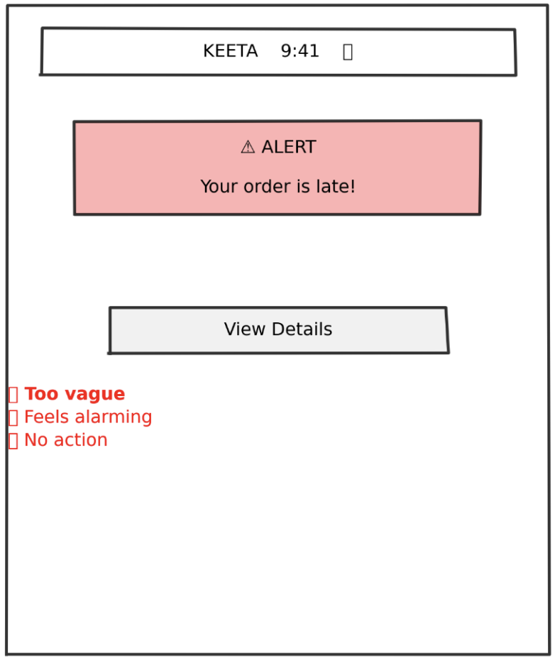

What Didn't Work
✕
Too vague - "late" doesn't tell them HOW late
✕
Feels alarming - red alert creates panic
✕
No immediate action - forces extra tap
✕
No empathy - comes across as notification spam
✕
Missing context - no order details visible
User Feedback:
"This looks like an error message, not help"
— Colleague 1
"What do you want me to do about it?"
— Colleague 2
v2
Getting Better
💭 Added specific time details and order context. Provided multiple options.
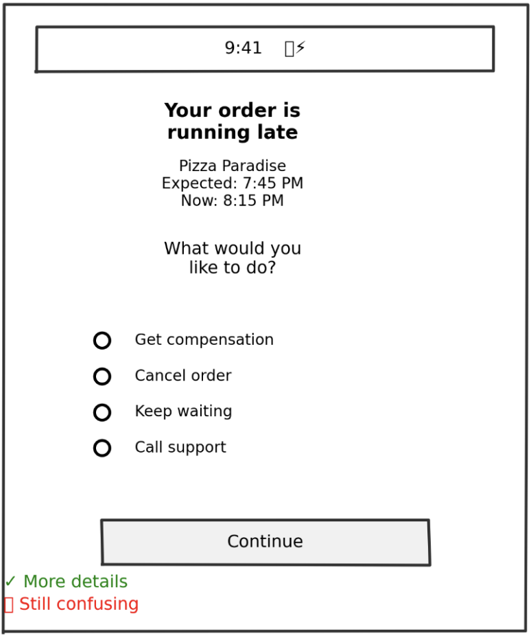

What Changed
✓
Added specific time details
✓
Softened language ("running late" vs "LATE")
✓
Gave order context (restaurant name)
✓
Provided multiple options
What Still Didn't Work
✕
Radio buttons require selection + confirmation (2 taps)
✕
All options equal weight - no guidance
✕
"Get compensation" - how much? What kind?
✕
Still requires decision-making from frustrated user
User Feedback:
"Which one should I pick?"
— 3 out of 5 testers
v3
The Breakthrough
💭 Default to the best action, but allow alternatives
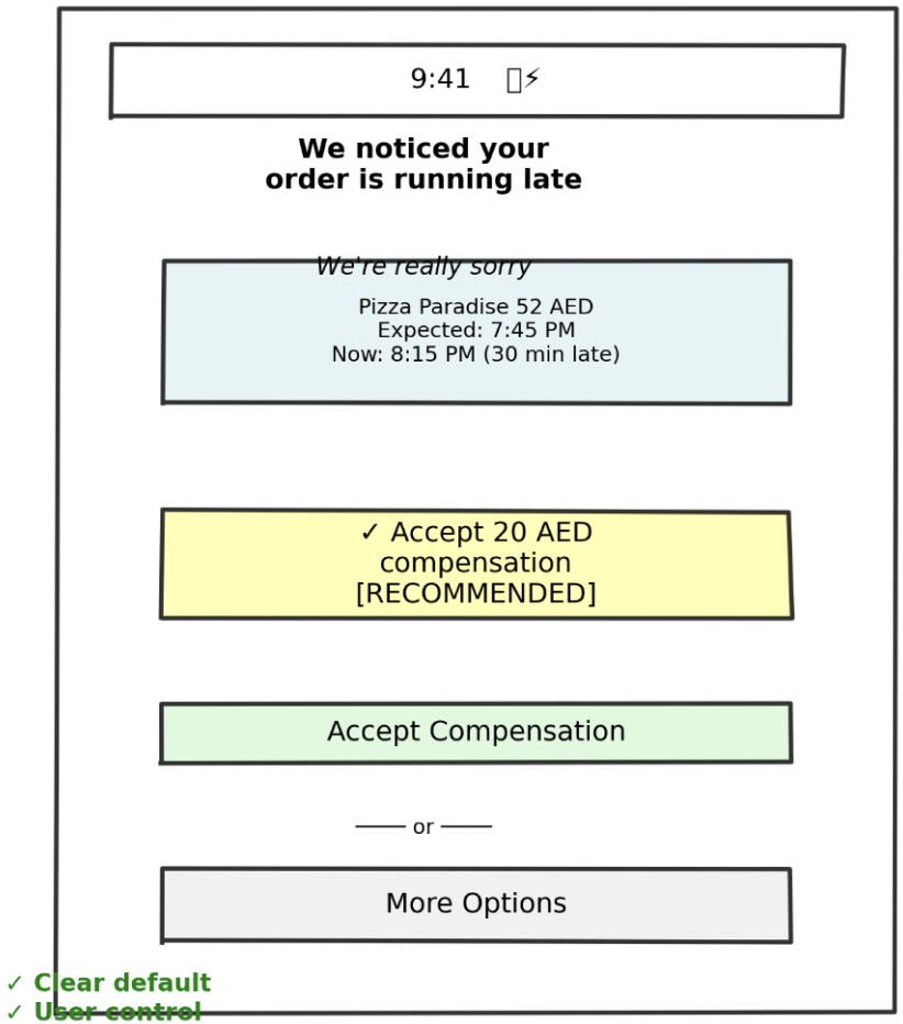
What Changed
✓
Empathetic opening ("We noticed" - proactive)
✓
Apology upfront
✓
Specific compensation amount (no mystery)
✓
Visual hierarchy - recommended action highlighted
✓
One-tap acceptance
✓
"More Options" for power users
✓
Compensation already added (sunk cost psychology)
User Feedback:
"Oh this is nice, I'd just tap Accept"
— 4 out of 5 testers
Screen 2: Food Quality Issue Report
v1
Too Complex
💭 Give users all possible issue types. Get detailed description.
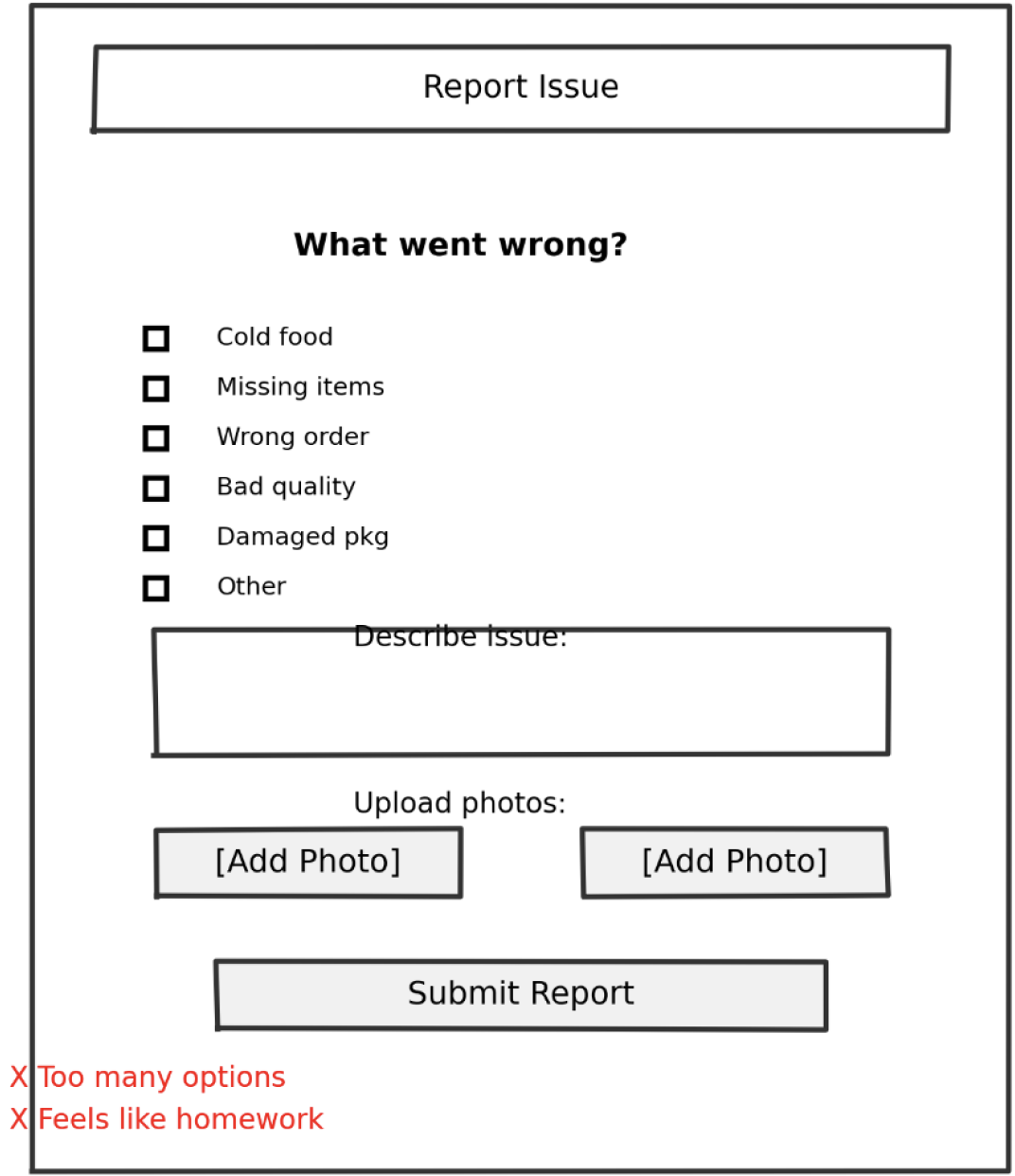
What Didn't Work
✕
Too many checkboxes - analysis paralysis
✕
Text field feels like homework
✕
Multiple photos = high effort
✕
No indication of what happens after submit
✕
Feels like filing a complaint, not getting help
User Feedback:
"This is so much work for a 50 AED order. I'd just not order again."
— User test
v2
Simplified
💭 One photo, text optional, examples given
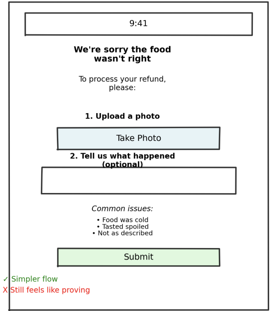
What Changed
✓
One photo instead of multiple
✓
Text made optional
✓
Examples given for context
✓
Empathetic opening
✓
Clear purpose: "To process your refund"
What Still Didn't Work
✕
Still feels like proving your case
✕
No indication of refund amount
✕
No indication of how fast
v3
Final Concept
💭 Show refund amount upfront. Reframe as helping, not proving.
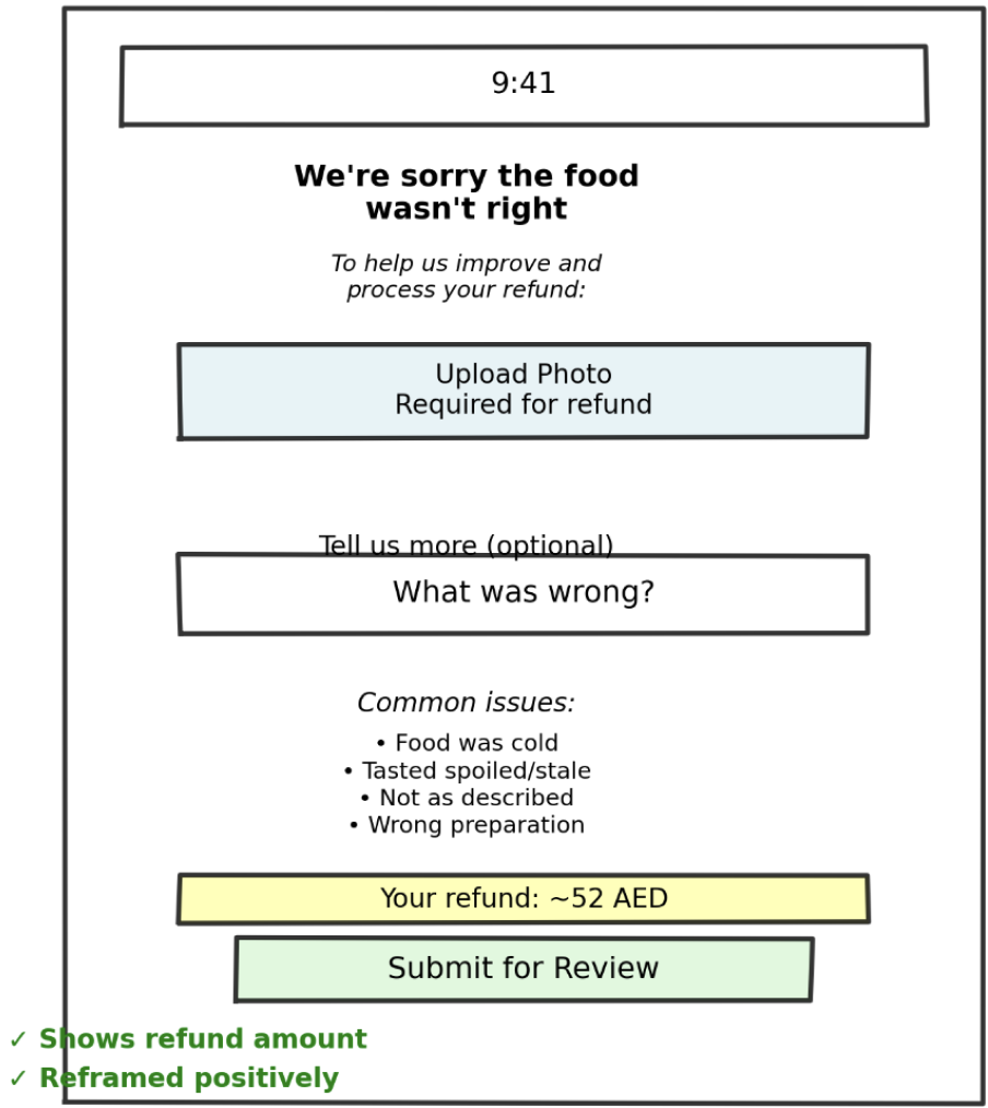
What Changed
✓
Showed estimated refund BEFORE submission
✓
Reframed as "help us improve" not "prove it"
✓
Clear "required" vs "optional" labels
✓
Examples are helpful, not exhaustive
User Feedback:
"5 out of 5 understood and said they'd use it"
— Testing result
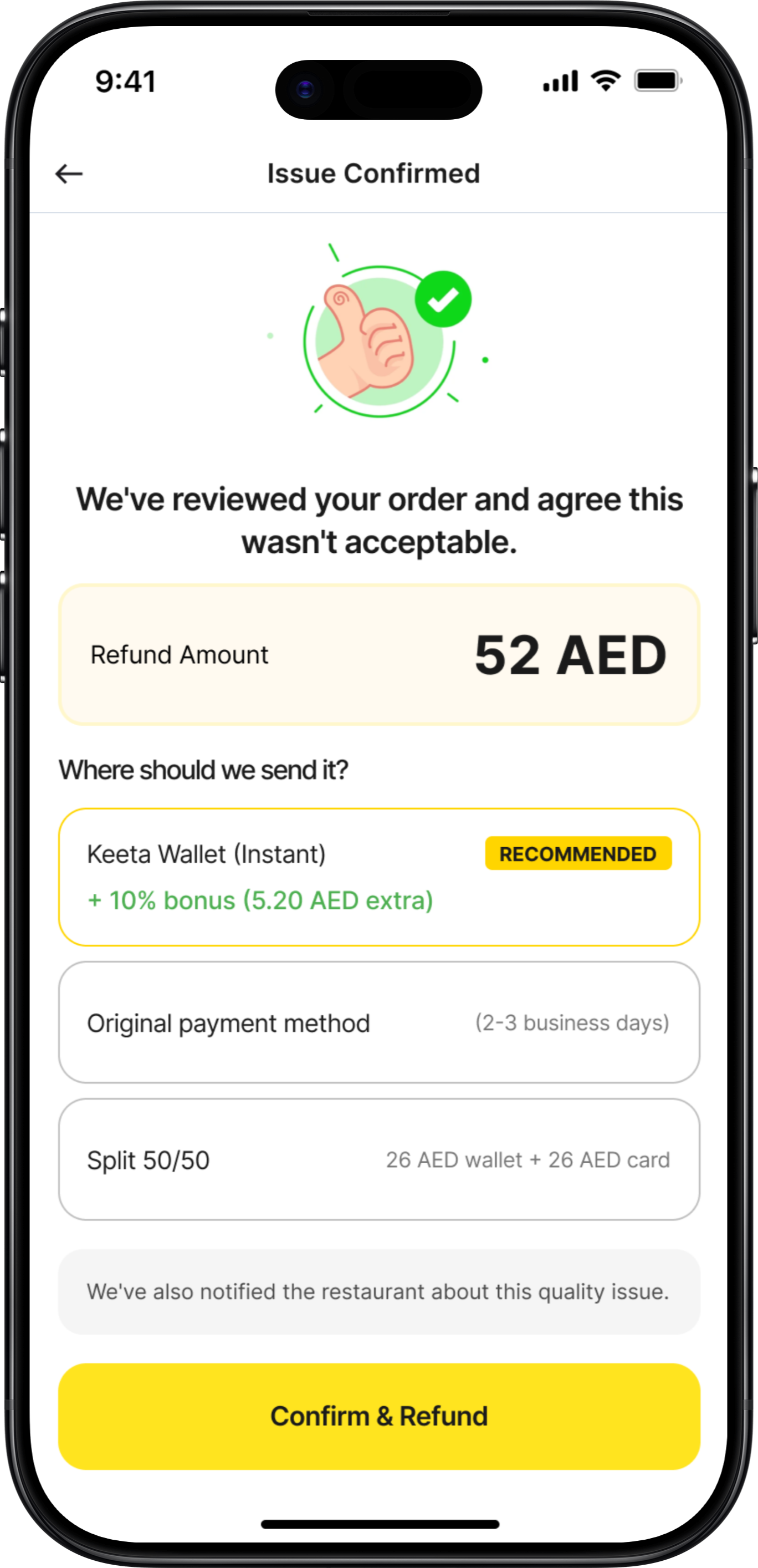
Screen 3: Refund Method Selection
v1
Too Transactional
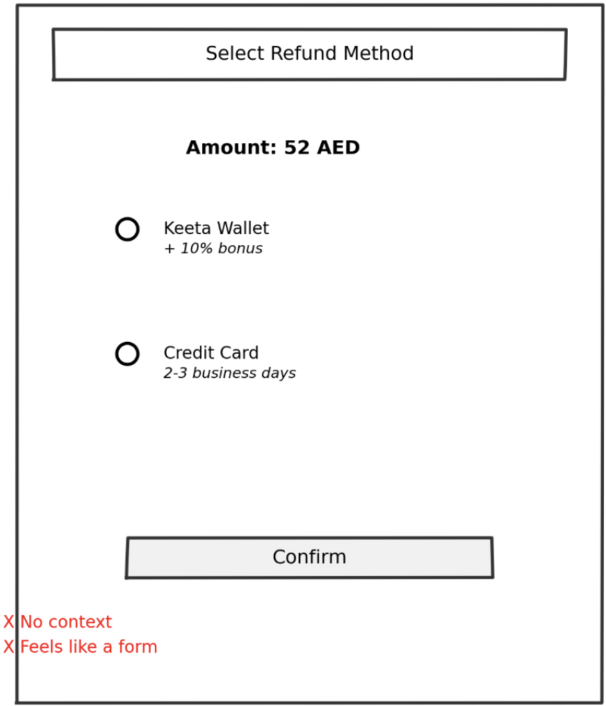
What Didn't Work
✕
No context about the issue
✕
Feels like a form, not resolution
✕
"Select" is too formal
✕
No explanation of why wallet has bonus
✕
Missing split option (user testing revealed this)
v2
Better
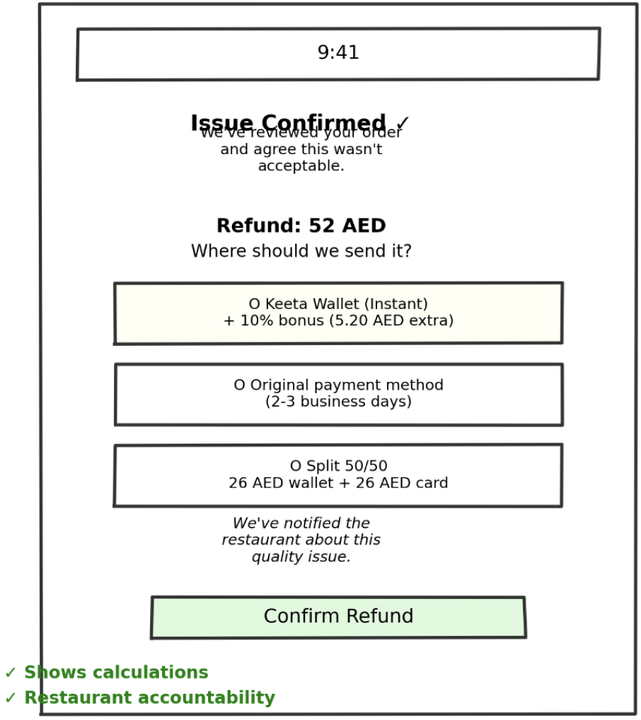
What Changed
✓
Validation upfront ("Issue Confirmed")
✓
Empathetic acknowledgment
✓
Conversational language
✓
Added split option
✓
Timing shown for each
User Feedback:
"I like that you're taking responsibility, not making me prove it"
— User test
Screens 4-6: Rapid Evolution Summary
Success Confirmation
v1:
Boring receipt-like confirmation
v2:
Added empathy + wallet balance
Final:
Animated checkmark, next actions, restaurant accountability mentioned
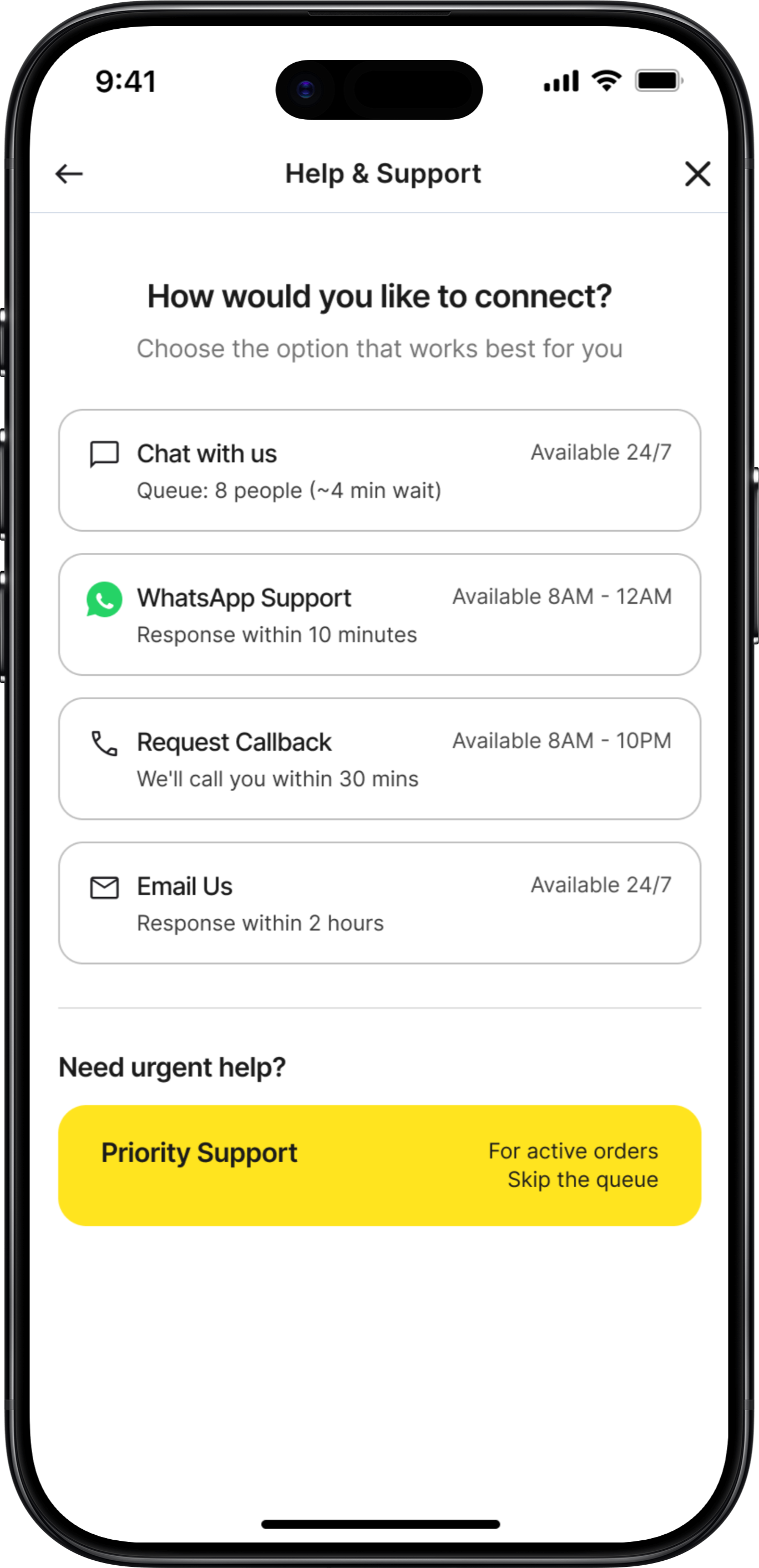
Support Hub
v1:
Simple list of channels
v2:
Added icons and descriptions
Final:
Wait times, agent availability, social proof ("Most popular!")
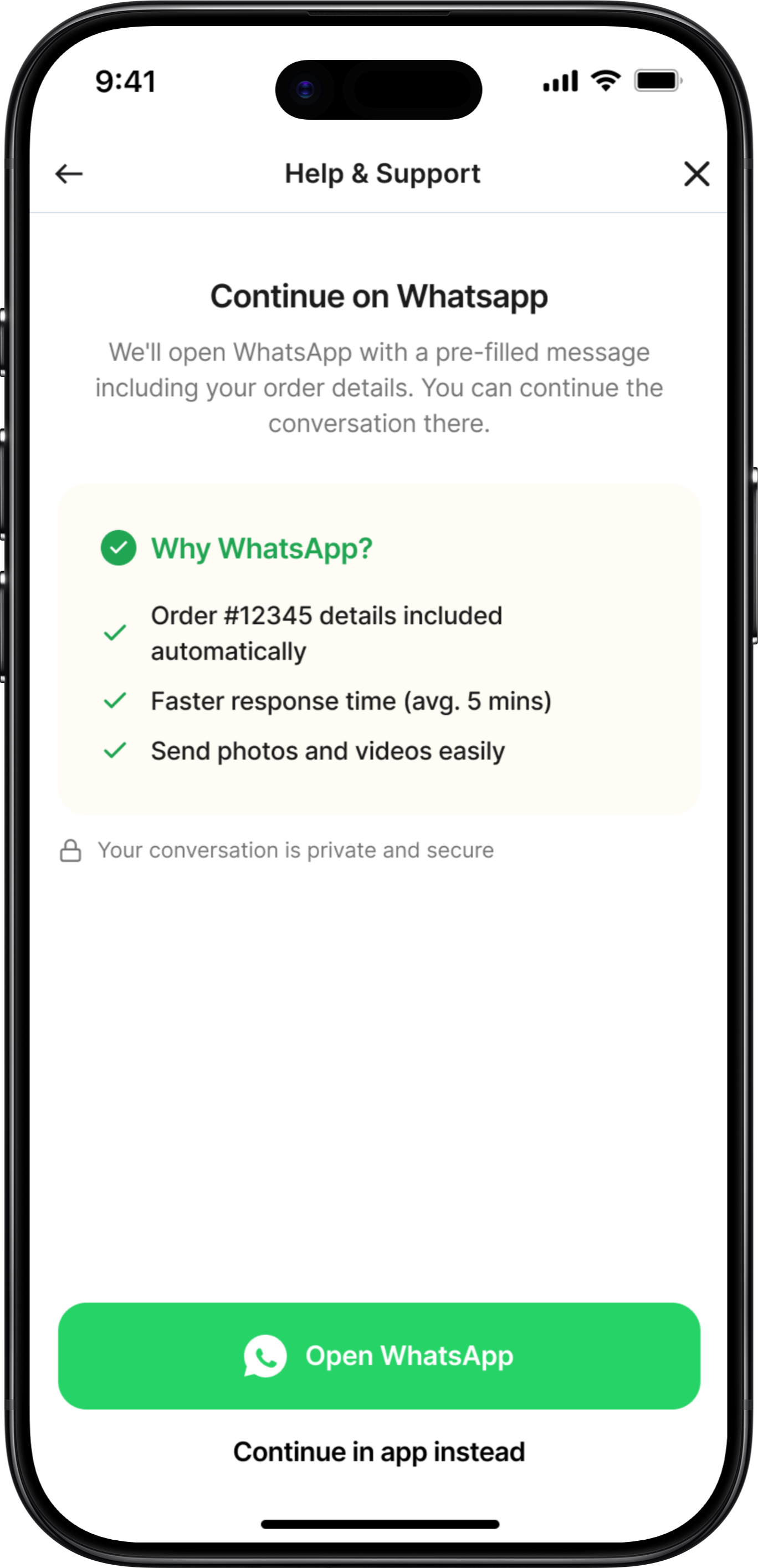
WhatsApp Handoff
v1:
Just "Open WhatsApp" button
v2:
Added explainer text
Final:
Message preview, order context included, clear expectations
What Lo-Fi vs Hi-Fi Each Achieved
Lo-Fi Sketches

Validated Core Concepts Fast
3 iterations in 1 day vs. weeks in Figma
Focused on Structure, Not Aesthetics
Users critiqued the FLOW, not the colors
Enabled Rapid Iteration
Drew 20+ variations before settling
Hi-Fi Designs

Visual Hierarchy
Typography scale, color system, spacing consistency
Micro-Interactions
Button states, loading animations, success celebrations
Production Details
Accessibility, responsive behavior, edge cases, copy refinement
Key Lessons from This Process

Sketch Multiple Versions
For every screen, I drew 3-5 variations before choosing. The first idea is rarely the best.

Test Ugly Wireframes
People give better feedback on sketches than polished designs. They critique substance, not style.

Details Come Last
Lo-fi validated IF the solution worked. Hi-fi figured out HOW to make it work beautifully.

Context Changes Everything
What looked good on paper sometimes failed when I added real content (long restaurant names, etc.)
Mobile Screens
Detailed UI Design
High-fidelity mobile screens showing the complete user experience
Screen 1
Proactive Issue Detection
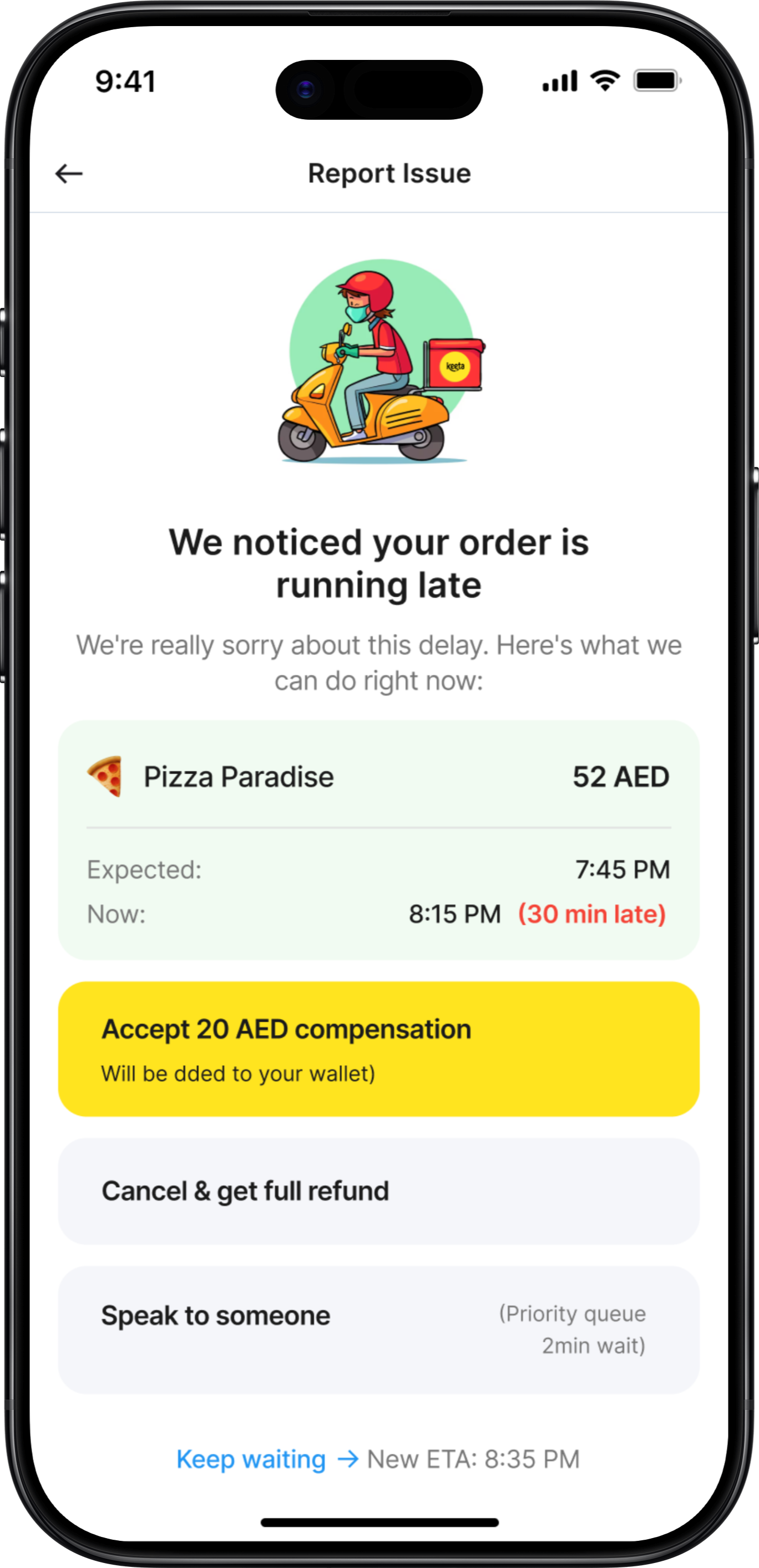
Proactive Issue Detection
App automatically detects order delay and offers instant resolution
Key Features
• Automatic delay detection (30+ minutes)
• Pre-calculated compensation (20 AED)
• Multiple resolution paths
• Priority queue access
• Transparent new ETA
Design Decisions
✓ Problem acknowledged immediately
✓ Compensation already added to wallet
✓ User has full control over outcome
✓ Easy escalation to human support
Deep Dive Exploration
Proactive Order Delay Detection
Now let's explore ONE critical flow in depth: Proactive Issue Detection for Delayed Orders. This is the make-or-break feature that differentiates Keeta from competitors.
Why This Flow Matters
This single feature can turn a frustrated user into a loyal advocate. It's the difference between "This app always has problems" and "This app actually cares when things go wrong." Let's examine the design decisions, iterations, edge cases, and interaction details.
Design Exploration: 3 Approaches Considered
1
REJECTED
Silent Compensation (Auto-Credit)
Initial Concept - Week 1
Just fix it, don't make users think about it.
Pros
•
Fastest resolution (no user action needed)
•
Minimal cognitive load
•
Demonstrates confidence ("we know we messed up")
Cons
•
Zero transparency (users don't know why)
•
No control (what if they want to cancel?)
•
Trust issue (feels like hush money)
User Testing Result:
"4 out of 5 users said "This feels sketchy. What if I wanted my money back?""
Why I Rejected This:
Autonomy matters more than speed. Users want agency, not to be managed.
2
REJECTED
Notification + Choice Menu
Second Iteration - Week 1
Give users all options, let them decide.
Pros
•
Full transparency
•
User maintains control
•
Covers all scenarios
Cons
•
Requires decision-making when user is frustrated
•
All options equal weight (no guidance)
•
Delays resolution (waiting for user input)
User Testing Result:
"3 out of 5 users asked "Which one should I pick? What's recommended?""
Why I Rejected This:
Choice paralysis is real. When users are frustrated, they want guidance, not homework.
3
SELECTED
Recommended Action + Alternatives
Final Design - Week 2
Guide, don't force. Recommend, but allow override.
Pros
•
Reduces cognitive load - Default action is clear
•
Maintains autonomy - Other options visible and accessible
•
Builds trust - Compensation already added (not contingent)
•
Fastest path - One tap to accept
•
Safety net - "More Options" for edge cases
Cons
•
Sacrificed simplicity of Approach 1 (needed transparency)
•
Sacrificed neutrality of Approach 2 (needed opinionated guidance)
•
Some screen real estate (worth it for clarity)
User Testing Result:
"5 out of 5 understood immediately. 4 out of 5 said they'd take the default."
Why This Won:
Perfect balance of guidance and autonomy. Users felt supported, not controlled.
Edge Cases & Error States
The happy path is easy. Here's how we handle when things go wrong:
User Ignored Initial Notification (10+ Minutes)
Notification sent at 8:15 PM, user didn't respond, now it's 8:30 PM
Solution:
Escalating compensation based on delay severity

30 min late: 20 AED
45 min late: 30 AED
60 min late: 50 AED (or auto-cancel with refund)
💡 Insight:
Shows app is continuously monitoring (builds trust)
Order Cancelled by Restaurant Mid-Delivery
Restaurant runs out of ingredients, cancels order
Solution:
Over-compensation: Refund + credit + discount + immediate alternative
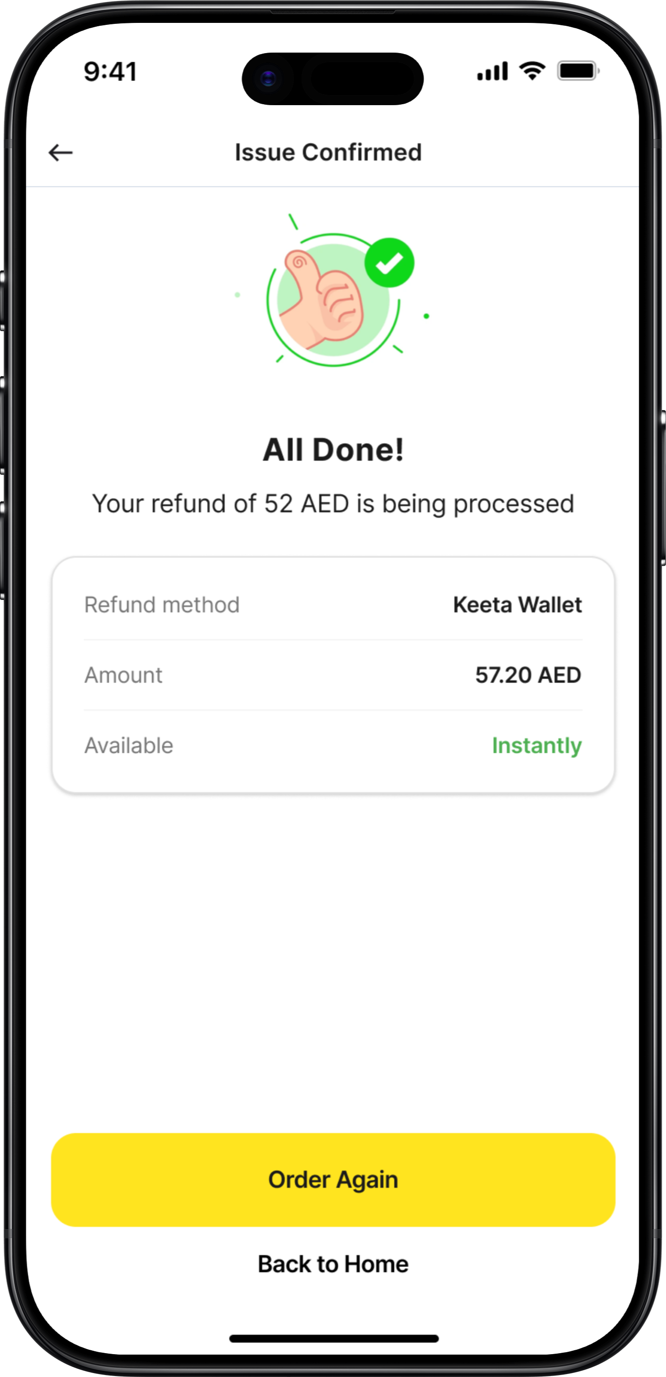
Full refund: 52 AED (to original payment)
Sorry credit: 20 AED (added to wallet)
25% off next order (valid 7 days)
Option: Order from nearby restaurant (free delivery)
💡 Insight:
Ownership + explanation + over-compensation = trust recovery
User Accepts Compensation BUT Order Never Arrives
Driver marked "delivered" without actually delivering
Solution:
Assume user is telling truth first
Full refund: 52 AED (processing now)
Keep the 20 AED compensation (already received)
Additional 30 AED credit (terrible experience)
Total: 102 AED back to user
💡 Insight:
Better to lose $30 than lose a customer. Flag for investigation, but don't punish user.
Compensation Failed (Payment Processing Error)
Technical issue prevents wallet credit
Solution:
Transparent about failure + clear next steps
We'll retry in 5 minutes
Notification when added
If fails again, refund to card
Reference number: #COMP-12847-001
💡 Insight:
Transparent about technical failure. Shows it's tracked, not lost.
Success Metrics & KPIs
Measuring Impact
Clear, measurable goals to validate the redesign's success
What I Would Test
Phase 1: Concept Validation
• Do users trust auto-compensation?
• Preferred support channel?
• Is proactive detection helpful?
• Wait time transparency impact?
Method: Prototype testing, 12-15 users
Phase 2: Usability Testing
• Task completion rate (95%+ target)
• Time on task (<2 min target)
• Error rate (<5% target)
• SUS score (85+ target)
Method: Moderated testing, 8-10 users
Phase 3: A/B Testing
• Compensation amounts
• Refund method defaults
• Support channel prominence
• Proactive alert timing
Method: Post-launch, real user data
Reflections
Key Learnings

About the Problem
Support is Service Design, Not Just UI
This isn't just about pretty screens—it's about the entire ecosystem of people, processes, and technology working together.
Prevention > Cure
Proactive detection and resolution is 10x more valuable than reactive support. Users love when problems are solved before they even complain.
Transparency Builds Trust
Even when there are issues, clear communication about wait times, processes, and timelines massively reduces frustration.
Local Context is Critical
WhatsApp support isn't just nice-to-have in UAE—it's essential. Phone support matters more in some cultures than others.
What Makes This a Concept Project
This is a design exploration, not a production-ready system. I made educated assumptions about:
• Technical feasibility (assumed modern tech stack)
• Budget availability (assumed company wants to invest in support)
• Stakeholder alignment (assumed everyone agrees support is priority)
• User behavior (extrapolated from 5 tests to thousands of users)
Final Reflection
The best design solves real problems. Keeta's users aren't complaining about gradients or button shapes—they're complaining about feeling ignored and helpless when things go wrong. This redesign addresses that fundamental need for agency, transparency, and resolution.
If I could change one thing about this project, I'd spend a week embedded with Keeta's support team in Dubai, experiencing firsthand what agents face and what users say when they're most frustrated.
Real empathy comes from real immersion.
Why I'm Transparent About This
Real design isn't about perfect portfolios—it's about honest problem-solving with real constraints. I'd rather show my thinking process and acknowledge limitations than pretend I built a production system in 3 weeks.
This case study demonstrates how I think, how I prioritize, and how I would approach the real challenges in a production environment.
Thank you for reading — feel free to share your feedback at garima.khulbe@gmail.com
Built with:
UX/UI Redesign & Service Design • Concept Project
Keeta Customer
Support Redesign
Turning the #1 User Complaint Into a Competitive Advantage
Role:
Product Designer
Duration:
3 weeks
Focus Area:
Customer Support Experience
200+
User reviews analyzed across platforms
40%
Target self-service resolution rate
Read Case Study
Project Overview
The Context
Keeta launched in Dubai in September 2025 with aggressive pricing and strong market anticipation. However, despite modern UI and competitive deals, customer support became the #1 user complaint, directly impacting retention and app ratings.
This concept project reimagines Keeta's entire support ecosystem—from proactive issue detection to multi-channel resolution—transforming frustration into trust and creating a sustainable competitive advantage.
The Problem
What Users Are Saying
"Customer service is beyond rude – When I complained, their response was basically: 'You got your food, didn't you? Sorry, nothing we can do.'"
— Dubai user, App Store
"Here is a fact - this app CS doesn't respond to messages and keep closing your tickets without providing any resolution!"
— UAE user, Google Play
"I spent over three hours trying to fix their mistake, but they were completely unhelpful and unprofessional."
— Dubai user, Trustpilot
"If i could rate it with a zero i really would... i had to wait more than 10 minutes to get an agent."
— UAE user, Google Play
The Core Problem:
Customer support is failing at every touchpoint, turning a promising food delivery app into a source of frustration and distrust.
67%
Long wait times
58%
No resolution
45%
Tickets closed unsolved
41%
Can't reach by phone
The Design Challenge
How might we transform customer support from Keeta's biggest weakness into its strongest competitive advantage?
Research & Discovery
Understanding the Problem
Key Insight
Users don't mind waiting IF they get actual resolution.
The problem isn't just speed—it's lack of resolution and transparency.
User Feedback Analysis
Analyzed 200+ reviews across App Store, Google Play, and Trustpilot
•
67% complained about long wait times (40-50 person queues)
•
58% received no resolution, just apologies
•
52% frustrated by wallet-only refunds
Journey Mapping
Mapped the existing customer support experience
•
No proactive issue detection
•
Support buried in settings
•
No transparency on wait times
•
Agents lack empowerment to solve
Competitive Benchmark
Analyzed support in Talabat, Deliveroo, Uber Eats
•
Keeta 2-3 years behind in support infrastructure
•
Competitors offer multi-channel support
•
AI-powered resolution becoming standard
Business Impact
Estimated costs of poor support
•
15-20% user churn due to poor support
•
$2-3M annual revenue impact
•
50,000-75,000 lost customers estimated
Dubai Market Context
Cultural Insights
•
Multi-language essential (English, Arabic, Hindi, Urdu, Tagalog)
•
WhatsApp extremely popular communication channel
•
Premium service expectations in Dubai market
Key Statistics
•
70%
won't return after one bad support experience
•
88%
expect response within 60 minutes
•
Support is
2nd most important
factor after price
Collaboration & Constraints
Cross-Functional Considerations
Real projects don't happen in a vacuum. Here's how I mapped potential stakeholder needs and constraints (conceptualized for this project):
Support Team Feedback (Conceptual)
"We have no power to actually solve problems"
Design Solution:
Gave agents authority to issue up to 50 AED compensation, pre-approved resolution templates, one-click compensation buttons
"Users get angry when we can only offer wallet refunds"
Design Solution:
Flexible refund options (wallet, card, split), agent can override default based on situation
"We don't know the order history when users call"
Design Solution:
Agent dashboard with full order history, previous support tickets visible, user's refund history for fraud prevention
Design Process
From Sketch to Screen
The journey from first pen-&-paper sketches to polished high-fidelity designs. This shows the messy, iterative reality of design - not just the final output.
Why I Started with Pen & Paper
Context:
After analyzing 200+ user reviews, I had key insights about users feeling ignored, lack of transparency, and buried support.
My First Question:
"How do we detect a problem and tell the user BEFORE they complain?"
I grabbed a notebook and started sketching at a café. No Figma, no constraints—just ideas.
Screen 1: Proactive Issue Detection
v1
Rejected
💭 Keep it simple - just alert the user. Modal popup to grab attention.
REJECTED
What Didn't Work
✕
Too vague - "late" doesn't tell them HOW late
✕
Feels alarming - red alert creates panic
✕
No immediate action - forces extra tap
✕
No empathy - comes across as notification spam
✕
Missing context - no order details visible
User Feedback:
"This looks like an error message, not help"
— Colleague 1
"What do you want me to do about it?"
— Colleague 2
v2
Getting Better
💭 Added specific time details and order context. Provided multiple options.
REJECTED
What Changed
✓
Added specific time details
✓
Softened language ("running late" vs "LATE")
✓
Gave order context (restaurant name)
✓
Provided multiple options
What Still Didn't Work
✕
Radio buttons require selection + confirmation (2 taps)
✕
All options equal weight - no guidance
✕
"Get compensation" - how much? What kind?
✕
Still requires decision-making from frustrated user
User Feedback:
"Which one should I pick?"
— 3 out of 5 testers
v3
The Breakthrough
💭 Default to the best action, but allow alternatives
SELECTED
What Changed
✓
Empathetic opening ("We noticed" - proactive)
✓
Apology upfront
✓
Specific compensation amount (no mystery)
✓
Visual hierarchy - recommended action highlighted
✓
One-tap acceptance
✓
"More Options" for power users
✓
Compensation already added (sunk cost psychology)
User Feedback:
"Oh this is nice, I'd just tap Accept"
— 4 out of 5 testers
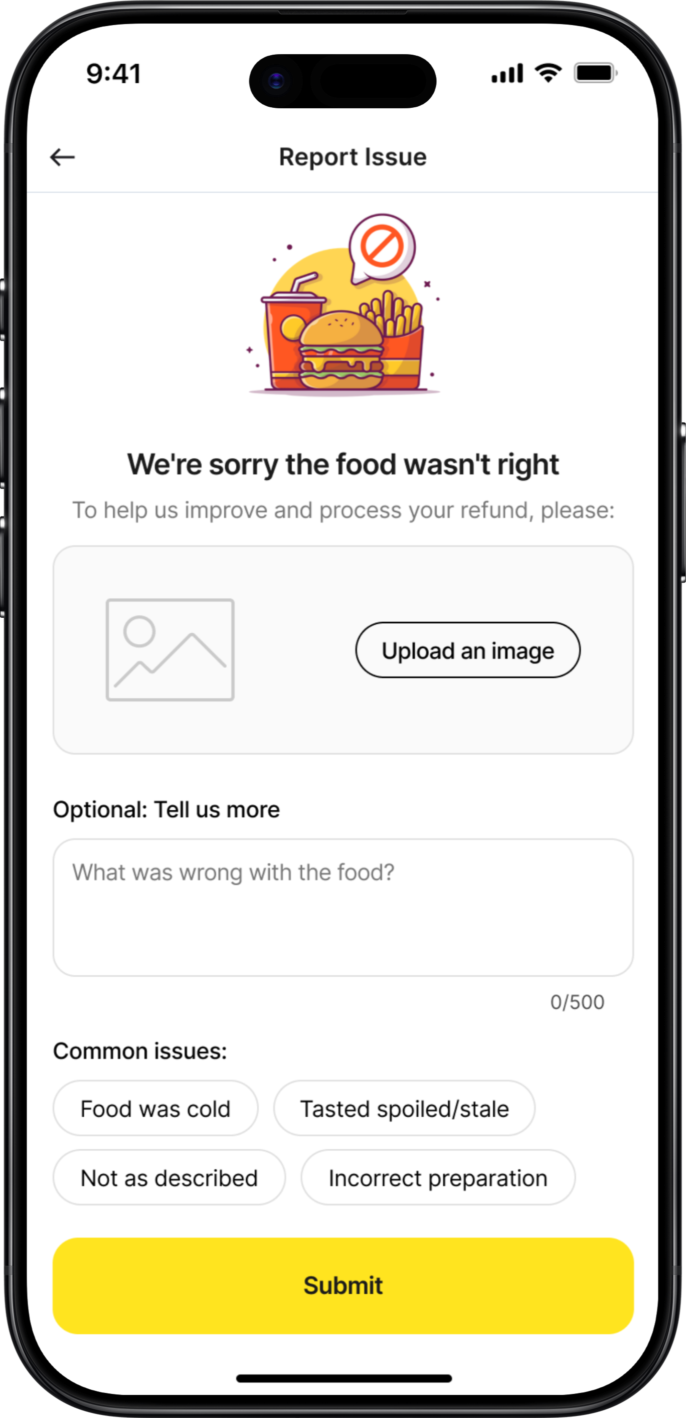
Screen 2: Food Quality Issue Report
v1
Too Complex
💭 Give users all possible issue types. Get detailed description.
REJECTED
What Didn't Work
✕
Too many checkboxes - analysis paralysis
✕
Text field feels like homework
✕
Multiple photos = high effort
✕
No indication of what happens after submit
✕
Feels like filing a complaint, not getting help
User Feedback:
"This is so much work for a 50 AED order. I'd just not order again."
— User test
v2
Simplified
💭 One photo, text optional, examples given
REJECTED
What Changed
✓
One photo instead of multiple
✓
Text made optional
✓
Examples given for context
✓
Empathetic opening
✓
Clear purpose: "To process your refund"
What Still Didn't Work
✕
Still feels like proving your case
✕
No indication of refund amount
✕
No indication of how fast
v3
Final Concept
💭 Show refund amount upfront. Reframe as helping, not proving.
SELECTED
What Changed
✓
Showed estimated refund BEFORE submission
✓
Reframed as "help us improve" not "prove it"
✓
Clear "required" vs "optional" labels
✓
Examples are helpful, not exhaustive
User Feedback:
"5 out of 5 understood and said they'd use it"
— Testing result
Screen 3: Refund Method Selection
v1
Too Transactional
REJECTED
What Didn't Work
✕
No context about the issue
✕
Feels like a form, not resolution
✕
"Select" is too formal
✕
No explanation of why wallet has bonus
✕
Missing split option (user testing revealed this)
v2
Better
SELECTED
What Changed
✓
Validation upfront ("Issue Confirmed")
✓
Empathetic acknowledgment
✓
Conversational language
✓
Added split option
✓
Timing shown for each
User Feedback:
"I like that you're taking responsibility, not making me prove it"
— User test
Screens 4-6: Rapid Evolution Summary
Success Confirmation
v1:
Boring receipt-like confirmation
v2:
Added empathy + wallet balance
Final:
Animated checkmark, next actions, restaurant accountability mentioned
Support Hub
v1:
Simple list of channels
v2:
Added icons and descriptions
Final:
Wait times, agent availability, social proof ("Most popular!")
WhatsApp Handoff
v1:
Just "Open WhatsApp" button
v2:
Added explainer text
Final:
Message preview, order context included, clear expectations
What Lo-Fi vs Hi-Fi Each Achieved
Lo-Fi Sketches
Validated Core Concepts Fast
3 iterations in 1 day vs. weeks in Figma
Focused on Structure, Not Aesthetics
Users critiqued the FLOW, not the colors
Enabled Rapid Iteration
Drew 20+ variations before settling
Hi-Fi Designs
Visual Hierarchy
Typography scale, color system, spacing consistency
Micro-Interactions
Button states, loading animations, success celebrations
Production Details
Accessibility, responsive behavior, edge cases, copy refinement
Key Lessons from This Process
Sketch Multiple Versions
For every screen, I drew 3-5 variations before choosing. The first idea is rarely the best.
Test Ugly Wireframes
People give better feedback on sketches than polished designs. They critique substance, not style.
Details Come Last
Lo-fi validated IF the solution worked. Hi-fi figured out HOW to make it work beautifully.
Context Changes Everything
What looked good on paper sometimes failed when I added real content (long restaurant names, etc.)
Mobile Screens
Detailed UI Design
High-fidelity mobile screens showing the complete user experience
Screen 1
Proactive Issue Detection
Proactive Issue Detection
App automatically detects order delay and offers instant resolution
Key Features
• Automatic delay detection (30+ minutes)
• Pre-calculated compensation (20 AED)
• Multiple resolution paths
• Priority queue access
• Transparent new ETA
Design Decisions
✓ Problem acknowledged immediately
✓ Compensation already added to wallet
✓ User has full control over outcome
✓ Easy escalation to human support
Deep Dive Exploration
Proactive Order Delay Detection
Now let's explore ONE critical flow in depth: Proactive Issue Detection for Delayed Orders. This is the make-or-break feature that differentiates Keeta from competitors.
Why This Flow Matters
This single feature can turn a frustrated user into a loyal advocate. It's the difference between "This app always has problems" and "This app actually cares when things go wrong." Let's examine the design decisions, iterations, edge cases, and interaction details.
Design Exploration: 3 Approaches Considered
1
Silent Compensation (Auto-Credit)
Initial Concept - Week 1
Just fix it, don't make users think about it.
REJECTED
Pros
•
Fastest resolution (no user action needed)
•
Minimal cognitive load
•
Demonstrates confidence ("we know we messed up")
Cons
•
Zero transparency (users don't know why)
•
No control (what if they want to cancel?)
•
Trust issue (feels like hush money)
User Testing Result:
"4 out of 5 users said "This feels sketchy. What if I wanted my money back?""
Why I Rejected This:
Autonomy matters more than speed. Users want agency, not to be managed.
2
Notification + Choice Menu
Second Iteration - Week 1
Give users all options, let them decide.
REJECTED
Pros
•
Full transparency
•
User maintains control
•
Covers all scenarios
Cons
•
Requires decision-making when user is frustrated
•
All options equal weight (no guidance)
•
Delays resolution (waiting for user input)
User Testing Result:
"3 out of 5 users asked "Which one should I pick? What's recommended?""
Why I Rejected This:
Choice paralysis is real. When users are frustrated, they want guidance, not homework.
3
Recommended Action + Alternatives
Final Design - Week 2
Guide, don't force. Recommend, but allow override.
SELECTED
Pros
•
Reduces cognitive load - Default action is clear
•
Maintains autonomy - Other options visible and accessible
•
Builds trust - Compensation already added (not contingent)
•
Fastest path - One tap to accept
•
Safety net - "More Options" for edge cases
Cons
•
Sacrificed simplicity of Approach 1 (needed transparency)
•
Sacrificed neutrality of Approach 2 (needed opinionated guidance)
•
Some screen real estate (worth it for clarity)
User Testing Result:
"5 out of 5 understood immediately. 4 out of 5 said they'd take the default."
Why This Won:
Perfect balance of guidance and autonomy. Users felt supported, not controlled.
Edge Cases & Error States
The happy path is easy. Here's how we handle when things go wrong:
User Ignored Initial Notification (10+ Minutes)
Notification sent at 8:15 PM, user didn't respond, now it's 8:30 PM
Solution:
Escalating compensation based on delay severity
30 min late: 20 AED
45 min late: 30 AED
60 min late: 50 AED (or auto-cancel with refund)
💡 Insight:
Shows app is continuously monitoring (builds trust)
Order Cancelled by Restaurant Mid-Delivery
Restaurant runs out of ingredients, cancels order
Solution:
Over-compensation: Refund + credit + discount + immediate alternative
Full refund: 52 AED (to original payment)
Sorry credit: 20 AED (added to wallet)
25% off next order (valid 7 days)
Option: Order from nearby restaurant (free delivery)
💡 Insight:
Ownership + explanation + over-compensation = trust recovery
User Accepts Compensation BUT Order Never Arrives
Driver marked "delivered" without actually delivering
Solution:
Assume user is telling truth first
Full refund: 52 AED (processing now)
Keep the 20 AED compensation (already received)
Additional 30 AED credit (terrible experience)
Total: 102 AED back to user
💡 Insight:
Better to lose $30 than lose a customer. Flag for investigation, but don't punish user.
Compensation Failed (Payment Processing Error)
Technical issue prevents wallet credit
Solution:
Transparent about failure + clear next steps
We'll retry in 5 minutes
Notification when added
If fails again, refund to card
Reference number: #COMP-12847-001
💡 Insight:
Transparent about technical failure. Shows it's tracked, not lost.
Success Metrics & KPIs
Measuring Impact
Clear, measurable goals to validate the redesign's success
What I Would Test
Phase 1: Concept Validation
• Do users trust auto-compensation?
• Preferred support channel?
• Is proactive detection helpful?
• Wait time transparency impact?
Method: Prototype testing, 12-15 users
Phase 2: Usability Testing
• Task completion rate (95%+ target)
• Time on task (<2 min target)
• Error rate (<5% target)
• SUS score (85+ target)
Method: Moderated testing, 8-10 users
Phase 3: A/B Testing
• Compensation amounts
• Refund method defaults
• Support channel prominence
• Proactive alert timing
Method: Post-launch, real user data
Reflections
Key Learnings
About the Problem
Support is Service Design, Not Just UI
This isn't just about pretty screens—it's about the entire ecosystem of people, processes, and technology working together.
Prevention > Cure
Proactive detection and resolution is 10x more valuable than reactive support. Users love when problems are solved before they even complain.
Transparency Builds Trust
Even when there are issues, clear communication about wait times, processes, and timelines massively reduces frustration.
Local Context is Critical
WhatsApp support isn't just nice-to-have in UAE—it's essential. Phone support matters more in some cultures than others.
What Makes This a Concept Project
This is a design exploration, not a production-ready system. I made educated assumptions about:
• Technical feasibility (assumed modern tech stack)
• Budget availability (assumed company wants to invest in support)
• Stakeholder alignment (assumed everyone agrees support is priority)
• User behavior (extrapolated from 5 tests to thousands of users)
Final Reflection
The best design solves real problems. Keeta's users aren't complaining about gradients or button shapes—they're complaining about feeling ignored and helpless when things go wrong. This redesign addresses that fundamental need for agency, transparency, and resolution.
If I could change one thing about this project, I'd spend a week embedded with Keeta's support team in Dubai, experiencing firsthand what agents face and what users say when they're most frustrated.
Real empathy comes from real immersion.
Why I'm Transparent About This
Real design isn't about perfect portfolios—it's about honest problem-solving with real constraints. I'd rather show my thinking process and acknowledge limitations than pretend I built a production system in 3 weeks.
This case study demonstrates how I think, how I prioritize, and how I would approach the real challenges in a production environment.
Thank you for reading — feel free to share your feedback at garima.khulbe@gmail.com
Built with:

UX/UI Redesign & Service Design • Concept Project
Keeta Customer
Support Redesign
Turning the #1 User Complaint Into a Competitive Advantage
Role:
Product Designer
Duration:
3 weeks
Focus Area:
Customer Support Experience
200+
User reviews analyzed across platforms
40%
Target self-service resolution rate
Read Case Study
Project Overview
The Context
Keeta launched in Dubai in September 2025 with aggressive pricing and strong market anticipation. However, despite modern UI and competitive deals, customer support became the #1 user complaint, directly impacting retention and app ratings.
This concept project reimagines Keeta's entire support ecosystem—from proactive issue detection to multi-channel resolution—transforming frustration into trust and creating a sustainable competitive advantage.
The Problem
What Users Are Saying
"Customer service is beyond rude – When I complained, their response was basically: 'You got your food, didn't you? Sorry, nothing we can do.'"
— Dubai user, App Store
"Here is a fact - this app CS doesn't respond to messages and keep closing your tickets without providing any resolution!"
— UAE user, Google Play
"I spent over three hours trying to fix their mistake, but they were completely unhelpful and unprofessional."
— Dubai user, Trustpilot
"If i could rate it with a zero i really would... i had to wait more than 10 minutes to get an agent."
— UAE user, Google Play
The Core Problem:
Customer support is failing at every touchpoint, turning a promising food delivery app into a source of frustration and distrust.
67%
Long wait times
58%
No resolution
45%
Tickets closed unsolved
41%
Can't reach by phone
The Design Challenge
How might we transform customer support from Keeta's biggest weakness into its strongest competitive advantage?
Research & Discovery
Understanding the Problem
Key Insight
Users don't mind waiting IF they get actual resolution.
The problem isn't just speed—it's lack of resolution and transparency.
User Feedback Analysis
Analyzed 200+ reviews across App Store, Google Play, and Trustpilot
•
67% complained about long wait times (40-50 person queues)
•
58% received no resolution, just apologies
•
52% frustrated by wallet-only refunds
Journey Mapping
Mapped the existing customer support experience
•
No proactive issue detection
•
Support buried in settings
•
No transparency on wait times
•
Agents lack empowerment to solve
Competitive Benchmark
Analyzed support in Talabat, Deliveroo, Uber Eats
•
Keeta 2-3 years behind in support infrastructure
•
Competitors offer multi-channel support
•
AI-powered resolution becoming standard
Business Impact
Estimated costs of poor support
•
15-20% user churn due to poor support
•
$2-3M annual revenue impact
•
50,000-75,000 lost customers estimated
Dubai Market Context
Cultural Insights
•
Multi-language essential (English, Arabic, Hindi, Urdu, Tagalog)
•
WhatsApp extremely popular communication channel
•
Premium service expectations in Dubai market
Key Statistics
•
70%
won't return after one bad support experience
•
88%
expect response within 60 minutes
•
Support is
2nd most important
factor after price
Collaboration & Constraints
Cross-Functional Considerations
Real projects don't happen in a vacuum. Here's how I mapped potential stakeholder needs and constraints (conceptualized for this project):
Support Team Feedback (Conceptual)
"We have no power to actually solve problems"
Design Solution:
Gave agents authority to issue up to 50 AED compensation, pre-approved resolution templates, one-click compensation buttons
"Users get angry when we can only offer wallet refunds"
Design Solution:
Flexible refund options (wallet, card, split), agent can override default based on situation
"We don't know the order history when users call"
Design Solution:
Agent dashboard with full order history, previous support tickets visible, user's refund history for fraud prevention
Design Process
From Sketch to Screen
The journey from first pen-&-paper sketches to polished high-fidelity designs. This shows the messy, iterative reality of design - not just the final output.
Why I Started with Pen & Paper
Context:
After analyzing 200+ user reviews, I had key insights about users feeling ignored, lack of transparency, and buried support.
My First Question:
"How do we detect a problem and tell the user BEFORE they complain?"
I grabbed a notebook and started sketching at a café. No Figma, no constraints—just ideas.
Screen 1: Proactive Issue Detection
v1
Rejected
Keep it simple - just alert the user. Modal popup to grab attention.
REJECTED
What Didn't Work
✕
Too vague - "late" doesn't tell them HOW late
✕
Feels alarming - red alert creates panic
✕
No immediate action - forces extra tap
✕
No empathy - comes across as notification spam
✕
Missing context - no order details visible
User Feedback:
"This looks like an error message, not help"
— Colleague 1
"What do you want me to do about it?"
— Colleague 2
v2
Getting Better
Added specific time details and order context. Provided multiple options.
REJECTED
What Changed
✓
Added specific time details
✓
Softened language ("running late" vs "LATE")
✓
Gave order context (restaurant name)
✓
Provided multiple options
What Still Didn't Work
✕
Radio buttons require selection + confirmation (2 taps)
✕
All options equal weight - no guidance
✕
"Get compensation" - how much? What kind?
✕
Still requires decision-making from frustrated user
User Feedback:
"Which one should I pick?"
— 3 out of 5 testers
v3
The Breakthrough
Default to the best action, but allow alternatives
SELECTED
What Changed
✓
Empathetic opening ("We noticed" - proactive)
✓
Apology upfront
✓
Specific compensation amount (no mystery)
✓
Visual hierarchy - recommended action highlighted
✓
One-tap acceptance
✓
"More Options" for power users
✓
Compensation already added (sunk cost psychology)
User Feedback:
"Oh this is nice, I'd just tap Accept"
— 4 out of 5 testers
Screen 2: Food Quality Issue Report
v1
Too Complex
Give users all possible issue types. Get detailed description.
REJECTED
What Didn't Work
✕
Too many checkboxes - analysis paralysis
✕
Text field feels like homework
✕
Multiple photos = high effort
✕
No indication of what happens after submit
✕
Feels like filing a complaint, not getting help
User Feedback:
"This is so much work for a 50 AED order. I'd just not order again."
— User test
v2
Simplified
One photo, text optional, examples given
REJECTED
What Changed
✓
One photo instead of multiple
✓
Text made optional
✓
Examples given for context
✓
Empathetic opening
✓
Clear purpose: "To process your refund"
What Still Didn't Work
✕
Still feels like proving your case
✕
No indication of refund amount
✕
No indication of how fast
v3
Final Concept
Show refund amount upfront. Reframe as helping, not proving.
SELECTED
What Changed
✓
Showed estimated refund BEFORE submission
✓
Reframed as "help us improve" not "prove it"
✓
Clear "required" vs "optional" labels
✓
Examples are helpful, not exhaustive
User Feedback:
"5 out of 5 understood and said they'd use it"
— Testing result
Screen 3: Refund Method Selection
v1
Too Transactional
REJECTED
What Didn't Work
✕
No context about the issue
✕
Feels like a form, not resolution
✕
"Select" is too formal
✕
No explanation of why wallet has bonus
✕
Missing split option (user testing revealed this)
v2
Better
SELECTED
What Changed
✓
Validation upfront ("Issue Confirmed")
✓
Empathetic acknowledgment
✓
Conversational language
✓
Added split option
✓
Timing shown for each
User Feedback:
"I like that you're taking responsibility, not making me prove it"
— User test
Screens 4-6: Rapid Evolution Summary
Success Confirmation
v1:
Boring receipt-like confirmation
v2:
Added empathy + wallet balance
Final:
Animated checkmark, next actions, restaurant accountability mentioned
Support Hub
v1:
Simple list of channels
v2:
Added icons and descriptions
Final:
Wait times, agent availability, social proof ("Most popular!")
WhatsApp Handoff
v1:
Just "Open WhatsApp" button
v2:
Added explainer text
Final:
Message preview, order context included, clear expectations
What Lo-Fi vs Hi-Fi Each Achieved
Lo-Fi Sketches
Validated Core Concepts Fast
3 iterations in 1 day vs. weeks in Figma
Focused on Structure, Not Aesthetics
Users critiqued the FLOW, not the colors
Enabled Rapid Iteration
Drew 20+ variations before settling
Hi-Fi Designs
Visual Hierarchy
Typography scale, color system, spacing consistency
Micro-Interactions
Button states, loading animations, success celebrations
Production Details
Accessibility, responsive behavior, edge cases, copy refinement
Key Lessons from This Process
Sketch Multiple Versions
For every screen, I drew 3-5 variations before choosing. The first idea is rarely the best.
Test Ugly Wireframes
People give better feedback on sketches than polished designs. They critique substance, not style.
Details Come Last
Lo-fi validated IF the solution worked. Hi-fi figured out HOW to make it work beautifully.
Context Changes Everything
What looked good on paper sometimes failed when I added real content (long restaurant names, etc.)
Mobile Screens
Detailed UI Design
High-fidelity mobile screens showing the complete user experience
Screen 1
Proactive Issue Detection
Proactive Issue Detection
App automatically detects order delay and offers instant resolution
Key Features
• Automatic delay detection (30+ minutes)
• Pre-calculated compensation (20 AED)
• Multiple resolution paths
• Priority queue access
• Transparent new ETA
Design Decisions
✓ Problem acknowledged immediately
✓ Compensation already added to wallet
✓ User has full control over outcome
✓ Easy escalation to human support
Deep Dive Exploration
Proactive Order Delay Detection
Now let's explore ONE critical flow in depth: Proactive Issue Detection for Delayed Orders. This is the make-or-break feature that differentiates Keeta from competitors.
Why This Flow Matters
This single feature can turn a frustrated user into a loyal advocate. It's the difference between "This app always has problems" and "This app actually cares when things go wrong." Let's examine the design decisions, iterations, edge cases, and interaction details.
Design Exploration: 3 Approaches Considered
1
Silent Compensation (Auto-Credit)
Initial Concept - Week 1
Just fix it, don't make users think about it.
REJECTED
Pros
•
Fastest resolution (no user action needed)
•
Minimal cognitive load
•
Demonstrates confidence ("we know we messed up")
Cons
•
Zero transparency (users don't know why)
•
No control (what if they want to cancel?)
•
Trust issue (feels like hush money)
User Testing Result:
"4 out of 5 users said "This feels sketchy. What if I wanted my money back?""
Why I Rejected This:
Autonomy matters more than speed. Users want agency, not to be managed.
2
Notification + Choice Menu
Second Iteration - Week 1
Give users all options, let them decide.
REJECTED
Pros
•
Full transparency
•
User maintains control
•
Covers all scenarios
Cons
•
Requires decision-making when user is frustrated
•
All options equal weight (no guidance)
•
Delays resolution (waiting for user input)
User Testing Result:
"3 out of 5 users asked "Which one should I pick? What's recommended?""
Why I Rejected This:
Choice paralysis is real. When users are frustrated, they want guidance, not homework.
3
Recommended Action + Alternatives
Final Design - Week 2
Guide, don't force. Recommend, but allow override.
SELECTED
Pros
•
Reduces cognitive load - Default action is clear
•
Maintains autonomy - Other options visible and accessible
•
Builds trust - Compensation already added (not contingent)
•
Fastest path - One tap to accept
•
Safety net - "More Options" for edge cases
Cons
•
Sacrificed simplicity of Approach 1 (needed transparency)
•
Sacrificed neutrality of Approach 2 (needed opinionated guidance)
•
Some screen real estate (worth it for clarity)
User Testing Result:
"5 out of 5 understood immediately. 4 out of 5 said they'd take the default."
Why This Won:
Perfect balance of guidance and autonomy. Users felt supported, not controlled.
Edge Cases & Error States
The happy path is easy. Here's how we handle when things go wrong:
User Ignored Initial Notification (10+ Minutes)
Notification sent at 8:15 PM, user didn't respond, now it's 8:30 PM
Solution:
Escalating compensation based on delay severity
30 min late: 20 AED
45 min late: 30 AED
60 min late: 50 AED (or auto-cancel with refund)
💡 Insight:
Shows app is continuously monitoring (builds trust)
Order Cancelled by Restaurant Mid-Delivery
Restaurant runs out of ingredients, cancels order
Solution:
Over-compensation: Refund + credit + discount + immediate alternative
Full refund: 52 AED (to original payment)
Sorry credit: 20 AED (added to wallet)
25% off next order (valid 7 days)
Option: Order from nearby restaurant (free delivery)
💡 Insight:
Ownership + explanation + over-compensation = trust recovery
User Accepts Compensation BUT Order Never Arrives
Driver marked "delivered" without actually delivering
Solution:
Assume user is telling truth first
Full refund: 52 AED (processing now)
Keep the 20 AED compensation (already received)
Additional 30 AED credit (terrible experience)
Total: 102 AED back to user
💡 Insight:
Better to lose $30 than lose a customer. Flag for investigation, but don't punish user.
Compensation Failed (Payment Processing Error)
Technical issue prevents wallet credit
Solution:
Transparent about failure + clear next steps
We'll retry in 5 minutes
Notification when added
If fails again, refund to card
Reference number: #COMP-12847-001
💡 Insight:
Transparent about technical failure. Shows it's tracked, not lost.
Success Metrics & KPIs
Measuring Impact
Clear, measurable goals to validate the redesign's success
What I Would Test
Phase 1: Concept Validation
• Do users trust auto-compensation?
• Preferred support channel?
• Is proactive detection helpful?
• Wait time transparency impact?
Method: Prototype testing, 12-15 users
Phase 2: Usability Testing
• Task completion rate (95%+ target)
• Time on task (<2 min target)
• Error rate (<5% target)
• SUS score (85+ target)
Method: Moderated testing, 8-10 users
Phase 3: A/B Testing
• Compensation amounts
• Refund method defaults
• Support channel prominence
• Proactive alert timing
Method: Post-launch, real user data
Reflections
Key Learnings
About the Problem
Support is Service Design, Not Just UI
This isn't just about pretty screens—it's about the entire ecosystem of people, processes, and technology working together.
Prevention > Cure
Proactive detection and resolution is 10x more valuable than reactive support. Users love when problems are solved before they even complain.
Transparency Builds Trust
Even when there are issues, clear communication about wait times, processes, and timelines massively reduces frustration.
Local Context is Critical
WhatsApp support isn't just nice-to-have in UAE—it's essential. Phone support matters more in some cultures than others.
What Makes This a Concept Project
This is a design exploration, not a production-ready system. I made educated assumptions about:
• Technical feasibility (assumed modern tech stack)
• Budget availability (assumed company wants to invest in support)
• Stakeholder alignment (assumed everyone agrees support is priority)
• User behavior (extrapolated from 5 tests to thousands of users)
Final Reflection
The best design solves real problems. Keeta's users aren't complaining about gradients or button shapes—they're complaining about feeling ignored and helpless when things go wrong. This redesign addresses that fundamental need for agency, transparency, and resolution.
If I could change one thing about this project, I'd spend a week embedded with Keeta's support team in Dubai, experiencing firsthand what agents face and what users say when they're most frustrated.
Real empathy comes from real immersion.
Why I'm Transparent About This
Real design isn't about perfect portfolios—it's about honest problem-solving with real constraints. I'd rather show my thinking process and acknowledge limitations than pretend I built a production system in 3 weeks.
This case study demonstrates how I think, how I prioritize, and how I would approach the real challenges in a production environment.
Thank you for reading — feel free to share your feedback at garima.khulbe@gmail.com
Built with:
UX/UI Redesign & Service Design • Concept Project
Keeta Customer
Support Redesign
Turning the #1 User Complaint Into a Competitive Advantage
Role:
Product Designer
Duration:
3 weeks
Focus Area:
Customer Support Experience
200+
User reviews analyzed across platforms
40%
Target self-service resolution rate
Read Case Study
Project Overview
The Context
Keeta launched in Dubai in September 2025 with aggressive pricing and strong market anticipation. However, despite modern UI and competitive deals, customer support became the #1 user complaint, directly impacting retention and app ratings.
This concept project reimagines Keeta's entire support ecosystem—from proactive issue detection to multi-channel resolution—transforming frustration into trust and creating a sustainable competitive advantage.
The Problem
What Users Are Saying
"Customer service is beyond rude – When I complained, their response was basically: 'You got your food, didn't you? Sorry, nothing we can do.'"
— Dubai user, App Store
"Here is a fact - this app CS doesn't respond to messages and keep closing your tickets without providing any resolution!"
— UAE user, Google Play
"I spent over three hours trying to fix their mistake, but they were completely unhelpful and unprofessional."
— Dubai user, Trustpilot
"If i could rate it with a zero i really would... i had to wait more than 10 minutes to get an agent."
— UAE user, Google Play
The Core Problem:
Customer support is failing at every touchpoint, turning a promising food delivery app into a source of frustration and distrust.
67%
Long wait times
58%
No resolution
45%
Tickets closed unsolved
41%
Can't reach by phone
The Design Challenge
How might we transform customer support from Keeta's biggest weakness into its strongest competitive advantage?
Research & Discovery
Understanding the Problem
Key Insight
Users don't mind waiting IF they get actual resolution.
The problem isn't just speed—it's lack of resolution and transparency.
User Feedback Analysis
Analyzed 200+ reviews across App Store, Google Play, and Trustpilot
•
67% complained about long wait times (40-50 person queues)
•
58% received no resolution, just apologies
•
52% frustrated by wallet-only refunds
Journey Mapping
Mapped the existing customer support experience
•
No proactive issue detection
•
Support buried in settings
•
No transparency on wait times
•
Agents lack empowerment to solve
Competitive Benchmark
Analyzed support in Talabat, Deliveroo, Uber Eats
•
Keeta 2-3 years behind in support infrastructure
•
Competitors offer multi-channel support
•
AI-powered resolution becoming standard
Business Impact
Estimated costs of poor support
•
15-20% user churn due to poor support
•
$2-3M annual revenue impact
•
50,000-75,000 lost customers estimated
Dubai Market Context
Cultural Insights
•
Multi-language essential (English, Arabic, Hindi, Urdu, Tagalog)
•
WhatsApp extremely popular communication channel
•
Premium service expectations in Dubai market
Key Statistics
•
70%
won't return after one bad support experience
•
88%
expect response within 60 minutes
•
Support is
2nd most important
factor after price
Collaboration & Constraints
Cross-Functional Considerations
Real projects don't happen in a vacuum. Here's how I mapped potential stakeholder needs and constraints (conceptualized for this project):
Support Team Feedback (Conceptual)
"We have no power to actually solve problems"
Design Solution:
Gave agents authority to issue up to 50 AED compensation, pre-approved resolution templates, one-click compensation buttons
"Users get angry when we can only offer wallet refunds"
Design Solution:
Flexible refund options (wallet, card, split), agent can override default based on situation
"We don't know the order history when users call"
Design Solution:
Agent dashboard with full order history, previous support tickets visible, user's refund history for fraud prevention
Design Process
From Sketch to Screen
The journey from first pen-&-paper sketches to polished high-fidelity designs. This shows the messy, iterative reality of design - not just the final output.
Why I Started with Pen & Paper
Context:
After analyzing 200+ user reviews, I had key insights about users feeling ignored, lack of transparency, and buried support.
My First Question:
"How do we detect a problem and tell the user BEFORE they complain?"
I grabbed a notebook and started sketching at a café. No Figma, no constraints—just ideas.
Screen 1: Proactive Issue Detection
v1
Rejected
💭 Keep it simple - just alert the user. Modal popup to grab attention.
REJECTED
[Low-fidelity wireframe sketch]
What Didn't Work
✕
Too vague - "late" doesn't tell them HOW late
✕
Feels alarming - red alert creates panic
✕
No immediate action - forces extra tap
✕
No empathy - comes across as notification spam
✕
Missing context - no order details visible
User Feedback:
"This looks like an error message, not help"
— Colleague 1
"What do you want me to do about it?"
— Colleague 2
v2
Getting Better
💭 Added specific time details and order context. Provided multiple options.
REJECTED
[Low-fidelity wireframe sketch]
What Changed
✓
Added specific time details
✓
Softened language ("running late" vs "LATE")
✓
Gave order context (restaurant name)
✓
Provided multiple options
What Still Didn't Work
✕
Radio buttons require selection + confirmation (2 taps)
✕
All options equal weight - no guidance
✕
"Get compensation" - how much? What kind?
✕
Still requires decision-making from frustrated user
User Feedback:
"Which one should I pick?"
— 3 out of 5 testers
v3
The Breakthrough
💭 Default to the best action, but allow alternatives
SELECTED
[Low-fidelity wireframe sketch]
What Changed
✓
Empathetic opening ("We noticed" - proactive)
✓
Apology upfront
✓
Specific compensation amount (no mystery)
✓
Visual hierarchy - recommended action highlighted
✓
One-tap acceptance
✓
"More Options" for power users
✓
Compensation already added (sunk cost psychology)
User Feedback:
"Oh this is nice, I'd just tap Accept"
— 4 out of 5 testers
Screen 2: Food Quality Issue Report
v1
Too Complex
💭 Give users all possible issue types. Get detailed description.
REJECTED
[Low-fidelity wireframe sketch]
What Didn't Work
✕
Too many checkboxes - analysis paralysis
✕
Text field feels like homework
✕
Multiple photos = high effort
✕
No indication of what happens after submit
✕
Feels like filing a complaint, not getting help
User Feedback:
"This is so much work for a 50 AED order. I'd just not order again."
— User test
v2
Simplified
💭 One photo, text optional, examples given
REJECTED
[Low-fidelity wireframe sketch]
What Changed
✓
One photo instead of multiple
✓
Text made optional
✓
Examples given for context
✓
Empathetic opening
✓
Clear purpose: "To process your refund"
What Still Didn't Work
✕
Still feels like proving your case
✕
No indication of refund amount
✕
No indication of how fast
v3
Final Concept
💭 Show refund amount upfront. Reframe as helping, not proving.
SELECTED
[Low-fidelity wireframe sketch]
What Changed
✓
Showed estimated refund BEFORE submission
✓
Reframed as "help us improve" not "prove it"
✓
Clear "required" vs "optional" labels
✓
Examples are helpful, not exhaustive
User Feedback:
"5 out of 5 understood and said they'd use it"
— Testing result
Screen 3: Refund Method Selection
v1
Too Transactional
REJECTED
[Low-fidelity wireframe sketch]
What Didn't Work
✕
No context about the issue
✕
Feels like a form, not resolution
✕
"Select" is too formal
✕
No explanation of why wallet has bonus
✕
Missing split option (user testing revealed this)
v2
Better
SELECTED
[Low-fidelity wireframe sketch]
What Changed
✓
Validation upfront ("Issue Confirmed")
✓
Empathetic acknowledgment
✓
Conversational language
✓
Added split option
✓
Timing shown for each
User Feedback:
"I like that you're taking responsibility, not making me prove it"
— User test
Screens 4-6: Rapid Evolution Summary
Success Confirmation
v1:
Boring receipt-like confirmation
v2:
Added empathy + wallet balance
Final:
Animated checkmark, next actions, restaurant accountability mentioned
Support Hub
v1:
Simple list of channels
v2:
Added icons and descriptions
Final:
Wait times, agent availability, social proof ("Most popular!")
WhatsApp Handoff
v1:
Just "Open WhatsApp" button
v2:
Added explainer text
Final:
Message preview, order context included, clear expectations
What Lo-Fi vs Hi-Fi Each Achieved
Lo-Fi Sketches
Validated Core Concepts Fast
3 iterations in 1 day vs. weeks in Figma
Focused on Structure, Not Aesthetics
Users critiqued the FLOW, not the colors
Enabled Rapid Iteration
Drew 20+ variations before settling
Hi-Fi Designs
Visual Hierarchy
Typography scale, color system, spacing consistency
Micro-Interactions
Button states, loading animations, success celebrations
Production Details
Accessibility, responsive behavior, edge cases, copy refinement
Key Lessons from This Process
Sketch Multiple Versions
For every screen, I drew 3-5 variations before choosing. The first idea is rarely the best.
Test Ugly Wireframes
People give better feedback on sketches than polished designs. They critique substance, not style.
Details Come Last
Lo-fi validated IF the solution worked. Hi-fi figured out HOW to make it work beautifully.
Context Changes Everything
What looked good on paper sometimes failed when I added real content (long restaurant names, etc.)
Mobile Screens
Detailed UI Design
High-fidelity mobile screens showing the complete user experience
Screen 1
Proactive Issue Detection
Proactive Issue Detection
App automatically detects order delay and offers instant resolution
Key Features
• Automatic delay detection (30+ minutes)
• Pre-calculated compensation (20 AED)
• Multiple resolution paths
• Priority queue access
• Transparent new ETA
Design Decisions
✓ Problem acknowledged immediately
✓ Compensation already added to wallet
✓ User has full control over outcome
✓ Easy escalation to human support
Deep Dive Exploration
Proactive Order Delay Detection
Now let's explore ONE critical flow in depth: Proactive Issue Detection for Delayed Orders. This is the make-or-break feature that differentiates Keeta from competitors.
Why This Flow Matters
This single feature can turn a frustrated user into a loyal advocate. It's the difference between "This app always has problems" and "This app actually cares when things go wrong." Let's examine the design decisions, iterations, edge cases, and interaction details.
Design Exploration: 3 Approaches Considered
1
Silent Compensation (Auto-Credit)
Initial Concept - Week 1
Just fix it, don't make users think about it.
REJECTED
Pros
•
Fastest resolution (no user action needed)
•
Minimal cognitive load
•
Demonstrates confidence ("we know we messed up")
Cons
•
Zero transparency (users don't know why)
•
No control (what if they want to cancel?)
•
Trust issue (feels like hush money)
User Testing Result:
"4 out of 5 users said "This feels sketchy. What if I wanted my money back?""
Why I Rejected This:
Autonomy matters more than speed. Users want agency, not to be managed.
2
Notification + Choice Menu
Second Iteration - Week 1
Give users all options, let them decide.
REJECTED
Pros
•
Full transparency
•
User maintains control
•
Covers all scenarios
Cons
•
Requires decision-making when user is frustrated
•
All options equal weight (no guidance)
•
Delays resolution (waiting for user input)
User Testing Result:
"3 out of 5 users asked "Which one should I pick? What's recommended?""
Why I Rejected This:
Choice paralysis is real. When users are frustrated, they want guidance, not homework.
3
Recommended Action + Alternatives
Final Design - Week 2
Guide, don't force. Recommend, but allow override.
SELECTED
Pros
•
Reduces cognitive load - Default action is clear
•
Maintains autonomy - Other options visible and accessible
•
Builds trust - Compensation already added (not contingent)
•
Fastest path - One tap to accept
•
Safety net - "More Options" for edge cases
Cons
•
Sacrificed simplicity of Approach 1 (needed transparency)
•
Sacrificed neutrality of Approach 2 (needed opinionated guidance)
•
Some screen real estate (worth it for clarity)
User Testing Result:
"5 out of 5 understood immediately. 4 out of 5 said they'd take the default."
Why This Won:
Perfect balance of guidance and autonomy. Users felt supported, not controlled.
Edge Cases & Error States
The happy path is easy. Here's how we handle when things go wrong:
User Ignored Initial Notification (10+ Minutes)
Notification sent at 8:15 PM, user didn't respond, now it's 8:30 PM
Solution:
Escalating compensation based on delay severity
30 min late: 20 AED
45 min late: 30 AED
60 min late: 50 AED (or auto-cancel with refund)
💡 Insight:
Shows app is continuously monitoring (builds trust)
Order Cancelled by Restaurant Mid-Delivery
Restaurant runs out of ingredients, cancels order
Solution:
Over-compensation: Refund + credit + discount + immediate alternative
Full refund: 52 AED (to original payment)
Sorry credit: 20 AED (added to wallet)
25% off next order (valid 7 days)
Option: Order from nearby restaurant (free delivery)
💡 Insight:
Ownership + explanation + over-compensation = trust recovery
User Accepts Compensation BUT Order Never Arrives
Driver marked "delivered" without actually delivering
Solution:
Assume user is telling truth first
Full refund: 52 AED (processing now)
Keep the 20 AED compensation (already received)
Additional 30 AED credit (terrible experience)
Total: 102 AED back to user
💡 Insight:
Better to lose $30 than lose a customer. Flag for investigation, but don't punish user.
Compensation Failed (Payment Processing Error)
Technical issue prevents wallet credit
Solution:
Transparent about failure + clear next steps
We'll retry in 5 minutes
Notification when added
If fails again, refund to card
Reference number: #COMP-12847-001
💡 Insight:
Transparent about technical failure. Shows it's tracked, not lost.
Success Metrics & KPIs
Measuring Impact
Clear, measurable goals to validate the redesign's success
What I Would Test
Phase 1: Concept Validation
• Do users trust auto-compensation?
• Preferred support channel?
• Is proactive detection helpful?
• Wait time transparency impact?
Method: Prototype testing, 12-15 users
Phase 2: Usability Testing
• Task completion rate (95%+ target)
• Time on task (<2 min target)
• Error rate (<5% target)
• SUS score (85+ target)
Method: Moderated testing, 8-10 users
Phase 3: A/B Testing
• Compensation amounts
• Refund method defaults
• Support channel prominence
• Proactive alert timing
Method: Post-launch, real user data
Reflections
Key Learnings
About the Problem
Support is Service Design, Not Just UI
This isn't just about pretty screens—it's about the entire ecosystem of people, processes, and technology working together.
Prevention > Cure
Proactive detection and resolution is 10x more valuable than reactive support. Users love when problems are solved before they even complain.
Transparency Builds Trust
Even when there are issues, clear communication about wait times, processes, and timelines massively reduces frustration.
Local Context is Critical
WhatsApp support isn't just nice-to-have in UAE—it's essential. Phone support matters more in some cultures than others.
What Makes This a Concept Project
This is a design exploration, not a production-ready system. I made educated assumptions about:
• Technical feasibility (assumed modern tech stack)
• Budget availability (assumed company wants to invest in support)
• Stakeholder alignment (assumed everyone agrees support is priority)
• User behavior (extrapolated from 5 tests to thousands of users)
Final Reflection
The best design solves real problems. Keeta's users aren't complaining about gradients or button shapes—they're complaining about feeling ignored and helpless when things go wrong. This redesign addresses that fundamental need for agency, transparency, and resolution.
If I could change one thing about this project, I'd spend a week embedded with Keeta's support team in Dubai, experiencing firsthand what agents face and what users say when they're most frustrated.
Real empathy comes from real immersion.
Why I'm Transparent About This
Real design isn't about perfect portfolios—it's about honest problem-solving with real constraints. I'd rather show my thinking process and acknowledge limitations than pretend I built a production system in 3 weeks.
This case study demonstrates how I think, how I prioritize, and how I would approach the real challenges in a production environment.
Thank you for reading — feel free to share your feedback at garima.khulbe@gmail.com
Built with:
UX/UI Redesign & Service Design • Concept Project
Keeta Customer
Support Redesign
Turning the #1 User Complaint Into a Competitive Advantage
Role:
Product Designer
Duration:
3 weeks
Focus Area:
Customer Support Experience
200+
User reviews analyzed across platforms
40%
Target self-service resolution rate
Read Case Study
Project Overview
The Context
Keeta launched in Dubai in September 2025 with aggressive pricing and strong market anticipation. However, despite modern UI and competitive deals, customer support became the #1 user complaint, directly impacting retention and app ratings.
This concept project reimagines Keeta's entire support ecosystem—from proactive issue detection to multi-channel resolution—transforming frustration into trust and creating a sustainable competitive advantage.
The Problem
What Users Are Saying
"Customer service is beyond rude – When I complained, their response was basically: 'You got your food, didn't you? Sorry, nothing we can do.'"
— Dubai user, App Store
"Here is a fact - this app CS doesn't respond to messages and keep closing your tickets without providing any resolution!"
— UAE user, Google Play
"I spent over three hours trying to fix their mistake, but they were completely unhelpful and unprofessional."
— Dubai user, Trustpilot
"If i could rate it with a zero i really would... i had to wait more than 10 minutes to get an agent."
— UAE user, Google Play
The Core Problem:
Customer support is failing at every touchpoint, turning a promising food delivery app into a source of frustration and distrust.
67%
Long wait times
58%
No resolution
45%
Tickets closed unsolved
41%
Can't reach by phone
The Design Challenge
How might we transform customer support from Keeta's biggest weakness into its strongest competitive advantage?
Research & Discovery
Understanding the Problem
Key Insight
Users don't mind waiting IF they get actual resolution.
The problem isn't just speed—it's lack of resolution and transparency.
User Feedback Analysis
Analyzed 200+ reviews across App Store, Google Play, and Trustpilot
•
67% complained about long wait times (40-50 person queues)
•
58% received no resolution, just apologies
•
52% frustrated by wallet-only refunds
Journey Mapping
Mapped the existing customer support experience
•
No proactive issue detection
•
Support buried in settings
•
No transparency on wait times
•
Agents lack empowerment to solve
Competitive Benchmark
Analyzed support in Talabat, Deliveroo, Uber Eats
•
Keeta 2-3 years behind in support infrastructure
•
Competitors offer multi-channel support
•
AI-powered resolution becoming standard
Business Impact
Estimated costs of poor support
•
15-20% user churn due to poor support
•
$2-3M annual revenue impact
•
50,000-75,000 lost customers estimated
Dubai Market Context
Cultural Insights
•
Multi-language essential (English, Arabic, Hindi, Urdu, Tagalog)
•
WhatsApp extremely popular communication channel
•
Premium service expectations in Dubai market
Key Statistics
•
70%
won't return after one bad support experience
•
88%
expect response within 60 minutes
•
Support is
2nd most important
factor after price
Collaboration & Constraints
Cross-Functional Considerations
Real projects don't happen in a vacuum. Here's how I mapped potential stakeholder needs and constraints (conceptualized for this project):
Support Team Feedback (Conceptual)
"We have no power to actually solve problems"
Design Solution:
Gave agents authority to issue up to 50 AED compensation, pre-approved resolution templates, one-click compensation buttons
"Users get angry when we can only offer wallet refunds"
Design Solution:
Flexible refund options (wallet, card, split), agent can override default based on situation
"We don't know the order history when users call"
Design Solution:
Agent dashboard with full order history, previous support tickets visible, user's refund history for fraud prevention
Design Process
From Sketch to Screen
The journey from first pen-&-paper sketches to polished high-fidelity designs. This shows the messy, iterative reality of design - not just the final output.
Why I Started with Pen & Paper
Context:
After analyzing 200+ user reviews, I had key insights about users feeling ignored, lack of transparency, and buried support.
My First Question:
"How do we detect a problem and tell the user BEFORE they complain?"
I grabbed a notebook and started sketching at a café. No Figma, no constraints—just ideas.
Screen 1: Proactive Issue Detection
v1
Rejected
Keep it simple - just alert the user. Modal popup to grab attention.
REJECTED
What Didn't Work
✕
Too vague - "late" doesn't tell them HOW late
✕
Feels alarming - red alert creates panic
✕
No immediate action - forces extra tap
✕
No empathy - comes across as notification spam
✕
Missing context - no order details visible
User Feedback:
"This looks like an error message, not help"
— Colleague 1
"What do you want me to do about it?"
— Colleague 2
v2
Getting Better
Added specific time details and order context. Provided multiple options.
REJECTED
What Changed
✓
Added specific time details
✓
Softened language ("running late" vs "LATE")
✓
Gave order context (restaurant name)
✓
Provided multiple options
What Still Didn't Work
✕
Radio buttons require selection + confirmation (2 taps)
✕
All options equal weight - no guidance
✕
"Get compensation" - how much? What kind?
✕
Still requires decision-making from frustrated user
User Feedback:
"Which one should I pick?"
— 3 out of 5 testers
v3
The Breakthrough
Default to the best action, but allow alternatives
SELECTED
What Changed
✓
Empathetic opening ("We noticed" - proactive)
✓
Apology upfront
✓
Specific compensation amount (no mystery)
✓
Visual hierarchy - recommended action highlighted
✓
One-tap acceptance
✓
"More Options" for power users
✓
Compensation already added (sunk cost psychology)
User Feedback:
"Oh this is nice, I'd just tap Accept"
— 4 out of 5 testers
Screen 2: Food Quality Issue Report
v1
Too Complex
Give users all possible issue types. Get detailed description.
REJECTED
What Didn't Work
✕
Too many checkboxes - analysis paralysis
✕
Text field feels like homework
✕
Multiple photos = high effort
✕
No indication of what happens after submit
✕
Feels like filing a complaint, not getting help
User Feedback:
"This is so much work for a 50 AED order. I'd just not order again."
— User test
v2
Simplified
One photo, text optional, examples given
REJECTED
What Changed
✓
One photo instead of multiple
✓
Text made optional
✓
Examples given for context
✓
Empathetic opening
✓
Clear purpose: "To process your refund"
What Still Didn't Work
✕
Still feels like proving your case
✕
No indication of refund amount
✕
No indication of how fast
v3
Final Concept
Show refund amount upfront. Reframe as helping, not proving.
SELECTED
What Changed
✓
Showed estimated refund BEFORE submission
✓
Reframed as "help us improve" not "prove it"
✓
Clear "required" vs "optional" labels
✓
Examples are helpful, not exhaustive
User Feedback:
"5 out of 5 understood and said they'd use it"
— Testing result
Screen 3: Refund Method Selection
v1
Too Transactional
REJECTED
What Didn't Work
✕
No context about the issue
✕
Feels like a form, not resolution
✕
"Select" is too formal
✕
No explanation of why wallet has bonus
✕
Missing split option (user testing revealed this)
v2
Better
SELECTED
What Changed
✓
Validation upfront ("Issue Confirmed")
✓
Empathetic acknowledgment
✓
Conversational language
✓
Added split option
✓
Timing shown for each
User Feedback:
"I like that you're taking responsibility, not making me prove it"
— User test
Screens 4-6: Rapid Evolution Summary
Success Confirmation
v1:
Boring receipt-like confirmation
v2:
Added empathy + wallet balance
Final:
Animated checkmark, next actions, restaurant accountability mentioned
Support Hub
v1:
Simple list of channels
v2:
Added icons and descriptions
Final:
Wait times, agent availability, social proof ("Most popular!")
WhatsApp Handoff
v1:
Just "Open WhatsApp" button
v2:
Added explainer text
Final:
Message preview, order context included, clear expectations
What Lo-Fi vs Hi-Fi Each Achieved
Lo-Fi Sketches
Validated Core Concepts Fast
3 iterations in 1 day vs. weeks in Figma
Focused on Structure, Not Aesthetics
Users critiqued the FLOW, not the colors
Enabled Rapid Iteration
Drew 20+ variations before settling
Hi-Fi Designs
Visual Hierarchy
Typography scale, color system, spacing consistency
Micro-Interactions
Button states, loading animations, success celebrations
Production Details
Accessibility, responsive behavior, edge cases, copy refinement
Key Lessons from This Process
Sketch Multiple Versions
For every screen, I drew 3-5 variations before choosing. The first idea is rarely the best.
Test Ugly Wireframes
People give better feedback on sketches than polished designs. They critique substance, not style.
Details Come Last
Lo-fi validated IF the solution worked. Hi-fi figured out HOW to make it work beautifully.
Context Changes Everything
What looked good on paper sometimes failed when I added real content (long restaurant names, etc.)
Mobile Screens
Detailed UI Design
High-fidelity mobile screens showing the complete user experience
Screen 1
Proactive Issue Detection
Proactive Issue Detection
App automatically detects order delay and offers instant resolution
Key Features
• Automatic delay detection (30+ minutes)
• Pre-calculated compensation (20 AED)
• Multiple resolution paths
• Priority queue access
• Transparent new ETA
Design Decisions
✓ Problem acknowledged immediately
✓ Compensation already added to wallet
✓ User has full control over outcome
✓ Easy escalation to human support
Deep Dive Exploration
Proactive Order Delay Detection
Now let's explore ONE critical flow in depth: Proactive Issue Detection for Delayed Orders. This is the make-or-break feature that differentiates Keeta from competitors.
Why This Flow Matters
This single feature can turn a frustrated user into a loyal advocate. It's the difference between "This app always has problems" and "This app actually cares when things go wrong." Let's examine the design decisions, iterations, edge cases, and interaction details.
Design Exploration: 3 Approaches Considered
1
Silent Compensation (Auto-Credit)
Initial Concept - Week 1
Just fix it, don't make users think about it.
REJECTED
Pros
•
Fastest resolution (no user action needed)
•
Minimal cognitive load
•
Demonstrates confidence ("we know we messed up")
Cons
•
Zero transparency (users don't know why)
•
No control (what if they want to cancel?)
•
Trust issue (feels like hush money)
User Testing Result:
"4 out of 5 users said "This feels sketchy. What if I wanted my money back?""
Why I Rejected This:
Autonomy matters more than speed. Users want agency, not to be managed.
2
Notification + Choice Menu
Second Iteration - Week 1
Give users all options, let them decide.
REJECTED
Pros
•
Full transparency
•
User maintains control
•
Covers all scenarios
Cons
•
Requires decision-making when user is frustrated
•
All options equal weight (no guidance)
•
Delays resolution (waiting for user input)
User Testing Result:
"3 out of 5 users asked "Which one should I pick? What's recommended?""
Why I Rejected This:
Choice paralysis is real. When users are frustrated, they want guidance, not homework.
3
Recommended Action + Alternatives
Final Design - Week 2
Guide, don't force. Recommend, but allow override.
SELECTED
Pros
•
Reduces cognitive load - Default action is clear
•
Maintains autonomy - Other options visible and accessible
•
Builds trust - Compensation already added (not contingent)
•
Fastest path - One tap to accept
•
Safety net - "More Options" for edge cases
Cons
•
Sacrificed simplicity of Approach 1 (needed transparency)
•
Sacrificed neutrality of Approach 2 (needed opinionated guidance)
•
Some screen real estate (worth it for clarity)
User Testing Result:
"5 out of 5 understood immediately. 4 out of 5 said they'd take the default."
Why This Won:
Perfect balance of guidance and autonomy. Users felt supported, not controlled.
Edge Cases & Error States
The happy path is easy. Here's how we handle when things go wrong:
User Ignored Initial Notification (10+ Minutes)
Notification sent at 8:15 PM, user didn't respond, now it's 8:30 PM
Solution:
Escalating compensation based on delay severity
30 min late: 20 AED
45 min late: 30 AED
60 min late: 50 AED (or auto-cancel with refund)
💡 Insight:
Shows app is continuously monitoring (builds trust)
Order Cancelled by Restaurant Mid-Delivery
Restaurant runs out of ingredients, cancels order
Solution:
Over-compensation: Refund + credit + discount + immediate alternative
Full refund: 52 AED (to original payment)
Sorry credit: 20 AED (added to wallet)
25% off next order (valid 7 days)
Option: Order from nearby restaurant (free delivery)
💡 Insight:
Ownership + explanation + over-compensation = trust recovery
User Accepts Compensation BUT Order Never Arrives
Driver marked "delivered" without actually delivering
Solution:
Assume user is telling truth first
Full refund: 52 AED (processing now)
Keep the 20 AED compensation (already received)
Additional 30 AED credit (terrible experience)
Total: 102 AED back to user
💡 Insight:
Better to lose $30 than lose a customer. Flag for investigation, but don't punish user.
Compensation Failed (Payment Processing Error)
Technical issue prevents wallet credit
Solution:
Transparent about failure + clear next steps
We'll retry in 5 minutes
Notification when added
If fails again, refund to card
Reference number: #COMP-12847-001
💡 Insight:
Transparent about technical failure. Shows it's tracked, not lost.
Success Metrics & KPIs
Measuring Impact
Clear, measurable goals to validate the redesign's success
What I Would Test
Phase 1: Concept Validation
• Do users trust auto-compensation?
• Preferred support channel?
• Is proactive detection helpful?
• Wait time transparency impact?
Method: Prototype testing, 12-15 users
Phase 2: Usability Testing
• Task completion rate (95%+ target)
• Time on task (<2 min target)
• Error rate (<5% target)
• SUS score (85+ target)
Method: Moderated testing, 8-10 users
Phase 3: A/B Testing
• Compensation amounts
• Refund method defaults
• Support channel prominence
• Proactive alert timing
Method: Post-launch, real user data
Reflections
Key Learnings
About the Problem
Support is Service Design, Not Just UI
This isn't just about pretty screens—it's about the entire ecosystem of people, processes, and technology working together.
Prevention > Cure
Proactive detection and resolution is 10x more valuable than reactive support. Users love when problems are solved before they even complain.
Transparency Builds Trust
Even when there are issues, clear communication about wait times, processes, and timelines massively reduces frustration.
Local Context is Critical
WhatsApp support isn't just nice-to-have in UAE—it's essential. Phone support matters more in some cultures than others.
What Makes This a Concept Project
This is a design exploration, not a production-ready system. I made educated assumptions about:
• Technical feasibility (assumed modern tech stack)
• Budget availability (assumed company wants to invest in support)
• Stakeholder alignment (assumed everyone agrees support is priority)
• User behavior (extrapolated from 5 tests to thousands of users)
Final Reflection
The best design solves real problems. Keeta's users aren't complaining about gradients or button shapes—they're complaining about feeling ignored and helpless when things go wrong. This redesign addresses that fundamental need for agency, transparency, and resolution.
If I could change one thing about this project, I'd spend a week embedded with Keeta's support team in Dubai, experiencing firsthand what agents face and what users say when they're most frustrated.
Real empathy comes from real immersion.
Why I'm Transparent About This
Real design isn't about perfect portfolios—it's about honest problem-solving with real constraints. I'd rather show my thinking process and acknowledge limitations than pretend I built a production system in 3 weeks.
This case study demonstrates how I think, how I prioritize, and how I would approach the real challenges in a production environment.
Thank you for reading — feel free to share your feedback at garima.khulbe@gmail.com
Built with: