


Built with:

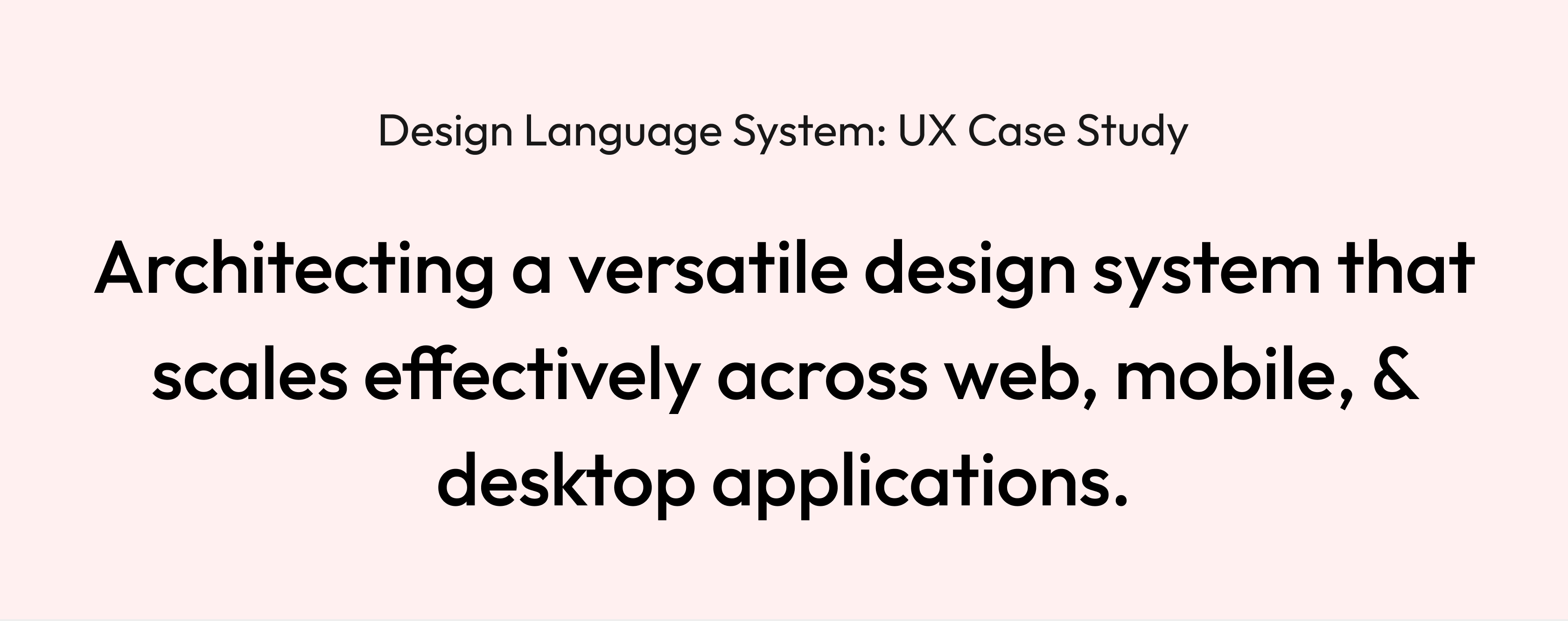
Design Language System: UX Case Study
Architecting a versatile design system that scales effectively across web, mobile, & desktop applications.
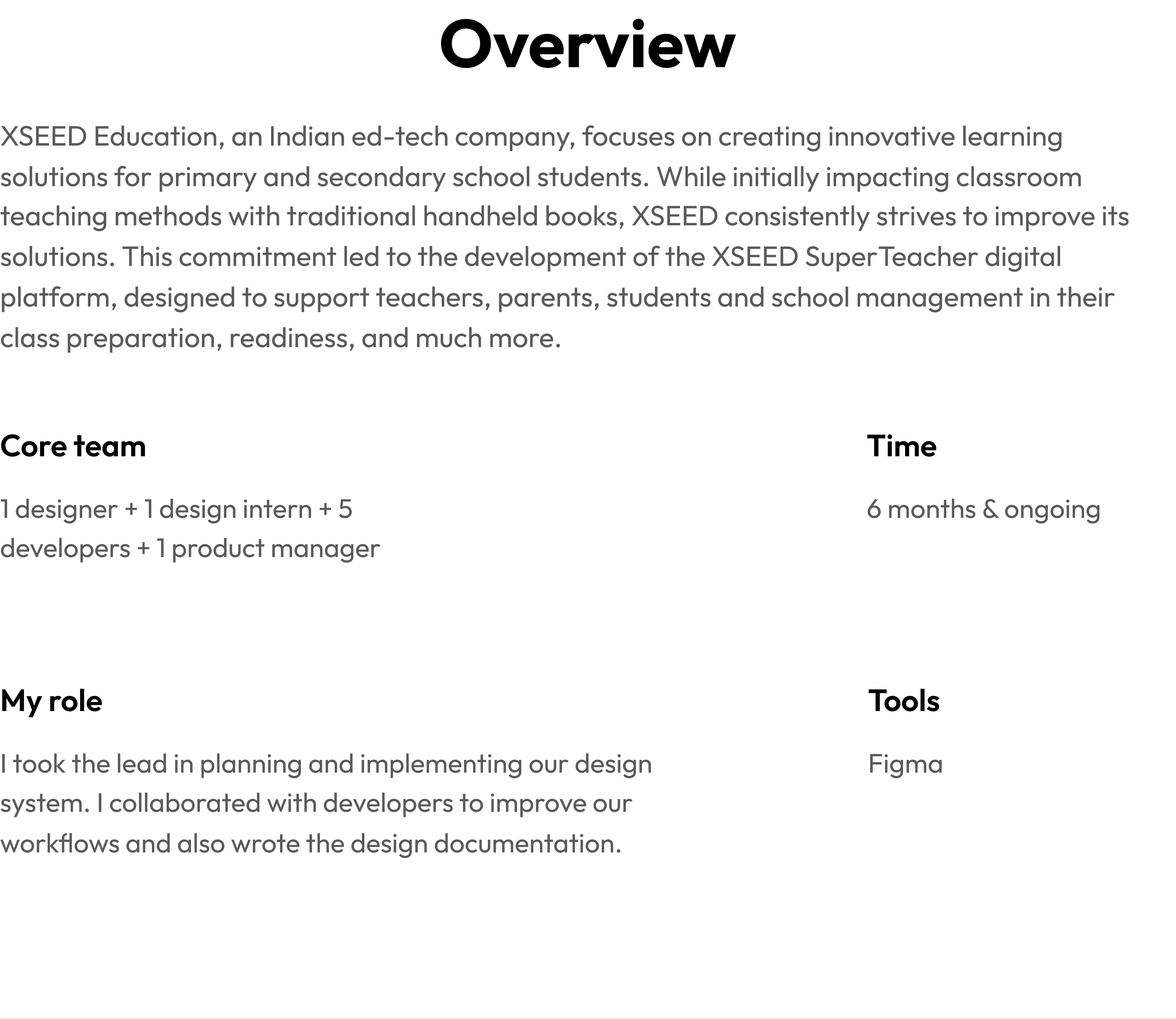
Overview
XSEED Education, an Indian ed-tech company, focuses on creating innovative learning solutions for primary and secondary school students. While initially impacting classroom teaching methods with traditional handheld books, XSEED consistently strives to improve its solutions. This commitment led to the development of the XSEED SuperTeacher digital platform, designed to support teachers, parents, students and school management in their class preparation, readiness, and much more.
Core team
1 designer + 1 design intern + 5 developers + 1 product manager
Time
6 months & ongoing
My role
I took the lead in planning and implementing our design system. I collaborated with developers to improve our workflows and also wrote the design documentation.
Tools
Figma
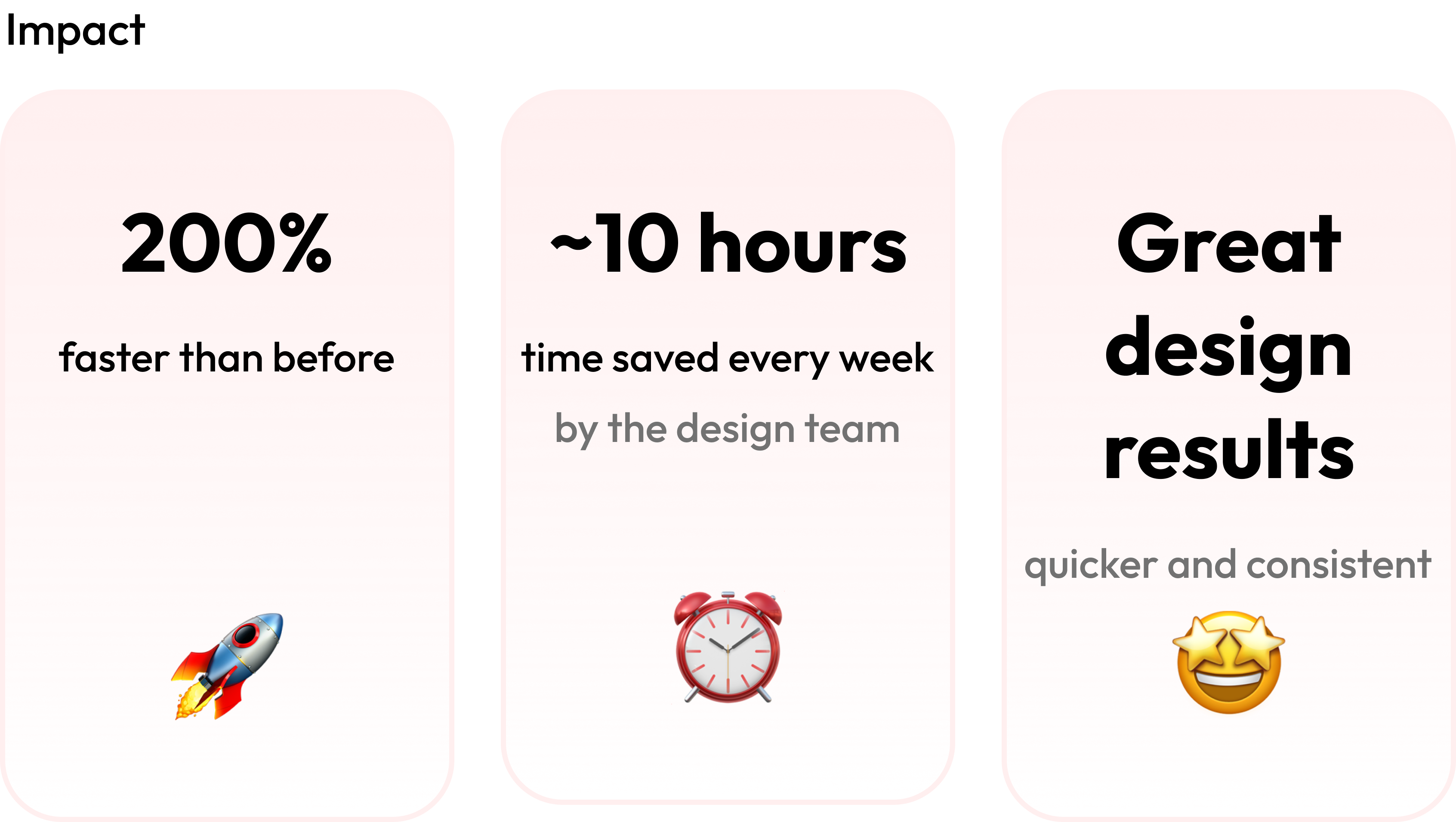
Impact
200%
faster than before
🚀
~10 hours
time saved every week
by the design team
⏰
Great design results
quicker and consistent
🤩
Working on a

application
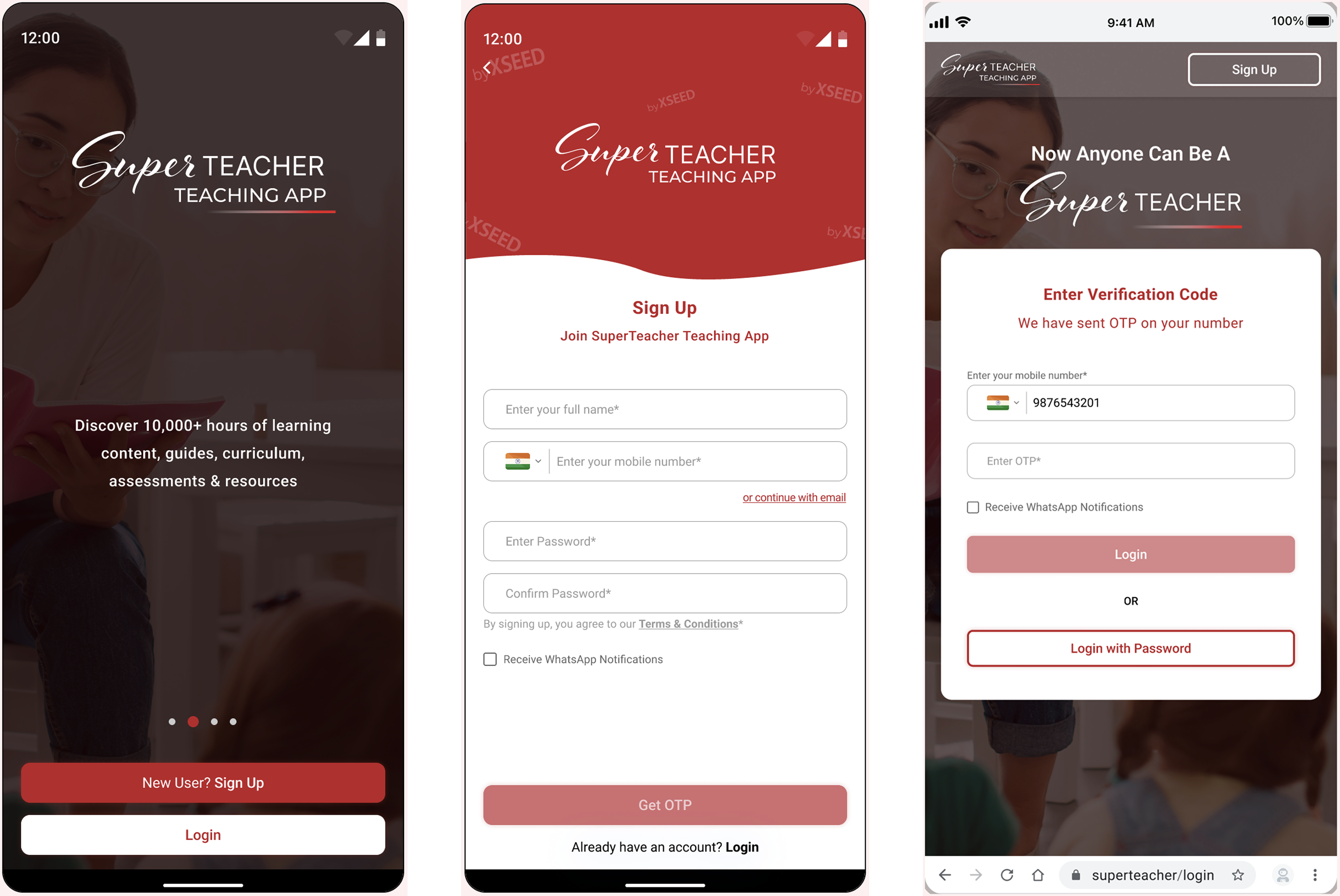
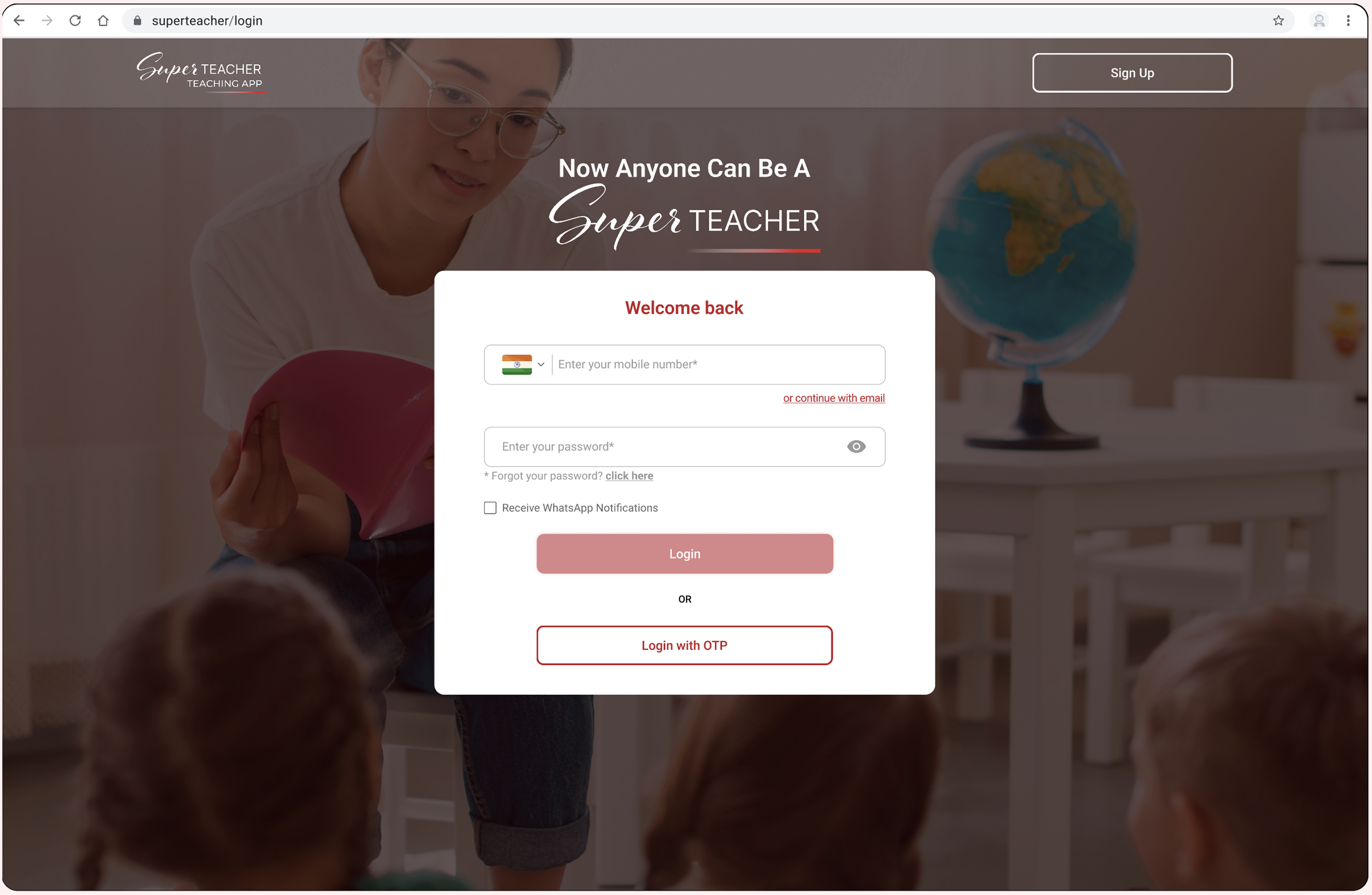
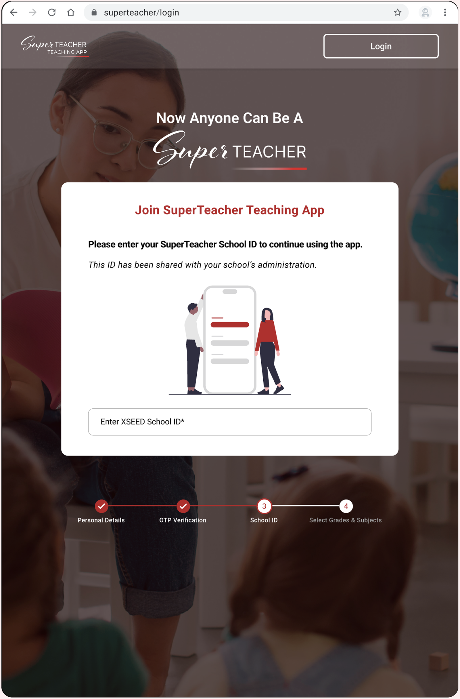
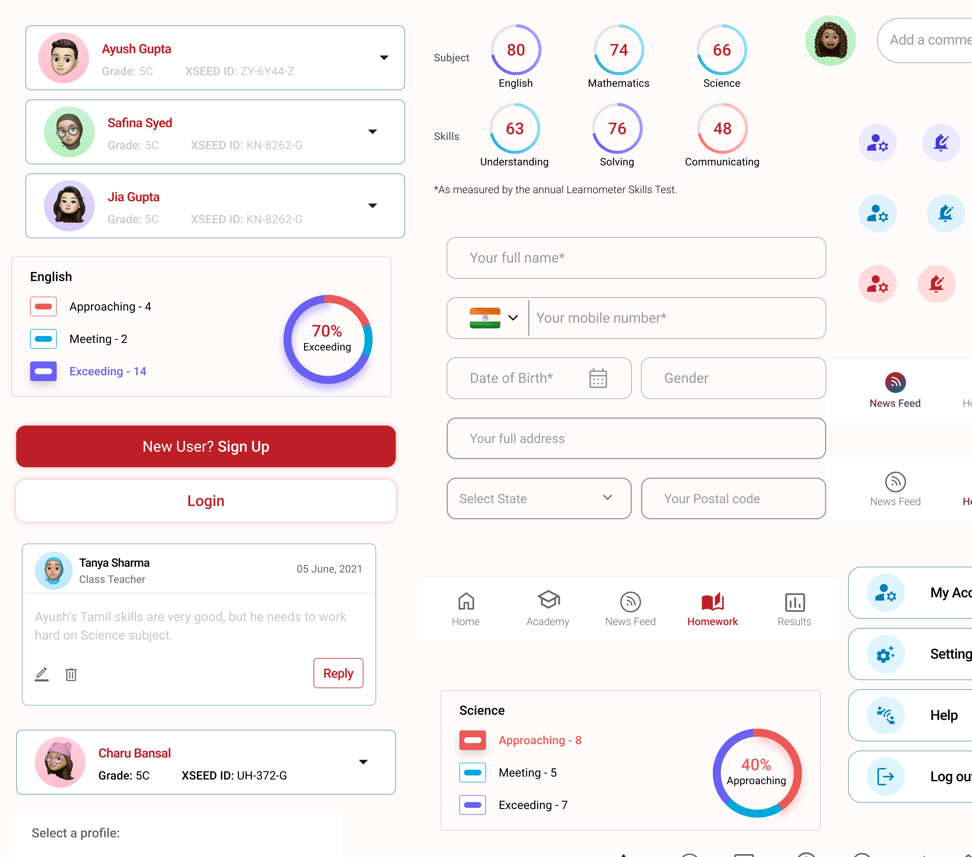
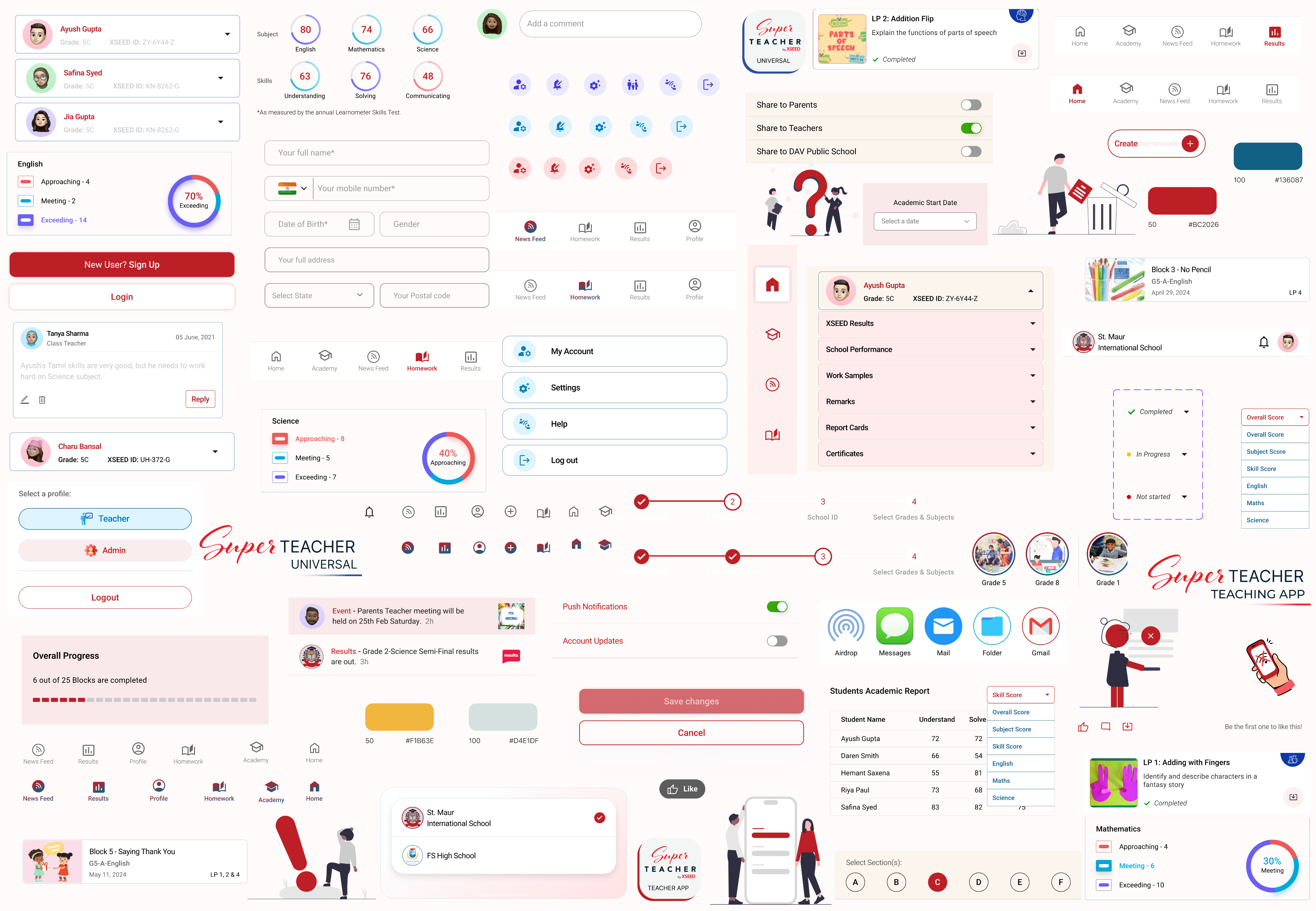
What is the superteacher product?
The SuperTeacher App gives Parents, Teachers & Schools everything needed for teaching the powerful K-8 school program in online classes or for face-to-face learning. It comes fully loaded with their micro-curriculum and lesson plans for students in pre-primary (from age 3+) to Grade 8. We designed the app for iOS, Android, Web, & Android TV.

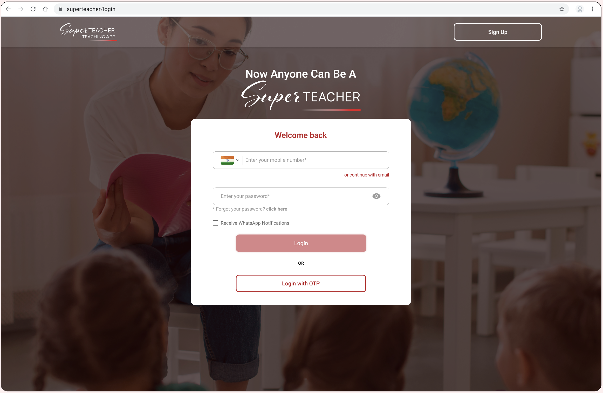
This is how our designs maintain a consistent and simple appearance across different devices and platforms, ensuring uniformity in components and branding throughout the user experience.
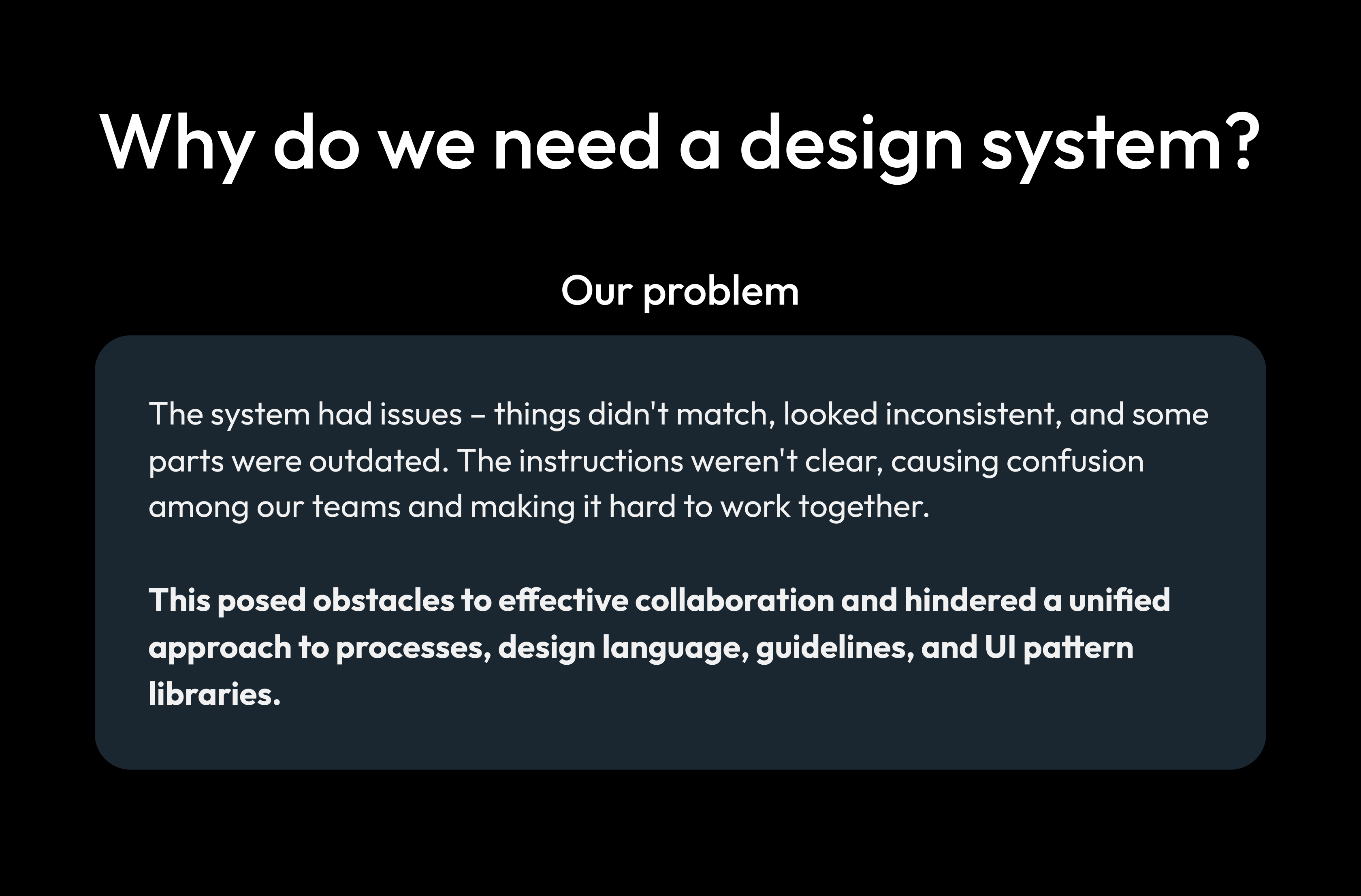
Why do we need a design system?
Our problem
The system had issues – things didn't match, looked inconsistent, and some parts were outdated. The instructions weren't clear, causing confusion among our teams and making it hard to work together.
This posed obstacles to effective collaboration and hindered a unified approach to processes, design language, guidelines, and UI pattern libraries.
The Challenges
Starting new projects meant building everything from the ground up, including new components each time. This resulted in redesigning the same elements repeatedly, with styles changing for different functions.
Big product, small team (working on the design system part-time)
With 2 designers and 11 developers, we handle the design roadmap for different platforms. Despite our commitment, implementing a full design system might take years. Our focus is on improving collaboration and efficiency as we work towards this goal.
Our approach: Take it step by step. Agree on a small, doable goal and test solutions before making them permanent.
Effectively launch, update and maintain design components across multiple platforms
This challenge demands a streamlined process for launching new components, refreshing existing ones, and maintaining consistency across diverse digital environments.
Our approach: Work closely together, listen to users to make sure our design elements look good and work well on different platforms. Keep things simple and flexible for ongoing improvements.
Maintain a high quality, consistent design language across mobile, web and TV
Over the years, inconsistencies between our platforms have grown. These make the code more complex and create usability problems for users.
Our approach: Create a single UI for each of our four devices (mobile, tablet, desktop and TV).
No design system = Disconnected user experience
The Research
Researching other design systems and interfaces for components common practices and inspiration.
Industry Insights
Exploring how design systems are implemented across various industries to understand diverse approaches and potential adaptations.
Methodologies in Practice
Analyzing the methodologies employed by successful companies in building their design systems, including the processes from ideation to implementation.
Component Breakdown
Examining the specific components and elements integrated into design systems, learning from real-world examples for a practical understanding.
Tailoring to Company Needs
Extracting insights on how successful design systems are adapted to meet the unique requirements and objectives of individual companies, ensuring relevance to our organizational goals.
User Experience Impact
Exploring how the implementation of design systems has positively impacted user experiences in other organizations, with a focus on enhancing usability and satisfaction.
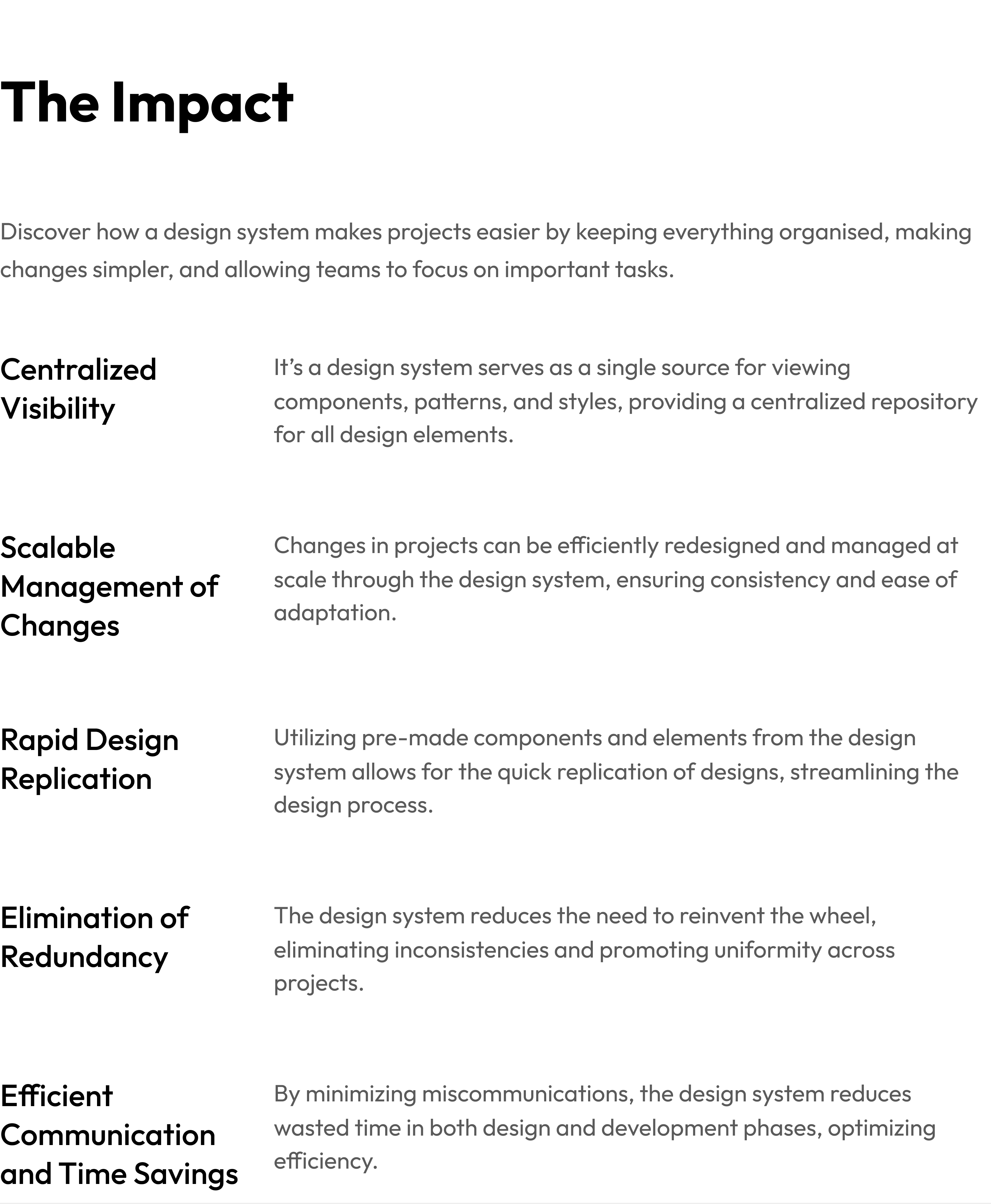
The Impact
Discover how a design system makes projects easier by keeping everything organised, making changes simpler, and allowing teams to focus on important tasks.
Centralized Visibility
It’s a design system serves as a single source for viewing components, patterns, and styles, providing a centralized repository for all design elements.
Scalable Management of Changes
Changes in projects can be efficiently redesigned and managed at scale through the design system, ensuring consistency and ease of adaptation.
Rapid Design Replication
Utilizing pre-made components and elements from the design system allows for the quick replication of designs, streamlining the design process.
Elimination of Redundancy
The design system reduces the need to reinvent the wheel, eliminating inconsistencies and promoting uniformity across projects.
Efficient Communication and Time Savings
By minimizing miscommunications, the design system reduces wasted time in both design and development phases, optimizing efficiency.
Comprehensive design system
for

applications
Discover all the essentials to craft a clean, consistent, and user-friendly app or website for SuperTeacher.
Colour Palette
Our colour system is like a handpicked set of colours. These colours show both strength and softness. They help you decide how your digital space looks, making it easy to emphasize and share what you're good at.
Each colour listed here has been carefully tested in real designs. We've looked at how they look and made sure they are accessible to everyone. This process helps us choose colours that not only look good but also work well in various designs.
Brand gradient
Primary palette
Secondary palette
Supporting palette
Neutrals palette
Some basic principles of colour
Do not pair multiple colours
Feel free to choose colours from either the primary or secondary palette. However, avoid pairing colours that are completely opposite, as this may create an incorrect and jarring aesthetic experience.
Main Heading
Sub - Heading
Resume
Overall Progress
6 out of 25 Tasks are completed

Main Heading
Sub - Heading
Resume
Overall Progress
6 out of 25 Tasks are completed

Do not reduce contrast ratio
WCAG 2.0 level AA requires a contrast ratio of at least 4.5:1 for normal text and 3:1 for large text.
Select a profile:
Black on gray
Gray on white
Select a profile:
Profile 1
Profile 2
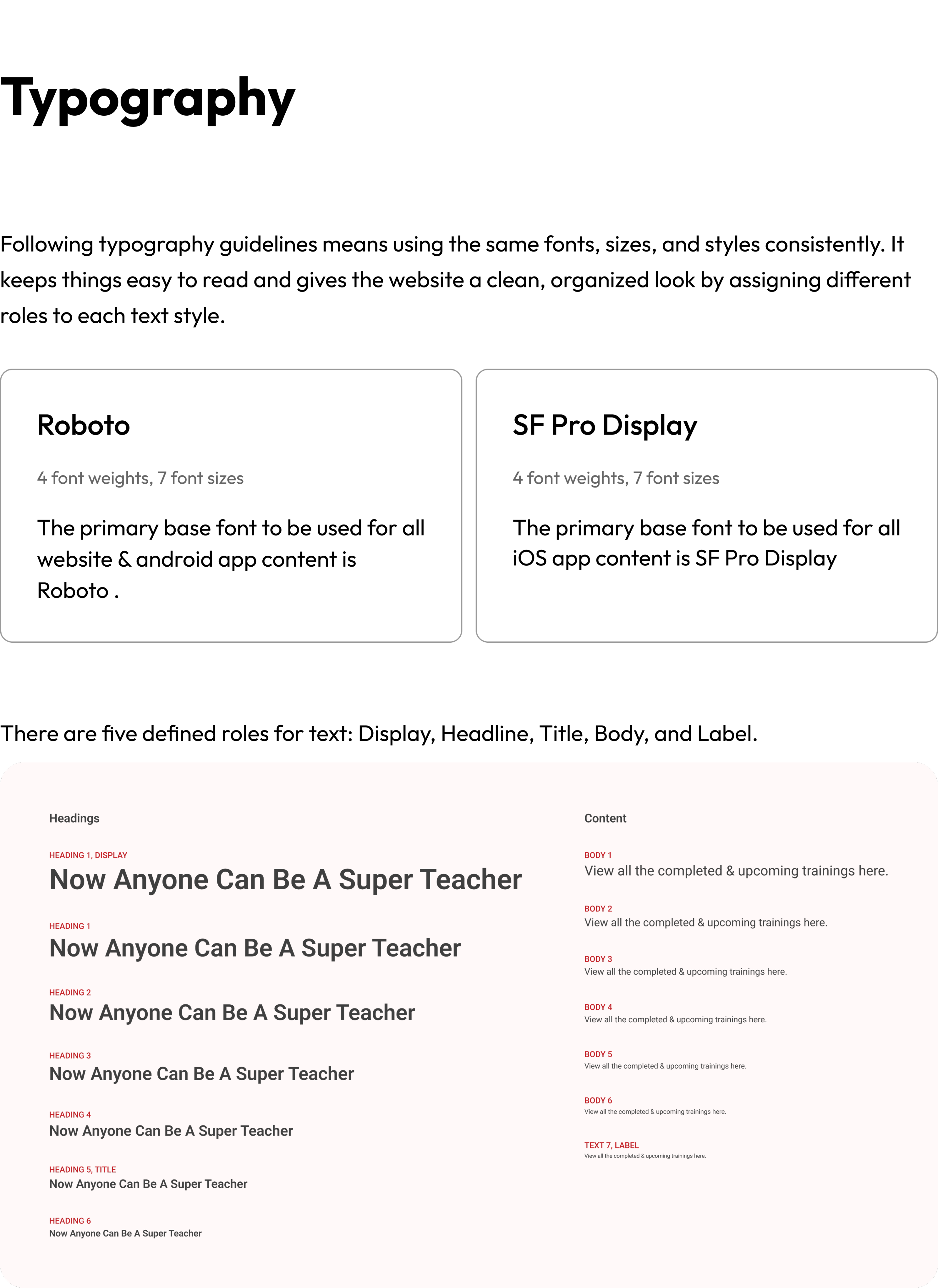
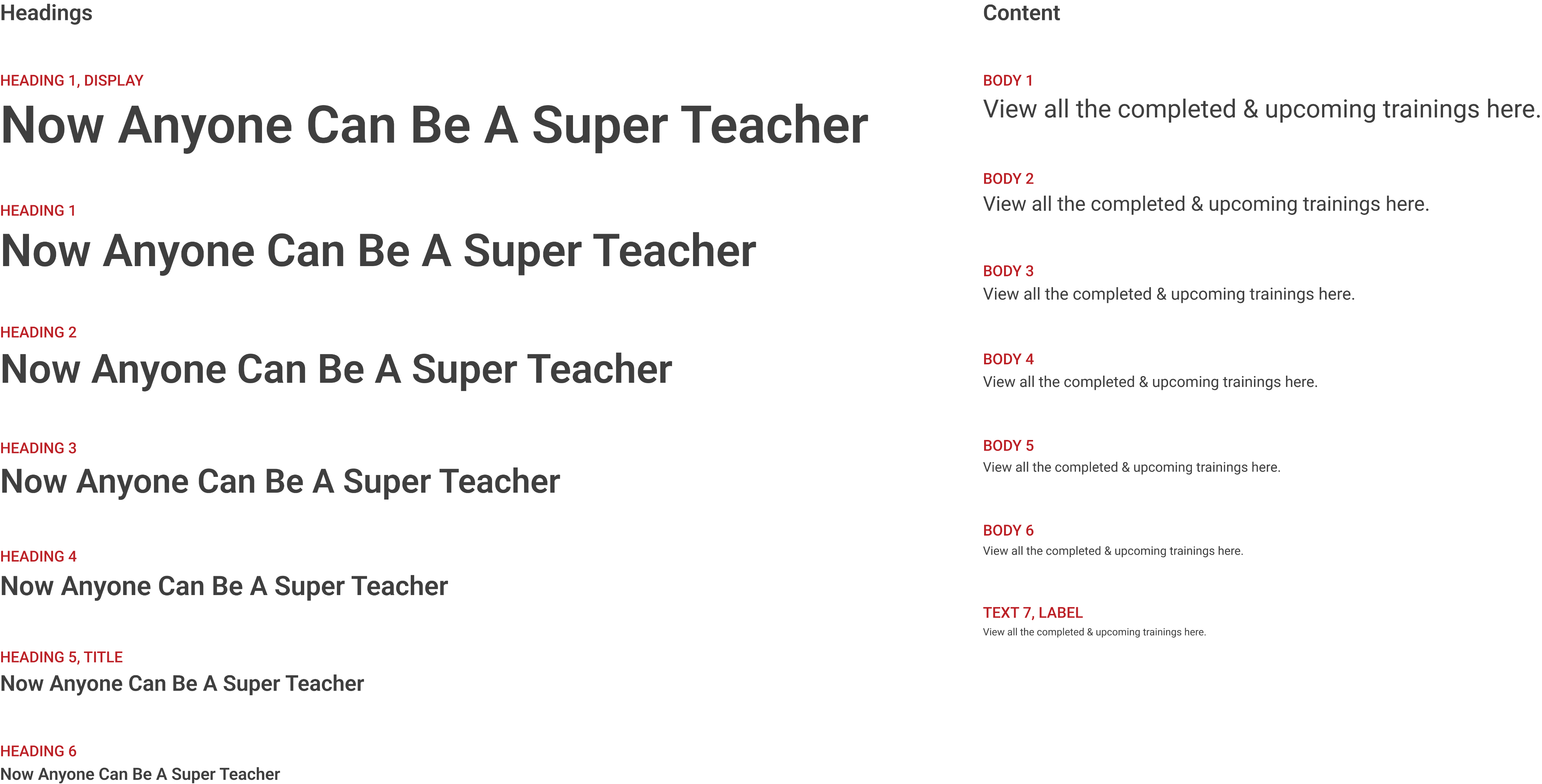
Typography
Following typography guidelines means using the same fonts, sizes, and styles consistently. It keeps things easy to read and gives the website a clean, organized look by assigning different roles to each text style.
Roboto
4 font weights, 7 font sizes
The primary base font to be used for all website & android app content is Roboto .
SF Pro Display
4 font weights, 7 font sizes
The primary base font to be used for all iOS app content is SF Pro Display
There are five defined roles for text: Display, Headline, Title, Body, and Label.
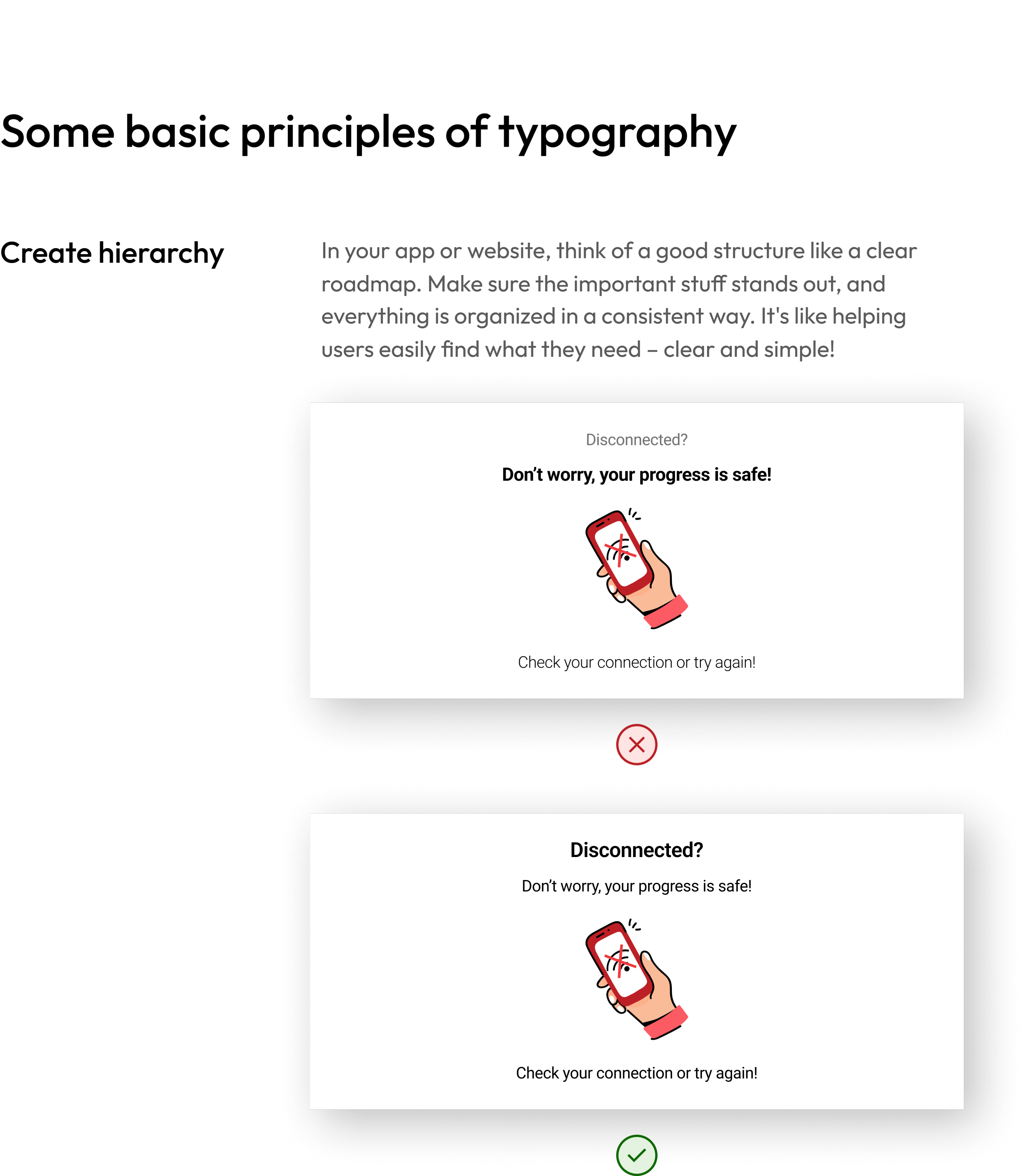
Some basic principles of typography
Create hierarchy
In your app or website, think of a good structure like a clear roadmap. Make sure the important stuff stands out, and everything is organized in a consistent way. It's like helping users easily find what they need – clear and simple!
Disconnected?
Don’t worry, your progress is safe!

Check your connection or try again!
Disconnected?
Don’t worry, your progress is safe!
Check your connection or try again!
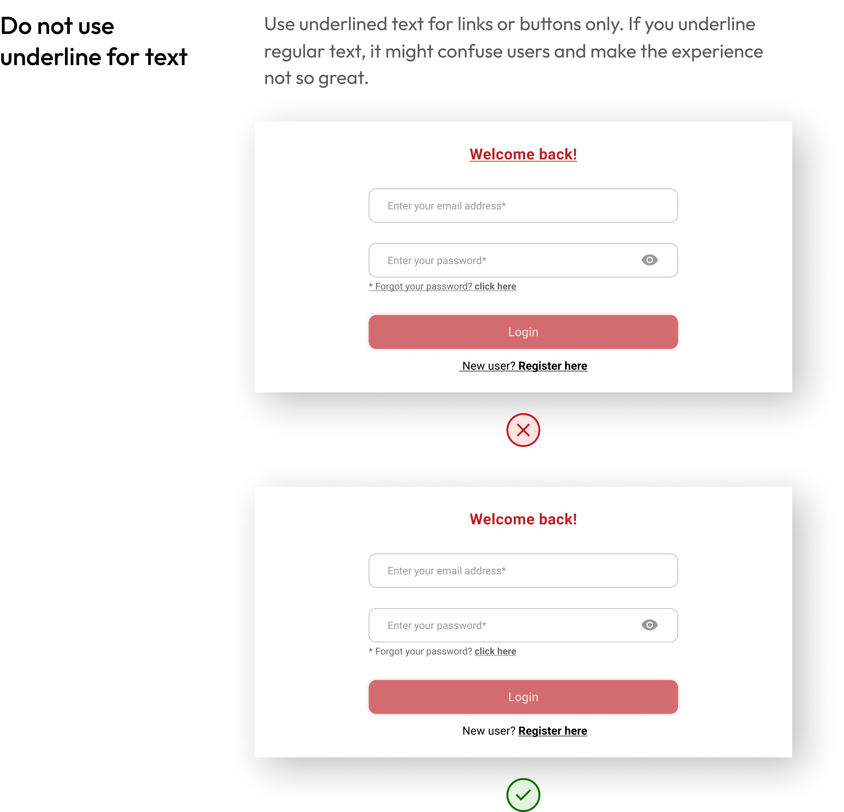
Do not use underline for text
Use underlined text for links or buttons only. If you underline regular text, it might confuse users and make the experience not so great.
Welcome back!
Enter your email address*
Enter your password*

* Forgot your password? click here
Login
New user? Register here
Welcome back!
Enter your email address*
Enter your password*
* Forgot your password? click here
Login
New user? Register here
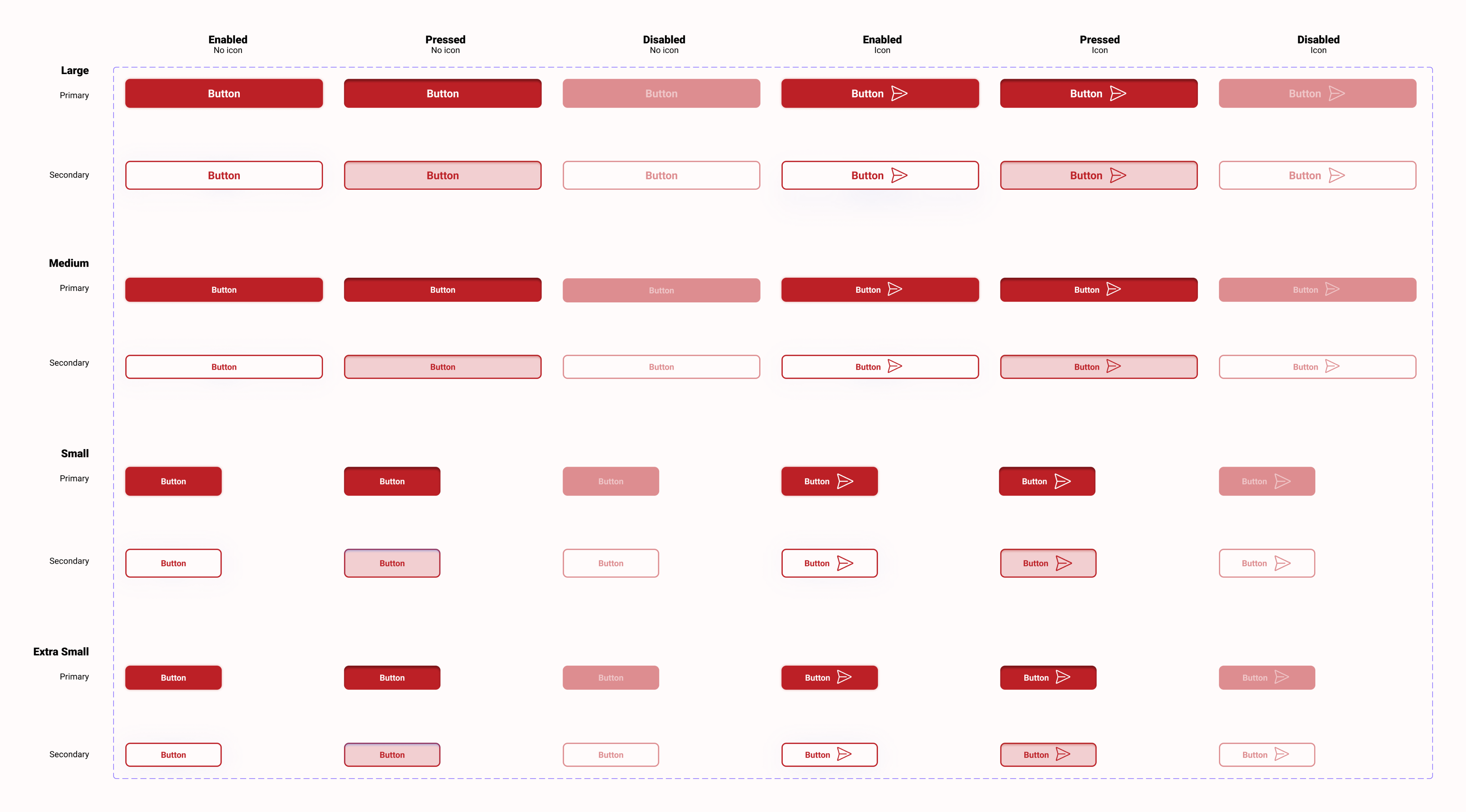
Actions and input
Buttons in both websites and mobile apps act like magic doors – tap or click them, and things happen! They're essential for helping you smoothly navigate and get things done. By sticking to some guidelines, we make sure these buttons work seamlessly, whether you're on a website or using a mobile app.
Input fields are interface elements that enable users to provide specific types of information, such as text, numbers, dates, or files, facilitating user interaction and data entry in a user-friendly manner.
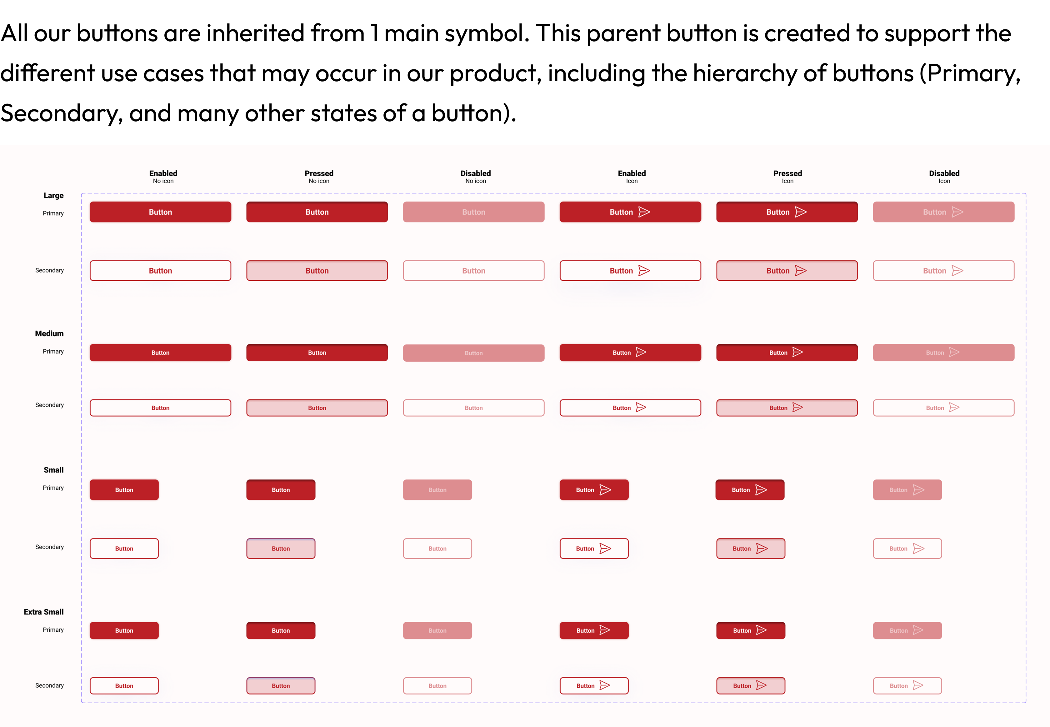
All our buttons are inherited from 1 main symbol. This parent button is created to support the different use cases that may occur in our product, including the hierarchy of buttons (Primary, Secondary, and many other states of a button).
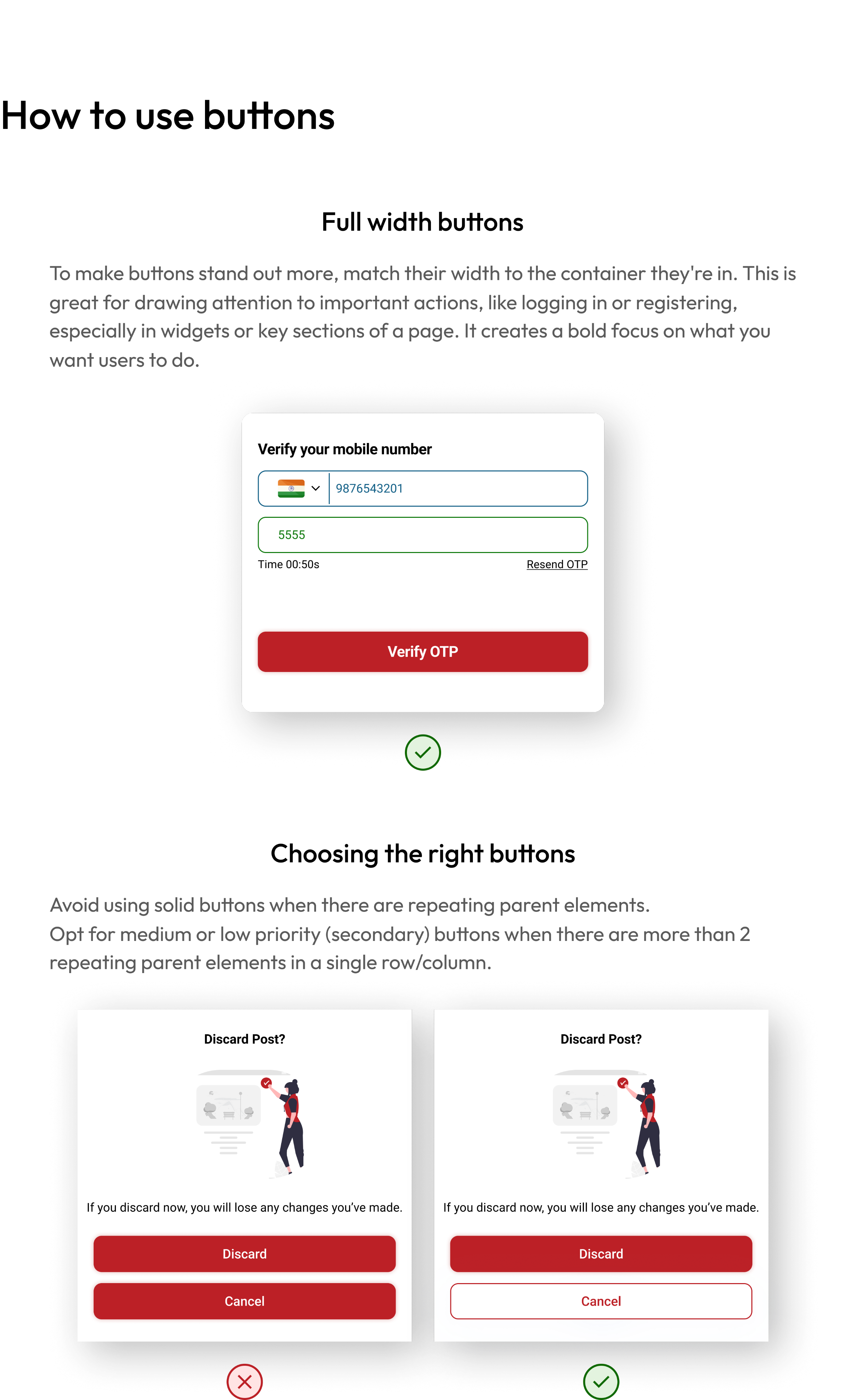
How to use buttons
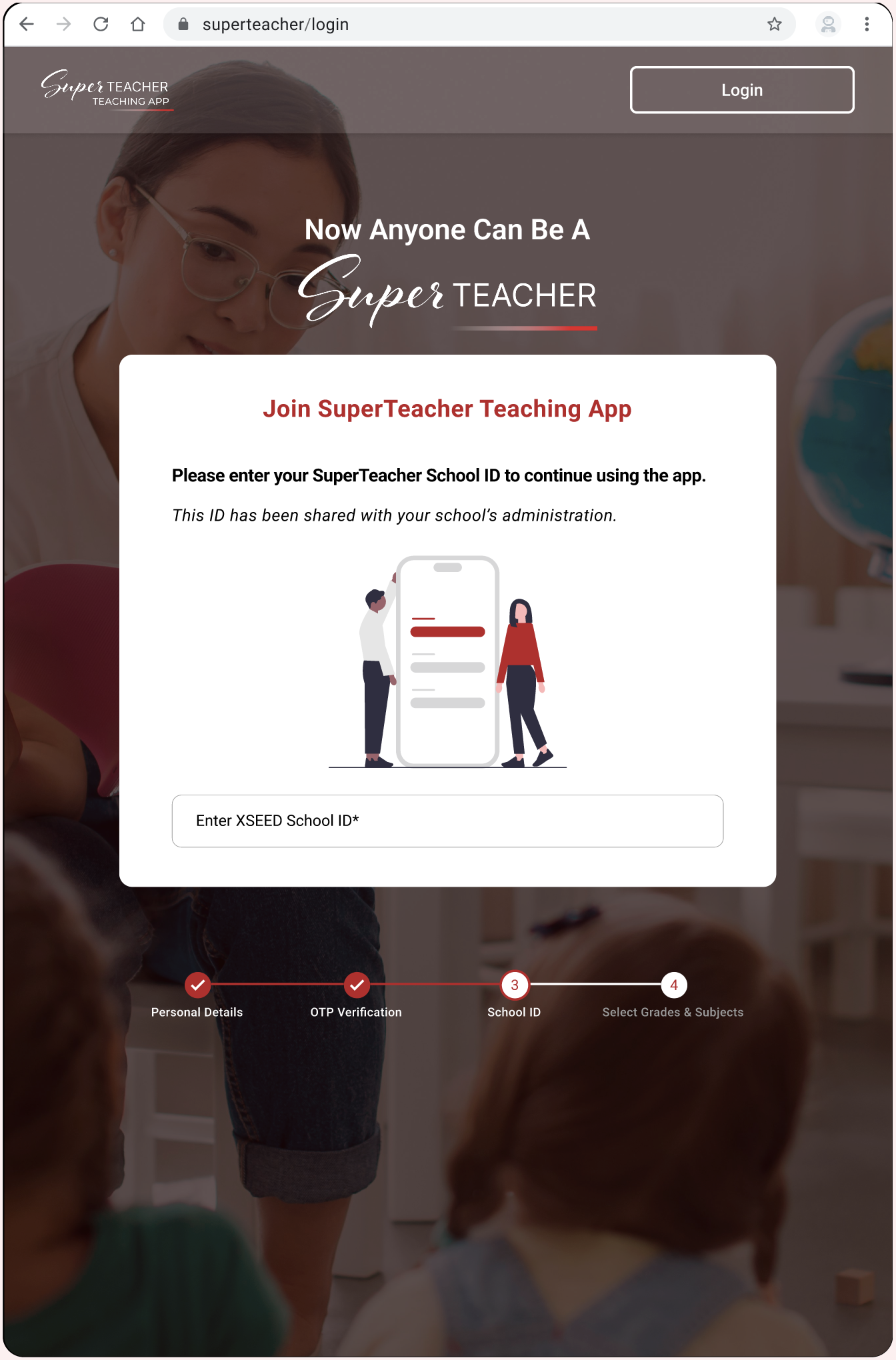
Full width buttons
To make buttons stand out more, match their width to the container they're in. This is great for drawing attention to important actions, like logging in or registering, especially in widgets or key sections of a page. It creates a bold focus on what you want users to do.
Verify your mobile number
9876543201
5555
Time 00:50s
Resend OTP
Verify OTP
Choosing the right buttons
Avoid using solid buttons when there are repeating parent elements.
Opt for medium or low priority (secondary) buttons when there are more than 2 repeating parent elements in a single row/column.
Discard Post?

If you discard now, you will lose any changes you’ve made.
Discard
Cancel
Discard Post?
If you discard now, you will lose any changes you’ve made.
Discard
Cancel
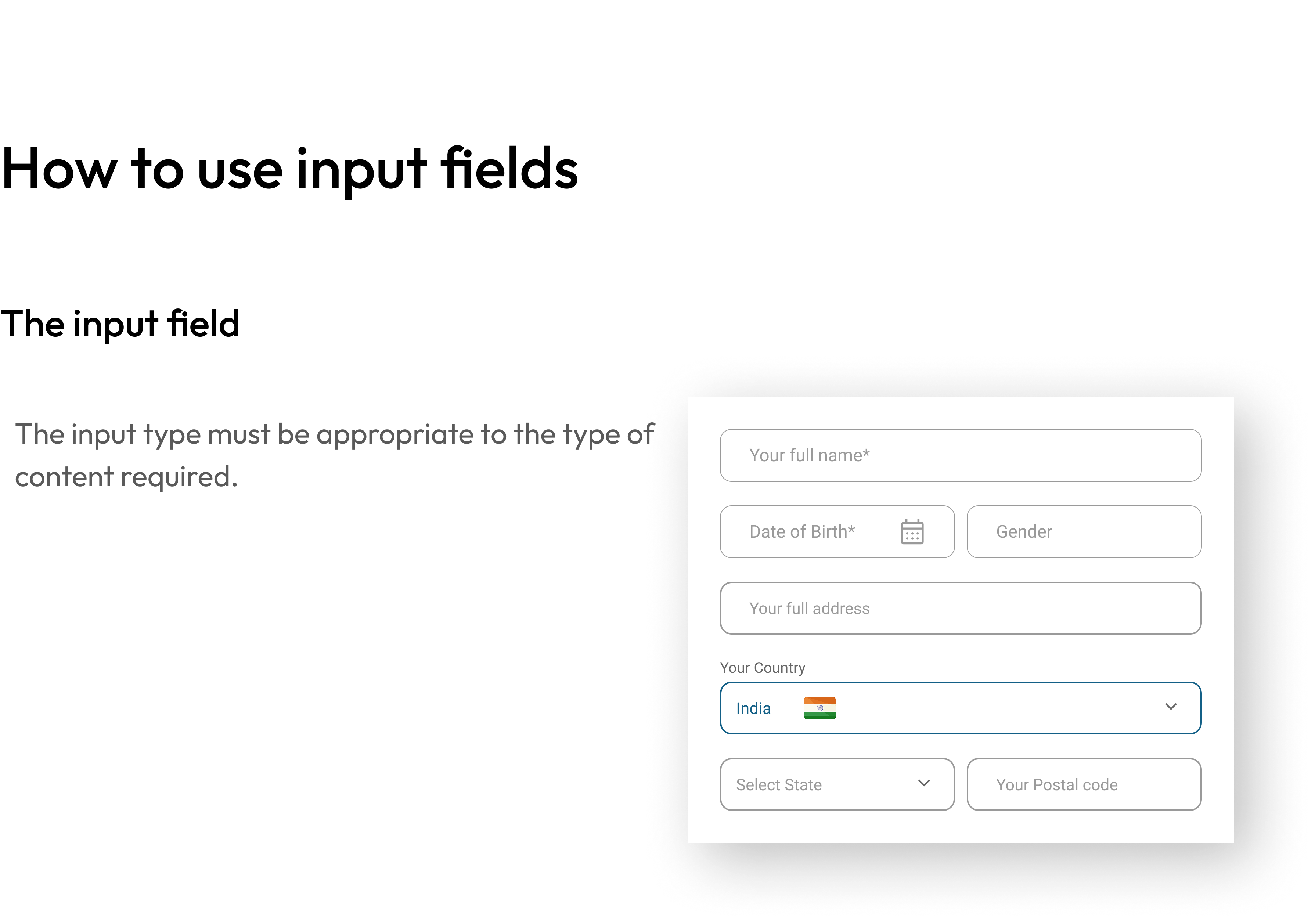
How to use input fields
The input field
The input type must be appropriate to the type of content required.
Your full name*
Date of Birth*

Gender
Your full address
Your Country
India


Select State
Your Postal code
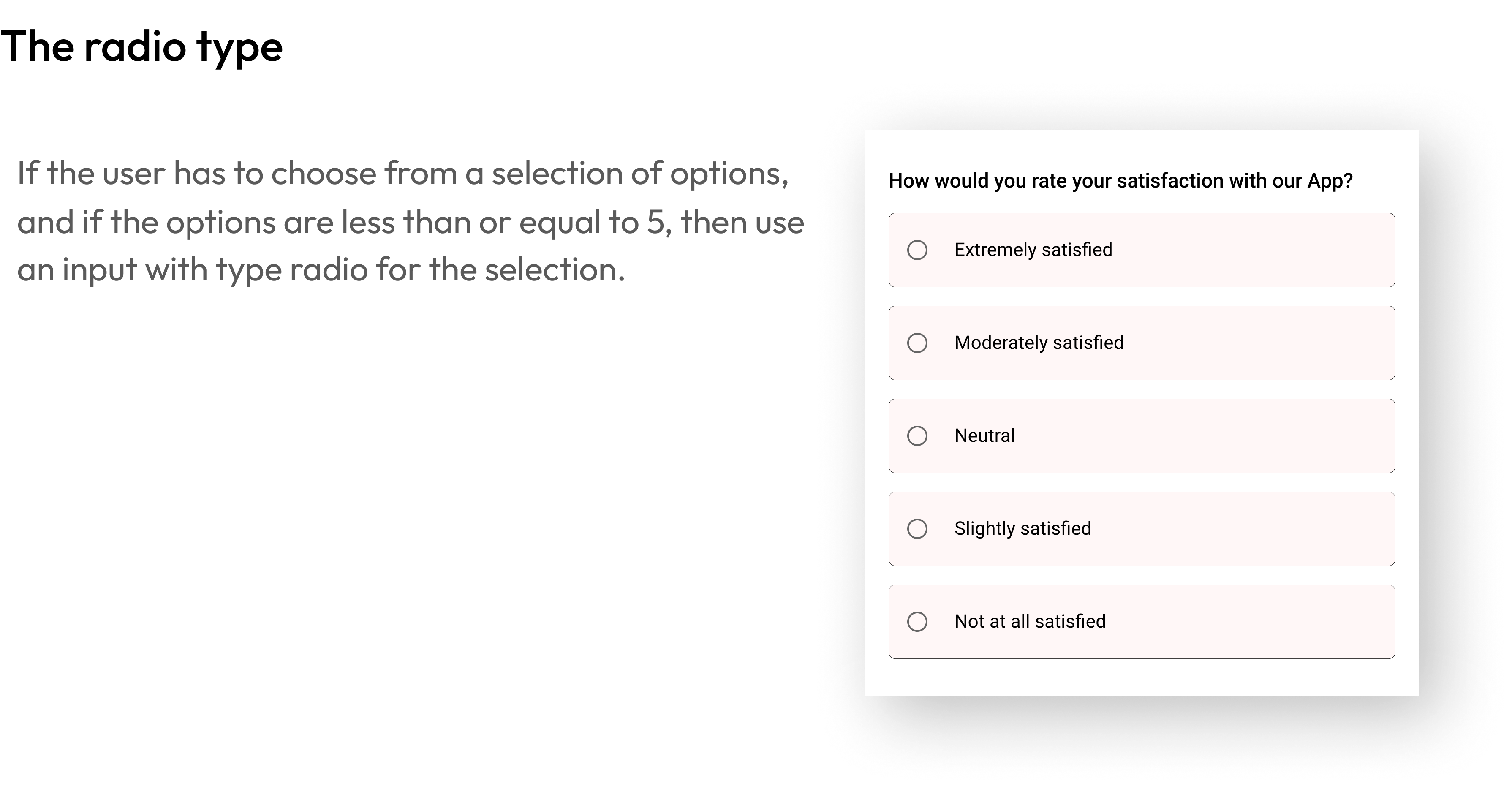
The radio type
If the user has to choose from a selection of options, and if the options are less than or equal to 5, then use an input with type radio for the selection.
How would you rate your satisfaction with our App?
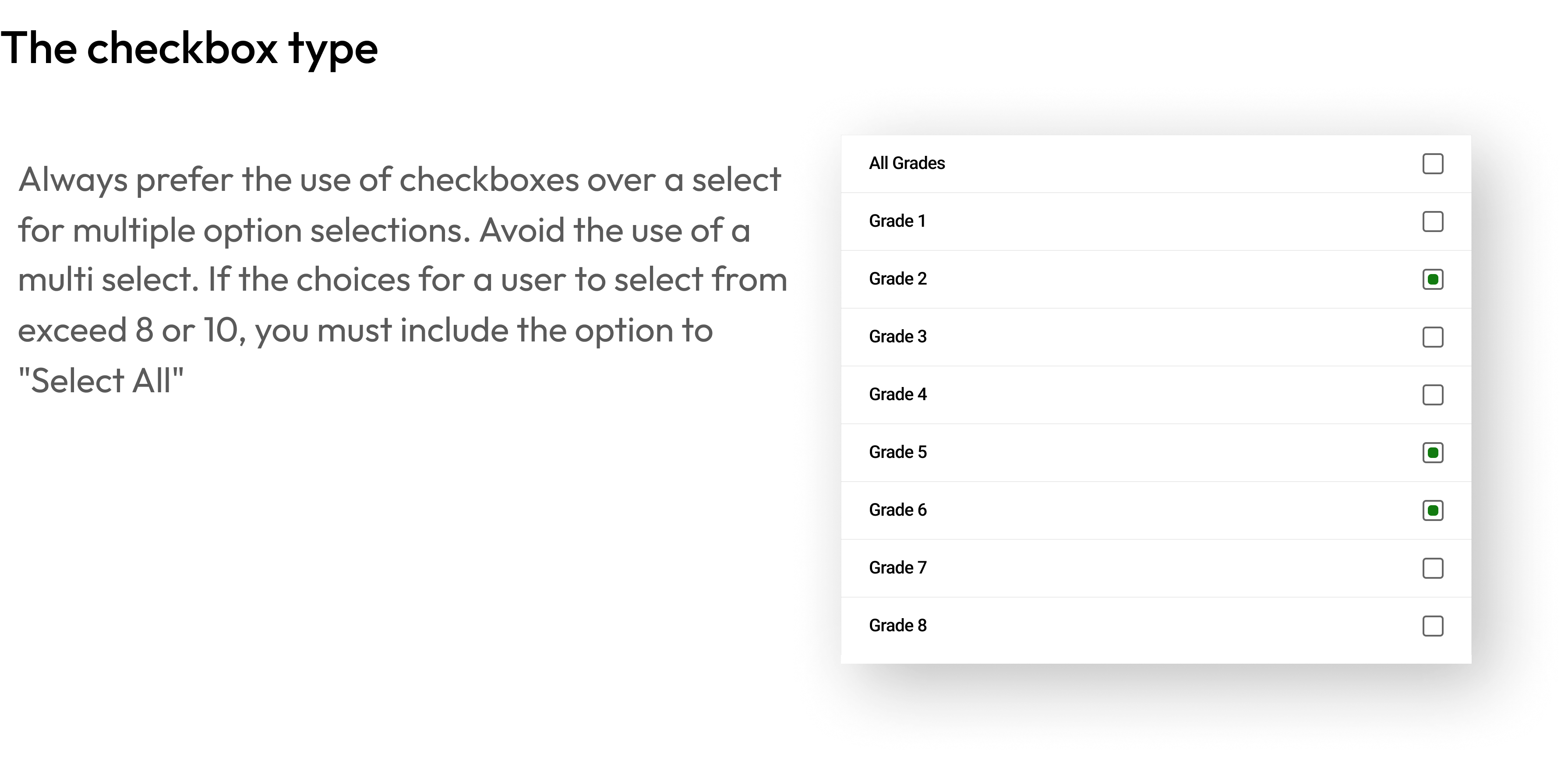
The checkbox type
Always prefer the use of checkboxes over a select for multiple option selections. Avoid the use of a multi select. If the choices for a user to select from exceed 8 or 10, you must include the option to "Select All"
All Grades
Grade 1
Grade 2
Grade 3
Grade 4
Grade 5
Grade 6
Grade 7
Grade 8
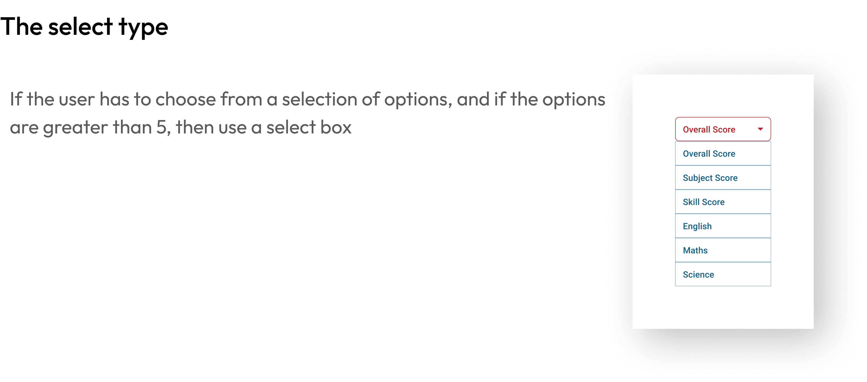
The select type
If the user has to choose from a selection of options, and if the options are greater than 5, then use a select box
Overall Score

Overall Score
Subject Score
Skill Score
English
Maths
Science
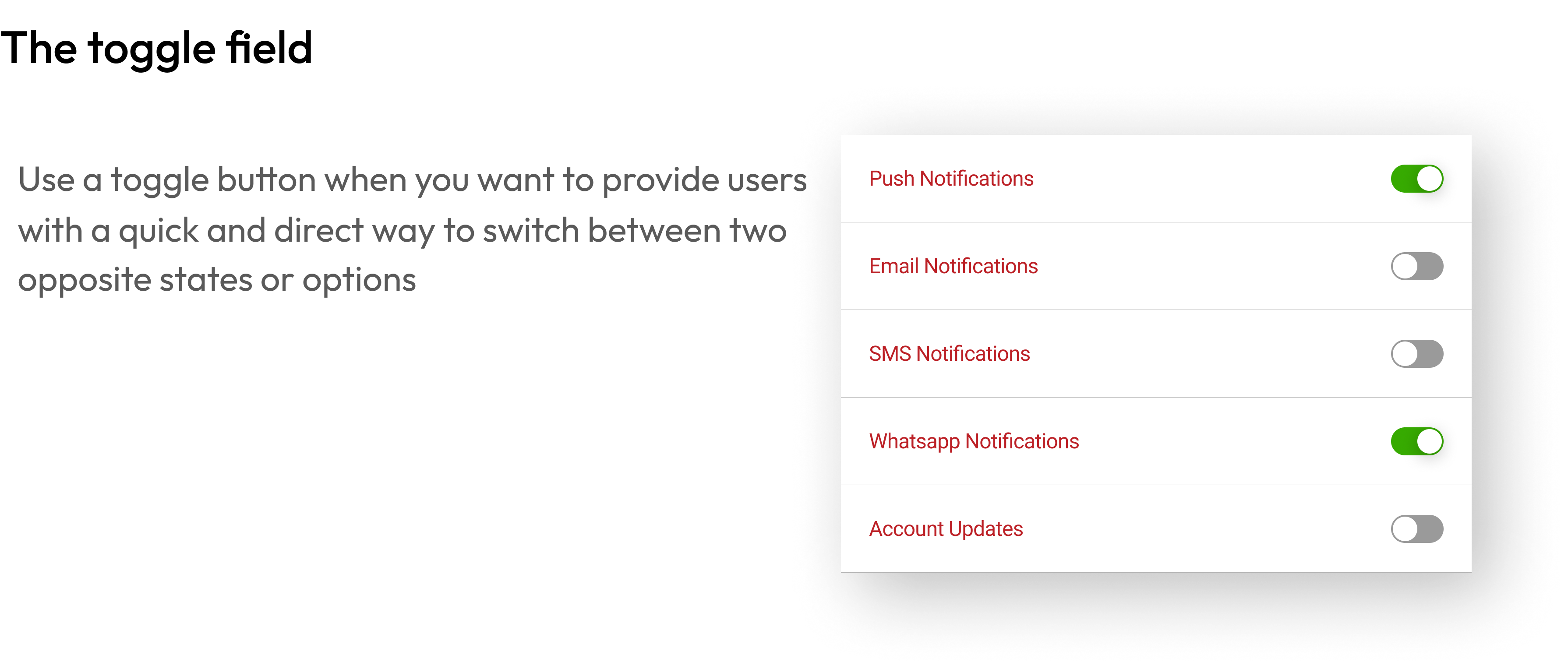
The toggle field
Use a toggle button when you want to provide users with a quick and direct way to switch between two opposite states or options
Push Notifications
Email Notifications
SMS Notifications

Whatsapp Notifications

Account Updates
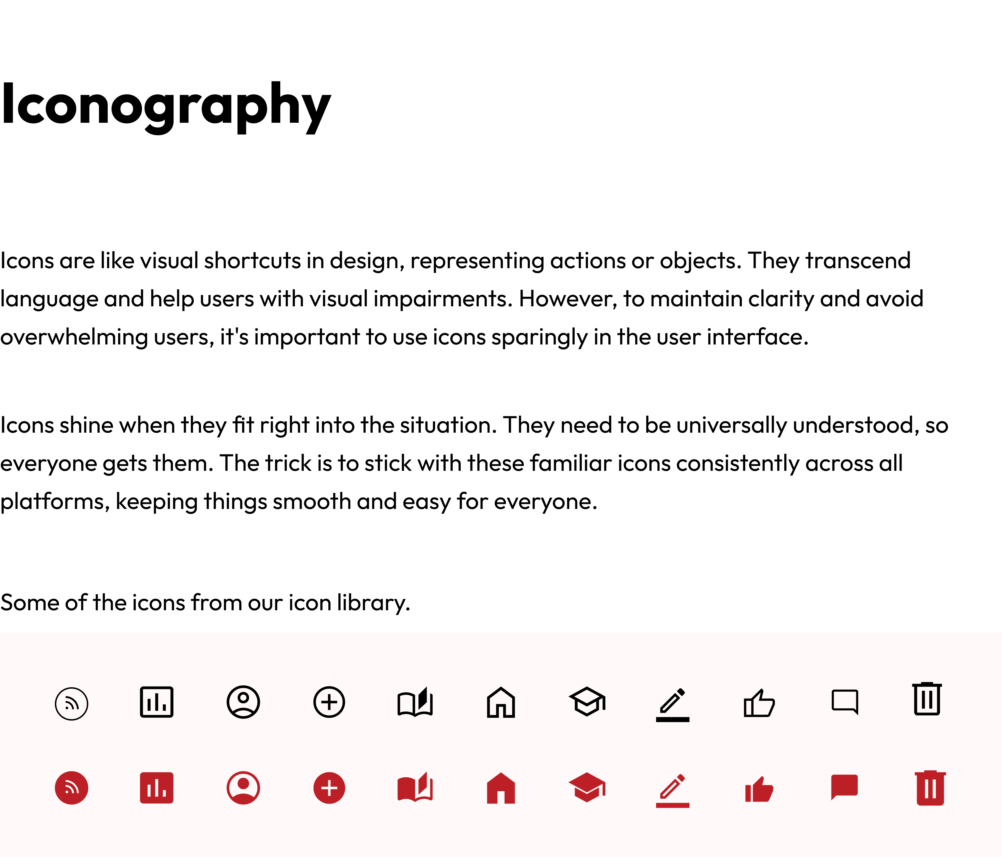
Iconography
Icons are like visual shortcuts in design, representing actions or objects. They transcend language and help users with visual impairments. However, to maintain clarity and avoid overwhelming users, it's important to use icons sparingly in the user interface.
Icons shine when they fit right into the situation. They need to be universally understood, so everyone gets them. The trick is to stick with these familiar icons consistently across all platforms, keeping things smooth and easy for everyone.
Some of the icons from our icon library.


Layout
Layouts form the fundamental structure of our UI design, acting as the blueprint that guides the placement and organization of visual elements on a screen.
We've chosen Tailwind as our go-to tool for making our website look great, and here's why:
- Easy to Make Styles: Tailwind helps us create styles that we can reuse easily, keeping things organized and saving time.
- Works Well with Different Tech: Whether it's our main PHP code or React parts of our website, Tailwind fits right in. This means our styles stay consistent no matter what tech we're using.
- Make it Look Just Right for Us: Tailwind is like a tool that lets us change and adjust our styles to match our brand, making our website look and feel just like us.
- Helps Teams Work Together: Tailwind makes it easy for our design and tech teams to understand each other, like they speak the same language, making it smoother for everyone to work together.
- Responsive Designs: Tailwind supports creating designs that look good on different devices and screen sizes. So, whether someone is on a big computer or a small phone, our website still looks awesome.
- Mobile-First Approach: With Tailwind, we follow a mobile-first approach, meaning we design our website first for mobile devices and then adapt it for larger screens. This ensures a great experience for users on all devices.
- Keeps Things in Line: We set up Tailwind using our design system rules, making sure everyone follows the same design principles across different parts of our website. This keeps everything looking neat and consistent.
So, by choosing Tailwind, we're not only making a good-looking and consistent website but also ensuring it works well on different devices with a mobile-first approach.
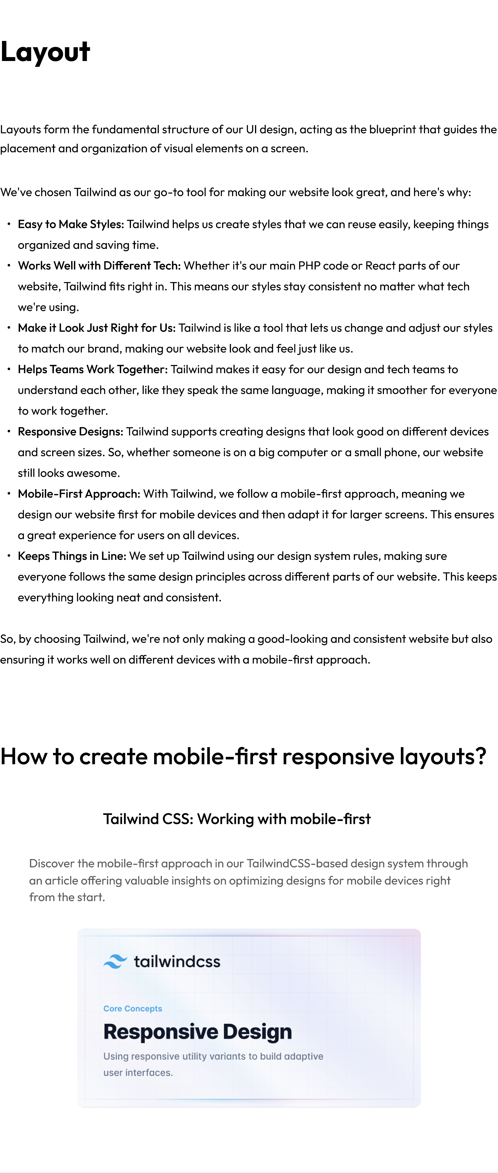
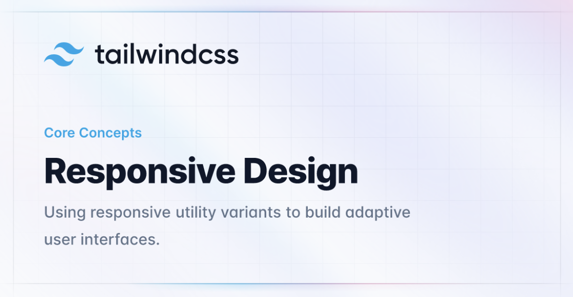
How to create mobile-first responsive layouts?
Tailwind CSS: Working with mobile-first
Discover the mobile-first approach in our TailwindCSS-based design system through an article offering valuable insights on optimizing designs for mobile devices right from the start.
The Future
The future of a design language system should focus on always getting better, being able to change easily, and working together well. It should aim to be a flexible tool that not only helps with making designs that look the same and work well but also grows and handles more complicated things. Important things to think about are:
- Always Getting Better: Keep improving and changing for the better.
- Flexibility: Be able to adapt and change easily.
- Working Together Well: Encourage everyone to work together smoothly.
- Helpful Tool: Be a useful resource for making designs look good and work efficiently.
- Handling Growth and Complexity: Be able to grow and handle more complicated design needs.
Built with:

Design Language System: UX Case Study
Architecting a versatile design system that scales effectively across web, mobile, & desktop applications.
Overview
XSEED Education, an Indian ed-tech company, focuses on creating innovative learning solutions for primary and secondary school students. While initially impacting classroom teaching methods with traditional handheld books, XSEED consistently strives to improve its solutions. This commitment led to the development of the XSEED SuperTeacher digital platform, designed to support teachers, parents, students and school management in their class preparation, readiness, and much more.
Core team
1 designer + 1 design intern + 5 developers + 1 product manager
Time
6 months & ongoing
My role
I took the lead in planning and implementing our design system. I collaborated with developers to improve our workflows and also wrote the design documentation.
Tools
Figma
Impact
200%
faster than before
🚀
~10 hours
time saved every week
by the design team
⏰
Great design results
quicker and consistent
🤩
Context

working on a

application
What is the superteacher product?
The SuperTeacher App gives Parents, Teachers & Schools everything needed for teaching the powerful K-8 school program in online classes or for face-to-face learning. It comes fully loaded with their micro-curriculum and lesson plans for students in pre-primary (from age 3+) to Grade 8. We designed the app for iOS, Android, Web, & Android TV.

This is how our designs maintain a consistent and simple appearance across different devices and platforms, ensuring uniformity in components and branding throughout the user experience.
Why do we need a design system?
Our problem
The system had issues – things didn't match, looked inconsistent, and some parts were outdated. The instructions weren't clear, causing confusion among our teams and making it hard to work together.
This posed obstacles to effective collaboration and hindered a unified approach to processes, design language, guidelines, and UI pattern libraries.
The Challenges
Starting new projects meant building everything from the ground up, including new components each time. This resulted in redesigning the same elements repeatedly, with styles changing for different functions.
Big product, small team (working on the design system part-time)
With 2 designers and 11 developers, we handle the design roadmap for different platforms. Despite our commitment, implementing a full design system might take years. Our focus is on improving collaboration and efficiency as we work towards this goal.
Our approach: Take it step by step. Agree on a small, doable goal and test solutions before making them permanent.
Effectively launch, update and maintain design components across multiple platforms
This challenge demands a streamlined process for launching new components, refreshing existing ones, and maintaining consistency across diverse digital environments.
Our approach: Work closely together, listen to users to make sure our design elements look good and work well on different platforms. Keep things simple and flexible for ongoing improvements.
Maintain a high quality, consistent design language across mobile, web and TV
Over the years, inconsistencies between our platforms have grown. These make the code more complex and create usability problems for users.
Our approach: Create a single UI for each of our four devices (mobile, tablet, desktop and TV).
No design system = Disconnected user experience
The Research
Researching other design systems and interfaces for components common practices and inspiration.
Industry Insights
Exploring how design systems are implemented across various industries to understand diverse approaches and potential adaptations.
Methodologies in Practice
Analyzing the methodologies employed by successful companies in building their design systems, including the processes from ideation to implementation.
Component Breakdown
Examining the specific components and elements integrated into design systems, learning from real-world examples for a practical understanding.
Tailoring to Company Needs
Extracting insights on how successful design systems are adapted to meet the unique requirements and objectives of individual companies, ensuring relevance to our organizational goals.
User Experience Impact
Exploring how the implementation of design systems has positively impacted user experiences in other organizations, with a focus on enhancing usability and satisfaction.
The Impact
Discover how a design system makes projects easier by keeping everything organised, making changes simpler, and allowing teams to focus on important tasks.
Centralized Visibility
It’s a design system serves as a single source for viewing components, patterns, and styles, providing a centralized repository for all design elements.
Scalable Management of Changes
Changes in projects can be efficiently redesigned and managed at scale through the design system, ensuring consistency and ease of adaptation.
Rapid Design Replication
Utilizing pre-made components and elements from the design system allows for the quick replication of designs, streamlining the design process.
Elimination of Redundancy
The design system reduces the need to reinvent the wheel, eliminating inconsistencies and promoting uniformity across projects.
Efficient Communication and Time Savings
By minimizing miscommunications, the design system reduces wasted time in both design and development phases, optimizing efficiency.
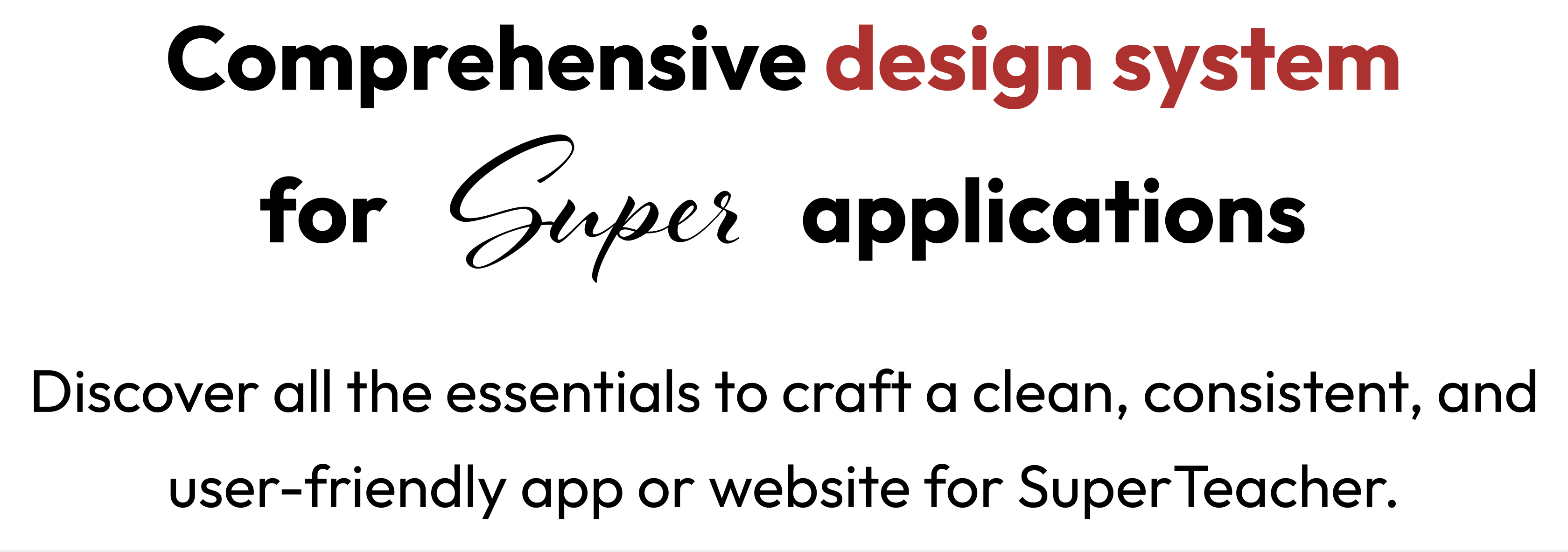
Comprehensive design system
for

applications
Discover all the essentials to craft a clean, consistent, and user-friendly app or website for SuperTeacher.
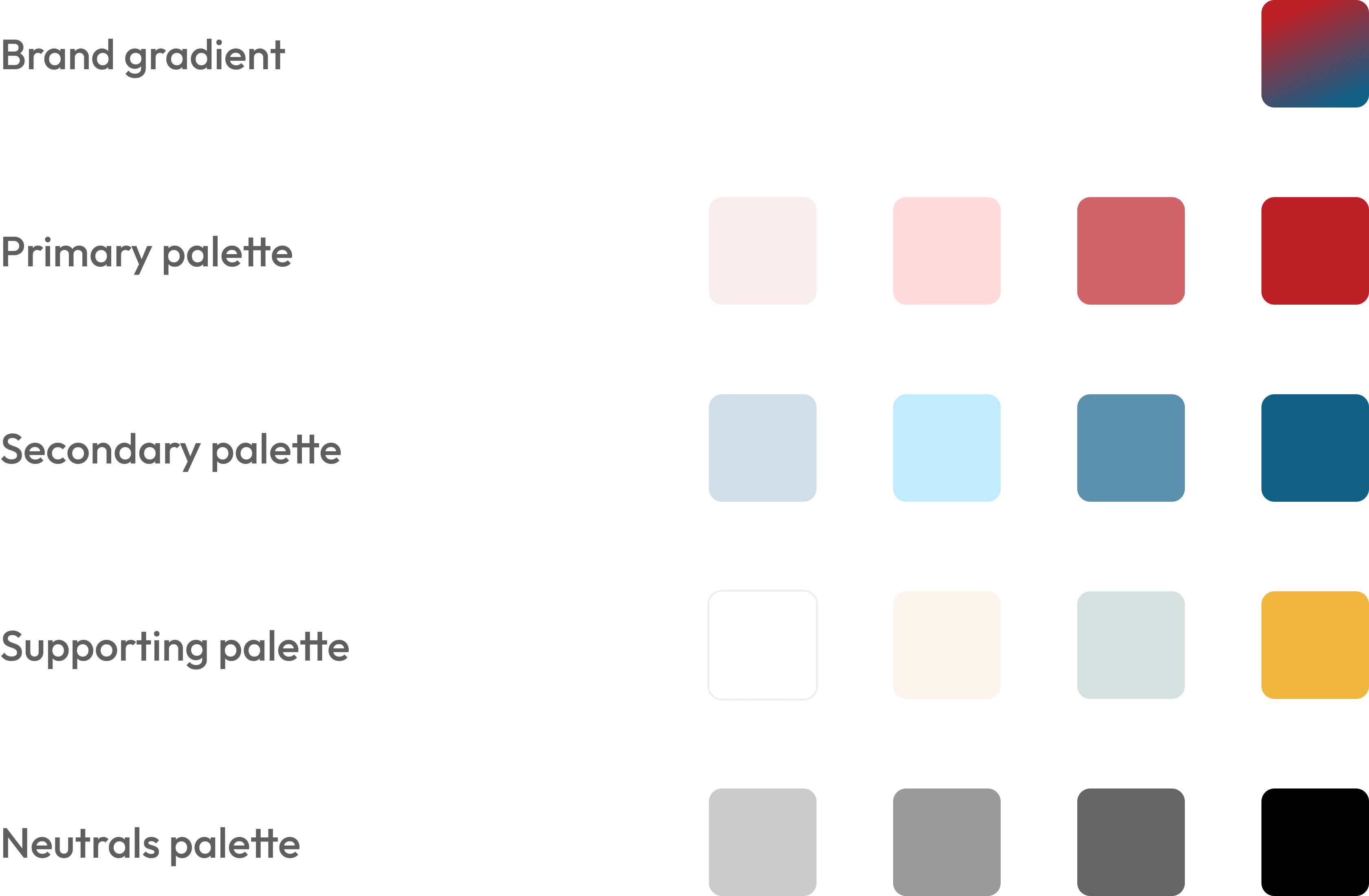
Colour Palette
Our colour system is like a handpicked set of colours. These colours show both strength and softness. They help you decide how your digital space looks, making it easy to emphasize and share what you're good at.
Each colour listed here has been carefully tested in real designs. We've looked at how they look and made sure they are accessible to everyone. This process helps us choose colours that not only look good but also work well in various designs.
Brand gradient
Primary palette
Secondary palette
Supporting palette
Neutrals palette
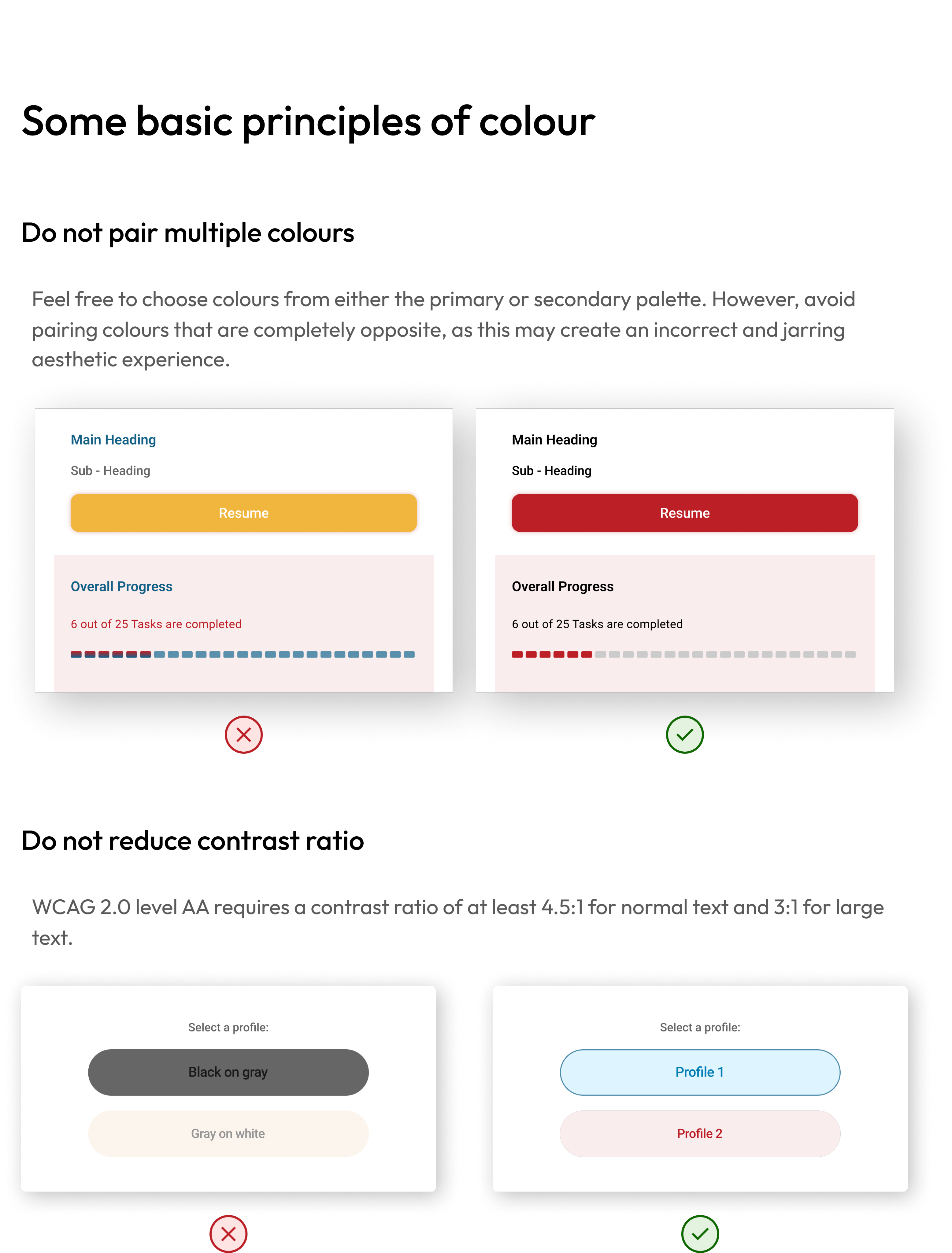
Some basic principles of colour
Do not pair multiple colours
Feel free to choose colours from either the primary or secondary palette. However, avoid pairing colours that are completely opposite, as this may create an incorrect and jarring aesthetic experience.
Main Heading
Sub - Heading
Resume
Overall Progress
6 out of 25 Tasks are completed
Main Heading
Sub - Heading
Resume
Overall Progress
6 out of 25 Tasks are completed
Do not reduce contrast ratio
WCAG 2.0 level AA requires a contrast ratio of at least 4.5:1 for normal text and 3:1 for large text.
Select a profile:
Black on gray
Gray on white
Select a profile:
Profile 1
Profile 2
Typography
Following typography guidelines means using the same fonts, sizes, and styles consistently. It keeps things easy to read and gives the website a clean, organized look by assigning different roles to each text style.
Roboto
4 font weights, 7 font sizes
The primary base font to be used for all website & android app content is Roboto .
SF Pro Display
4 font weights, 7 font sizes
The primary base font to be used for all iOS app content is SF Pro Display
There are five defined roles for text: Display, Headline, Title, Body, and Label.
Some basic principles of typography
Create hierarchy
In your app or website, think of a good structure like a clear roadmap. Make sure the important stuff stands out, and everything is organized in a consistent way. It's like helping users easily find what they need – clear and simple!
Disconnected?
Don’t worry, your progress is safe!

Check your connection or try again!
Disconnected?
Don’t worry, your progress is safe!
Check your connection or try again!
Do not use underline for text
Use underlined text for links or buttons only. If you underline regular text, it might confuse users and make the experience not so great.
Welcome back!
Enter your email address*
Enter your password*
* Forgot your password? click here
Login
New user? Register here
Welcome back!
Enter your email address*
Enter your password*
* Forgot your password? click here
Login
New user? Register here
Actions and input
Buttons in both websites and mobile apps act like magic doors – tap or click them, and things happen! They're essential for helping you smoothly navigate and get things done. By sticking to some guidelines, we make sure these buttons work seamlessly, whether you're on a website or using a mobile app.
Input fields are interface elements that enable users to provide specific types of information, such as text, numbers, dates, or files, facilitating user interaction and data entry in a user-friendly manner.
All our buttons are inherited from 1 main symbol. This parent button is created to support the different use cases that may occur in our product, including the hierarchy of buttons (Primary, Secondary, and many other states of a button).
How to use buttons
Full width buttons
To make buttons stand out more, match their width to the container they're in. This is great for drawing attention to important actions, like logging in or registering, especially in widgets or key sections of a page. It creates a bold focus on what you want users to do.
Verify your mobile number
9876543201
5555
Time 00:50s
Resend OTP
Verify OTP
Choosing the right buttons
Avoid using solid buttons when there are repeating parent elements.
Opt for medium or low priority (secondary) buttons when there are more than 2 repeating parent elements in a single row/column.
Discard Post?
If you discard now, you will lose any changes you’ve made.
Discard
Cancel
Discard Post?
If you discard now, you will lose any changes you’ve made.
Discard
Cancel
How to use input fields
The input field
The input type must be appropriate to the type of content required.
Your full name*
Date of Birth*
Gender
Your full address
Your Country
India
Select State
Your Postal code
The radio type
If the user has to choose from a selection of options, and if the options are less than or equal to 5, then use an input with type radio for the selection.
How would you rate your satisfaction with our App?
Extremely satisfied
Moderately satisfied
Neutral
Slightly satisfied
Not at all satisfied
The checkbox type
Always prefer the use of checkboxes over a select for multiple option selections. Avoid the use of a multi select. If the choices for a user to select from exceed 8 or 10, you must include the option to "Select All"
All Grades
Grade 1
Grade 2
Grade 3
Grade 4
Grade 5
Grade 6
Grade 7
Grade 8
The select type
If the user has to choose from a selection of options, and if the options are greater than 5, then use a select box
Overall Score
Overall Score
Subject Score
Skill Score
English
Maths
Science
The toggle field
Use a toggle button when you want to provide users with a quick and direct way to switch between two opposite states or options
Push Notifications
Email Notifications
SMS Notifications
Whatsapp Notifications
Account Updates
Iconography
Icons are like visual shortcuts in design, representing actions or objects. They transcend language and help users with visual impairments. However, to maintain clarity and avoid overwhelming users, it's important to use icons sparingly in the user interface.
Icons shine when they fit right into the situation. They need to be universally understood, so everyone gets them. The trick is to stick with these familiar icons consistently across all platforms, keeping things smooth and easy for everyone.
Some of the icons from our icon library.
Layout
Layouts form the fundamental structure of our UI design, acting as the blueprint that guides the placement and organization of visual elements on a screen.
We've chosen Tailwind as our go-to tool for making our website look great, and here's why:
- Easy to Make Styles: Tailwind helps us create styles that we can reuse easily, keeping things organized and saving time.
- Works Well with Different Tech: Whether it's our main PHP code or React parts of our website, Tailwind fits right in. This means our styles stay consistent no matter what tech we're using.
- Make it Look Just Right for Us: Tailwind is like a tool that lets us change and adjust our styles to match our brand, making our website look and feel just like us.
- Helps Teams Work Together: Tailwind makes it easy for our design and tech teams to understand each other, like they speak the same language, making it smoother for everyone to work together.
- Responsive Designs: Tailwind supports creating designs that look good on different devices and screen sizes. So, whether someone is on a big computer or a small phone, our website still looks awesome.
- Mobile-First Approach: With Tailwind, we follow a mobile-first approach, meaning we design our website first for mobile devices and then adapt it for larger screens. This ensures a great experience for users on all devices.
- Keeps Things in Line: We set up Tailwind using our design system rules, making sure everyone follows the same design principles across different parts of our website. This keeps everything looking neat and consistent.
So, by choosing Tailwind, we're not only making a good-looking and consistent website but also ensuring it works well on different devices with a mobile-first approach.
How to create mobile-first responsive layouts?
Tailwind CSS: Working with mobile-first
Discover the mobile-first approach in our TailwindCSS-based design system through an article offering valuable insights on optimizing designs for mobile devices right from the start.
The Future
The future of a design language system should focus on always getting better, being able to change easily, and working together well. It should aim to be a flexible tool that not only helps with making designs that look the same and work well but also grows and handles more complicated things. Important things to think about are:
- Always Getting Better: Keep improving and changing for the better.
- Flexibility: Be able to adapt and change easily.
- Working Together Well: Encourage everyone to work together smoothly.
- Helpful Tool: Be a useful resource for making designs look good and work efficiently.
- Handling Growth and Complexity: Be able to grow and handle more complicated design needs.
Built with:

Design Language System: UX Case Study
Architecting a versatile design system that scales effectively across web, mobile, & desktop applications.
Overview
XSEED Education, an Indian ed-tech company, focuses on creating innovative learning solutions for primary and secondary school students. While initially impacting classroom teaching methods with traditional handheld books, XSEED consistently strives to improve its solutions. This commitment led to the development of the XSEED SuperTeacher digital platform, designed to support teachers, parents, students and school management in their class preparation, readiness, and much more.
Core team
1 designer + 1 design intern + 5 developers + 1 product manager
Time
6 months & ongoing
My role
I took the lead in planning and implementing our design system. I collaborated with developers to improve our workflows and also wrote the design documentation.
Tools
Figma
Impact
200%
faster than before
🚀
~10 hours
time saved every week
by the design team
⏰
Great design results
quicker and consistent
🤩
Context
working on a
application
What is the superteacher product?
The SuperTeacher App gives Parents, Teachers & Schools everything needed for teaching the powerful K-8 school program in online classes or for face-to-face learning. It comes fully loaded with their micro-curriculum and lesson plans for students in pre-primary (from age 3+) to Grade 8. We designed the app for iOS, Android, Web, & Android TV.
This is how our designs maintain a consistent and simple appearance across different devices and platforms, ensuring uniformity in components and branding throughout the user experience.
Why do we need a design system?
Our problem
The system had issues – things didn't match, looked inconsistent, and some parts were outdated. The instructions weren't clear, causing confusion among our teams and making it hard to work together.
This posed obstacles to effective collaboration and hindered a unified approach to processes, design language, guidelines, and UI pattern libraries.
The Challenges
Starting new projects meant building everything from the ground up, including new components each time. This resulted in redesigning the same elements repeatedly, with styles changing for different functions.
Big product, small team (working on the design system part-time)
With 2 designers and 11 developers, we handle the design roadmap for different platforms. Despite our commitment, implementing a full design system might take years. Our focus is on improving collaboration and efficiency as we work towards this goal.
Our approach: Take it step by step. Agree on a small, doable goal and test solutions before making them permanent.
Effectively launch, update and maintain design components across multiple platforms
This challenge demands a streamlined process for launching new components, refreshing existing ones, and maintaining consistency across diverse digital environments.
Our approach: Work closely together, listen to users to make sure our design elements look good and work well on different platforms. Keep things simple and flexible for ongoing improvements.
Maintain a high quality, consistent design language across mobile, web and TV
Over the years, inconsistencies between our platforms have grown. These make the code more complex and create usability problems for users.
Our approach: Create a single UI for each of our four devices (mobile, tablet, desktop and TV).
No design system = Disconnected user experience
The Research
Researching other design systems and interfaces for components common practices and inspiration.
Industry Insights
Exploring how design systems are implemented across various industries to understand diverse approaches and potential adaptations.
Methodologies in Practice
Analyzing the methodologies employed by successful companies in building their design systems, including the processes from ideation to implementation.
Component Breakdown
Examining the specific components and elements integrated into design systems, learning from real-world examples for a practical understanding.
Tailoring to Company Needs
Extracting insights on how successful design systems are adapted to meet the unique requirements and objectives of individual companies, ensuring relevance to our organizational goals.
User Experience Impact
Exploring how the implementation of design systems has positively impacted user experiences in other organizations, with a focus on enhancing usability and satisfaction.
The Impact
Discover how a design system makes projects easier by keeping everything organised, making changes simpler, and allowing teams to focus on important tasks.
Centralized Visibility
It’s a design system serves as a single source for viewing components, patterns, and styles, providing a centralized repository for all design elements.
Scalable Management of Changes
Changes in projects can be efficiently redesigned and managed at scale through the design system, ensuring consistency and ease of adaptation.
Rapid Design Replication
Utilizing pre-made components and elements from the design system allows for the quick replication of designs, streamlining the design process.
Elimination of Redundancy
The design system reduces the need to reinvent the wheel, eliminating inconsistencies and promoting uniformity across projects.
Efficient Communication and Time Savings
By minimizing miscommunications, the design system reduces wasted time in both design and development phases, optimizing efficiency.
Comprehensive design system
for
applications
Discover all the essentials to craft a clean, consistent, and user-friendly app or website for SuperTeacher.
Colour Palette
Our colour system is like a handpicked set of colours. These colours show both strength and softness. They help you decide how your digital space looks, making it easy to emphasize and share what you're good at.
Each colour listed here has been carefully tested in real designs. We've looked at how they look and made sure they are accessible to everyone. This process helps us choose colours that not only look good but also work well in various designs.
Brand gradient
Primary palette
Secondary palette
Supporting palette
Neutrals palette
Some basic principles of colour
Do not pair multiple colours
Feel free to choose colours from either the primary or secondary palette. However, avoid pairing colours that are completely opposite, as this may create an incorrect and jarring aesthetic experience.
Main Heading
Sub - Heading
Resume
Overall Progress
6 out of 25 Tasks are completed
Main Heading
Sub - Heading
Resume
Overall Progress
6 out of 25 Tasks are completed
Do not reduce contrast ratio
WCAG 2.0 level AA requires a contrast ratio of at least 4.5:1 for normal text and 3:1 for large text.
Select a profile:
Black on gray
Gray on white
Select a profile:
Profile 1
Profile 2
Typography
Following typography guidelines means using the same fonts, sizes, and styles consistently. It keeps things easy to read and gives the website a clean, organized look by assigning different roles to each text style.
Roboto
4 font weights, 7 font sizes
The primary base font to be used for all website & android app content is Roboto .
SF Pro Display
4 font weights, 7 font sizes
The primary base font to be used for all iOS app content is SF Pro Display
There are five defined roles for text: Display, Headline, Title, Body, and Label.
Some basic principles of typography
Create hierarchy
In your app or website, think of a good structure like a clear roadmap. Make sure the important stuff stands out, and everything is organized in a consistent way. It's like helping users easily find what they need – clear and simple!
Disconnected?
Don’t worry, your progress is safe!

Check your connection or try again!
Disconnected?
Don’t worry, your progress is safe!
Check your connection or try again!
Do not use underline for text
Use underlined text for links or buttons only. If you underline regular text, it might confuse users and make the experience not so great.
Welcome back!
Enter your email address*
Enter your password*
* Forgot your password? click here
Login
New user? Register here
Welcome back!
Enter your email address*
Enter your password*
* Forgot your password? click here
Login
New user? Register here
Actions and input
Buttons in both websites and mobile apps act like magic doors – tap or click them, and things happen! They're essential for helping you smoothly navigate and get things done. By sticking to some guidelines, we make sure these buttons work seamlessly, whether you're on a website or using a mobile app.
Input fields are interface elements that enable users to provide specific types of information, such as text, numbers, dates, or files, facilitating user interaction and data entry in a user-friendly manner.
All our buttons are inherited from 1 main symbol. This parent button is created to support the different use cases that may occur in our product, including the hierarchy of buttons (Primary, Secondary, and many other states of a button).
How to use buttons
Full width buttons
To make buttons stand out more, match their width to the container they're in. This is great for drawing attention to important actions, like logging in or registering, especially in widgets or key sections of a page. It creates a bold focus on what you want users to do.
Verify your mobile number
9876543201
5555
Time 00:50s
Resend OTP
Verify OTP
Choosing the right buttons
Avoid using solid buttons when there are repeating parent elements.
Opt for medium or low priority (secondary) buttons when there are more than 2 repeating parent elements in a single row/column.
Discard Post?
If you discard now, you will lose any changes you’ve made.
Discard
Cancel
Discard Post?
If you discard now, you will lose any changes you’ve made.
Discard
Cancel
How to use input fields
The input field
The input type must be appropriate to the type of content required.
Your full name*
Date of Birth*
Gender
Your full address
Your Country
India
Select State
Your Postal code
The radio type
If the user has to choose from a selection of options, and if the options are less than or equal to 5, then use an input with type radio for the selection.
How would you rate your satisfaction with our App?
The checkbox type
Always prefer the use of checkboxes over a select for multiple option selections. Avoid the use of a multi select. If the choices for a user to select from exceed 8 or 10, you must include the option to "Select All"
All Grades
Grade 1
Grade 2
Grade 3
Grade 4
Grade 5
Grade 6
Grade 7
Grade 8
The select type
If the user has to choose from a selection of options, and if the options are greater than 5, then use a select box
Overall Score
Overall Score
Subject Score
Skill Score
English
Maths
Science
The toggle field
Use a toggle button when you want to provide users with a quick and direct way to switch between two opposite states or options
Push Notifications
Email Notifications
SMS Notifications
Whatsapp Notifications
Account Updates
Iconography
Icons are like visual shortcuts in design, representing actions or objects. They transcend language and help users with visual impairments. However, to maintain clarity and avoid overwhelming users, it's important to use icons sparingly in the user interface.
Icons shine when they fit right into the situation. They need to be universally understood, so everyone gets them. The trick is to stick with these familiar icons consistently across all platforms, keeping things smooth and easy for everyone.
Some of the icons from our icon library.
Layout
Layouts form the fundamental structure of our UI design, acting as the blueprint that guides the placement and organization of visual elements on a screen.
We've chosen Tailwind as our go-to tool for making our website look great, and here's why:
- Easy to Make Styles: Tailwind helps us create styles that we can reuse easily, keeping things organized and saving time.
- Works Well with Different Tech: Whether it's our main PHP code or React parts of our website, Tailwind fits right in. This means our styles stay consistent no matter what tech we're using.
- Make it Look Just Right for Us: Tailwind is like a tool that lets us change and adjust our styles to match our brand, making our website look and feel just like us.
- Helps Teams Work Together: Tailwind makes it easy for our design and tech teams to understand each other, like they speak the same language, making it smoother for everyone to work together.
- Responsive Designs: Tailwind supports creating designs that look good on different devices and screen sizes. So, whether someone is on a big computer or a small phone, our website still looks awesome.
- Mobile-First Approach: With Tailwind, we follow a mobile-first approach, meaning we design our website first for mobile devices and then adapt it for larger screens. This ensures a great experience for users on all devices.
- Keeps Things in Line: We set up Tailwind using our design system rules, making sure everyone follows the same design principles across different parts of our website. This keeps everything looking neat and consistent.
So, by choosing Tailwind, we're not only making a good-looking and consistent website but also ensuring it works well on different devices with a mobile-first approach.
How to create mobile-first responsive layouts?
Tailwind CSS: Working with mobile-first
Discover the mobile-first approach in our TailwindCSS-based design system through an article offering valuable insights on optimizing designs for mobile devices right from the start.
The Future
The future of a design language system should focus on always getting better, being able to change easily, and working together well. It should aim to be a flexible tool that not only helps with making designs that look the same and work well but also grows and handles more complicated things. Important things to think about are:
- Always Getting Better: Keep improving and changing for the better.
- Flexibility: Be able to adapt and change easily.
- Working Together Well: Encourage everyone to work together smoothly.
- Helpful Tool: Be a useful resource for making designs look good and work efficiently.
- Handling Growth and Complexity: Be able to grow and handle more complicated design needs.
Built with:
