


Built with:


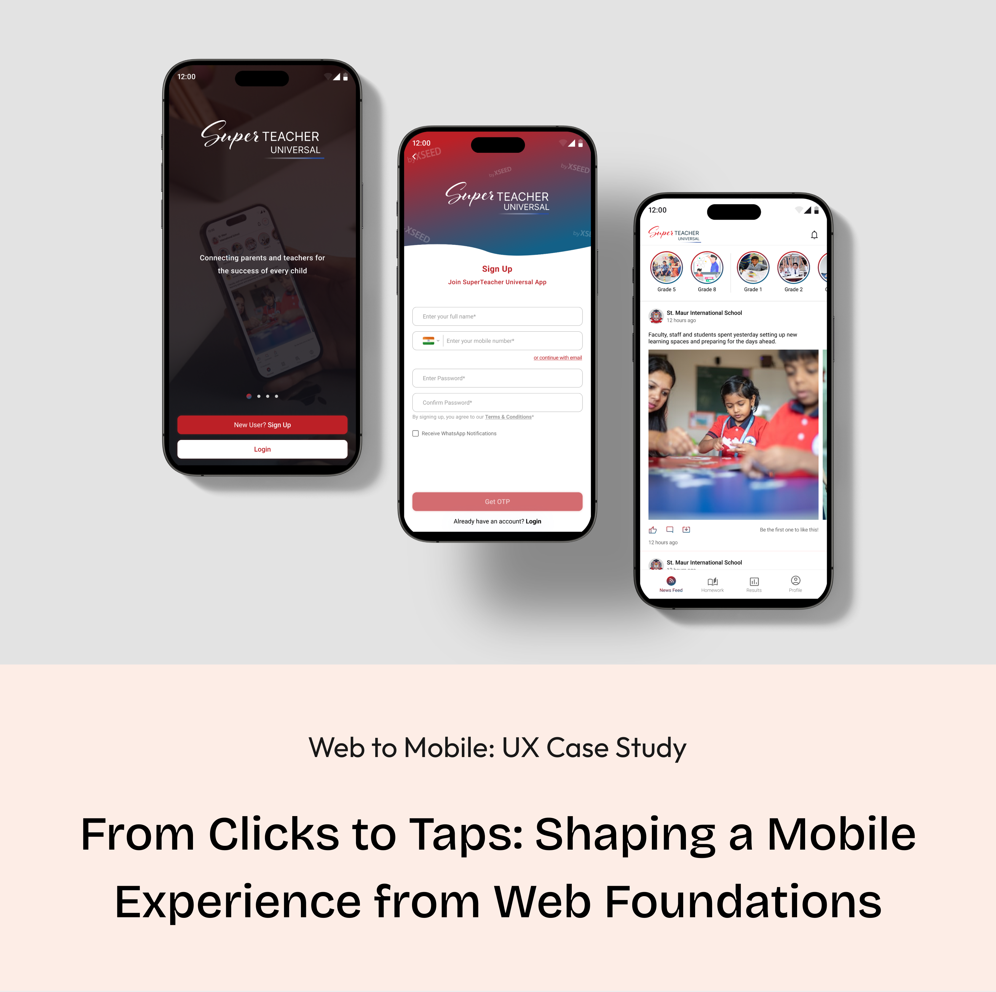
Web to Mobile: UX Case Study
From Clicks to Taps: Shaping a Mobile Experience from Web Foundations
Background
A strategic shift from a web-based solution to a mobile app for XSEED Universal, recognizing the need for enhanced accessibility and on-the-go information retrieval.
Context
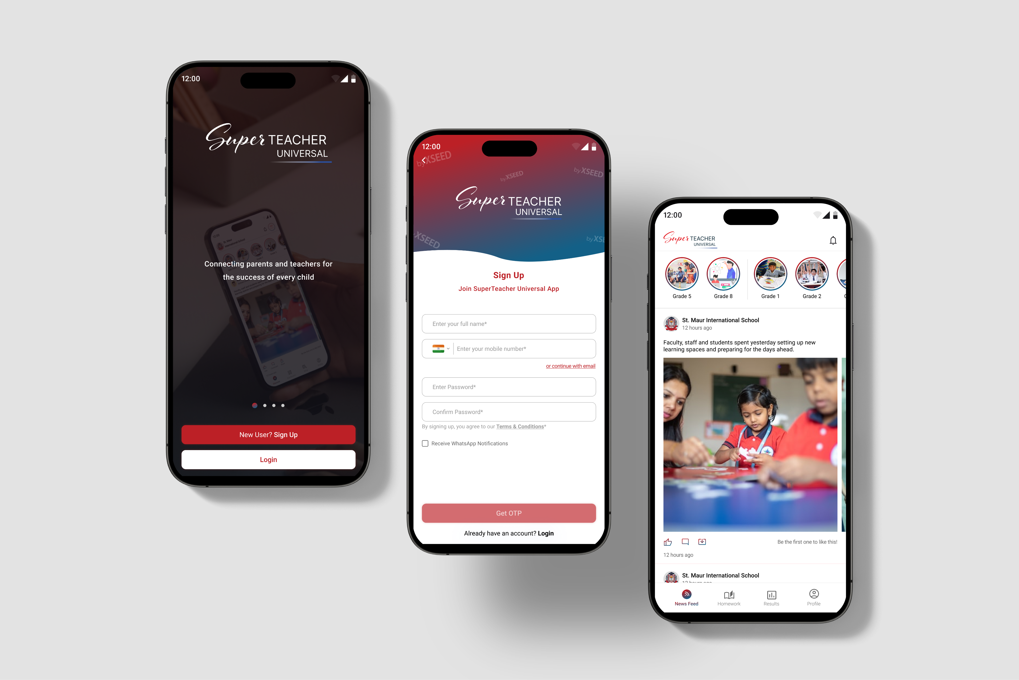
In the world of education, a smart company saw a problem: it wasn't easy for schools and parents to talk to each other. This company, known for helping kids from kindergarten to higher grades, decided to change that. They wanted to make a special app to make talking between schools and parents much better.
I was the main designer for this project, helping to make it happen. We wanted to make sure that parents and schools could talk easily and get information quickly. This project shows how the company is always trying to make things better in the world of education.
Core team
2 designers + 1 product manager + lead developer + business team
Time
4 months
My role
As the lead product designer, I drove the shift from a website to a mobile app. I identified communication issues, collaborated on decisions, and ensured a smooth transition. The result was a successful move to a mobile app, improving communication for parents and schools.
Tools
Figma, Zoom, FigJam
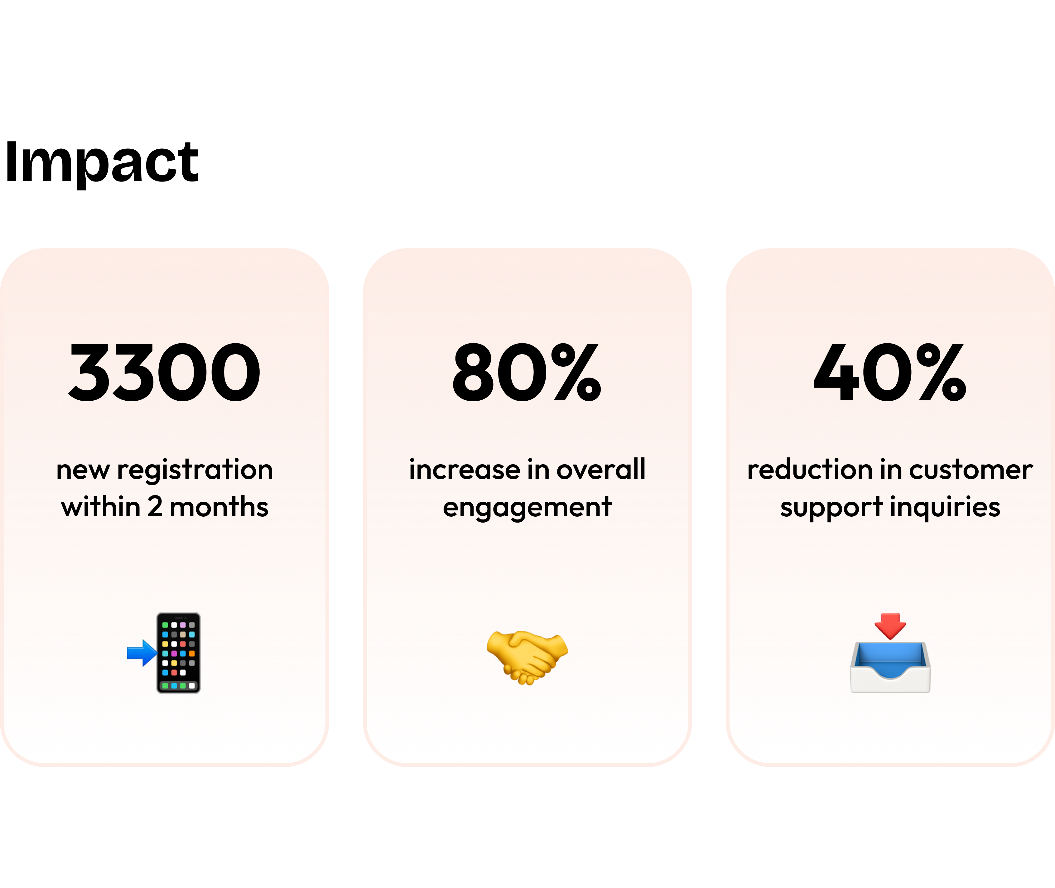
Impact
3300
new registration within 2 months
📲
80%
increase in overall engagement
🤝
40%
reduction in customer support inquiries
📥
Conflict
Bridging the Void: Navigating Educational Communication Challenges
Recognizing the lack of effective communication between schools and parents regarding academic and extracurricular progress, the existing methods, such as traditional report cards or fragmented digital platforms, fell short in meeting the need for streamlined and comprehensive communication. The challenge was to bridge these communication gaps and create a one-stop solution for parents and schools, providing valuable insights into students' progress.
the 'why' behind our decisions
The decision was made to create a user-friendly solution as traditional communication methods between schools and parents were ineffective. Current approaches lacked streamlined communication, and our goal is to bridge these gaps, offering valuable insights into students' progress through a single solution.
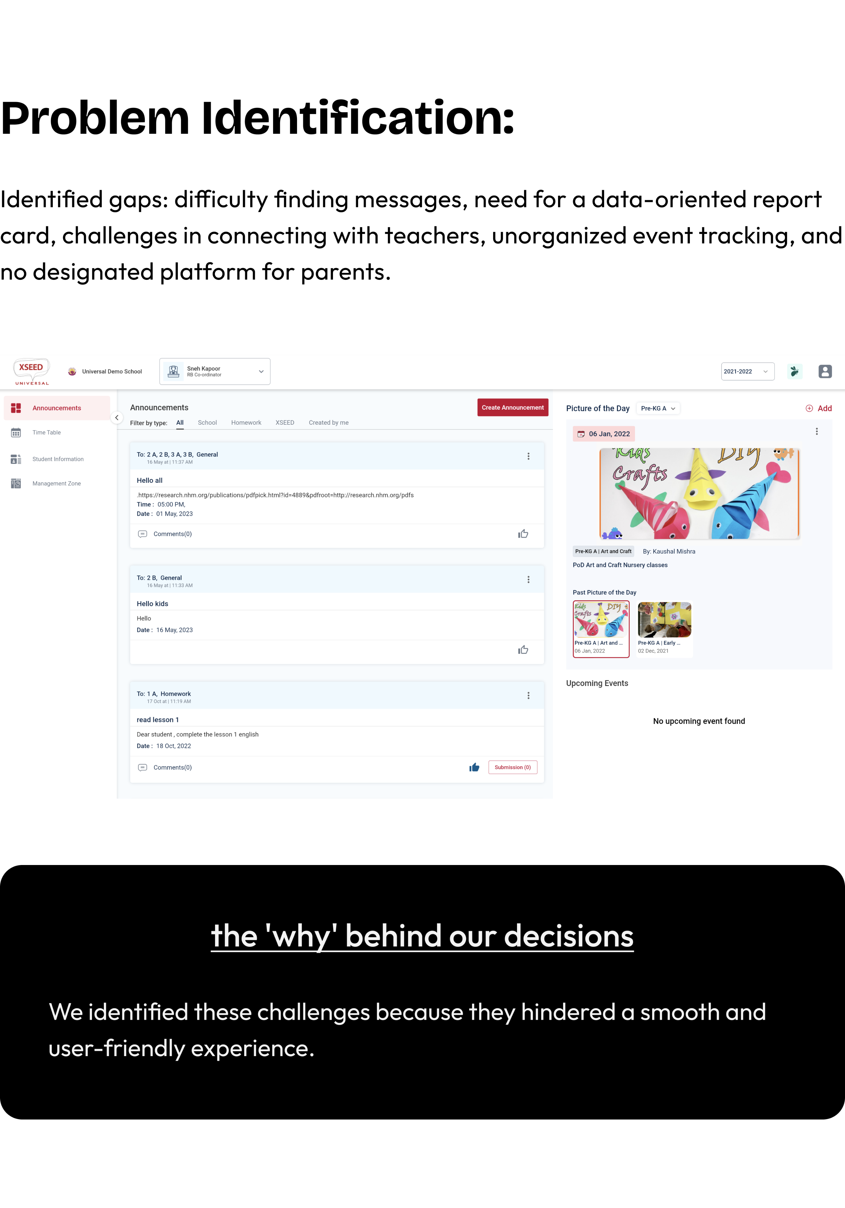
Problem Identification:
Identified gaps: difficulty finding messages, need for a data-oriented report card, challenges in connecting with teachers, unorganized event tracking, and no designated platform for parents.

the 'why' behind our decisions
We identified these challenges because they hindered a smooth and user-friendly experience.
Decision to Shift to Mobile App
Making things easier & acknowledging the growing importance of mobile accessibility.
A strategic shift to a mobile app was prompted by the realization that mobile accessibility was becoming increasingly crucial. Understanding the need for parents to have immediate, on-the-go access to student information influenced this decision, aligning with evolving user behaviors and preferences.
We decided to change from the website to a mobile app for Universal Education to make things better for parents and schools. We know parents use their phones a lot, so we wanted to give them a way to quickly check important info about their child's education, wherever they are. This decision is all about making things simpler and more connected for parents and schools.
the 'why' behind our decisions
We moved to a mobile app for Universal Education to simplify and improve communication between parents and schools. With parents using phones frequently, the app offers quick access to essential information, making education more convenient for everyone.
Business Requirements
Aligning strategic objectives with tangible features and functionalities
- Push notifications, personalized content recommendations.
- Robust in-app messaging, customizable notifications.
- User-friendly dashboard with real-time updates.
- API connections for data sharing.
- Adherence to visual design language, brand elements.
the 'why' behind our decisions
We've decided on these features to make the app engaging and user-friendly, with timely updates, effective communication, easy access to real-time information, seamless data sharing, and a consistent brand identity.
Designer - Developer Sync
🛠️
Discussions with developers centered on the technical feasibility and implementation of key features like push notifications, API connections, and adherence to the visual design language.
For instance, developers played a crucial role in ensuring the seamless integration of API connections to facilitate data sharing between XSEED Universal and other products.
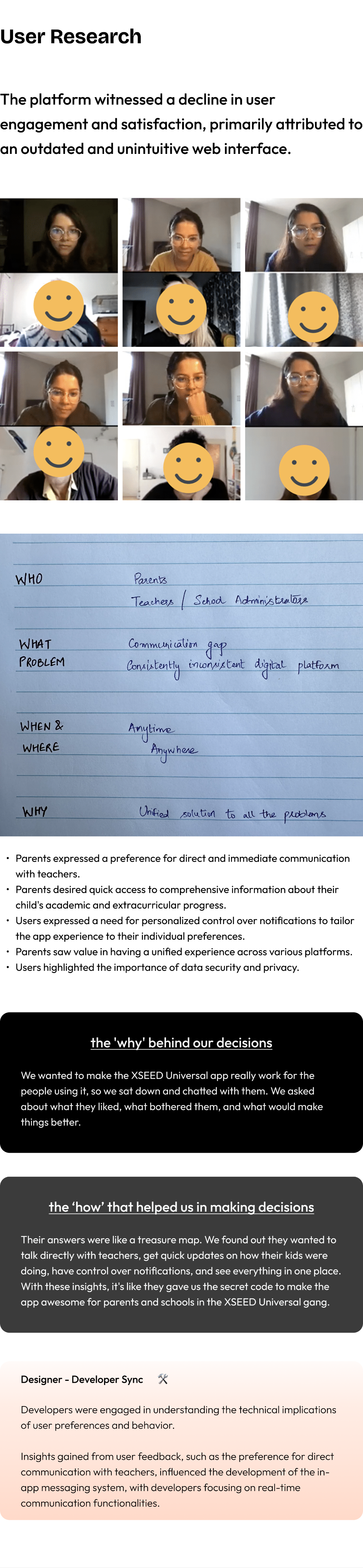
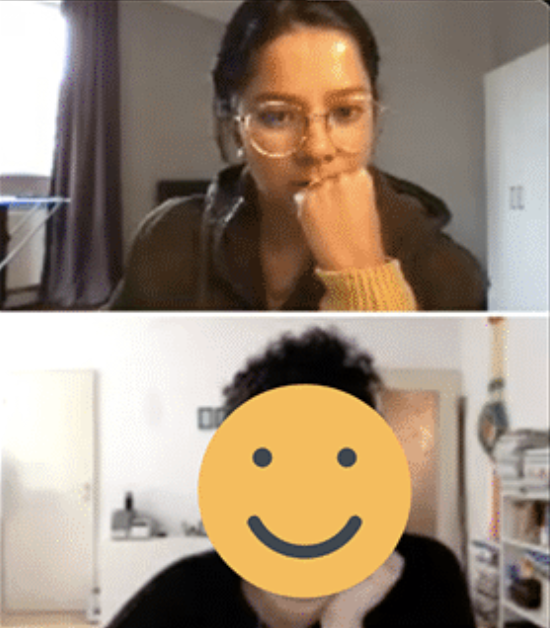
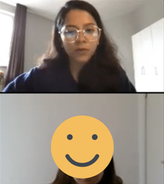
User Research
The platform witnessed a decline in user engagement and satisfaction, primarily attributed to an outdated and unintuitive web interface.
- Parents expressed a preference for direct and immediate communication with teachers.
- Parents desired quick access to comprehensive information about their child's academic and extracurricular progress.
- Users expressed a need for personalized control over notifications to tailor the app experience to their individual preferences.
- Parents saw value in having a unified experience across various platforms.
- Users highlighted the importance of data security and privacy.
the 'why' behind our decisions
We wanted to make the XSEED Universal app really work for the people using it, so we sat down and chatted with them. We asked about what they liked, what bothered them, and what would make things better.
the ‘how’ that helped us in making decisions
Their answers were like a treasure map. We found out they wanted to talk directly with teachers, get quick updates on how their kids were doing, have control over notifications, and see everything in one place. With these insights, it's like they gave us the secret code to make the app awesome for parents and schools in the XSEED Universal gang.
Designer - Developer Sync
🛠️
Developers were engaged in understanding the technical implications of user preferences and behavior.
Insights gained from user feedback, such as the preference for direct communication with teachers, influenced the development of the in-app messaging system, with developers focusing on real-time communication functionalities.
Competitive Analysis
Learning from Others: How We Made Our App Stand Out
In comparing our app to competitors like Byjus, Khan Academy, and Vedantu, we've identified specific areas where we can implement unique features to bridge the gap between education/school and parents:
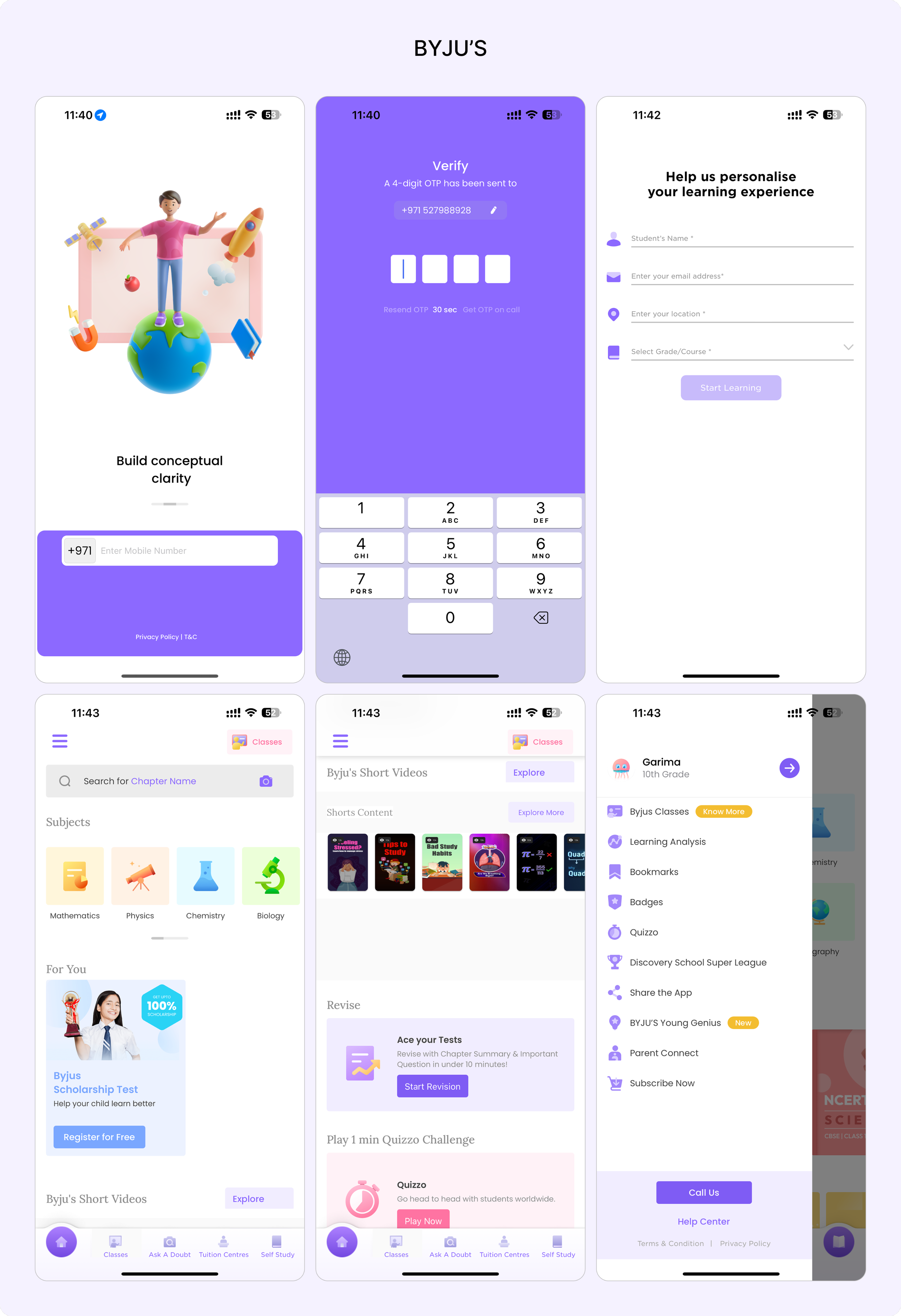
BYJU’S


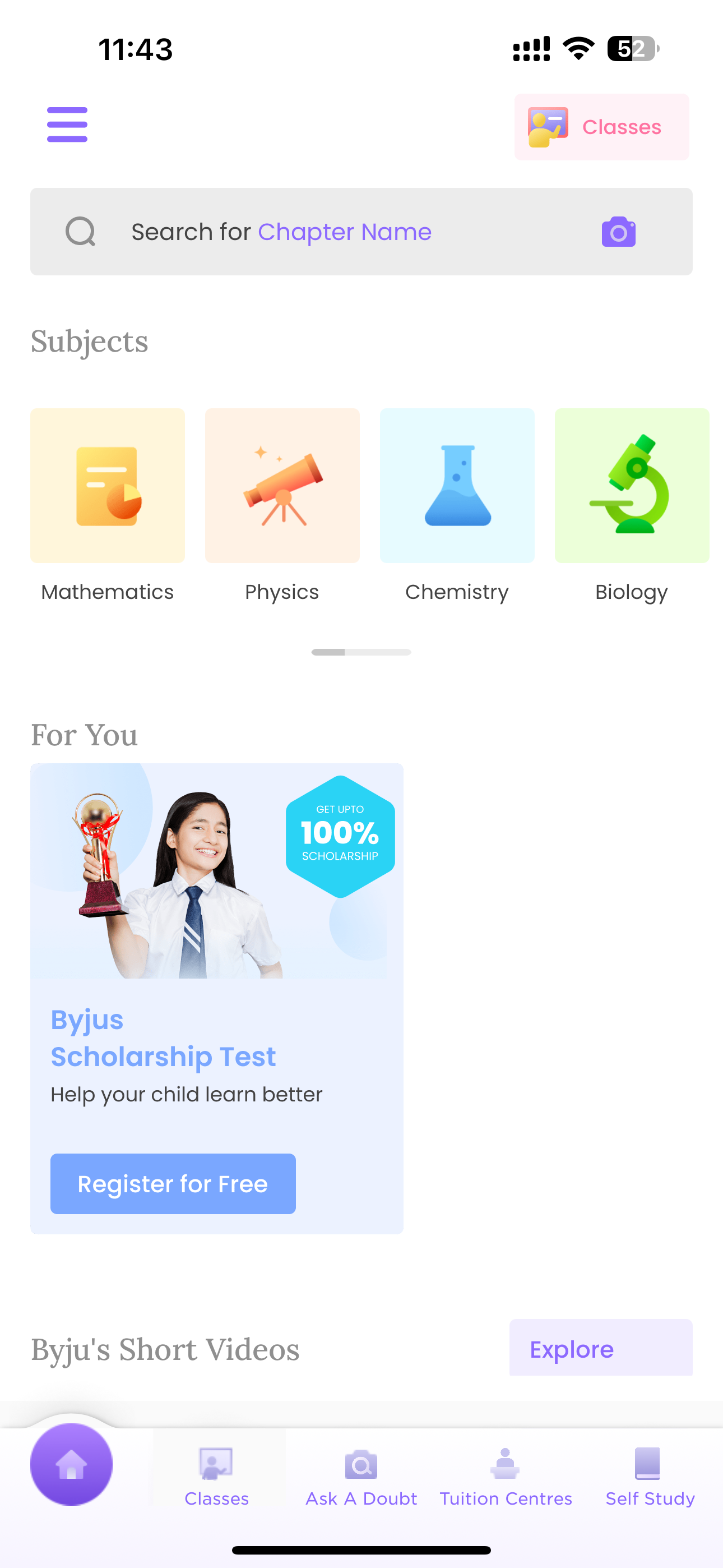
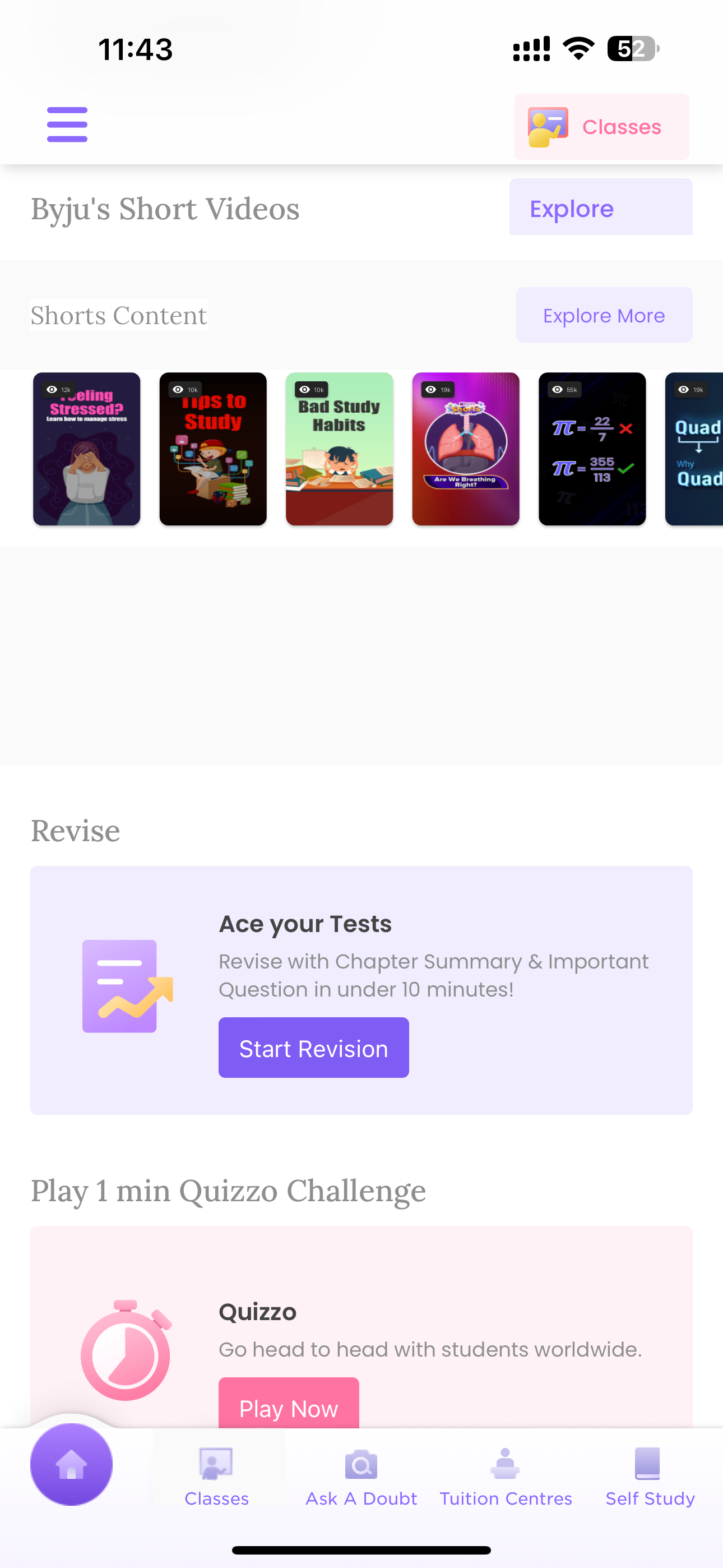
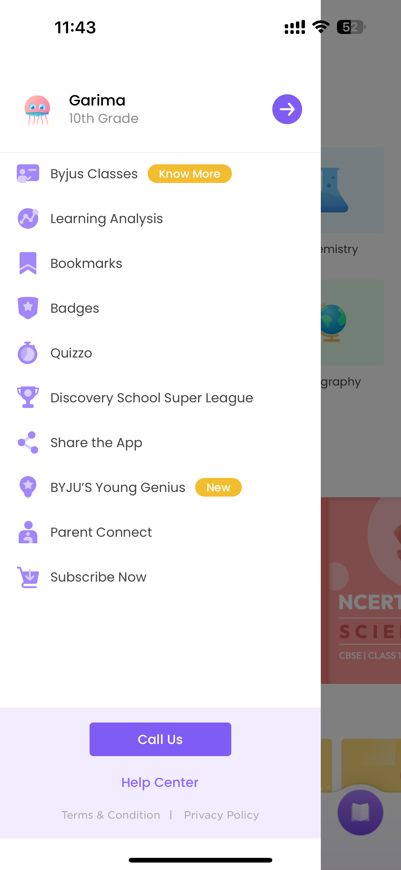
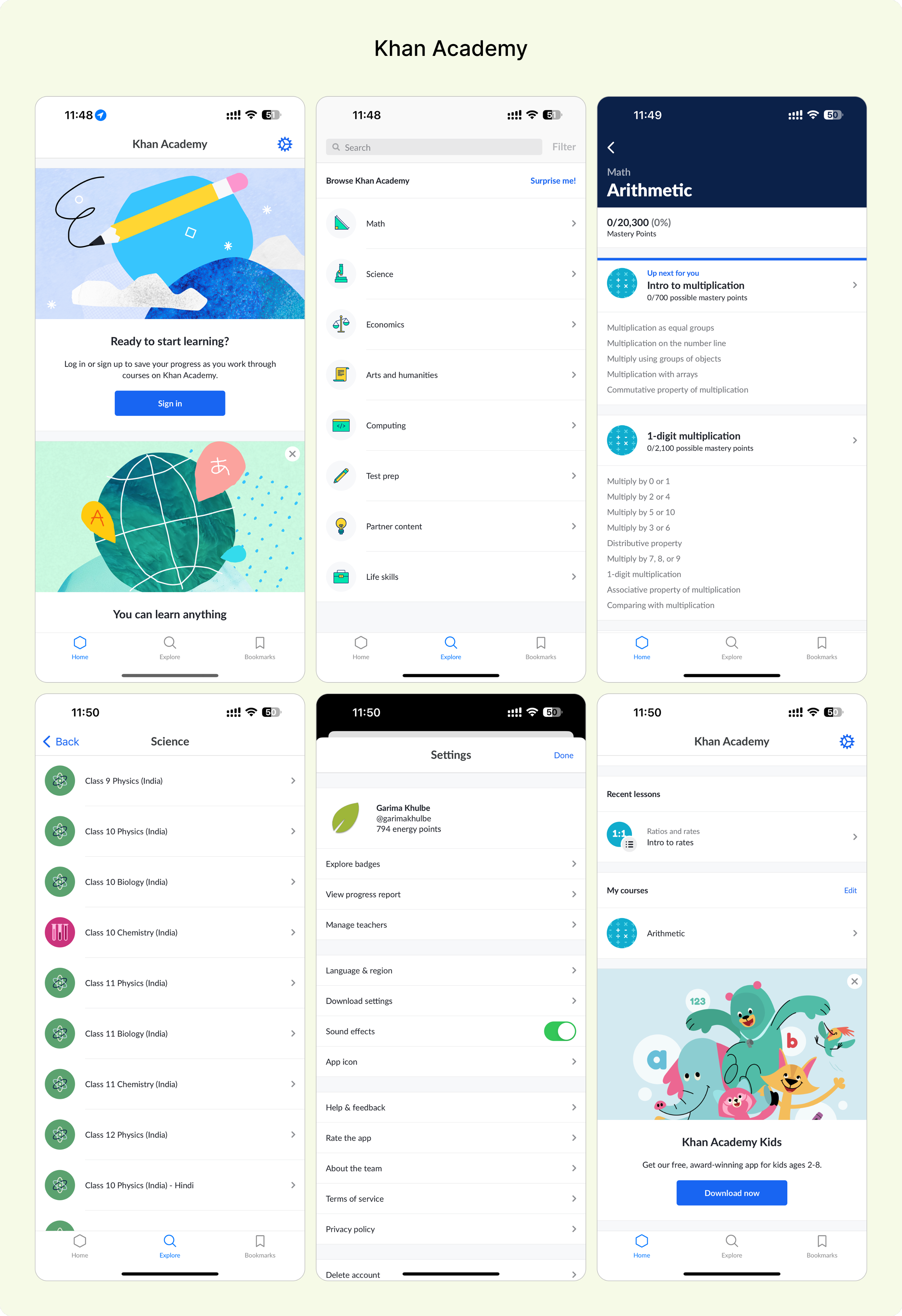
Khan Academy
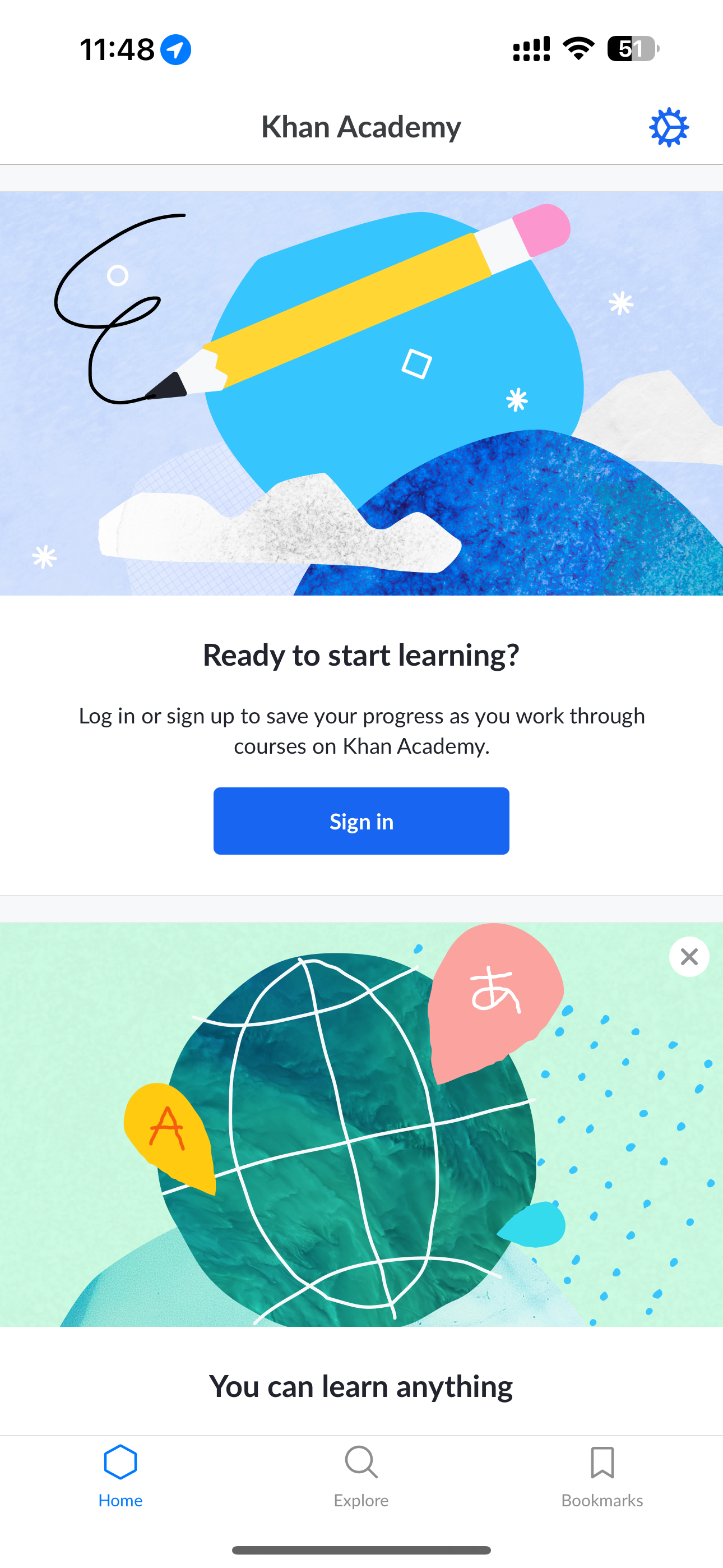
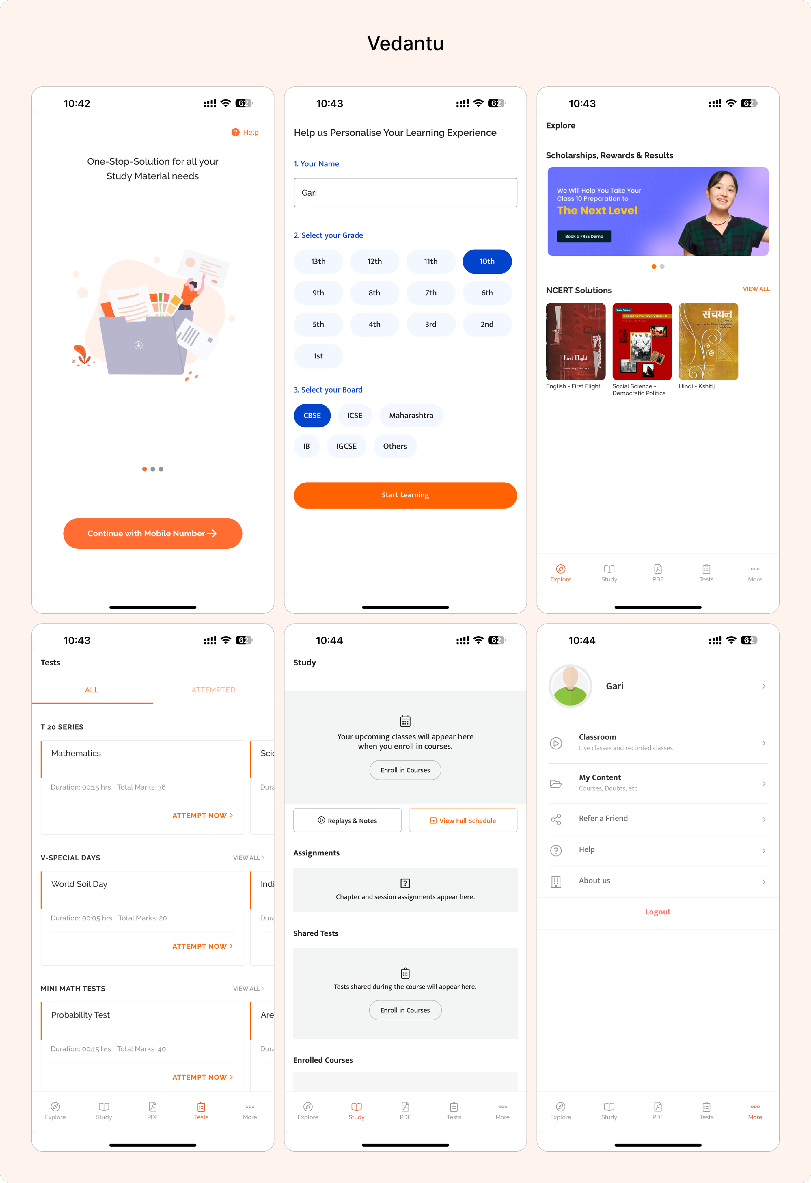
Vedantu
- Create a dedicated dashboard for parents that provides insights into their child's academic progress, attendance, and extracurricular activities. None of the competitors currently offer a comprehensive parental involvement feature
- Implement a feature that allows schools to share updates, events, and important announcements directly through the app. None of the competitors have a centralized system for school-wide communication and updates.
- Prioritize robust data security measures and provide parents with granular privacy controls over their child's information. None of the competitors explicitly address data security concerns from a parental perspective.
- Implement community-building features within our app to encourage interaction and collaboration among users. None of the competitors have a dedicated platform for fostering collaboration between parents and teachers.
- Ensure our app has a responsive design to provide a consistent and optimal experience across various devices.
the 'why' behind our decisions
We wanted our app to be the coolest one out there, so we checked what others were doing. It helped us figure out where we could do things differently and better.
the ‘how’ that helped us in making decisions
Looking at other apps was like getting insider info. We found spots where we could shine, like giving parents a special dashboard, letting them talk directly to teachers, sharing school updates, personalizing learning plans, and making sure all data is super safe. No other app was doing all of that, so we're making ours the go-to for parents who want a top-notch connection between school and home.
Designer - Developer Sync
🛠️
Discussions with developers in this stage focused on identifying technical differentiators for features like the Parental Involvement Dashboard and Direct Teacher-Parent Communication.
Developers contributed to the technical aspects of creating a collaborative space within the app and ensuring secure communication channels.
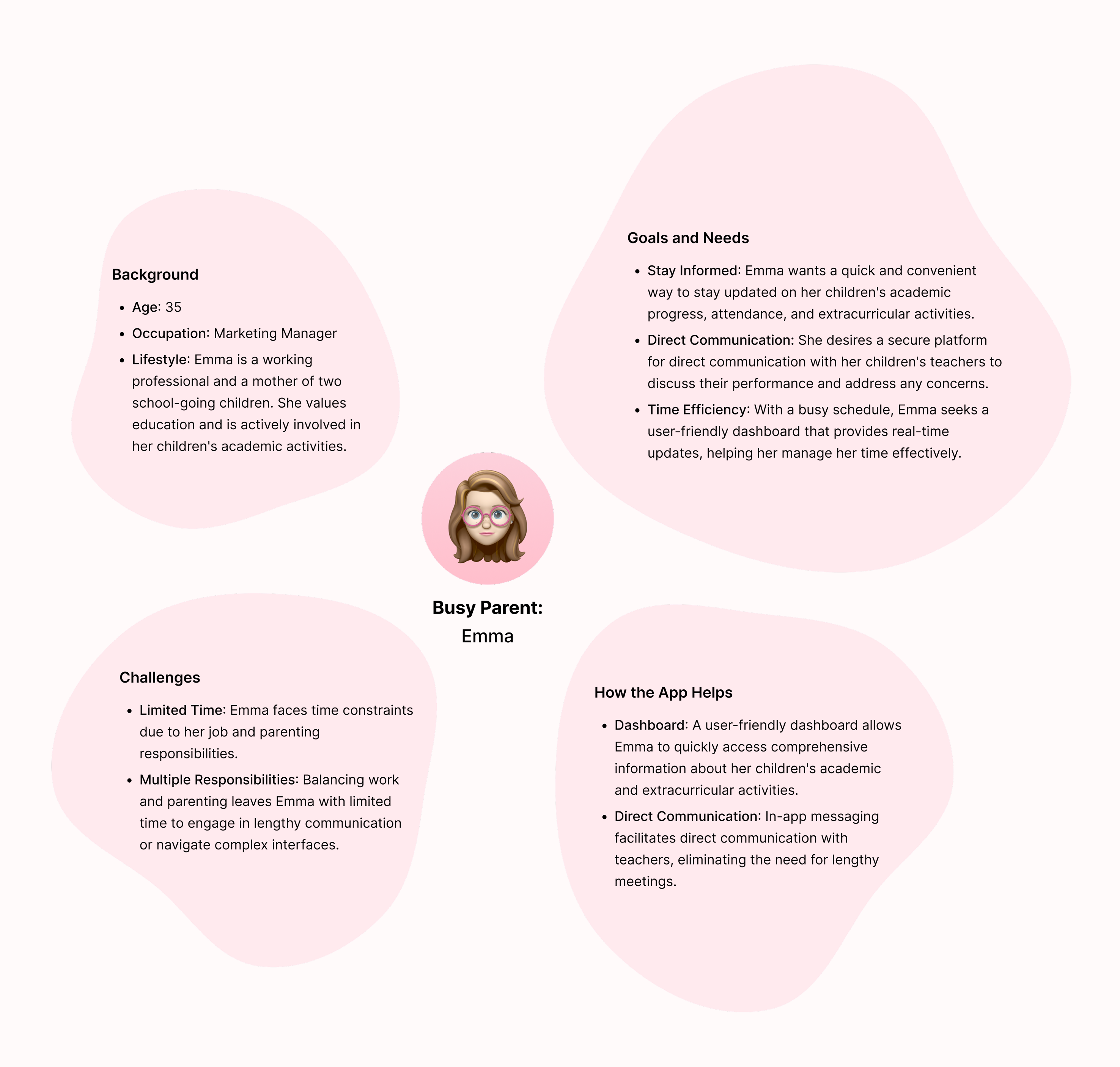
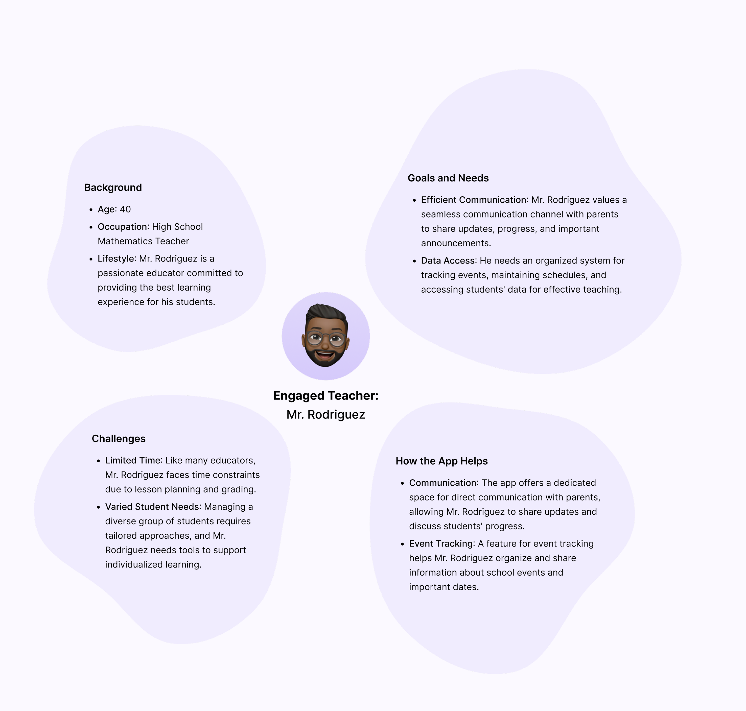
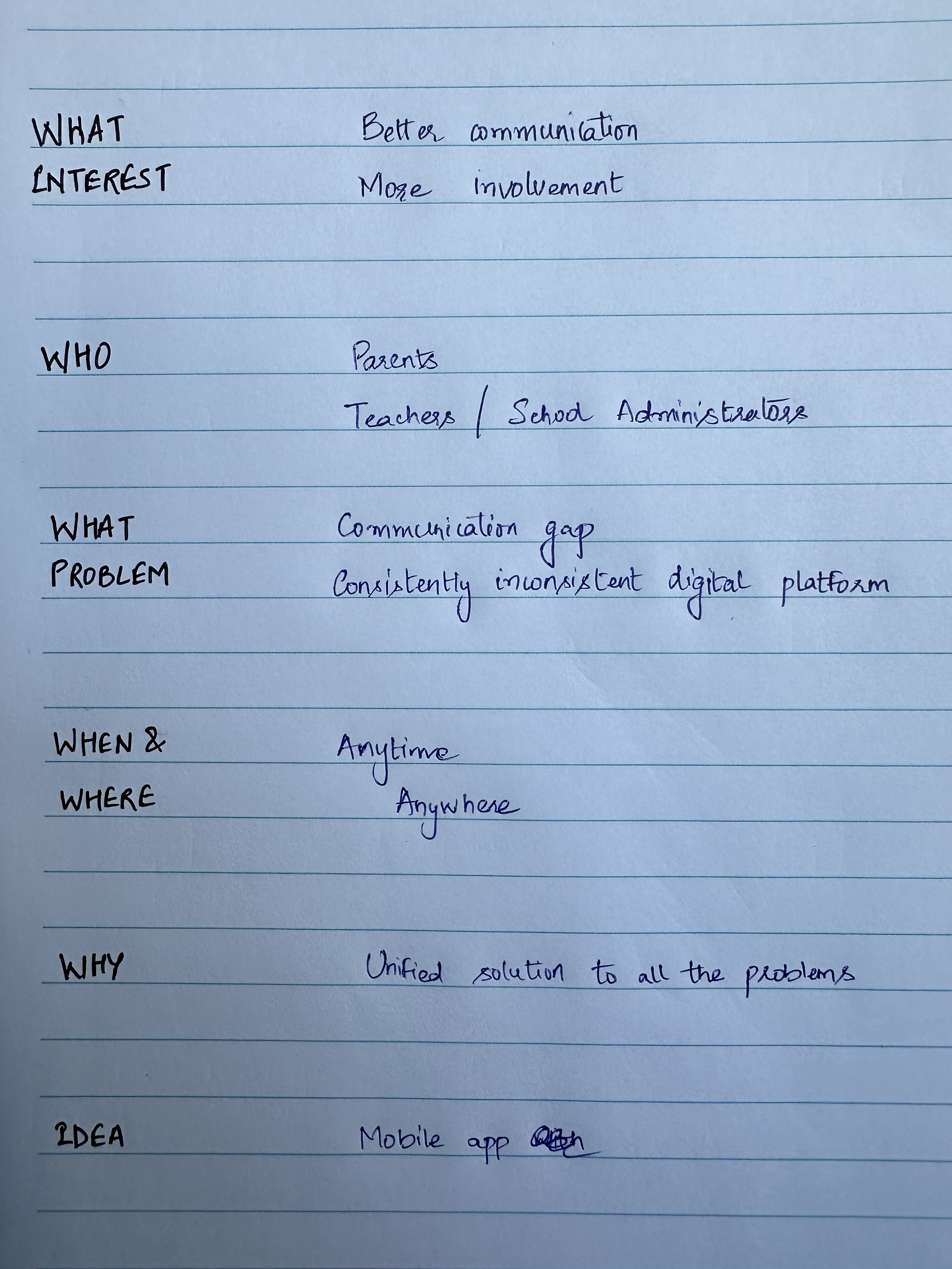
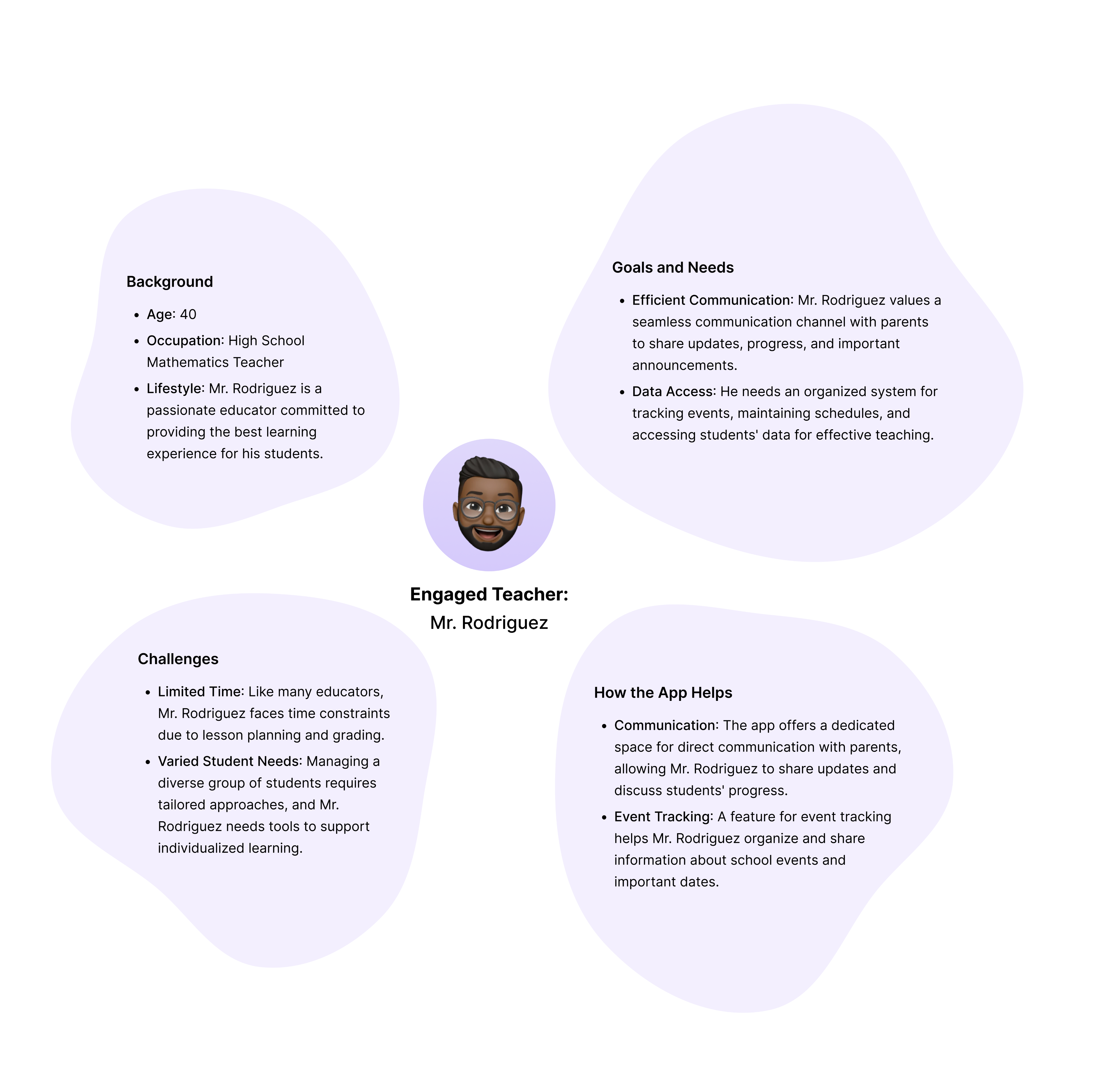
User Personas
A crucial step to empathize with the end users—parents and teachers.
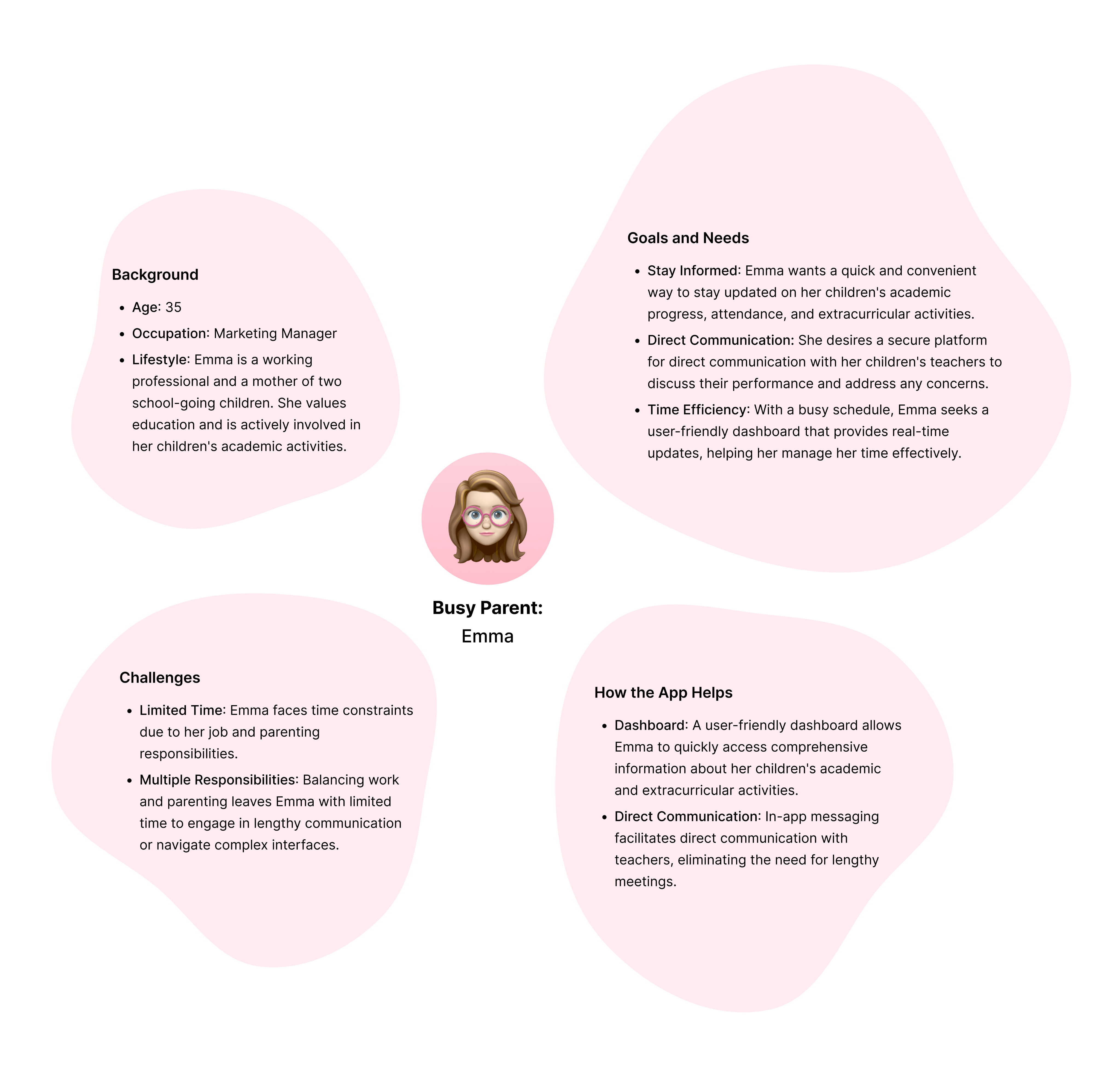
the 'why' behind our decisions
We wanted our app to not only met but exceeded users' expectations, making it a practical solution for parents, teachers, and stakeholders.
These personas allowed us to understand the real challenges users face, uncover pain points in communication, and tailor features to meet specific needs.
the ‘how’ that helped us in making decisions
Emma’s persona highlighted the need for quick access to her child's progress and streamlined communication with teachers.Mr. Rodriguez persona desired a platform where he could efficiently communicate with parents and share school updates.
Designer - Developer Sync
🛠️
Discussions with developers revolved around the technical aspects of tailoring the app's features to meet the diverse needs of different user personas.
For example, for the Parent-Teacher Collaboration Space feature identified in the competitive analysis, developers were involved in planning secure and efficient data sharing mechanisms.
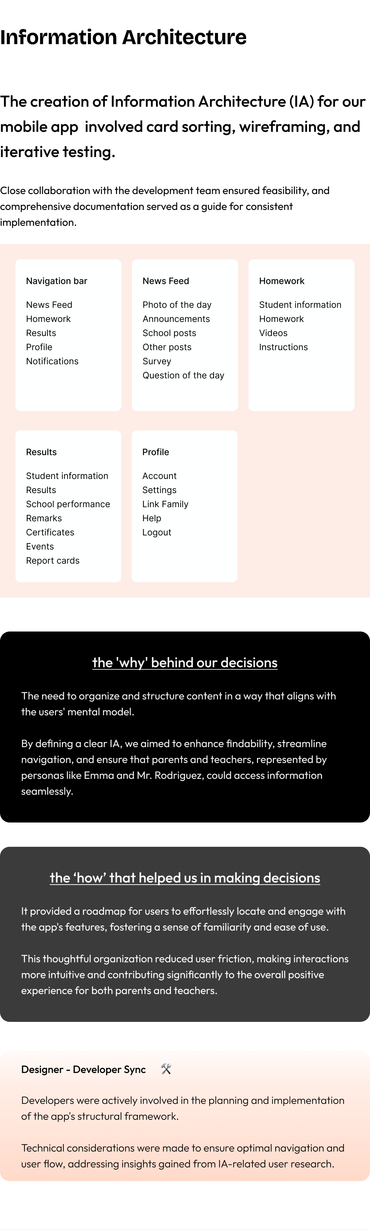
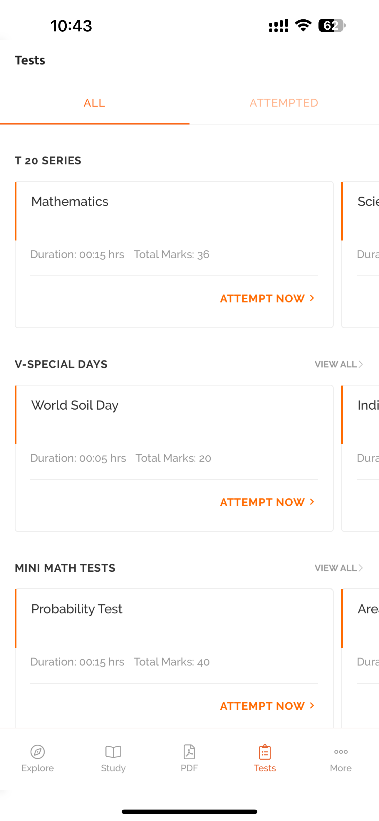
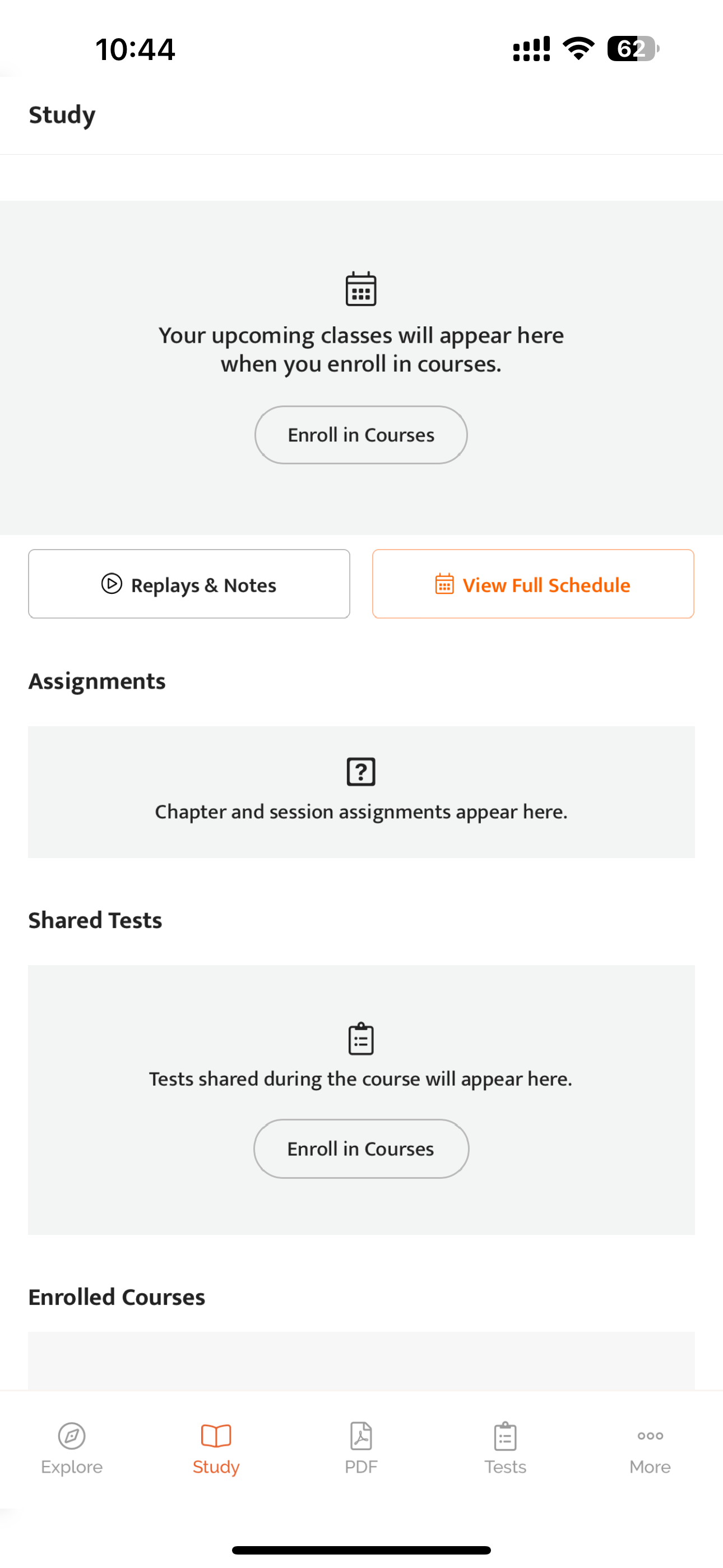
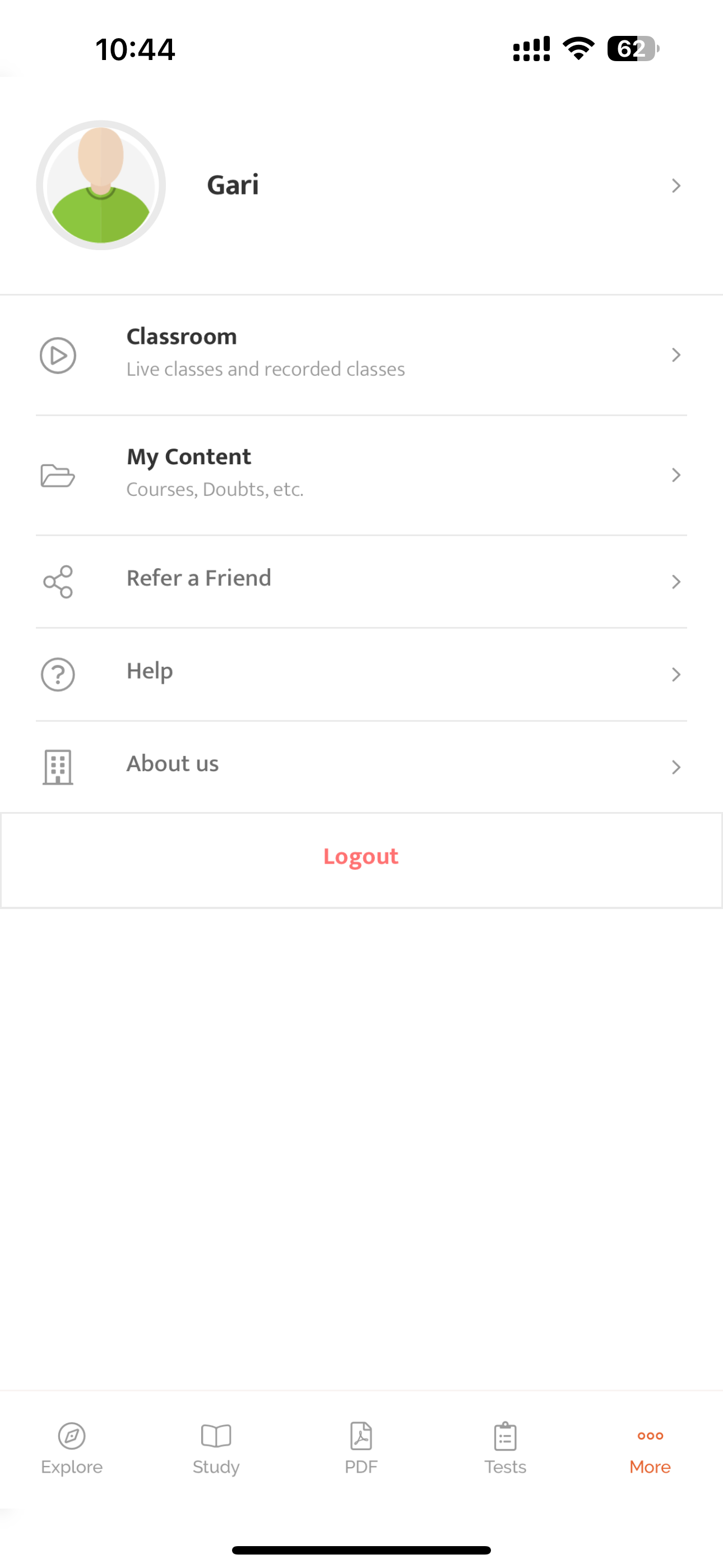
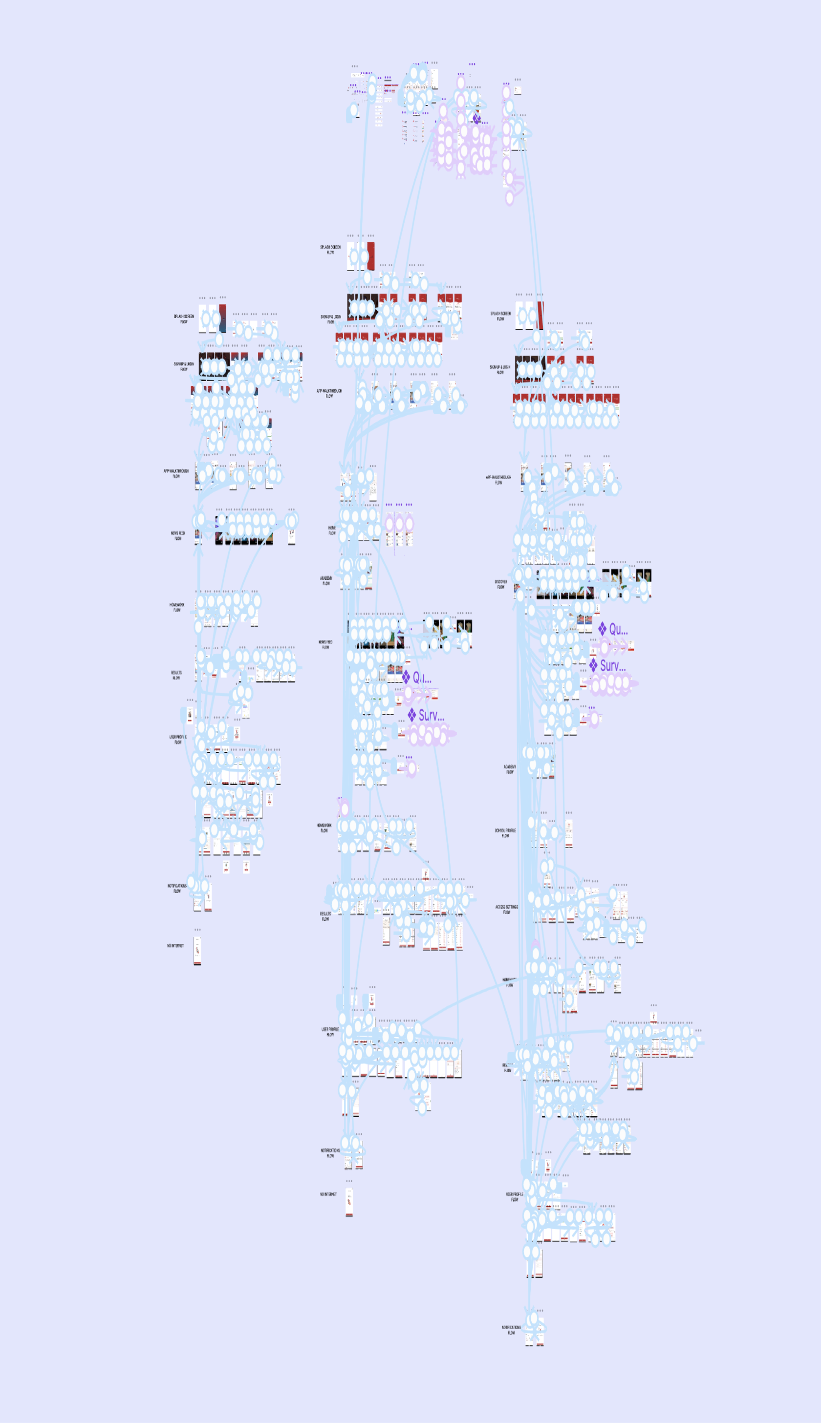
Information Architecture
The creation of Information Architecture (IA) for our mobile app involved card sorting, wireframing, and iterative testing.
Close collaboration with the development team ensured feasibility, and comprehensive documentation served as a guide for consistent implementation.
Navigation bar
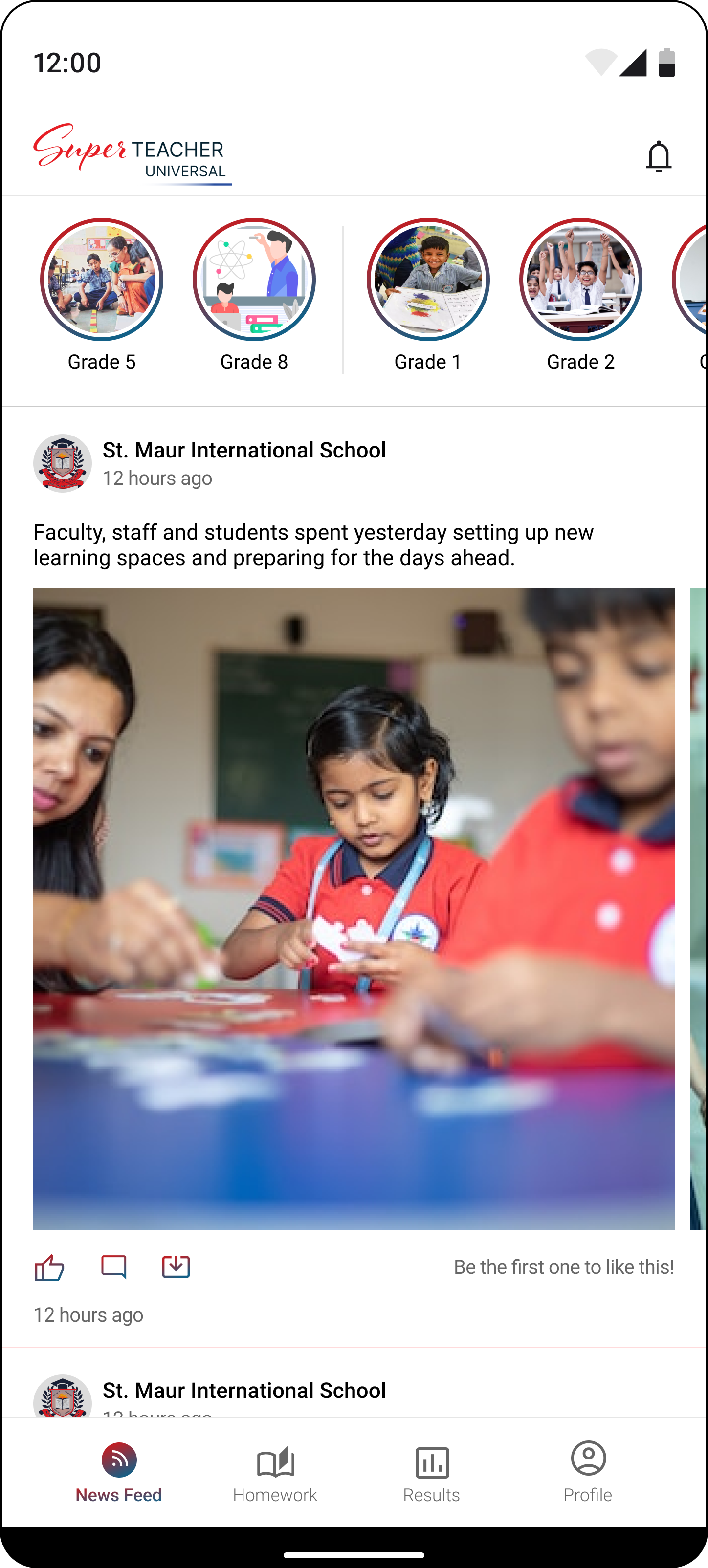
News Feed
Homework
Results
Profile
Notifications
News Feed
Photo of the day
Announcements
School postsOther postsSurveyQuestion of the day
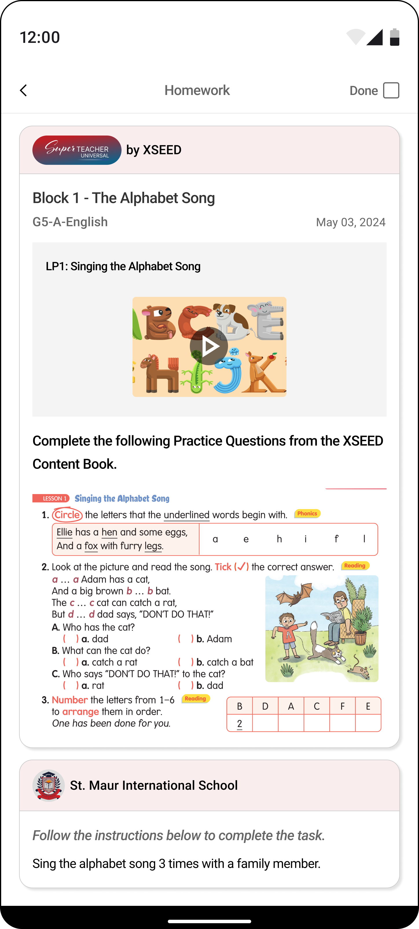
Homework
Student information
Homework
Videos
Instructions
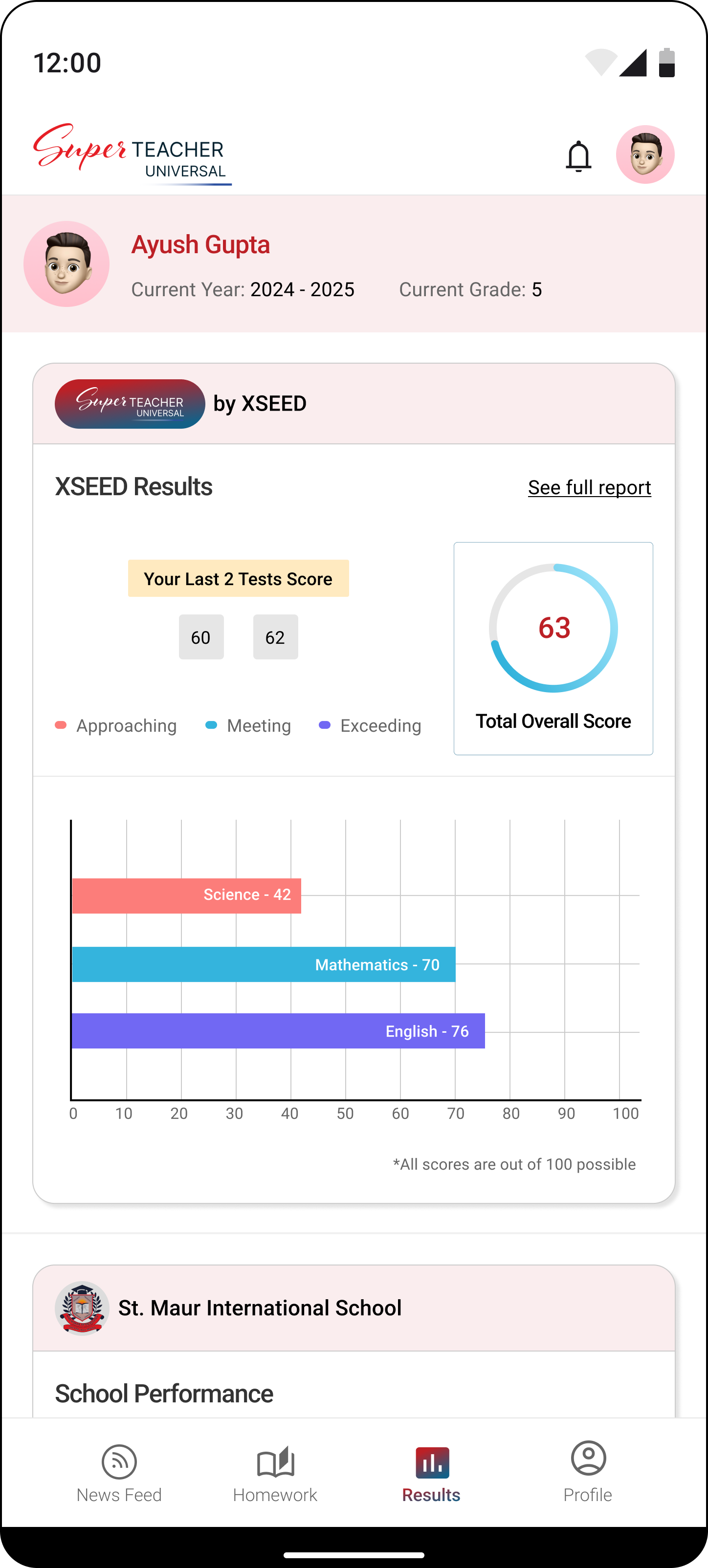
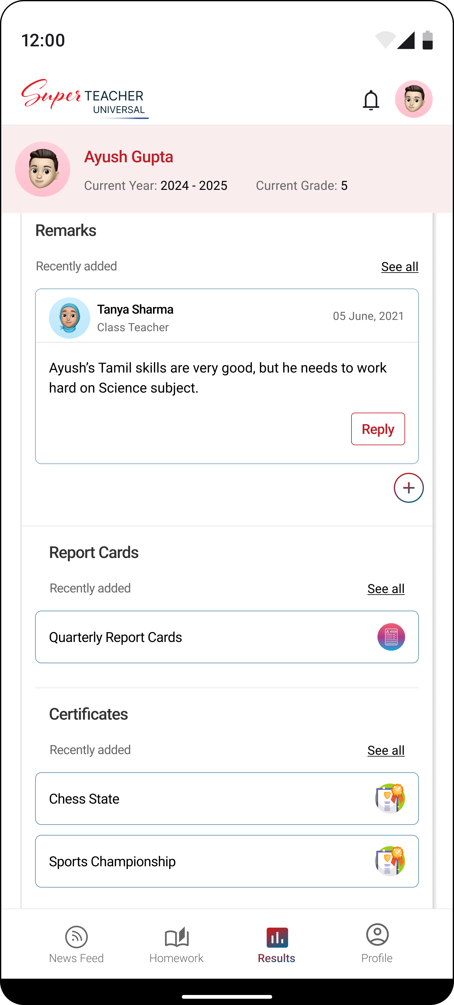
Results
Student information
Results
School performance
Remarks
Certificates
Events
Report cards
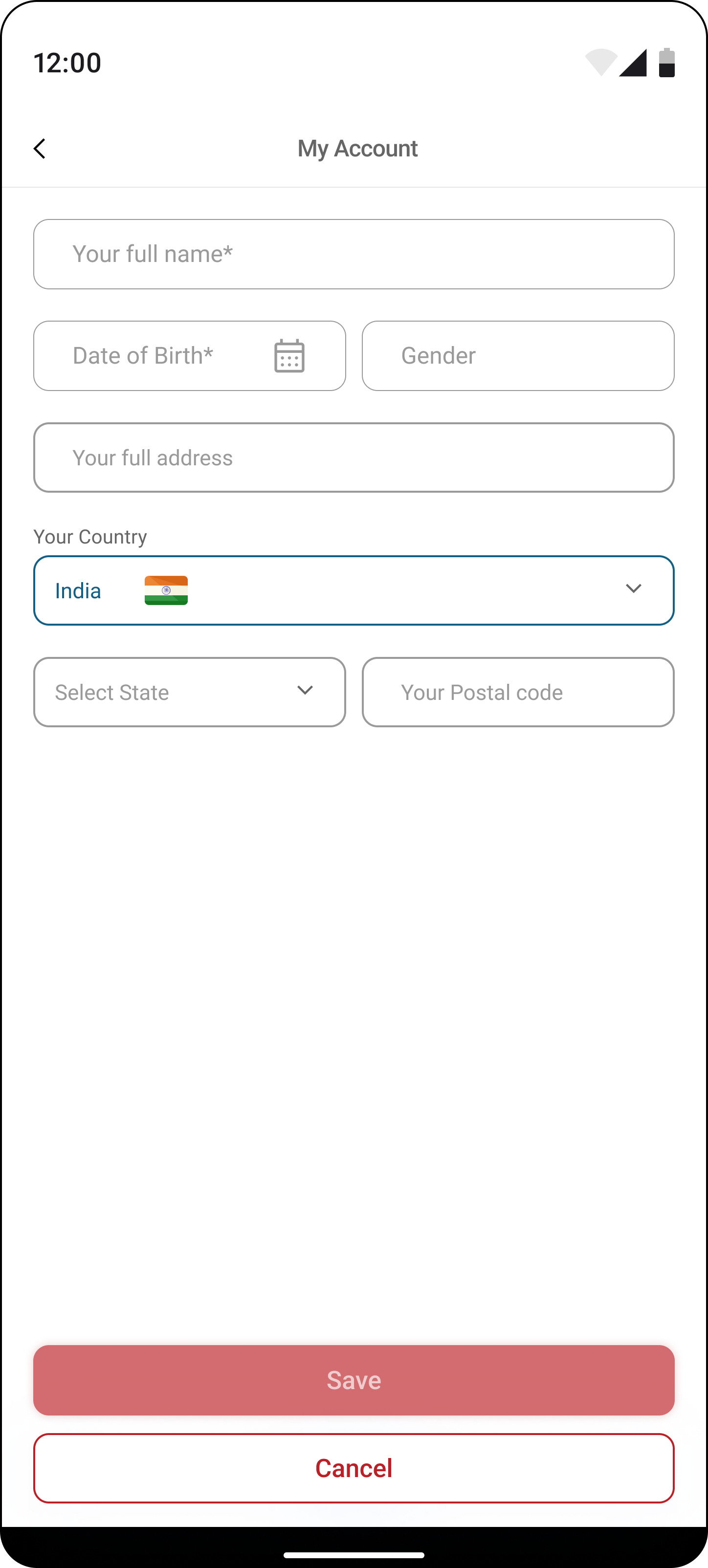
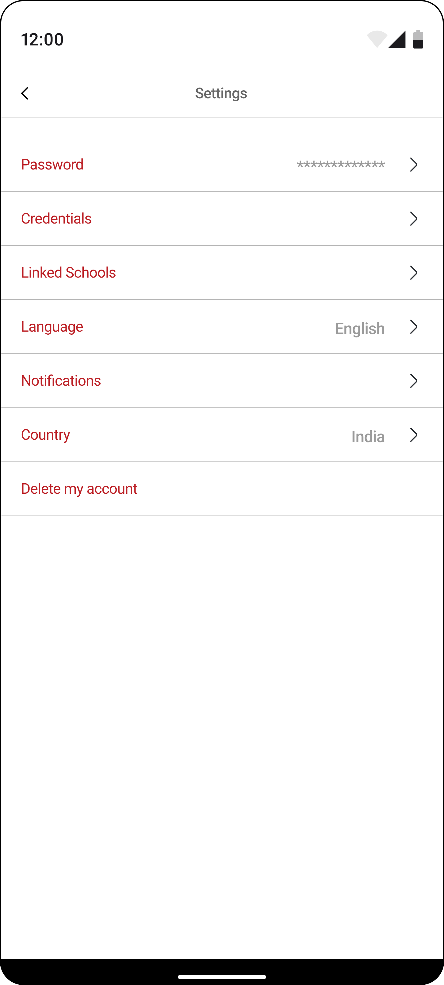
Profile
Account
Settings
Link Family
Help
Logout
the 'why' behind our decisions
The need to organize and structure content in a way that aligns with the users' mental model.
By defining a clear IA, we aimed to enhance findability, streamline navigation, and ensure that parents and teachers, represented by personas like Emma and Mr. Rodriguez, could access information seamlessly.
the ‘how’ that helped us in making decisions
It provided a roadmap for users to effortlessly locate and engage with the app's features, fostering a sense of familiarity and ease of use.
This thoughtful organization reduced user friction, making interactions more intuitive and contributing significantly to the overall positive experience for both parents and teachers.
Designer - Developer Sync
🛠️
Developers were actively involved in the planning and implementation of the app's structural framework.
Technical considerations were made to ensure optimal navigation and user flow, addressing insights gained from IA-related user research.
Design
User-Driven & Feature-Forward Design for a Transformative User Experience
By studying user reviews, we learned that turning visitors into active users depends on having specific features. Now, we've kicked off our design process, focusing on incorporating these essential elements to enhance the user experience.
3
1
2
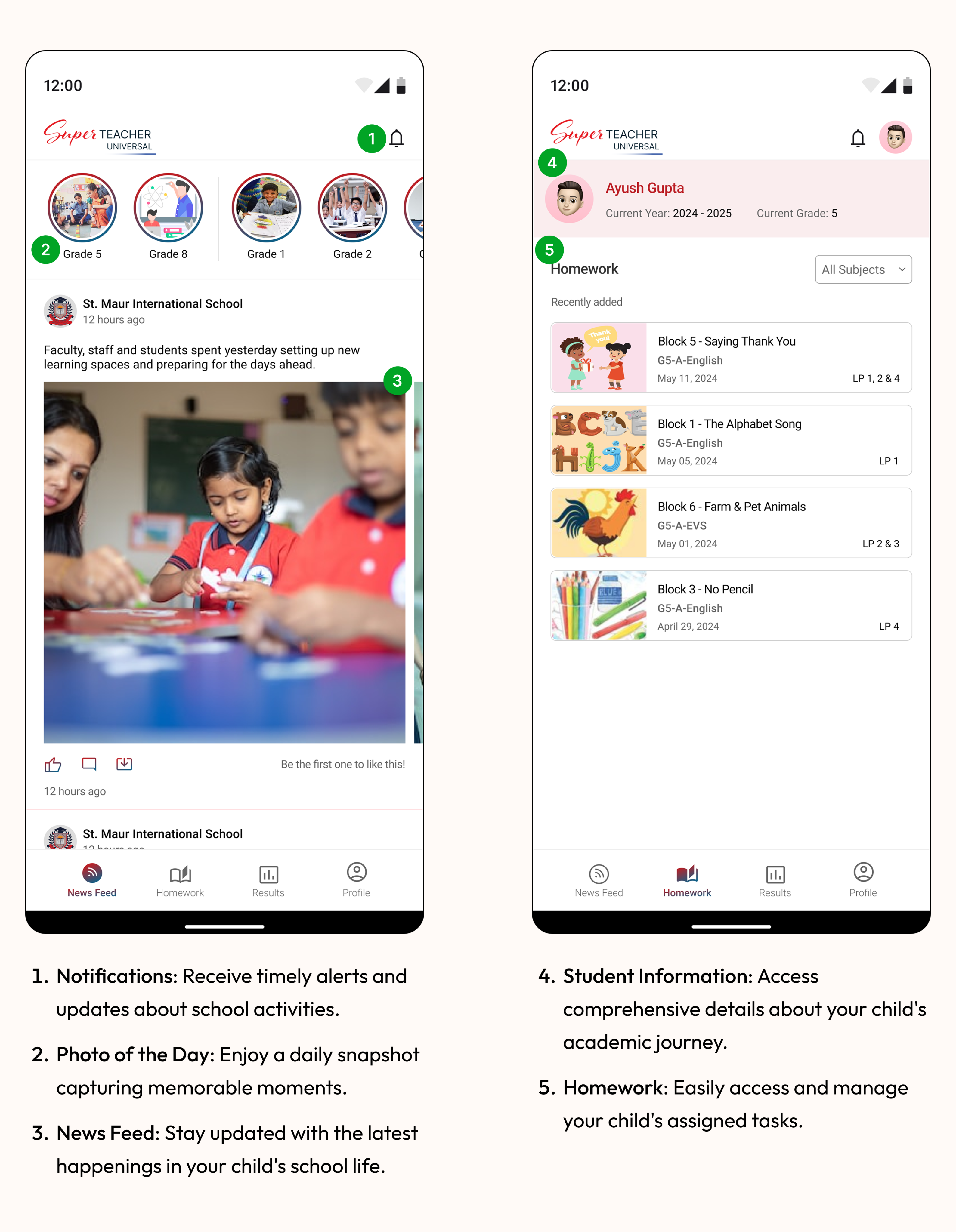
- Notifications: Receive timely alerts and updates about school activities.
- Photo of the Day: Enjoy a daily snapshot capturing memorable moments.
- News Feed: Stay updated with the latest happenings in your child's school life.

4
5
- Student Information: Access comprehensive details about your child's academic journey.
- Homework: Easily access and manage your child's assigned tasks.
6
7
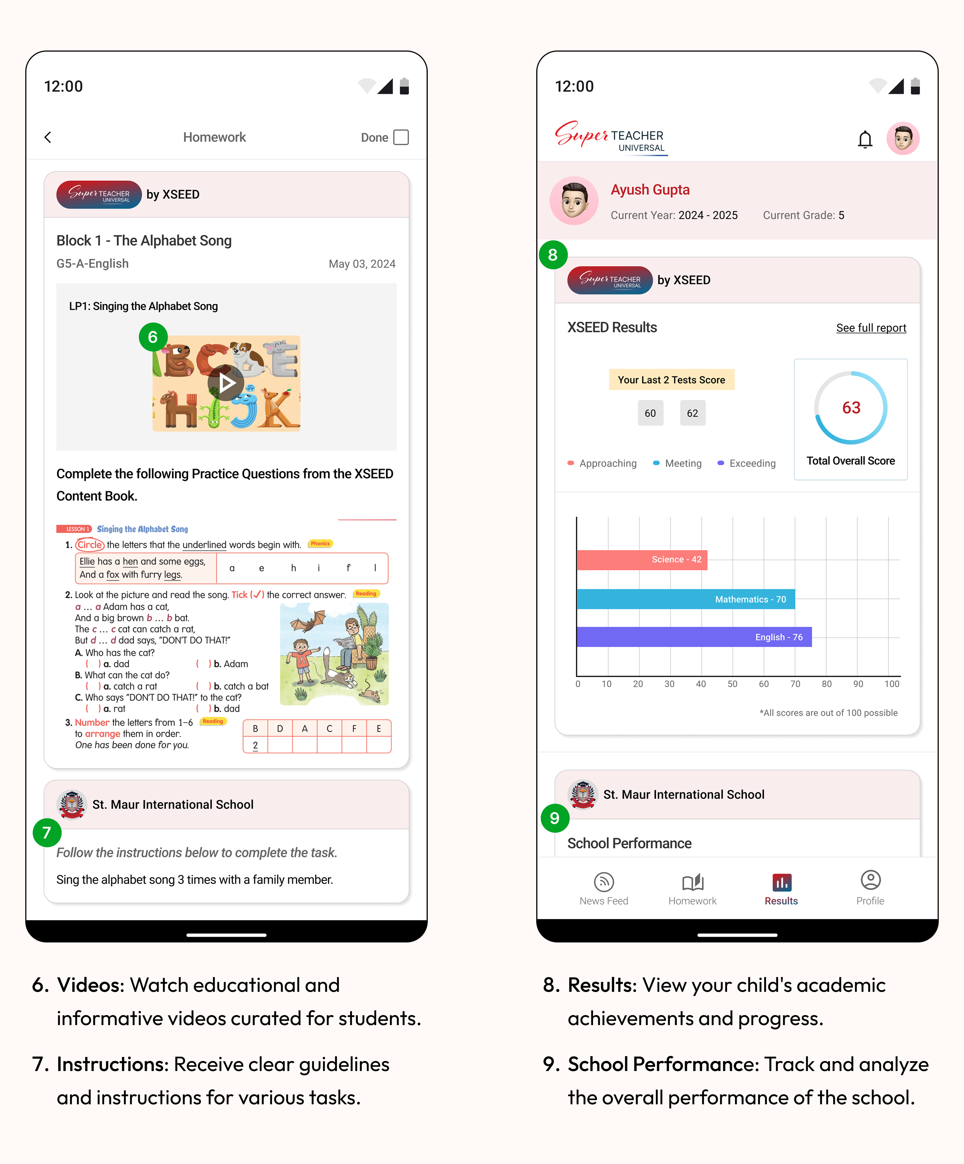
- Videos: Watch educational and informative videos curated for students.
- Instructions: Receive clear guidelines and instructions for various tasks.
8
9
- Results: View your child's academic achievements and progress.
- School Performance: Track and analyze the overall performance of the school.

10
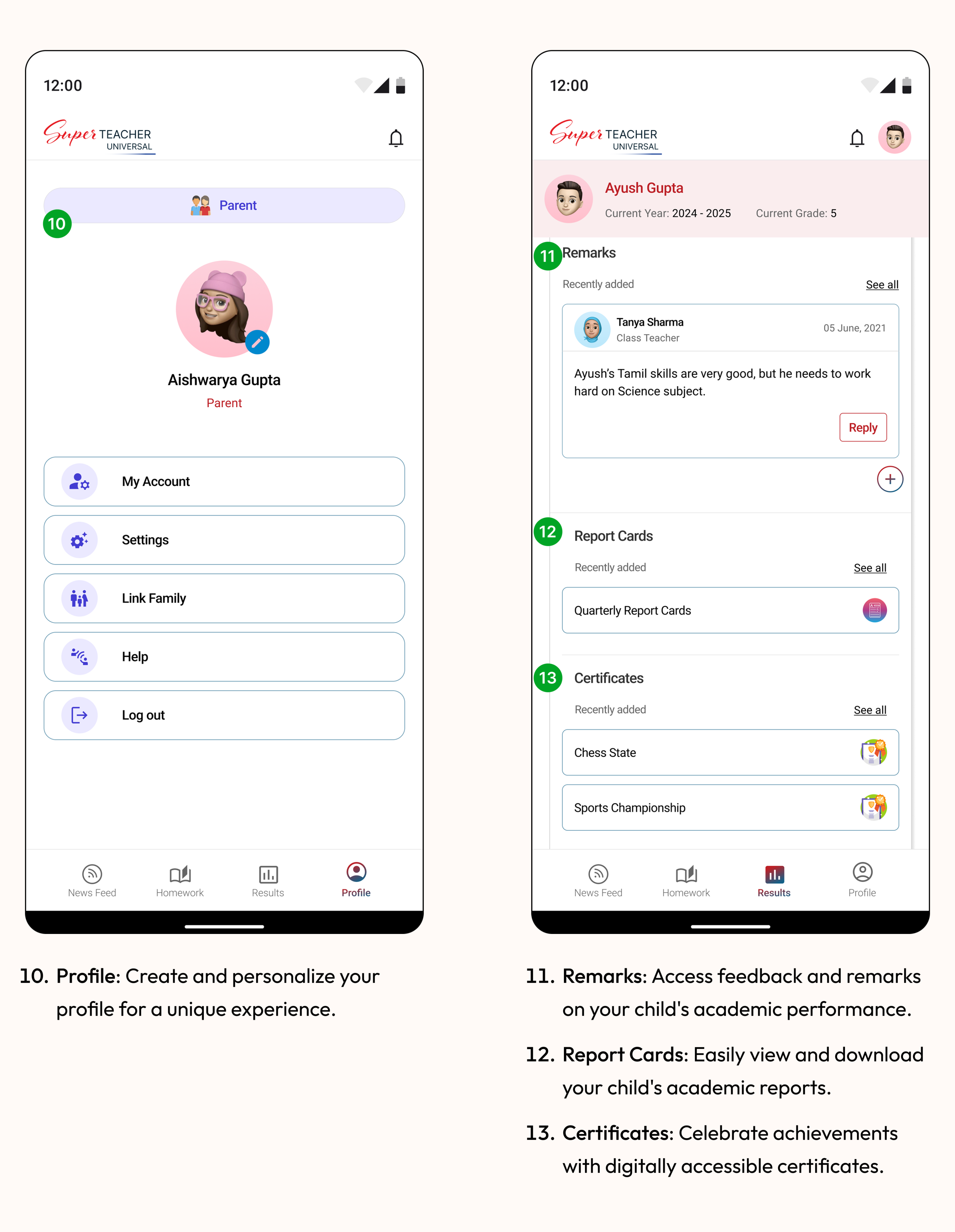
- Profile: Create and personalize your profile for a unique experience.
11
12
13
- Remarks: Access feedback and remarks on your child's academic performance.
- Report Cards: Easily view and download your child's academic reports.
- Certificates: Celebrate achievements with digitally accessible certificates.
14
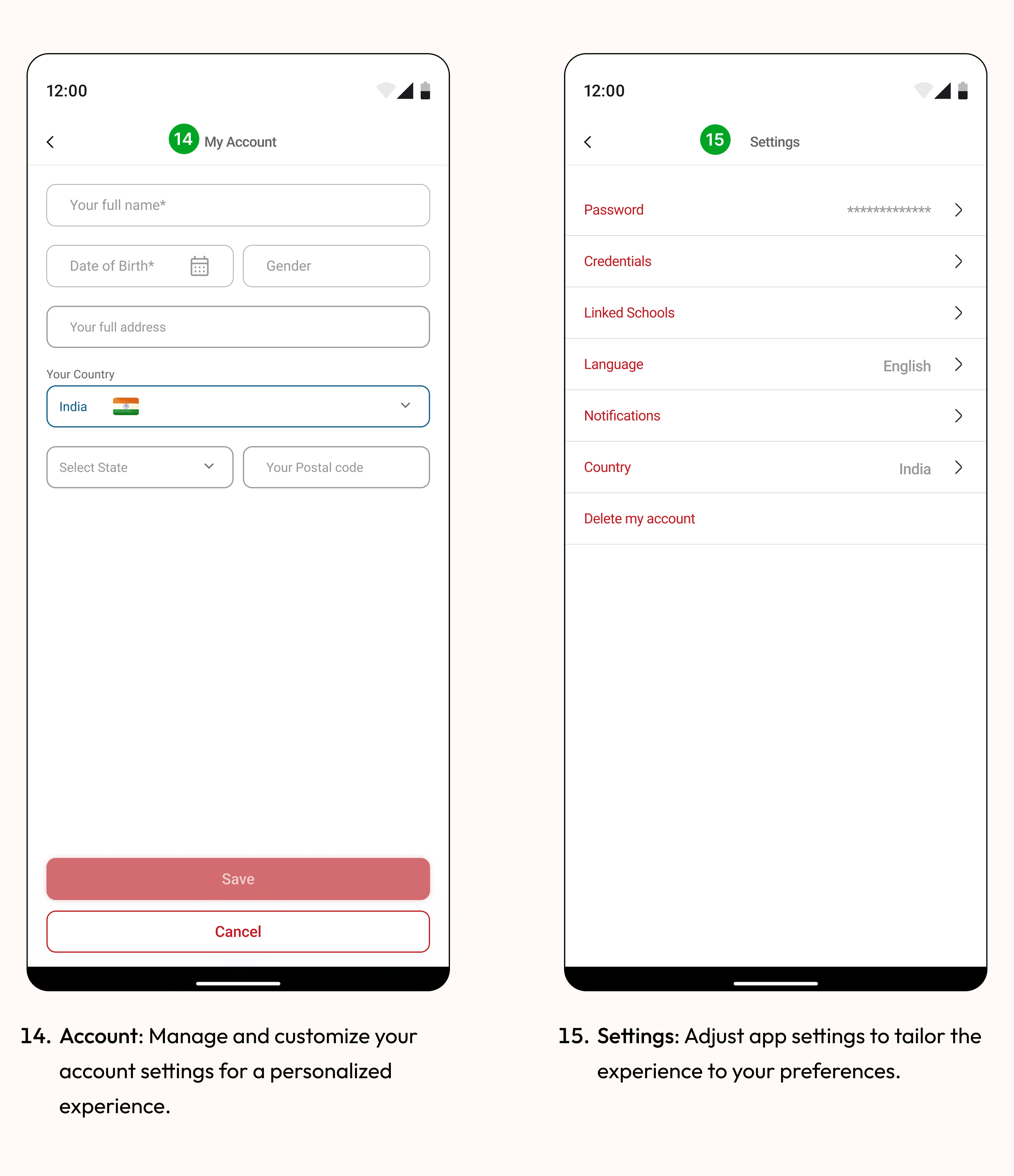
- Account: Manage and customize your account settings for a personalized experience.
15
- Settings: Adjust app settings to tailor the experience to your preferences.
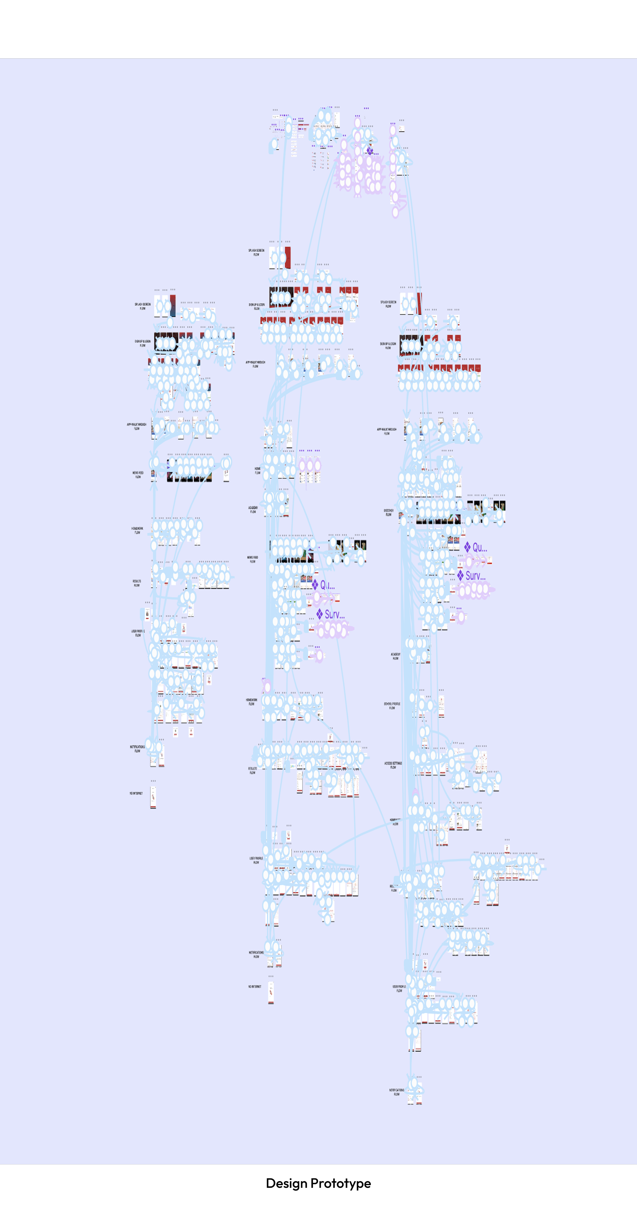
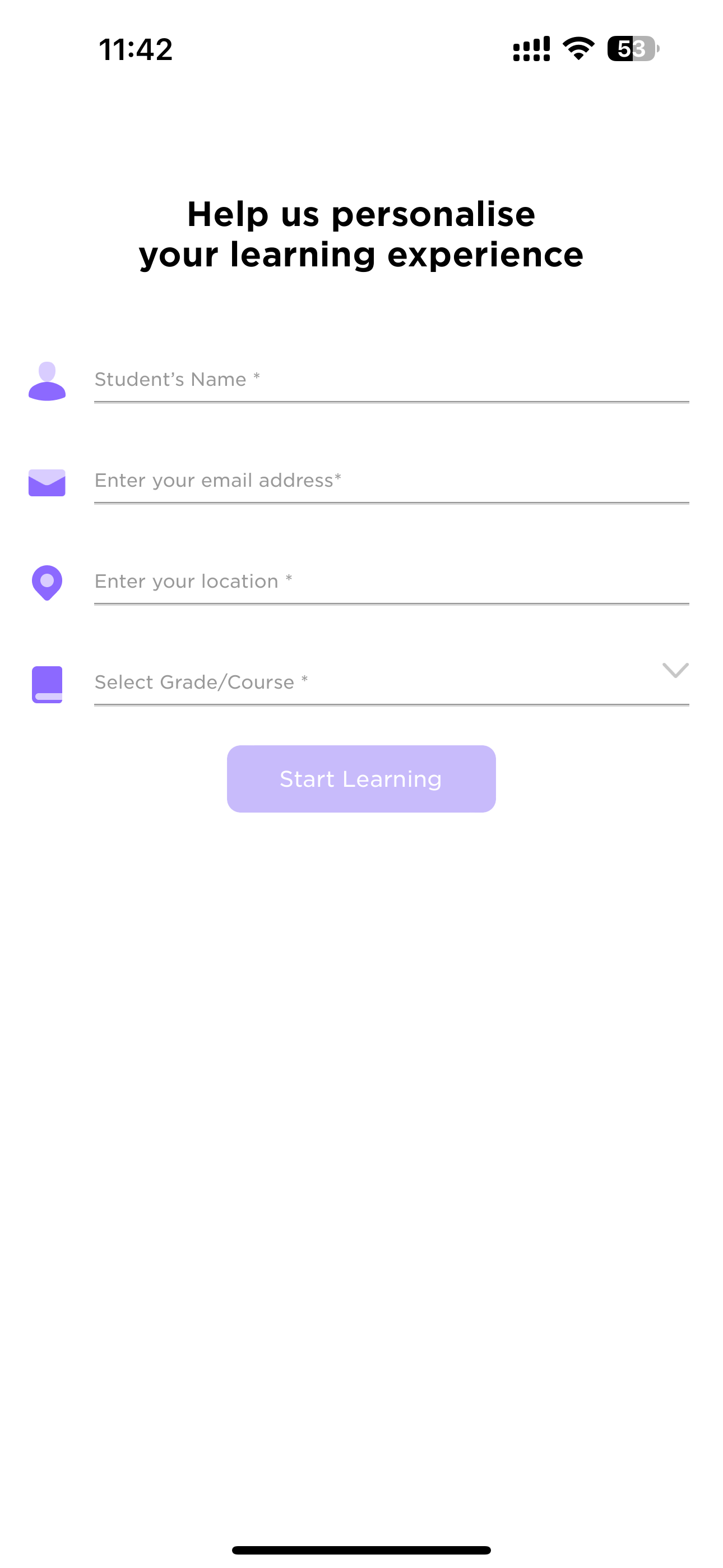
Design Prototype
the 'why' behind our decisions
Initiating the design process at this stage ensured that the features align with user needs and business goals. It helped bridge identified communication gaps and meet the expectations of our target audience.
the ‘how’ that helped us in making decisions
Starting with user research, we gathered insights to inform the creation of user personas. This deepened our understanding of user needs.
The development of Information Architecture (IA) logically organized features, streamlining the design process. This approach ensured purposeful design decisions, contributing to an improved user experience.
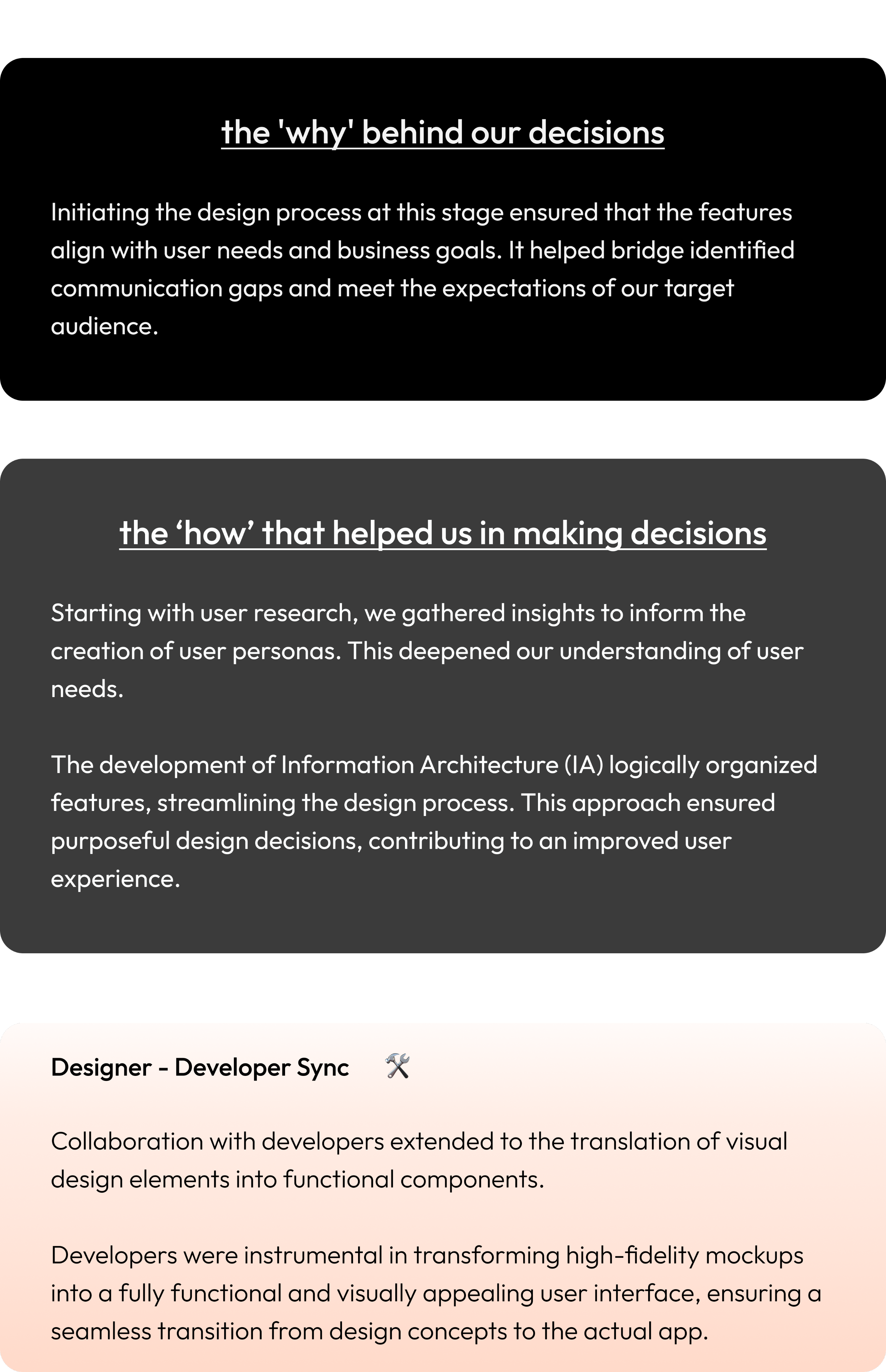
Designer - Developer Sync
🛠️
Collaboration with developers extended to the translation of visual design elements into functional components.
Developers were instrumental in transforming high-fidelity mockups into a fully functional and visually appealing user interface, ensuring a seamless transition from design concepts to the actual app.
Next Steps
Improving Our App
Our journey isn't over! We couldn't talk to as many users as we wanted, but we're determined to make our app even better.
In the future, we plan to chat more with users, get their thoughts, and test how well our app works. This way, we can keep making it more user-friendly and helpful for parents and schools. It's all about moving forward and making things even better!
What I learned
Key Takeaways from this journey so far
Empathy is not sympathy. Understanding people's problems is more than just feeling sorry for them; it's about truly putting ourselves in their shoes. Solving real-world problems, especially in education, is complex and requires not just knowledge but also a deep understanding of emotions. As designers, it's essential to listen with all our senses, not just our ears.
Keep being curious. Curiosity is a superpower. To design better solutions, we need to stay curious and keep learning. If we encounter something new, research and explore until we feel confident and knowledgeable. The XSEED Universal project emphasized the importance of curiosity in navigating challenges and adapting throughout the design process.
Thank you for reading — feel free to share your feedback!
Built with:
Web to Mobile: UX Case Study
From Clicks to Taps: Shaping a Mobile Experience from Web Foundations
Background
A strategic shift from a web-based solution to a mobile app for XSEED Universal, recognizing the need for enhanced accessibility and on-the-go information retrieval.
Context
In the world of education, a smart company saw a problem: it wasn't easy for schools and parents to talk to each other. This company, known for helping kids from kindergarten to higher grades, decided to change that. They wanted to make a special app to make talking between schools and parents much better.
I was the main designer for this project, helping to make it happen. We wanted to make sure that parents and schools could talk easily and get information quickly. This project shows how the company is always trying to make things better in the world of education.
Core team
2 designers + 1 product manager + lead developer + business team
Time
4 months
My role
As the lead product designer, I drove the shift from a website to a mobile app. I identified communication issues, collaborated on decisions, and ensured a smooth transition. The result was a successful move to a mobile app, improving communication for parents and schools.
Tools
Figma, Zoom, FigJam
Impact
3300
new registration within 2 months
📲
80%
increase in overall engagement
🤝
40%
reduction in customer support inquiries
📥
Conflict
Bridging the Void: Navigating Educational Communication Challenges
Recognizing the lack of effective communication between schools and parents regarding academic and extracurricular progress, the existing methods, such as traditional report cards or fragmented digital platforms, fell short in meeting the need for streamlined and comprehensive communication. The challenge was to bridge these communication gaps and create a one-stop solution for parents and schools, providing valuable insights into students' progress.
the 'why' behind our decisions
The decision was made to create a user-friendly solution as traditional communication methods between schools and parents were ineffective. Current approaches lacked streamlined communication, and our goal is to bridge these gaps, offering valuable insights into students' progress through a single solution.
Problem Identification:
Identified gaps: difficulty finding messages, need for a data-oriented report card, challenges in connecting with teachers, unorganized event tracking, and no designated platform for parents.
the 'why' behind our decisions
We identified these challenges because they hindered a smooth and user-friendly experience.
Decision to Shift to Mobile App
Making things easier & acknowledging the growing importance of mobile accessibility.
A strategic shift to a mobile app was prompted by the realization that mobile accessibility was becoming increasingly crucial. Understanding the need for parents to have immediate, on-the-go access to student information influenced this decision, aligning with evolving user behaviors and preferences.
We decided to change from the website to a mobile app for Universal Education to make things better for parents and schools. We know parents use their phones a lot, so we wanted to give them a way to quickly check important info about their child's education, wherever they are. This decision is all about making things simpler and more connected for parents and schools.
the 'why' behind our decisions
We moved to a mobile app for Universal Education to simplify and improve communication between parents and schools. With parents using phones frequently, the app offers quick access to essential information, making education more convenient for everyone.
Business Requirements
Aligning strategic objectives with tangible features and functionalities
- Push notifications, personalized content recommendations.
- Robust in-app messaging, customizable notifications.
- User-friendly dashboard with real-time updates.
- API connections for data sharing.
- Adherence to visual design language, brand elements.
the 'why' behind our decisions
We've decided on these features to make the app engaging and user-friendly, with timely updates, effective communication, easy access to real-time information, seamless data sharing, and a consistent brand identity.
Designer - Developer Sync
🛠️
Discussions with developers centered on the technical feasibility and implementation of key features like push notifications, API connections, and adherence to the visual design language.
For instance, developers played a crucial role in ensuring the seamless integration of API connections to facilitate data sharing between XSEED Universal and other products.
User Research
The platform witnessed a decline in user engagement and satisfaction, primarily attributed to an outdated and unintuitive web interface.
- Parents expressed a preference for direct and immediate communication with teachers.
- Parents desired quick access to comprehensive information about their child's academic and extracurricular progress.
- Users expressed a need for personalized control over notifications to tailor the app experience to their individual preferences.
- Parents saw value in having a unified experience across various platforms.
- Users highlighted the importance of data security and privacy.
the 'why' behind our decisions
We wanted to make the XSEED Universal app really work for the people using it, so we sat down and chatted with them. We asked about what they liked, what bothered them, and what would make things better.
the ‘how’ that helped us in making decisions
Their answers were like a treasure map. We found out they wanted to talk directly with teachers, get quick updates on how their kids were doing, have control over notifications, and see everything in one place. With these insights, it's like they gave us the secret code to make the app awesome for parents and schools in the XSEED Universal gang.
Designer - Developer Sync
🛠️
Developers were engaged in understanding the technical implications of user preferences and behavior.
Insights gained from user feedback, such as the preference for direct communication with teachers, influenced the development of the in-app messaging system, with developers focusing on real-time communication functionalities.
Competitive Analysis
Learning from Others: How We Made Our App Stand Out
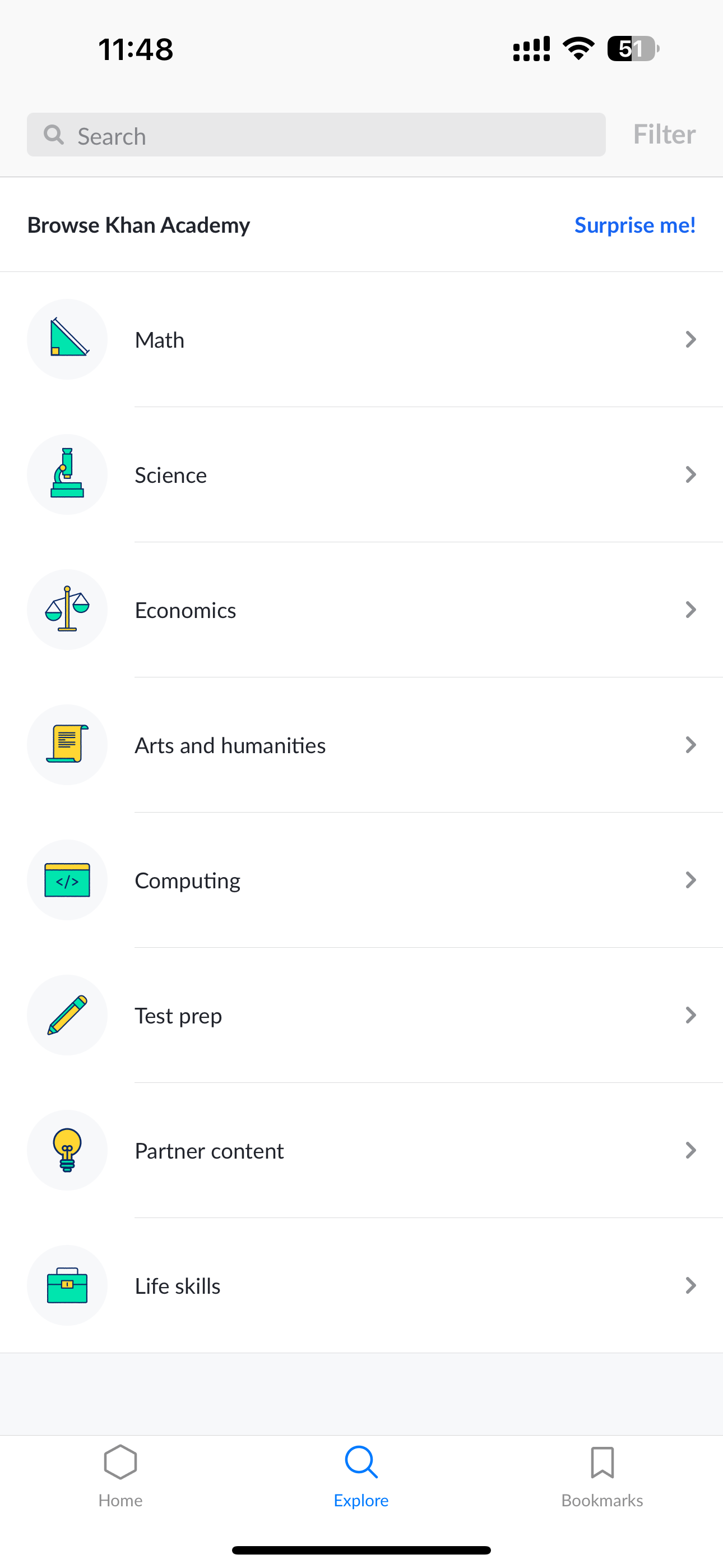
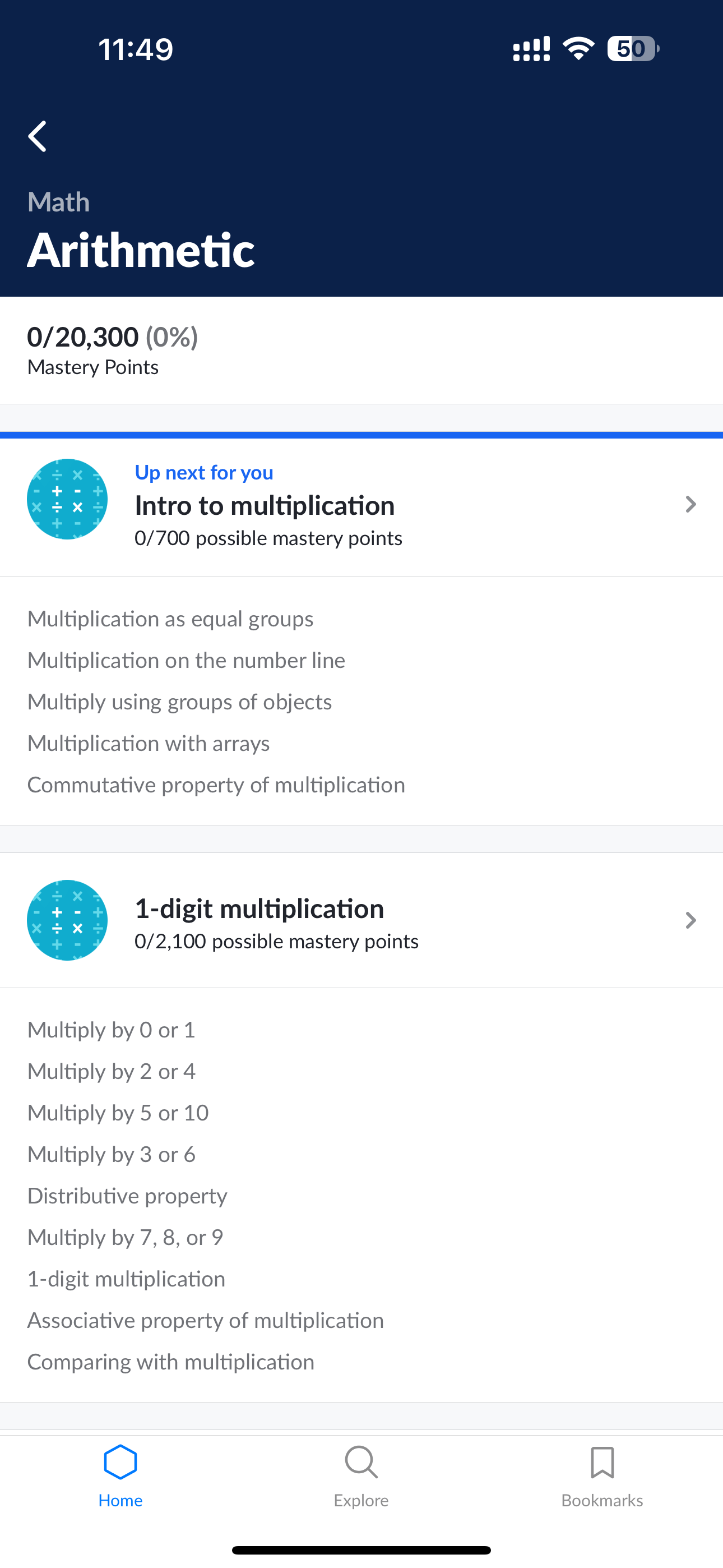
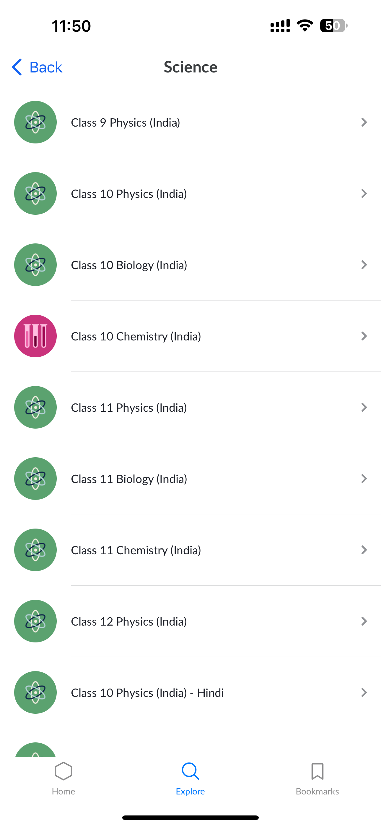
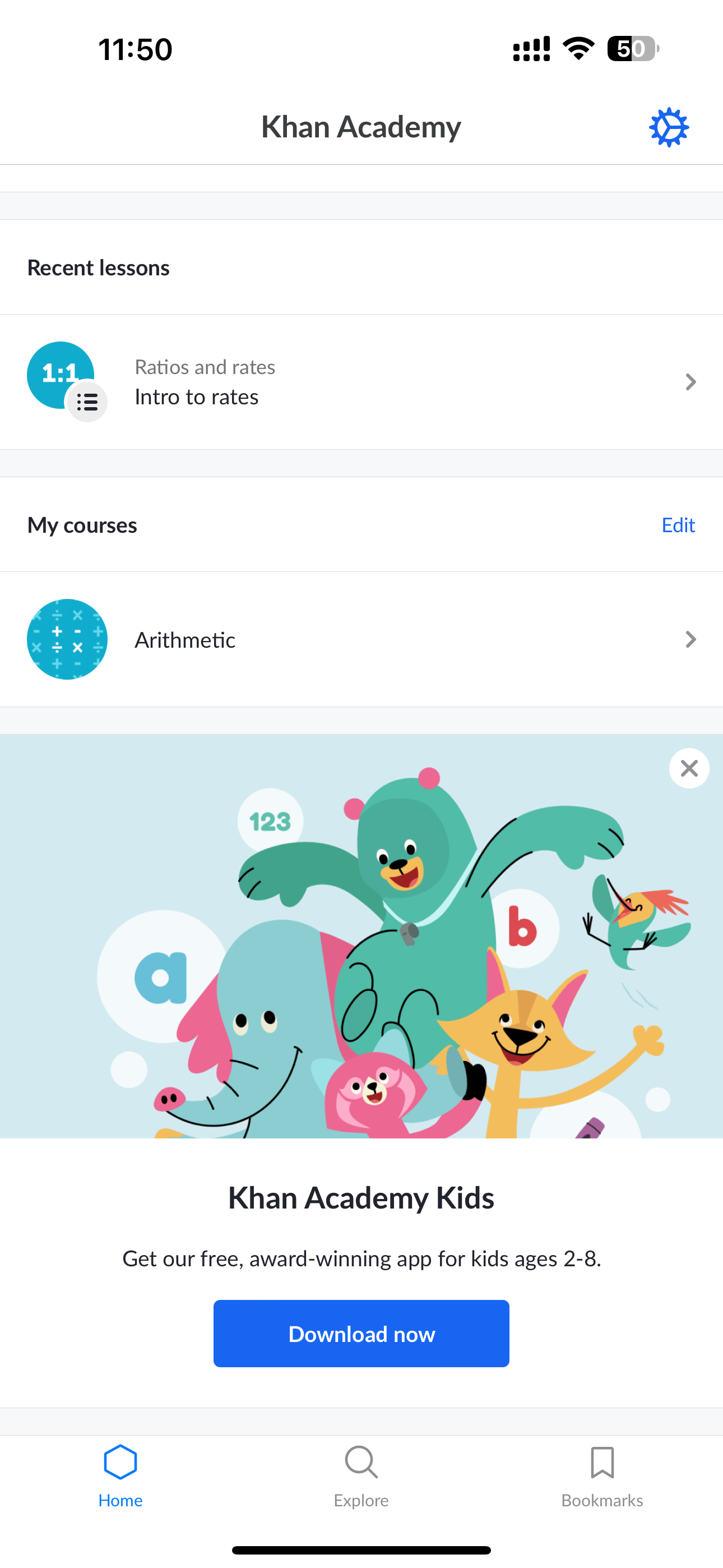
In comparing our app to competitors like Byjus, Khan Academy, and Vedantu, we've identified specific areas where we can implement unique features to bridge the gap between education/school and parents:
BYJU’S
Khan Academy
Vedantu
- Create a dedicated dashboard for parents that provides insights into their child's academic progress, attendance, and extracurricular activities. None of the competitors currently offer a comprehensive parental involvement feature
- Implement a feature that allows schools to share updates, events, and important announcements directly through the app. None of the competitors have a centralized system for school-wide communication and updates.
- Prioritize robust data security measures and provide parents with granular privacy controls over their child's information. None of the competitors explicitly address data security concerns from a parental perspective.
- Implement community-building features within our app to encourage interaction and collaboration among users. None of the competitors have a dedicated platform for fostering collaboration between parents and teachers.
- Ensure our app has a responsive design to provide a consistent and optimal experience across various devices.
the 'why' behind our decisions
We wanted our app to be the coolest one out there, so we checked what others were doing. It helped us figure out where we could do things differently and better.
the ‘how’ that helped us in making decisions
Looking at other apps was like getting insider info. We found spots where we could shine, like giving parents a special dashboard, letting them talk directly to teachers, sharing school updates, personalizing learning plans, and making sure all data is super safe. No other app was doing all of that, so we're making ours the go-to for parents who want a top-notch connection between school and home.
Designer - Developer Sync
🛠️
Discussions with developers in this stage focused on identifying technical differentiators for features like the Parental Involvement Dashboard and Direct Teacher-Parent Communication.
Developers contributed to the technical aspects of creating a collaborative space within the app and ensuring secure communication channels.
User Personas
A crucial step to empathize with the end users—parents and teachers.
the 'why' behind our decisions
We wanted our app to not only met but exceeded users' expectations, making it a practical solution for parents, teachers, and stakeholders.
These personas allowed us to understand the real challenges users face, uncover pain points in communication, and tailor features to meet specific needs.
the ‘how’ that helped us in making decisions
Emma’s persona highlighted the need for quick access to her child's progress and streamlined communication with teachers.Mr. Rodriguez persona desired a platform where he could efficiently communicate with parents and share school updates.
Designer - Developer Sync
🛠️
Discussions with developers revolved around the technical aspects of tailoring the app's features to meet the diverse needs of different user personas.
For example, for the Parent-Teacher Collaboration Space feature identified in the competitive analysis, developers were involved in planning secure and efficient data sharing mechanisms.
Information Architecture
The creation of Information Architecture (IA) for our mobile app involved card sorting, wireframing, and iterative testing.
Close collaboration with the development team ensured feasibility, and comprehensive documentation served as a guide for consistent implementation.
Navigation bar
News Feed
Homework
Results
Profile
Notifications
News Feed
Photo of the day
Announcements
School postsOther postsSurveyQuestion of the day
Homework
Student information
Homework
Videos
Instructions
Results
Student information
Results
School performance
Remarks
Certificates
Events
Report cards
Profile
Account
Settings
Link Family
Help
Logout
the 'why' behind our decisions
The need to organize and structure content in a way that aligns with the users' mental model.
By defining a clear IA, we aimed to enhance findability, streamline navigation, and ensure that parents and teachers, represented by personas like Emma and Mr. Rodriguez, could access information seamlessly.
the ‘how’ that helped us in making decisions
It provided a roadmap for users to effortlessly locate and engage with the app's features, fostering a sense of familiarity and ease of use.
This thoughtful organization reduced user friction, making interactions more intuitive and contributing significantly to the overall positive experience for both parents and teachers.
Designer - Developer Sync
🛠️
Developers were actively involved in the planning and implementation of the app's structural framework.
Technical considerations were made to ensure optimal navigation and user flow, addressing insights gained from IA-related user research.
Design
User-Driven & Feature-Forward Design for a Transformative User Experience
By studying user reviews, we learned that turning visitors into active users depends on having specific features. Now, we've kicked off our design process, focusing on incorporating these essential elements to enhance the user experience.
3
1
2
- Notifications: Receive timely alerts and updates about school activities.
- Photo of the Day: Enjoy a daily snapshot capturing memorable moments.
- News Feed: Stay updated with the latest happenings in your child's school life.
4
5
- Student Information: Access comprehensive details about your child's academic journey.
- Homework: Easily access and manage your child's assigned tasks.
6
7
- Videos: Watch educational and informative videos curated for students.
- Instructions: Receive clear guidelines and instructions for various tasks.
8
9
- Results: View your child's academic achievements and progress.
- School Performance: Track and analyze the overall performance of the school.
10
- Profile: Create and personalize your profile for a unique experience.
11
12
13
- Remarks: Access feedback and remarks on your child's academic performance.
- Report Cards: Easily view and download your child's academic reports.
- Certificates: Celebrate achievements with digitally accessible certificates.
14
- Account: Manage and customize your account settings for a personalized experience.
15
- Settings: Adjust app settings to tailor the experience to your preferences.

Design Prototype
the 'why' behind our decisions
Initiating the design process at this stage ensured that the features align with user needs and business goals. It helped bridge identified communication gaps and meet the expectations of our target audience.
the ‘how’ that helped us in making decisions
Starting with user research, we gathered insights to inform the creation of user personas. This deepened our understanding of user needs.
The development of Information Architecture (IA) logically organized features, streamlining the design process. This approach ensured purposeful design decisions, contributing to an improved user experience.
Designer - Developer Sync
🛠️
Collaboration with developers extended to the translation of visual design elements into functional components.
Developers were instrumental in transforming high-fidelity mockups into a fully functional and visually appealing user interface, ensuring a seamless transition from design concepts to the actual app.
Next Steps
Improving Our App
Our journey isn't over! We couldn't talk to as many users as we wanted, but we're determined to make our app even better.
In the future, we plan to chat more with users, get their thoughts, and test how well our app works. This way, we can keep making it more user-friendly and helpful for parents and schools. It's all about moving forward and making things even better!
What I learned
Key Takeaways from this journey so far
Empathy is not sympathy. Understanding people's problems is more than just feeling sorry for them; it's about truly putting ourselves in their shoes. Solving real-world problems, especially in education, is complex and requires not just knowledge but also a deep understanding of emotions. As designers, it's essential to listen with all our senses, not just our ears.
Keep being curious. Curiosity is a superpower. To design better solutions, we need to stay curious and keep learning. If we encounter something new, research and explore until we feel confident and knowledgeable. The XSEED Universal project emphasized the importance of curiosity in navigating challenges and adapting throughout the design process.
Thank you for reading — feel free to share your feedback!
Built with:
Web to Mobile: UX Case Study
From Clicks to Taps: Shaping a Mobile Experience from Web Foundations
Background
A strategic shift from a web-based solution to a mobile app for XSEED Universal, recognizing the need for enhanced accessibility and on-the-go information retrieval.
Context
In the world of education, a smart company saw a problem: it wasn't easy for schools and parents to talk to each other. This company, known for helping kids from kindergarten to higher grades, decided to change that. They wanted to make a special app to make talking between schools and parents much better.
I was the main designer for this project, helping to make it happen. We wanted to make sure that parents and schools could talk easily and get information quickly. This project shows how the company is always trying to make things better in the world of education.
Core team
2 designers + 1 product manager + lead developer + business team
Time
4 months
My role
As the lead product designer, I drove the shift from a website to a mobile app. I identified communication issues, collaborated on decisions, and ensured a smooth transition. The result was a successful move to a mobile app, improving communication for parents and schools.
Tools
Figma, Zoom, FigJam
Impact
3300
new registration within 2 months
📲
80%
increase in overall engagement
🤝
40%
reduction in customer support inquiries
📥
Conflict
Bridging the Void: Navigating Educational Communication Challenges
Recognizing the lack of effective communication between schools and parents regarding academic and extracurricular progress, the existing methods, such as traditional report cards or fragmented digital platforms, fell short in meeting the need for streamlined and comprehensive communication. The challenge was to bridge these communication gaps and create a one-stop solution for parents and schools, providing valuable insights into students' progress.
the 'why' behind our decisions
The decision was made to create a user-friendly solution as traditional communication methods between schools and parents were ineffective. Current approaches lacked streamlined communication, and our goal is to bridge these gaps, offering valuable insights into students' progress through a single solution.
Problem Identification:
Identified gaps: difficulty finding messages, need for a data-oriented report card, challenges in connecting with teachers, unorganized event tracking, and no designated platform for parents.
the 'why' behind our decisions
We identified these challenges because they hindered a smooth and user-friendly experience.
Decision to Shift to Mobile App
Making things easier & acknowledging the growing importance of mobile accessibility.
A strategic shift to a mobile app was prompted by the realization that mobile accessibility was becoming increasingly crucial. Understanding the need for parents to have immediate, on-the-go access to student information influenced this decision, aligning with evolving user behaviors and preferences.
We decided to change from the website to a mobile app for Universal Education to make things better for parents and schools. We know parents use their phones a lot, so we wanted to give them a way to quickly check important info about their child's education, wherever they are. This decision is all about making things simpler and more connected for parents and schools.
the 'why' behind our decisions
We moved to a mobile app for Universal Education to simplify and improve communication between parents and schools. With parents using phones frequently, the app offers quick access to essential information, making education more convenient for everyone.
Business Requirements
Aligning strategic objectives with tangible features and functionalities
- Push notifications, personalized content recommendations.
- Robust in-app messaging, customizable notifications.
- User-friendly dashboard with real-time updates.
- API connections for data sharing.
- Adherence to visual design language, brand elements.
the 'why' behind our decisions
We've decided on these features to make the app engaging and user-friendly, with timely updates, effective communication, easy access to real-time information, seamless data sharing, and a consistent brand identity.
Designer - Developer Sync
🛠️
Discussions with developers centered on the technical feasibility and implementation of key features like push notifications, API connections, and adherence to the visual design language.
For instance, developers played a crucial role in ensuring the seamless integration of API connections to facilitate data sharing between XSEED Universal and other products.
User Research
The platform witnessed a decline in user engagement and satisfaction, primarily attributed to an outdated and unintuitive web interface.
- Parents expressed a preference for direct and immediate communication with teachers.
- Parents desired quick access to comprehensive information about their child's academic and extracurricular progress.
- Users expressed a need for personalized control over notifications to tailor the app experience to their individual preferences.
- Parents saw value in having a unified experience across various platforms.
- Users highlighted the importance of data security and privacy.
the 'why' behind our decisions
We wanted to make the XSEED Universal app really work for the people using it, so we sat down and chatted with them. We asked about what they liked, what bothered them, and what would make things better.
the ‘how’ that helped us in making decisions
Their answers were like a treasure map. We found out they wanted to talk directly with teachers, get quick updates on how their kids were doing, have control over notifications, and see everything in one place. With these insights, it's like they gave us the secret code to make the app awesome for parents and schools in the XSEED Universal gang.
Designer - Developer Sync
🛠️
Developers were engaged in understanding the technical implications of user preferences and behavior.
Insights gained from user feedback, such as the preference for direct communication with teachers, influenced the development of the in-app messaging system, with developers focusing on real-time communication functionalities.
Competitive Analysis
Learning from Others: How We Made Our App Stand Out
In comparing our app to competitors like Byjus, Khan Academy, and Vedantu, we've identified specific areas where we can implement unique features to bridge the gap between education/school and parents:
BYJU’S
Khan Academy
Vedantu
- Create a dedicated dashboard for parents that provides insights into their child's academic progress, attendance, and extracurricular activities. None of the competitors currently offer a comprehensive parental involvement feature
- Implement a feature that allows schools to share updates, events, and important announcements directly through the app. None of the competitors have a centralized system for school-wide communication and updates.
- Prioritize robust data security measures and provide parents with granular privacy controls over their child's information. None of the competitors explicitly address data security concerns from a parental perspective.
- Implement community-building features within our app to encourage interaction and collaboration among users. None of the competitors have a dedicated platform for fostering collaboration between parents and teachers.
- Ensure our app has a responsive design to provide a consistent and optimal experience across various devices.
the 'why' behind our decisions
We wanted our app to be the coolest one out there, so we checked what others were doing. It helped us figure out where we could do things differently and better.
the ‘how’ that helped us in making decisions
Looking at other apps was like getting insider info. We found spots where we could shine, like giving parents a special dashboard, letting them talk directly to teachers, sharing school updates, personalizing learning plans, and making sure all data is super safe. No other app was doing all of that, so we're making ours the go-to for parents who want a top-notch connection between school and home.
Designer - Developer Sync
🛠️
Discussions with developers in this stage focused on identifying technical differentiators for features like the Parental Involvement Dashboard and Direct Teacher-Parent Communication.
Developers contributed to the technical aspects of creating a collaborative space within the app and ensuring secure communication channels.
User Personas
A crucial step to empathize with the end users—parents and teachers.
the 'why' behind our decisions
We wanted our app to not only met but exceeded users' expectations, making it a practical solution for parents, teachers, and stakeholders.
These personas allowed us to understand the real challenges users face, uncover pain points in communication, and tailor features to meet specific needs.
the ‘how’ that helped us in making decisions
Emma’s persona highlighted the need for quick access to her child's progress and streamlined communication with teachers.Mr. Rodriguez persona desired a platform where he could efficiently communicate with parents and share school updates.
Designer - Developer Sync
🛠️
Discussions with developers revolved around the technical aspects of tailoring the app's features to meet the diverse needs of different user personas.
For example, for the Parent-Teacher Collaboration Space feature identified in the competitive analysis, developers were involved in planning secure and efficient data sharing mechanisms.
Information Architecture
The creation of Information Architecture (IA) for our mobile app involved card sorting, wireframing, and iterative testing.
Close collaboration with the development team ensured feasibility, and comprehensive documentation served as a guide for consistent implementation.
Navigation bar
News Feed
Homework
Results
Profile
Notifications
News Feed
Photo of the day
Announcements
School postsOther postsSurveyQuestion of the day
Homework
Student information
Homework
Videos
Instructions
Results
Student information
Results
School performance
Remarks
Certificates
Events
Report cards
Profile
Account
Settings
Link Family
Help
Logout
the 'why' behind our decisions
The need to organize and structure content in a way that aligns with the users' mental model.
By defining a clear IA, we aimed to enhance findability, streamline navigation, and ensure that parents and teachers, represented by personas like Emma and Mr. Rodriguez, could access information seamlessly.
the ‘how’ that helped us in making decisions
It provided a roadmap for users to effortlessly locate and engage with the app's features, fostering a sense of familiarity and ease of use.
This thoughtful organization reduced user friction, making interactions more intuitive and contributing significantly to the overall positive experience for both parents and teachers.
Designer - Developer Sync
🛠️
Developers were actively involved in the planning and implementation of the app's structural framework.
Technical considerations were made to ensure optimal navigation and user flow, addressing insights gained from IA-related user research.
Design
User-Driven & Feature-Forward Design for a Transformative User Experience
By studying user reviews, we learned that turning visitors into active users depends on having specific features. Now, we've kicked off our design process, focusing on incorporating these essential elements to enhance the user experience.
3
1
2
- Notifications: Receive timely alerts and updates about school activities.
- Photo of the Day: Enjoy a daily snapshot capturing memorable moments.
- News Feed: Stay updated with the latest happenings in your child's school life.
4
5
- Student Information: Access comprehensive details about your child's academic journey.
- Homework: Easily access and manage your child's assigned tasks.
6
7
- Videos: Watch educational and informative videos curated for students.
- Instructions: Receive clear guidelines and instructions for various tasks.
8
9
- Results: View your child's academic achievements and progress.
- School Performance: Track and analyze the overall performance of the school.
10
- Profile: Create and personalize your profile for a unique experience.
11
12
13
- Remarks: Access feedback and remarks on your child's academic performance.
- Report Cards: Easily view and download your child's academic reports.
- Certificates: Celebrate achievements with digitally accessible certificates.
14
- Account: Manage and customize your account settings for a personalized experience.
15
- Settings: Adjust app settings to tailor the experience to your preferences.
Design Prototype
the 'why' behind our decisions
Initiating the design process at this stage ensured that the features align with user needs and business goals. It helped bridge identified communication gaps and meet the expectations of our target audience.
the ‘how’ that helped us in making decisions
Starting with user research, we gathered insights to inform the creation of user personas. This deepened our understanding of user needs.
The development of Information Architecture (IA) logically organized features, streamlining the design process. This approach ensured purposeful design decisions, contributing to an improved user experience.
Designer - Developer Sync
🛠️
Collaboration with developers extended to the translation of visual design elements into functional components.
Developers were instrumental in transforming high-fidelity mockups into a fully functional and visually appealing user interface, ensuring a seamless transition from design concepts to the actual app.
Next Steps
Improving Our App
Our journey isn't over! We couldn't talk to as many users as we wanted, but we're determined to make our app even better.
In the future, we plan to chat more with users, get their thoughts, and test how well our app works. This way, we can keep making it more user-friendly and helpful for parents and schools. It's all about moving forward and making things even better!
What I learned
Key Takeaways from this journey so far
Empathy is not sympathy. Understanding people's problems is more than just feeling sorry for them; it's about truly putting ourselves in their shoes. Solving real-world problems, especially in education, is complex and requires not just knowledge but also a deep understanding of emotions. As designers, it's essential to listen with all our senses, not just our ears.
Keep being curious. Curiosity is a superpower. To design better solutions, we need to stay curious and keep learning. If we encounter something new, research and explore until we feel confident and knowledgeable. The XSEED Universal project emphasized the importance of curiosity in navigating challenges and adapting throughout the design process.
Thank you for reading — feel free to share your feedback!
Built with:
